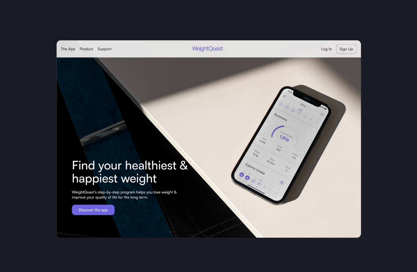
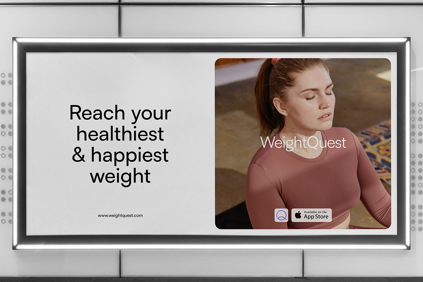
Explore UI/UX design excellence in WeightQuest, an app merging health tracking with a user-friendly interface tailored for women, featuring smart integration.
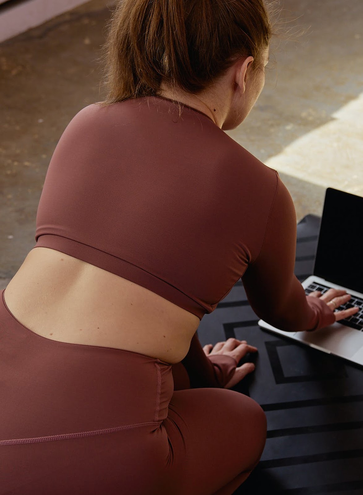
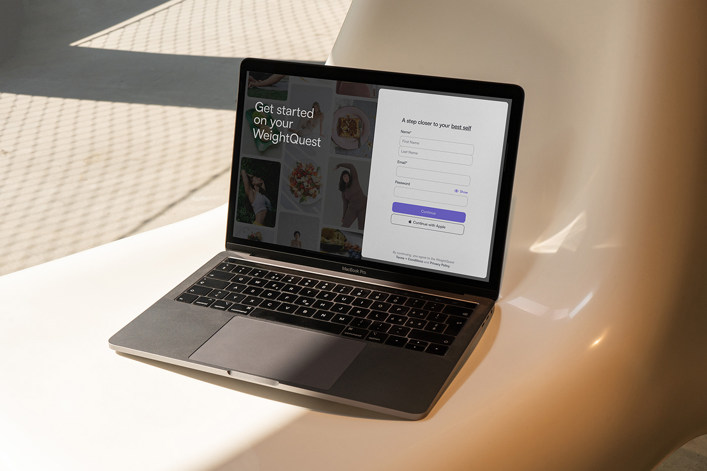
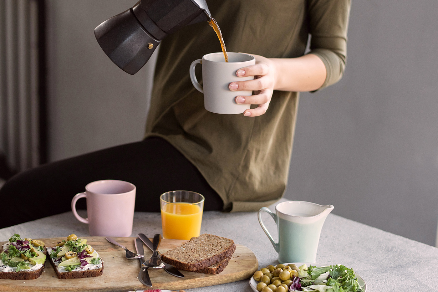
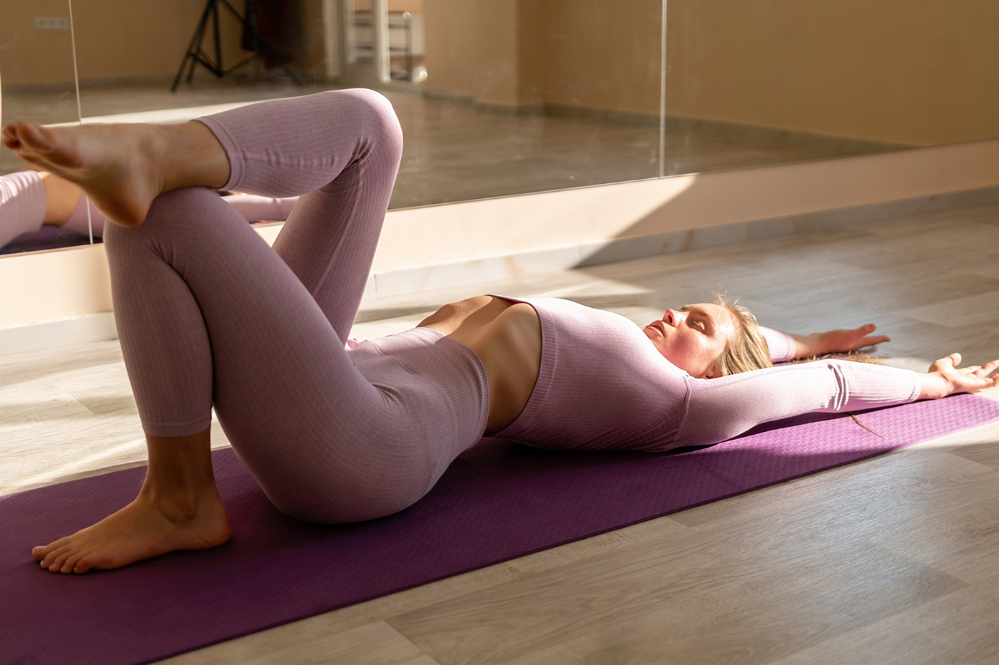
In the rapidly evolving landscape of health and wellness technology, WeightQuest emerges as a tailored solution designed to empower women aged 25-40 on their journey towards healthier living. Created by designers Stefana Stojanoska and Valentino M., this holistic app integrates a smart scale and personal coaching with a user-centric interface that prioritizes ease of use and emotional connection.
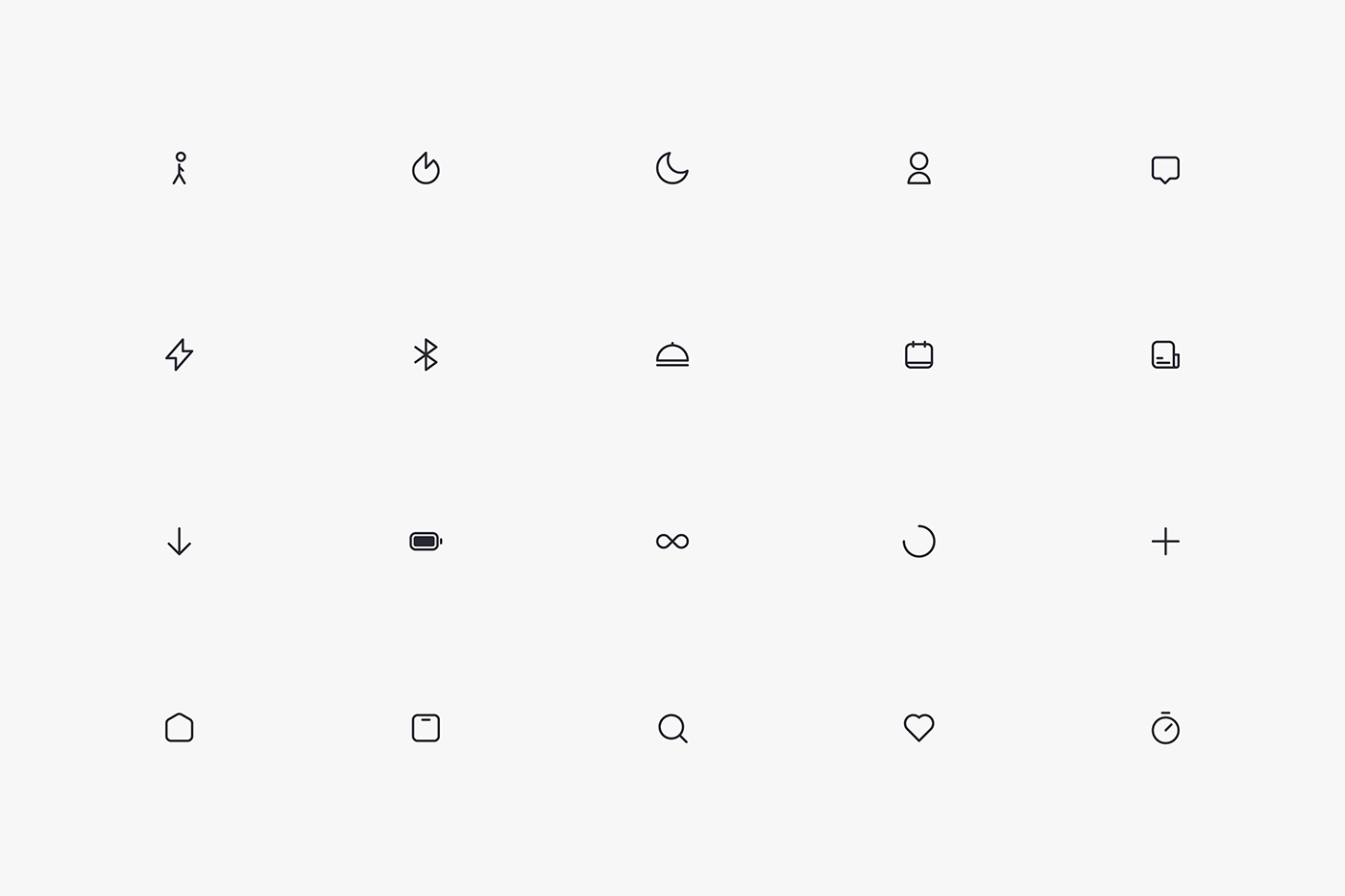
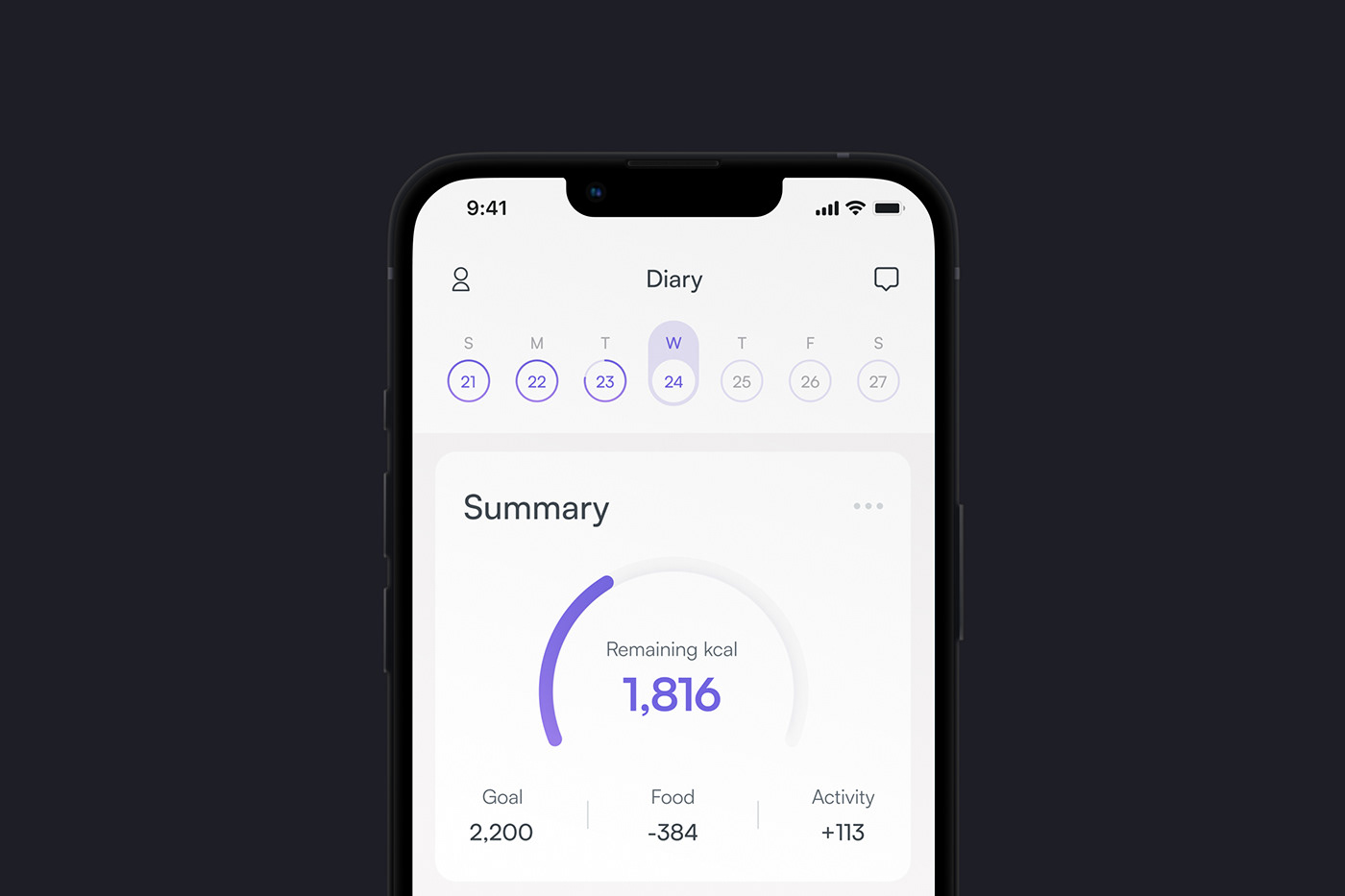
The design of WeightQuest is focused on providing an effortless experience for its users. It features a clean, easy-to-navigate layout that helps users engage with the app without feeling overwhelmed. The simplified iconography and coherent visual language across the app ensure that users can intuitively navigate through the features, making health management both practical and accessible.
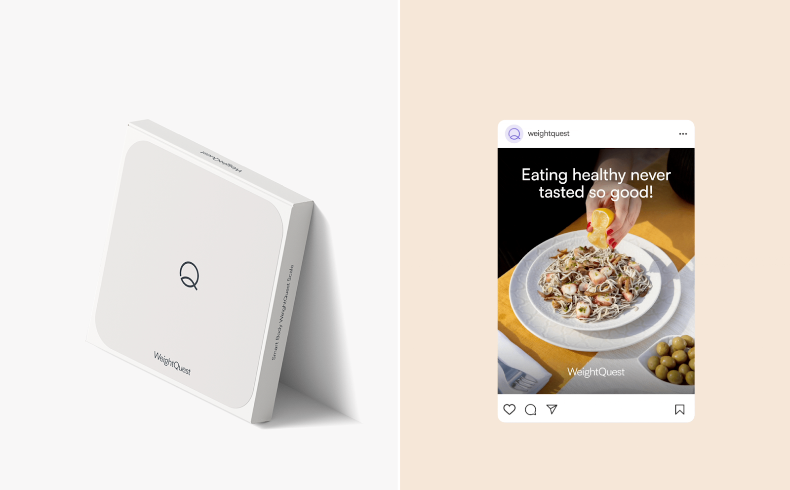
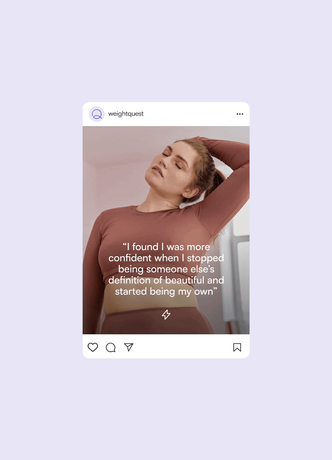
The choice of a soothing purple color scheme is particularly noteworthy. Not only does it appeal to the app's primary female demographic, but it also imbues the interface with a sense of luxury and care. This strategic use of color enhances the user's emotional engagement with the app, fostering a serene and supportive environment for personal health journeys.
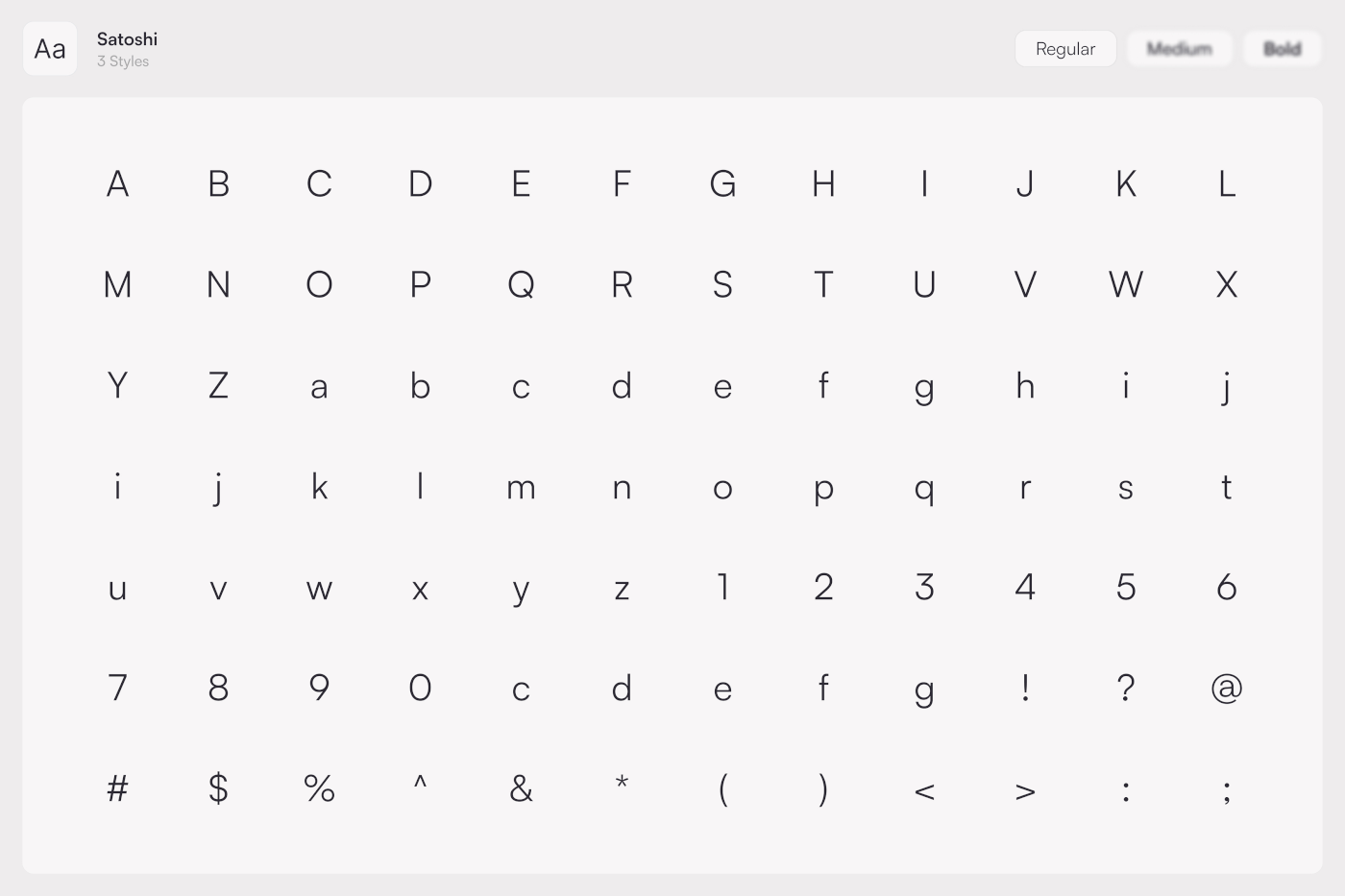
Typography in WeightQuest is handled with a similar sensitivity; legible sans-serif fonts contribute to a contemporary and approachable aesthetic. This choice complements the app's clean design and supports readability, a crucial aspect when users interact with health data and coaching tips.
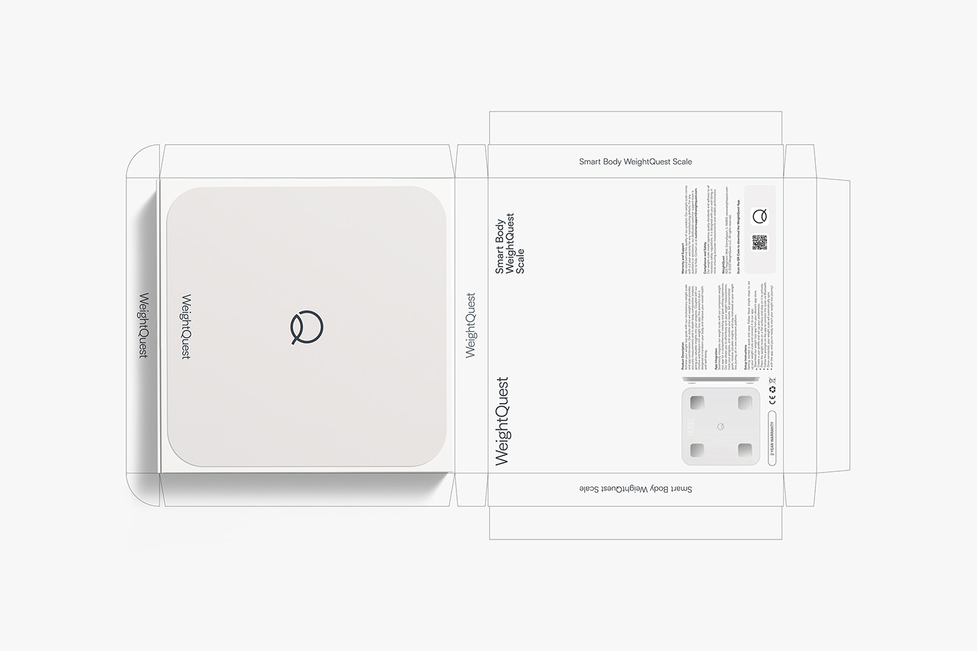
Moreover, the integration with a smart scale exemplifies the seamless blend of hardware and software. The scale's minimalist design and the straightforward functionality of connecting it to the app underline the brand's commitment to convenience and user-focused design. By allowing the app to generate personalized wellness plans based on precise data from the smart scale, WeightQuest provides a customized experience that respects individual goals and preferences.
For UI/UX enthusiasts and app developers, WeightQuest is a sterling example of how design can enhance functionality and user satisfaction. By aligning aesthetic choices with user needs and technological capabilities, the designers have created an app that stands out in the crowded health and wellness market.
App design, UI/UX artifacts
For more information make sure to check out Stefana Stojanoska and Valentino M..


