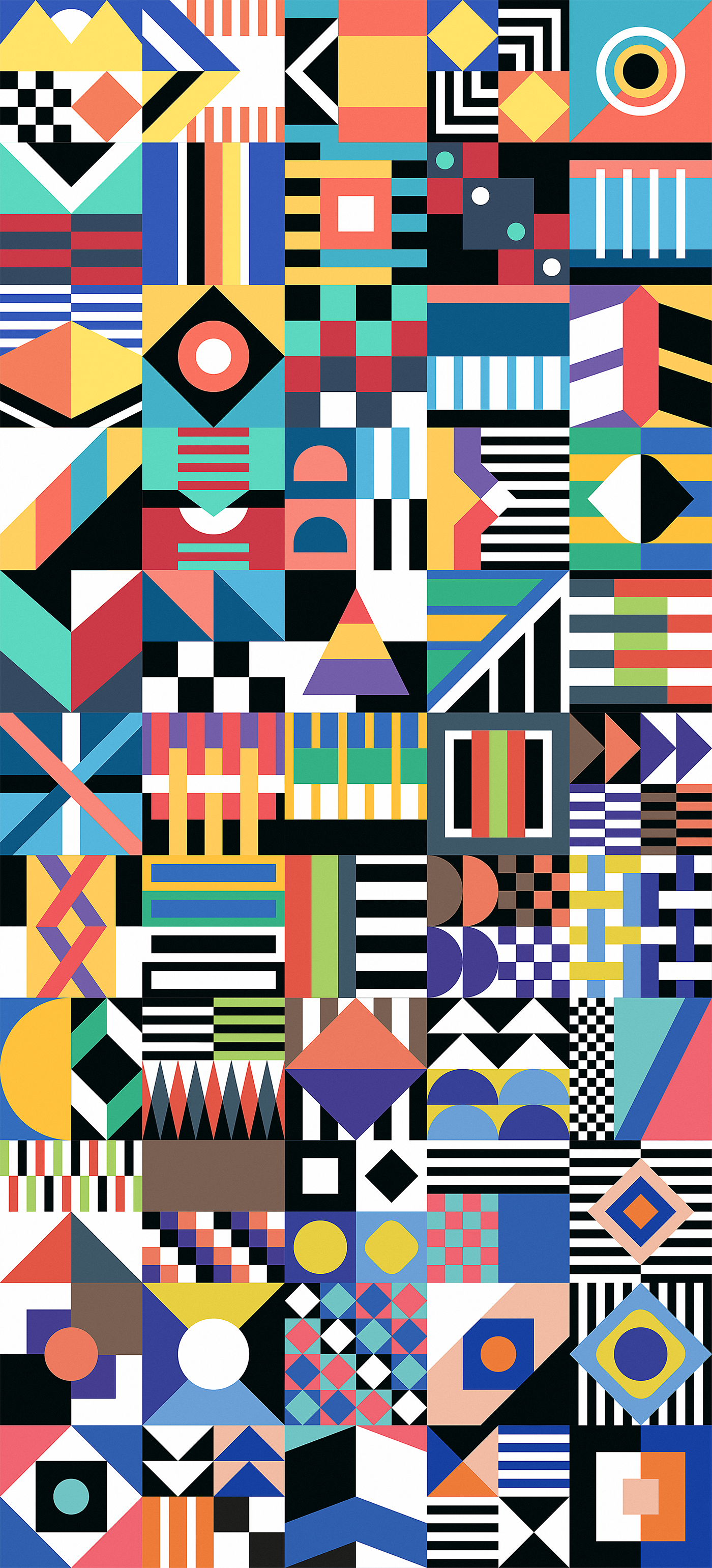
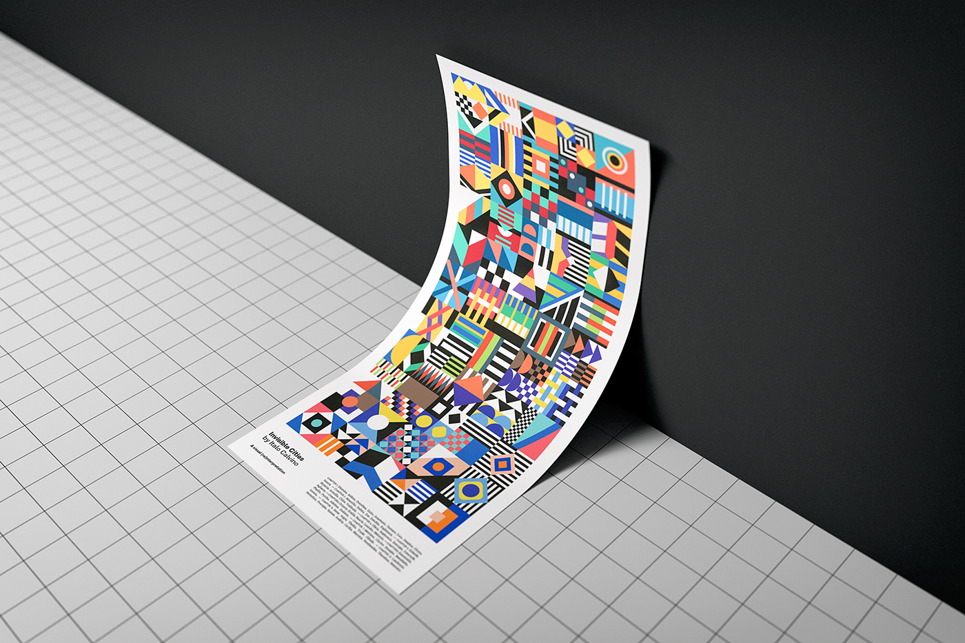
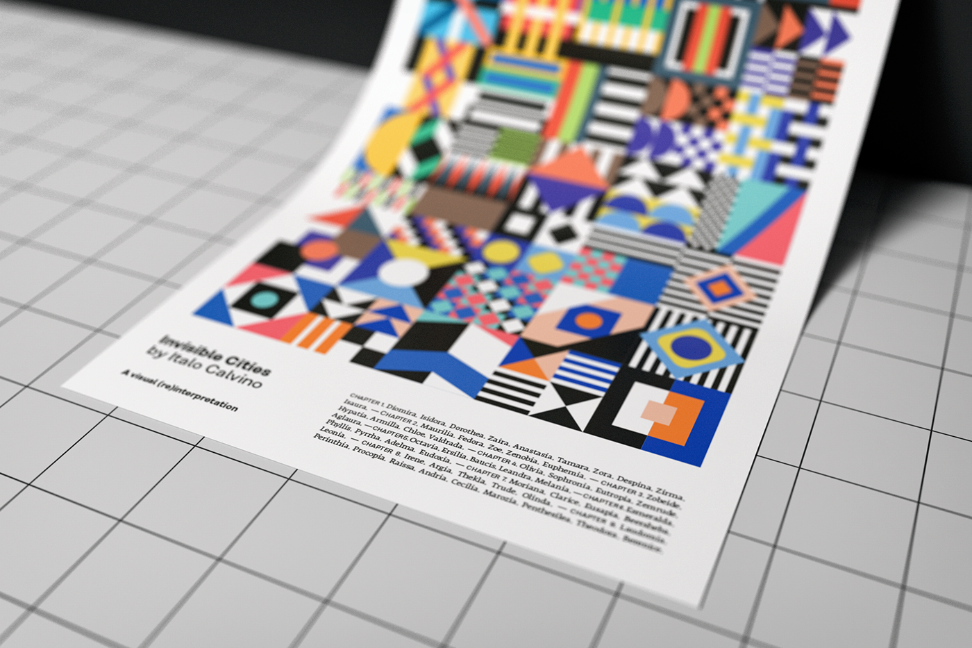
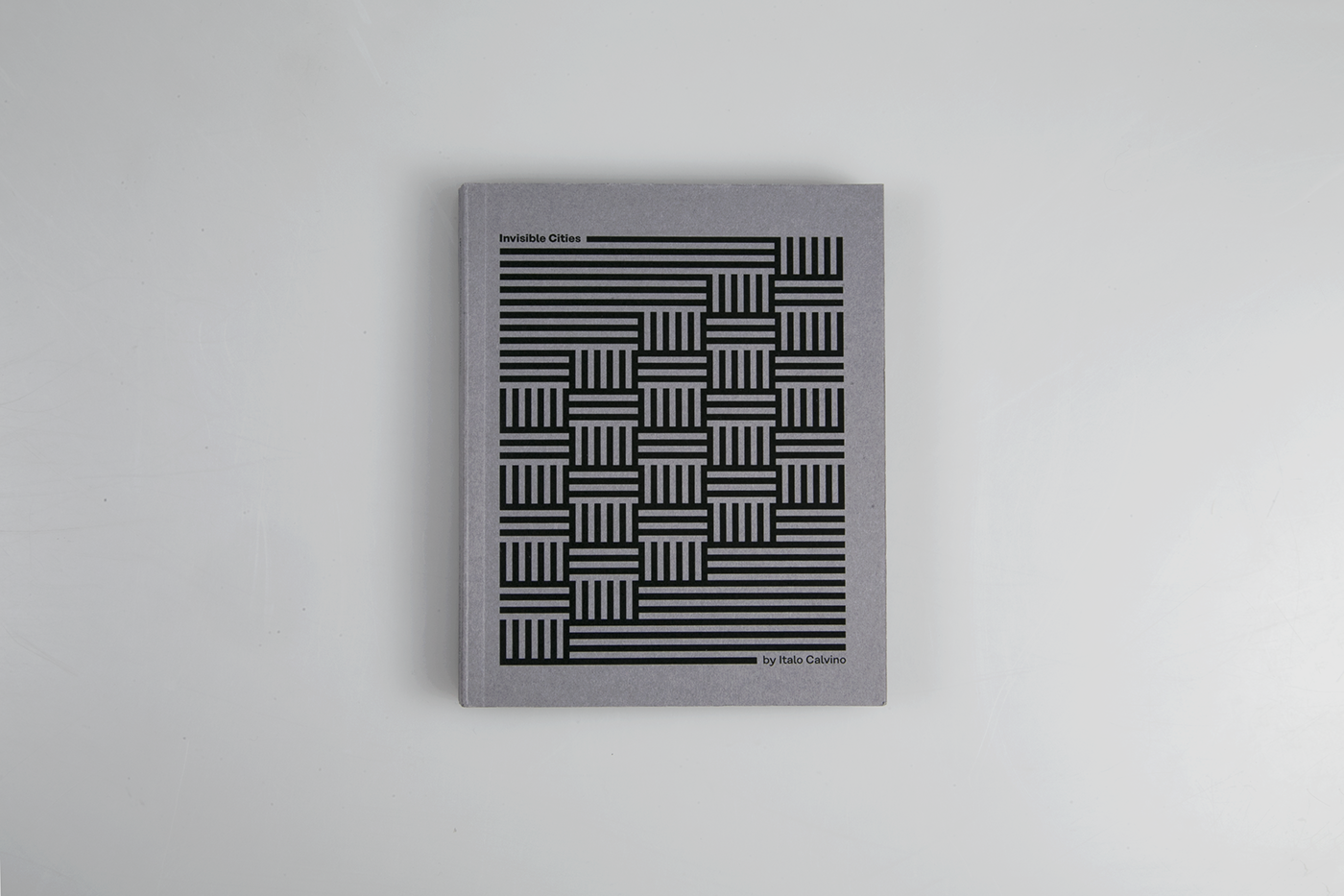
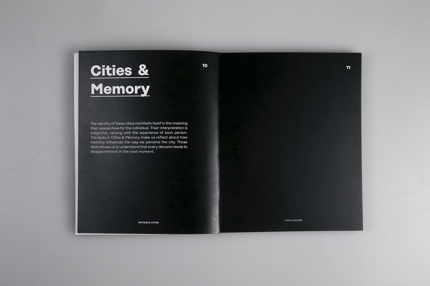
We are always looking for references and inspiration, it's part of our job as designers. The biggest goal in my opinion is to make something better learning from the materials we collect. Serafin Mendes worked on a visual re-interpretation of the book Invisible Cities by Italo Calvino (first published in 1972) for his MA in Communication Design and outcome is simply awesome. Check out a little glimpse of the process below.
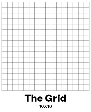
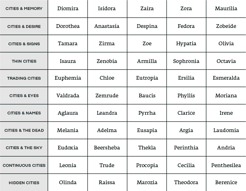
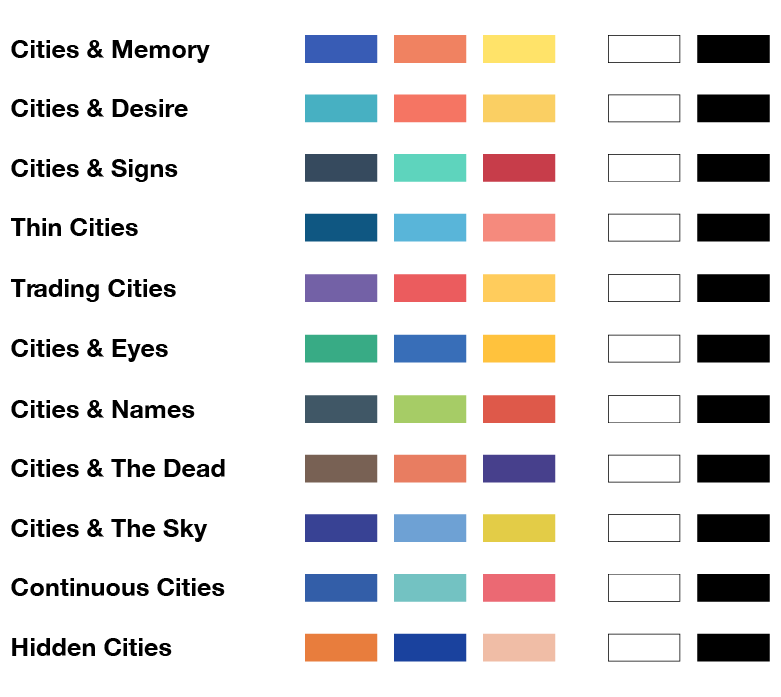
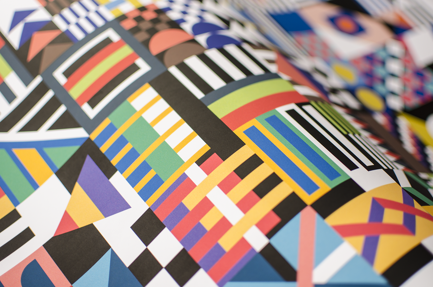
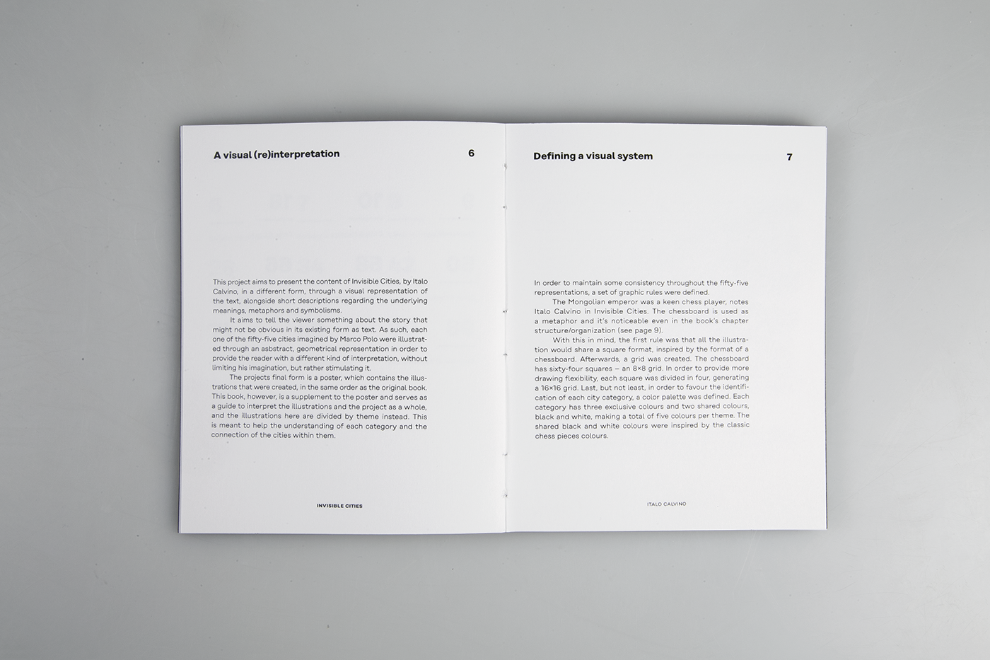
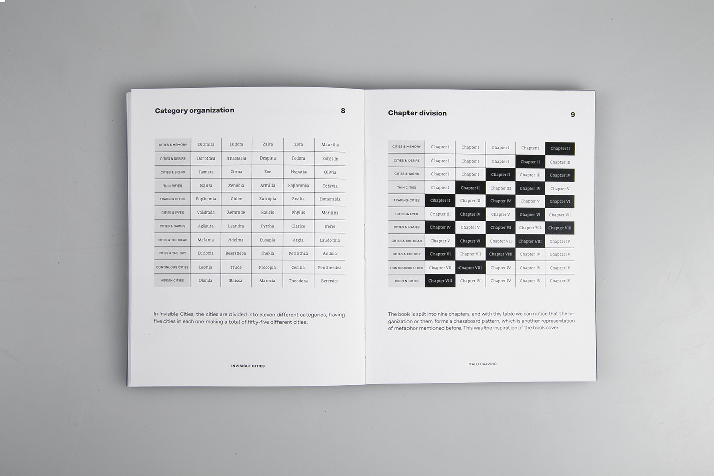
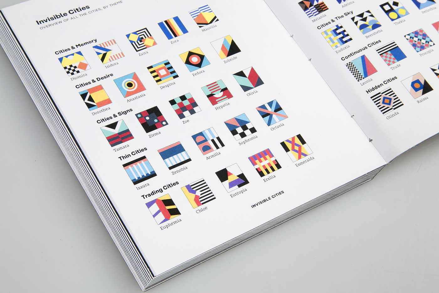
Despite the notorious abstraction of the illustrations, they come from the simplification of the concept of each city. I also defined a set of rules (a visual system) in order to help organizing everything – all the illustrations share a common grid (16x16). The cities are divided into 11 categories and I defined a unique color palette, with three different colors, for each one of them. Black/white are common colors among all of them.


Serafin is a designer from Porto, Portugal. His main focus is typography, type, and editorial design, although he is not limited to those. Recently, he started delving into the world of 3D illustration in order to combine it with typography. For more information check out https://www.behance.net/serafimmendes

