In today's competitive digital landscape, branding and visual design play an instrumental role in distinguishing one brand from another. One such exemplary case that caught our eye is the Matcha Matcha brand, meticulously crafted by the talented Blake Scott.
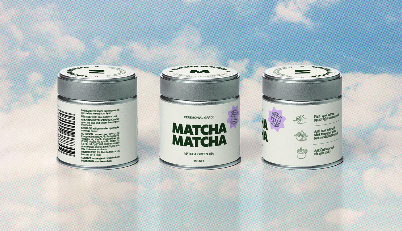
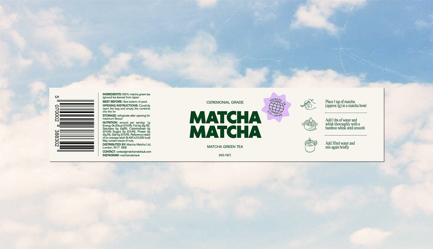
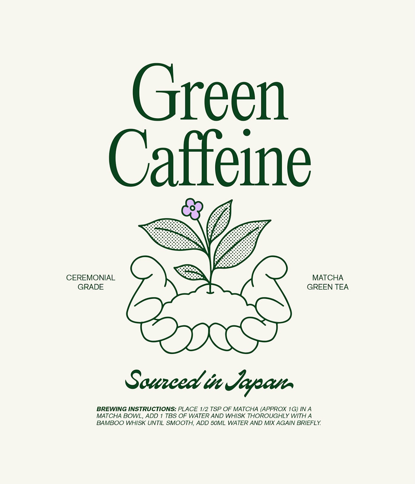
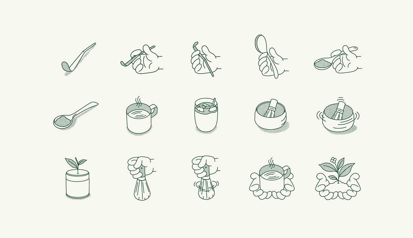
The brand represents ceremonial-grade matcha sourced from Uji, Japan, an iconic region often revered as the birthplace of matcha. At first glance, the packaging design embodies simplicity, allowing the product's authentic origins to shine through. It's worth noting that Matcha Matcha commits to using only the first flush of shade-grown tea leaves. These are not just any leaves but are hand-picked, steamed, dried, and stone-ground to perfection.
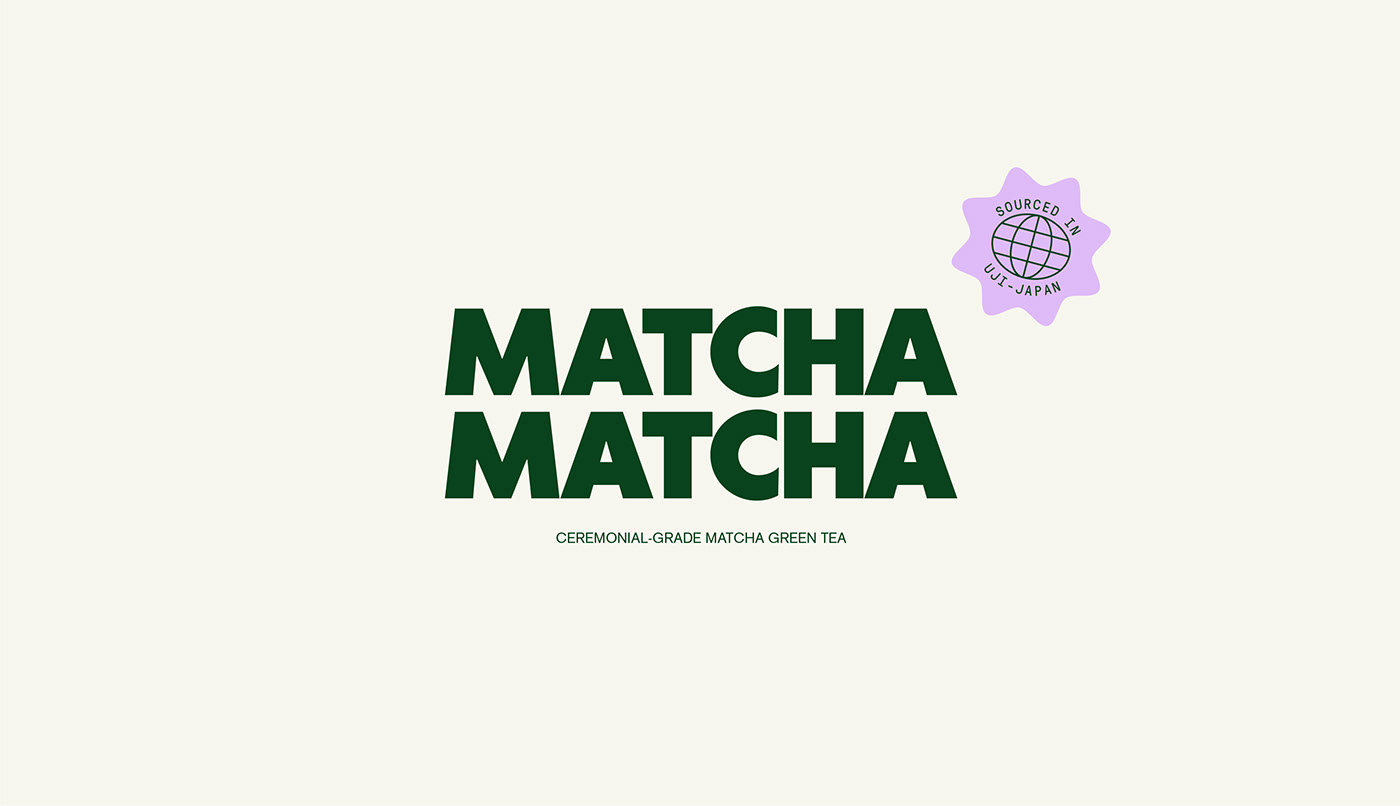
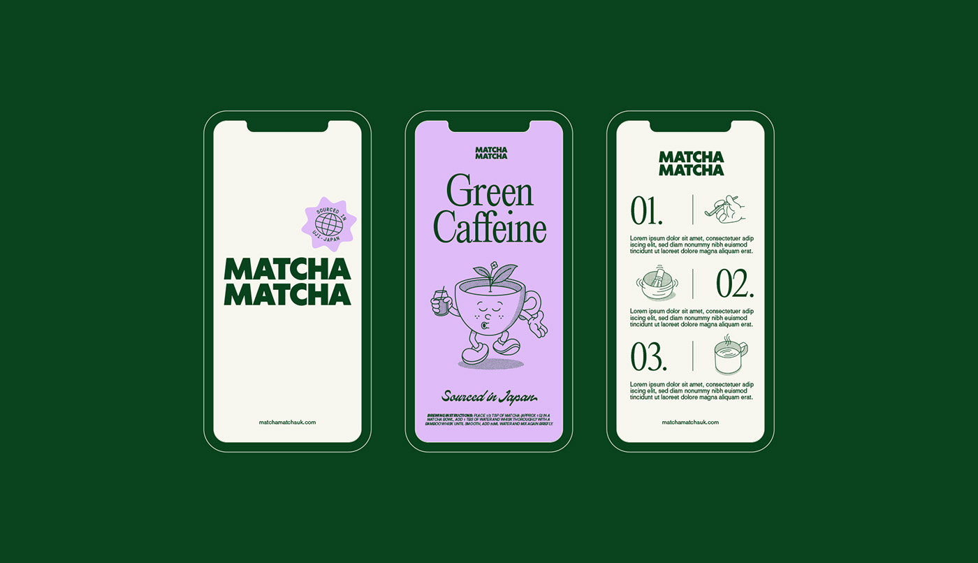
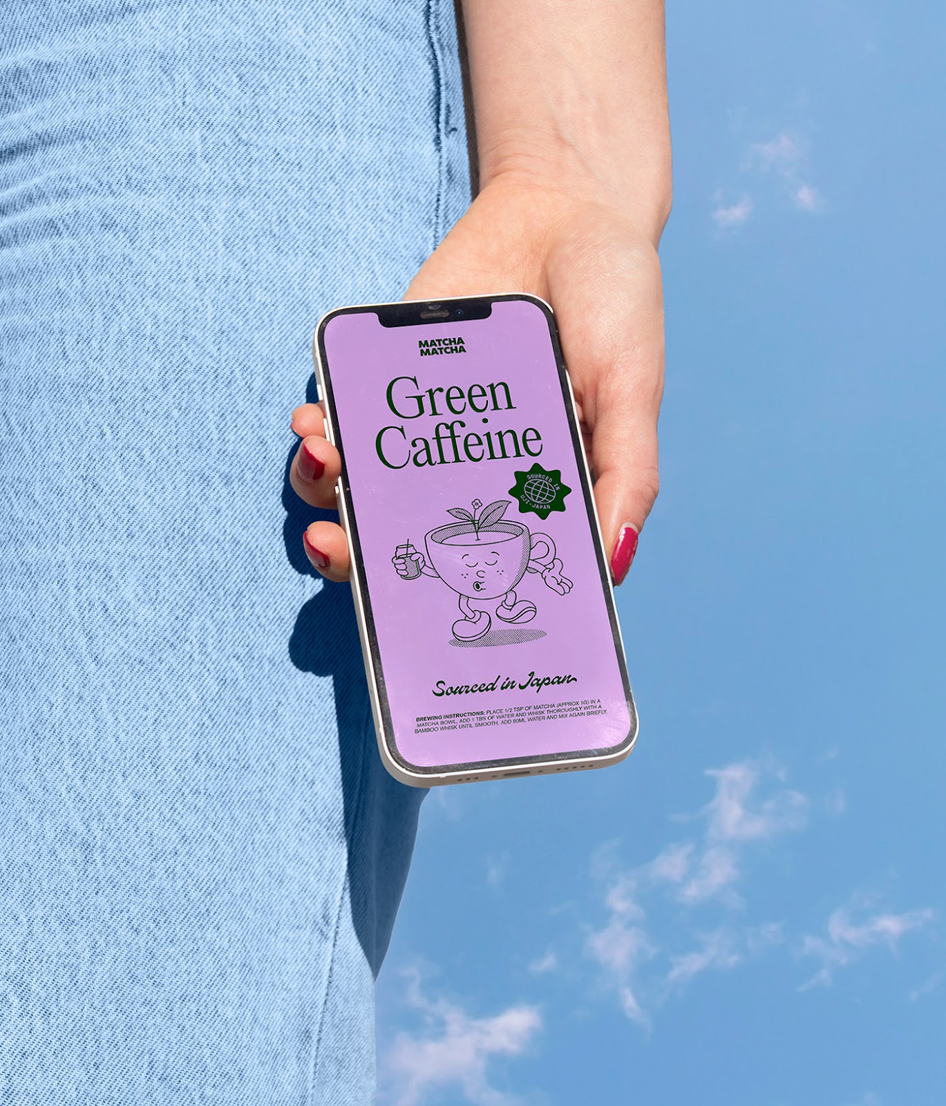
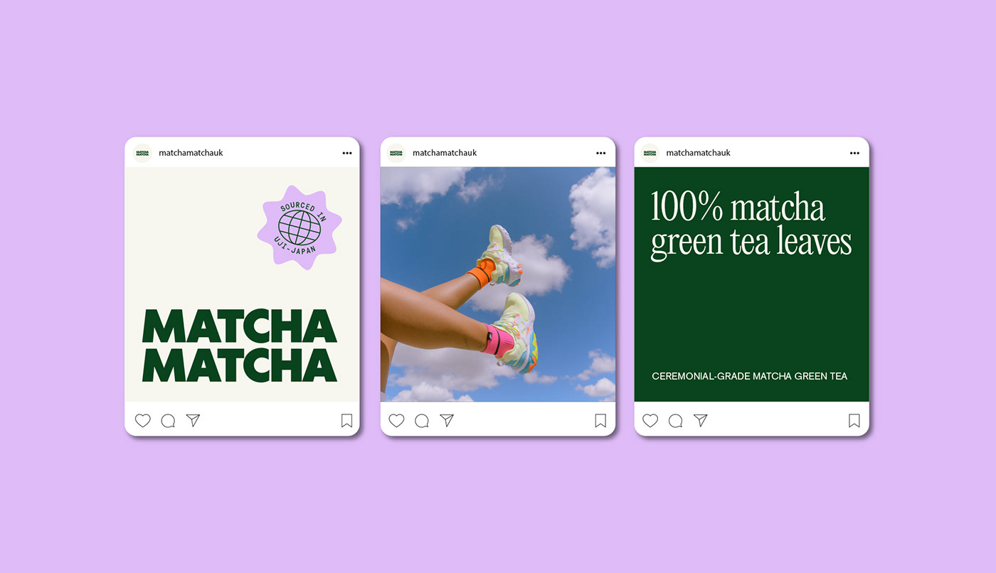
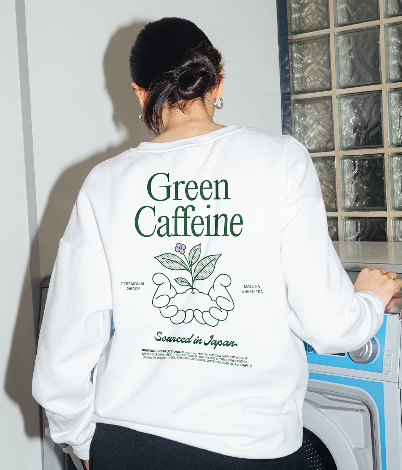
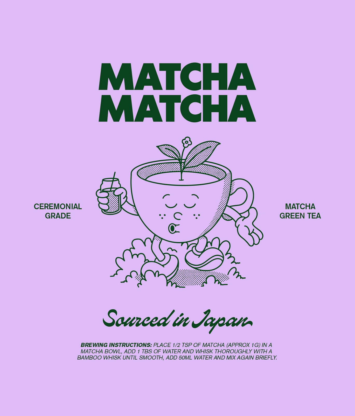
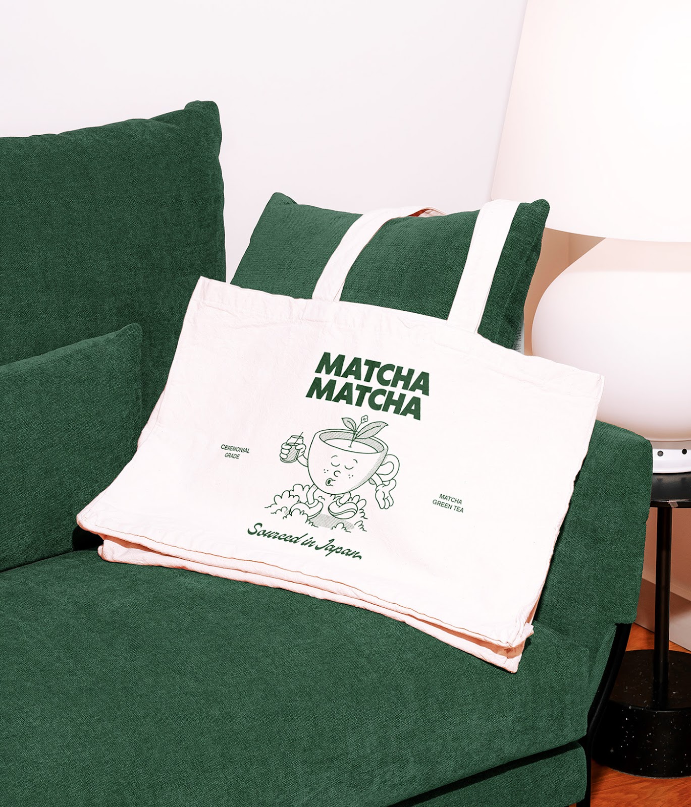
Looking at the images, Scott's design approach becomes evident. He strategically utilizes a minimalist palette, emphasizing muted greens and off-whites to symbolize the pure, organic nature of the product. There's an undeniable elegance in the understated design elements. It is reflective of the brand's philosophy that sees matcha not just as a consumable product but as a holistic experience. A sentiment that resonates throughout their branding.
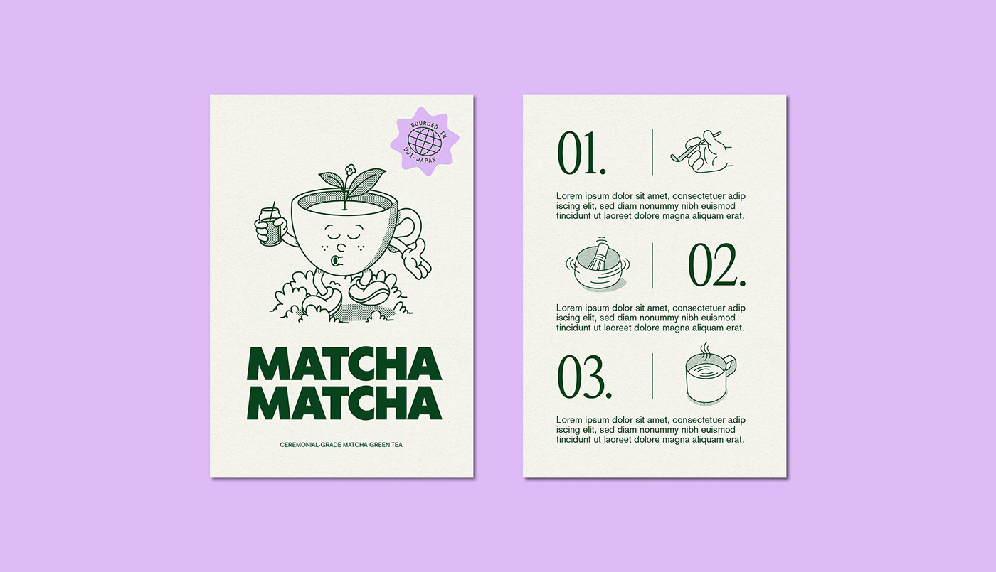
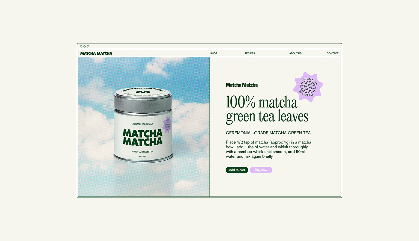
The web design for Matcha Matcha further cements its branding ethos. It’s clean, intuitive, and most importantly, offers a user-friendly experience. The interface seamlessly combines product information with a visual narrative, ensuring users not only understand the product's tangible benefits but also connect with its rich history and tradition.
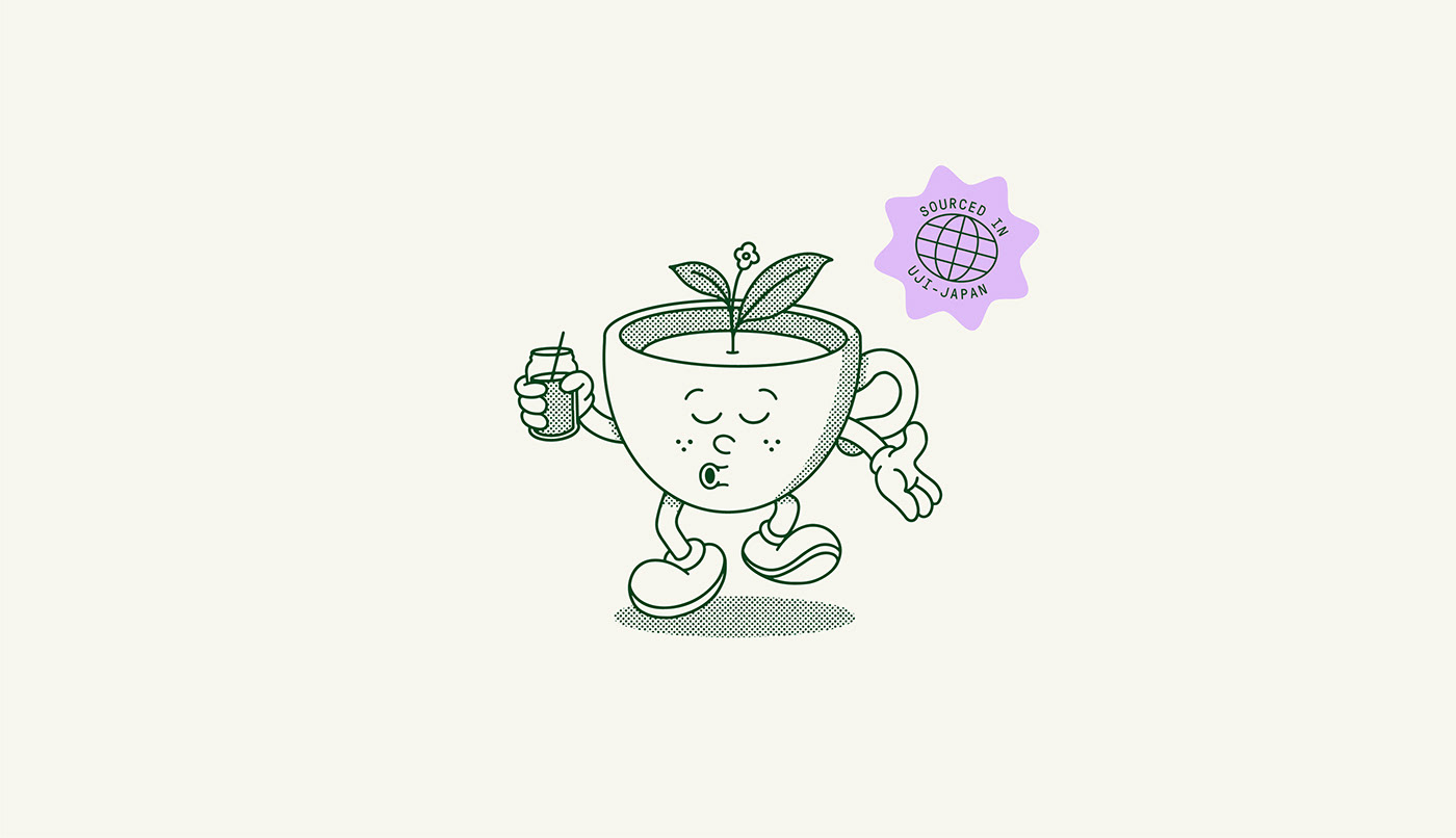
Scott's design triumphs in translating the brand's core belief into tangible visual elements. Matcha Matcha prides itself on the artistry of matcha preparation. For them, and many enthusiasts, matcha is not just a beverage. It is an experience, a ritual. Every sip is an invitation to pause, reflect, and truly savor the moment. This philosophy finds its echo in the brand's design. The visuals are not cluttered; they breathe, mimicking the very experience of consuming the tea.
To better understand the brand's commitment to offering an authentic experience, one need not look further than their official website, www.matchamatchauk.com. It's not just a platform to purchase matcha but a space that educates and immerses users into the world of matcha.
In conclusion, the Matcha Matcha branding, designed by Blake Scott, is a masterclass in branding and visual design. It seamlessly weaves the product's rich history with modern design principles, presenting a brand that is not just visually appealing but deeply rooted in tradition and authenticity. In an era where brands often scream for attention, Matcha Matcha's design whispers, making its impact all the more profound.
Branding, packaging design and web design
For more information make sure to check Blake Scott website or follow Blake on Behance.


