Explore how Deezer's branding and visual identity, crafted by Koto Studio, redefines music streaming with its heart-inspired logo and dynamic design system.
In the competitive world of music streaming, Deezer has carved a niche for itself, not just through its extensive music library but also through a distinctive visual identity that resonates with its audience. Established in 2007 and now reaching audiences in over 180 countries, Deezer's journey is a testament to the power of branding in connecting with users on a deep, emotional level. The recent redesign by Koto Studio has further solidified Deezer's place in the hearts of nearly 10 million paid subscribers.
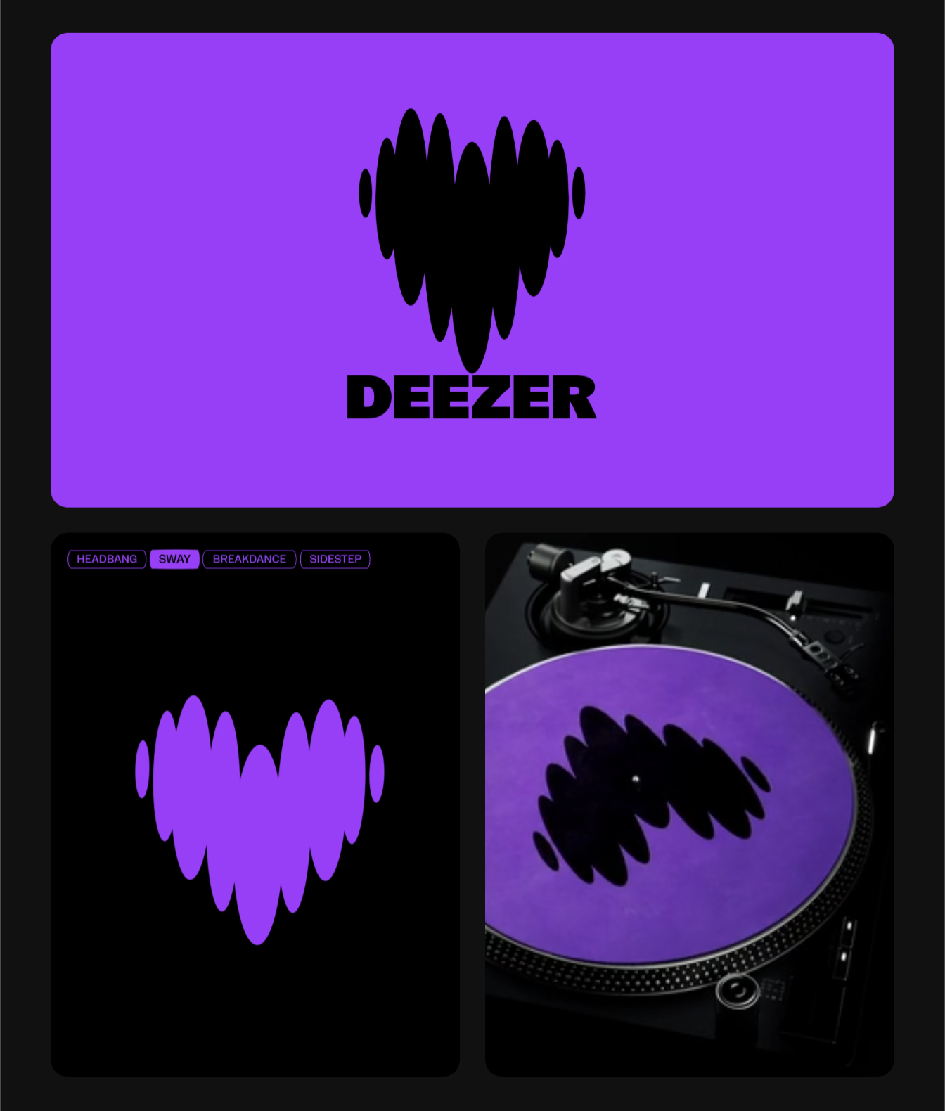
At the heart of Deezer's new visual identity is a logo that epitomizes the essence of music itself. This new logo, symbolizing a beating heart, captures the universal love for music, building a sense of belonging among its users. It fluidly transitions between human emotion and musical rhythm, embodying Deezer's commitment to providing an immersive, emotional music experience.
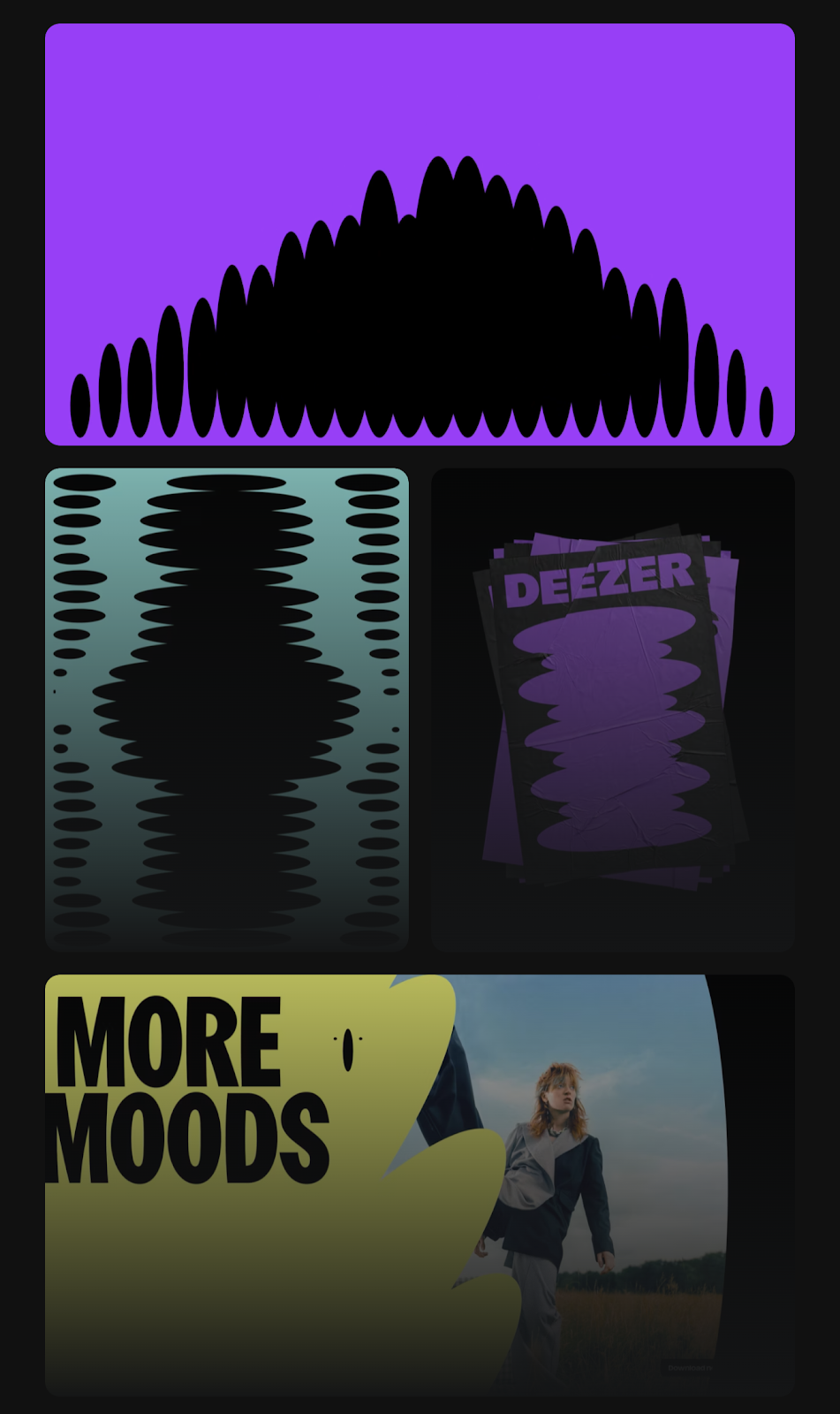
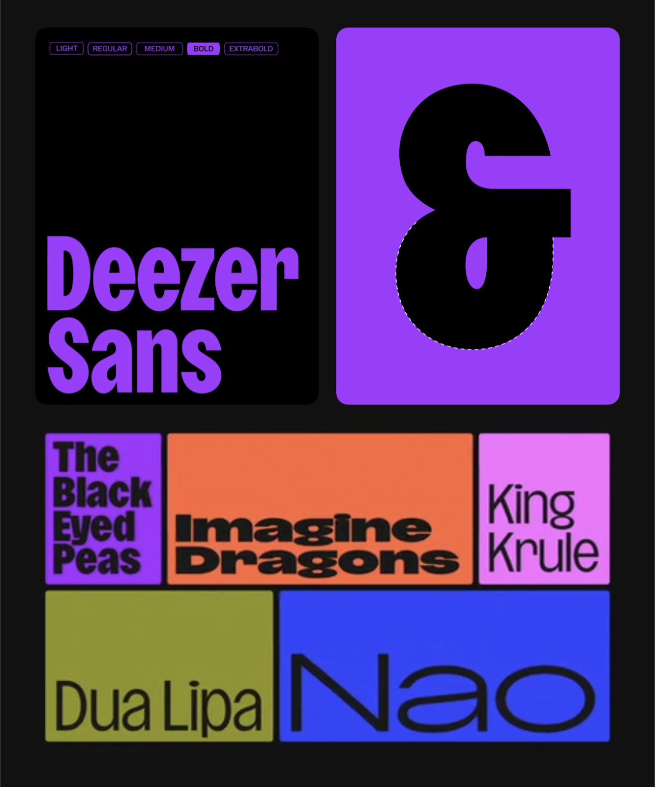
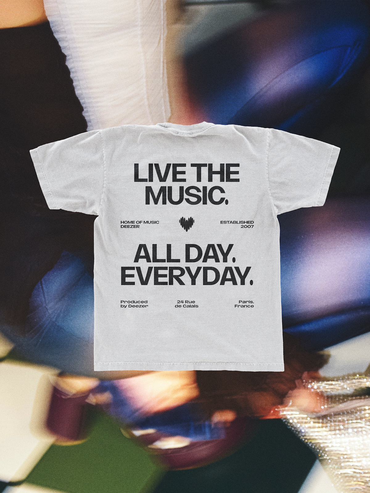
Koto's comprehensive design system for Deezer extends beyond the logo, incorporating dynamic beats that serve various roles within the brand's visual identity. These beats morph into patterns, graphic elements, and even container shapes for imagery, providing a versatile yet coherent look across all brand touchpoints. The introduction of the Deezer SANS typeface, designed in collaboration with the NaN type foundry, further enhances this versatility. Inspired by the logo's shapes, the typeface allows for customized typography across different content types, ensuring clarity and brand consistency.
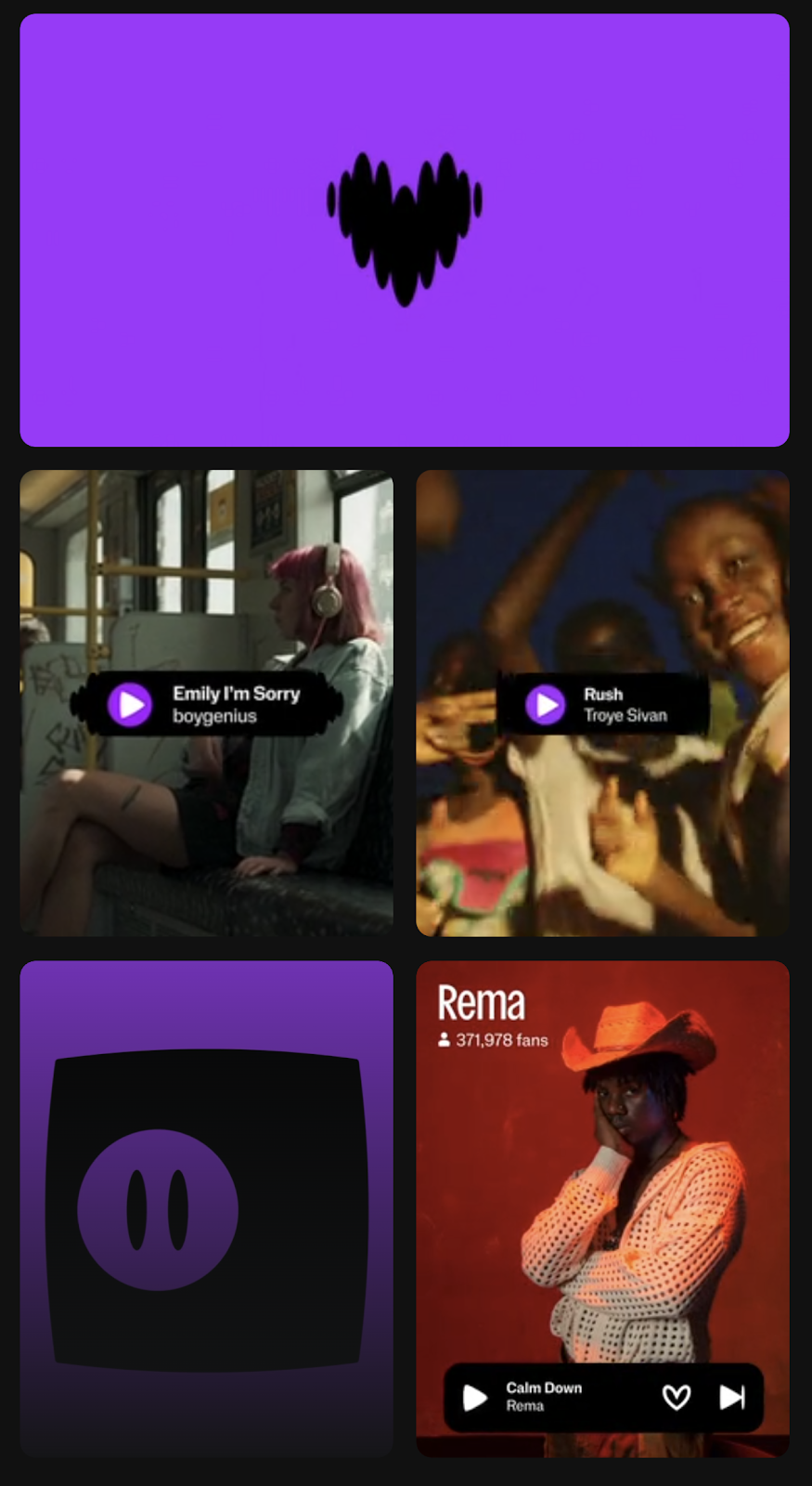
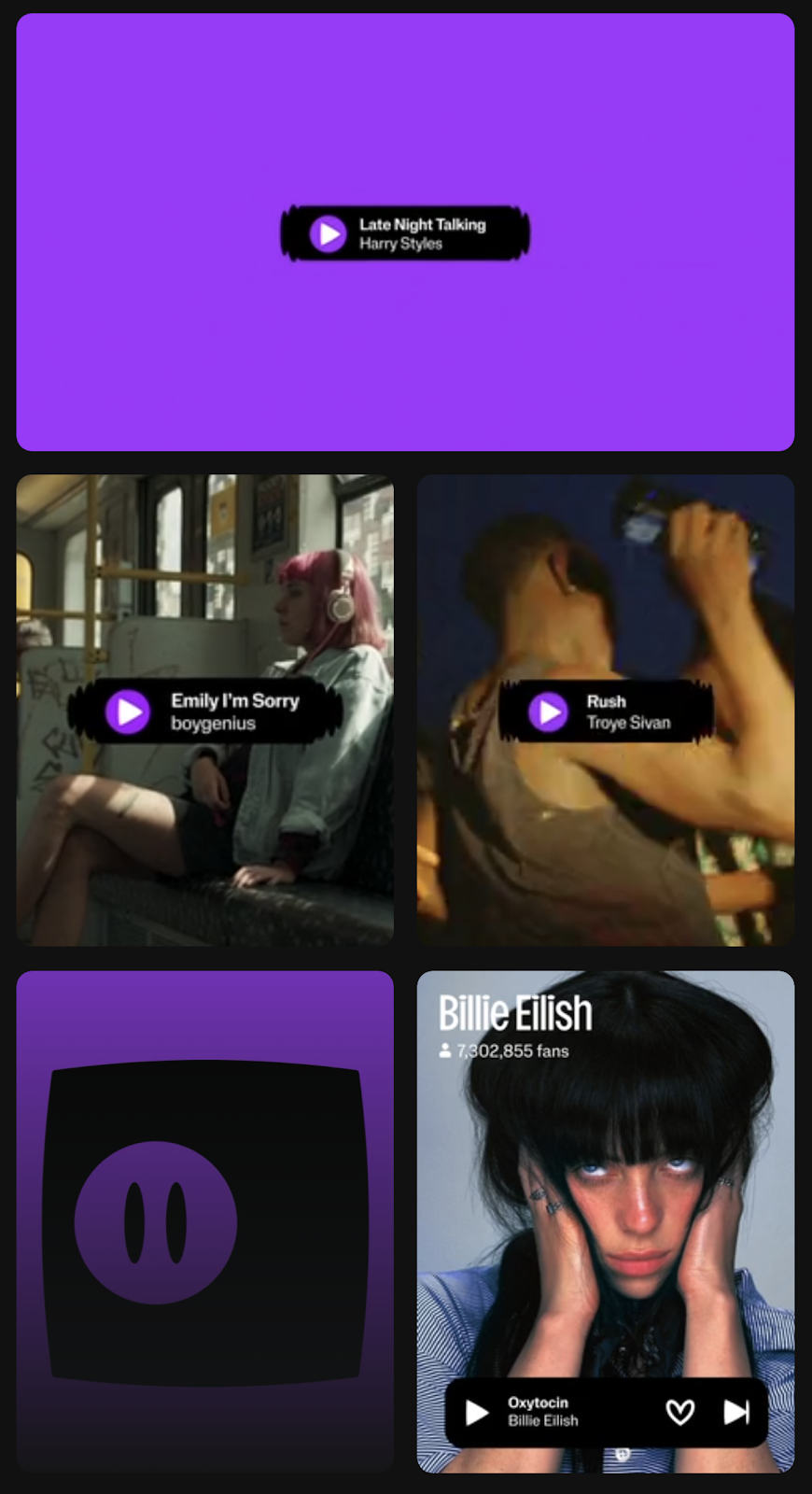
The UI design and iconography take cues from the logo's rounded forms, creating a distinctive and functional user interface that remains true to the Deezer identity. The expressive UI modules, responsive to music of all genres, alongside a bespoke iconography style, reinforce the brand's unique identity.
Deezer's editorial system unifies these design elements, using beats as a core mechanic to create vibrant, dynamic backgrounds that celebrate artists. With the flexible Deezer SANS typeface and consistent branding elements, the system places artists and music at the forefront, embodying the brand's central belief in the unparalleled power of music.
Deezer's reimagined branding and visual identity, thanks to the collaborative efforts of the Deezer team and Koto Studio, showcases the brand's dedication to enriching the music streaming experience. It's a harmonious blend of design and music, where each creative touchpoint echoes Deezer's mission to connect fans with the music they love.
Branding and visual identity artifacts
For more information make sure to check out Koto Studio website.


