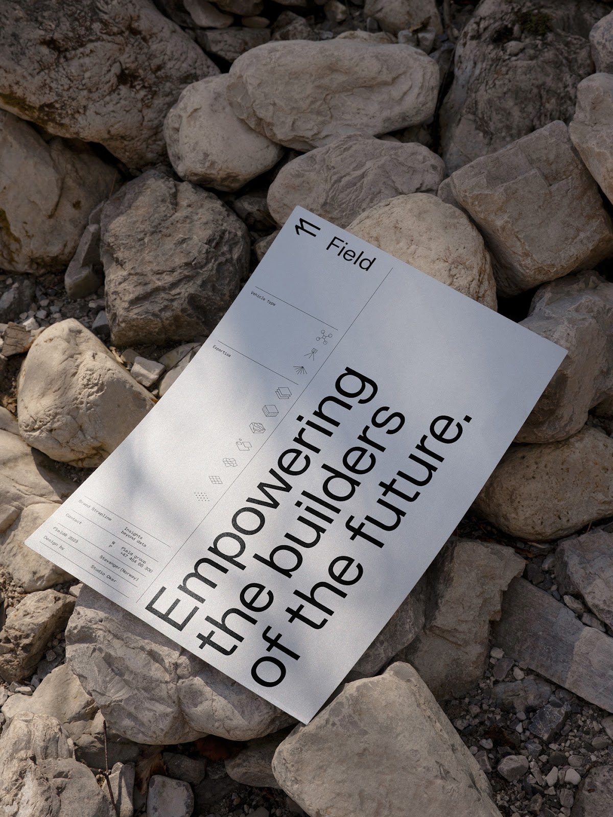
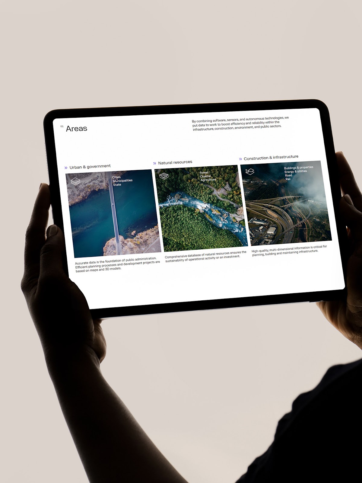
In the picturesque landscapes of Norway, where fjords meet mountains and innovation thrives, Studio Oker has emerged as a creative force in the world of design. Their latest venture led them to collaborate with Field, a pioneering tech company with a mission to revolutionize the geospatial industry. Together, they embarked on a journey to shape the visual identity of Field, a project that showcases the power of design in conveying complex ideas and fostering innovation. Field is not just any tech company; it's a trailblazer in leveraging geodata competence, proprietary software, and geospatial technologies to develop critical solutions. They provide invaluable data and insights that empower the builders of tomorrow, from urban planners to infrastructure developers. To convey this vision effectively, a strong visual identity was paramount, and Studio Oker was the perfect collaborator for the job. What sets Studio Oker apart is their ability to grasp the essence of a brand and translate it into visuals that resonate with the target audience. For Field, this meant encapsulating the ideas of innovation, precision, and connectivity. Studio Oker's expertise in design strategy was the catalyst that brought these concepts to life. The resulting visual identity for Field is a testament to Studio Oker's creative prowess.
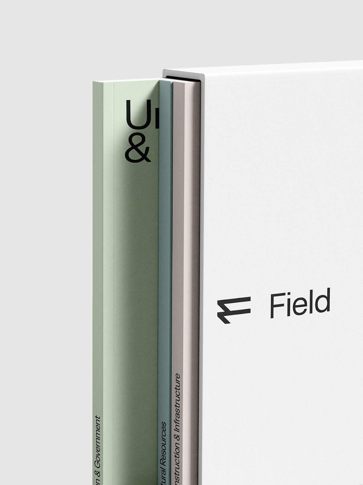
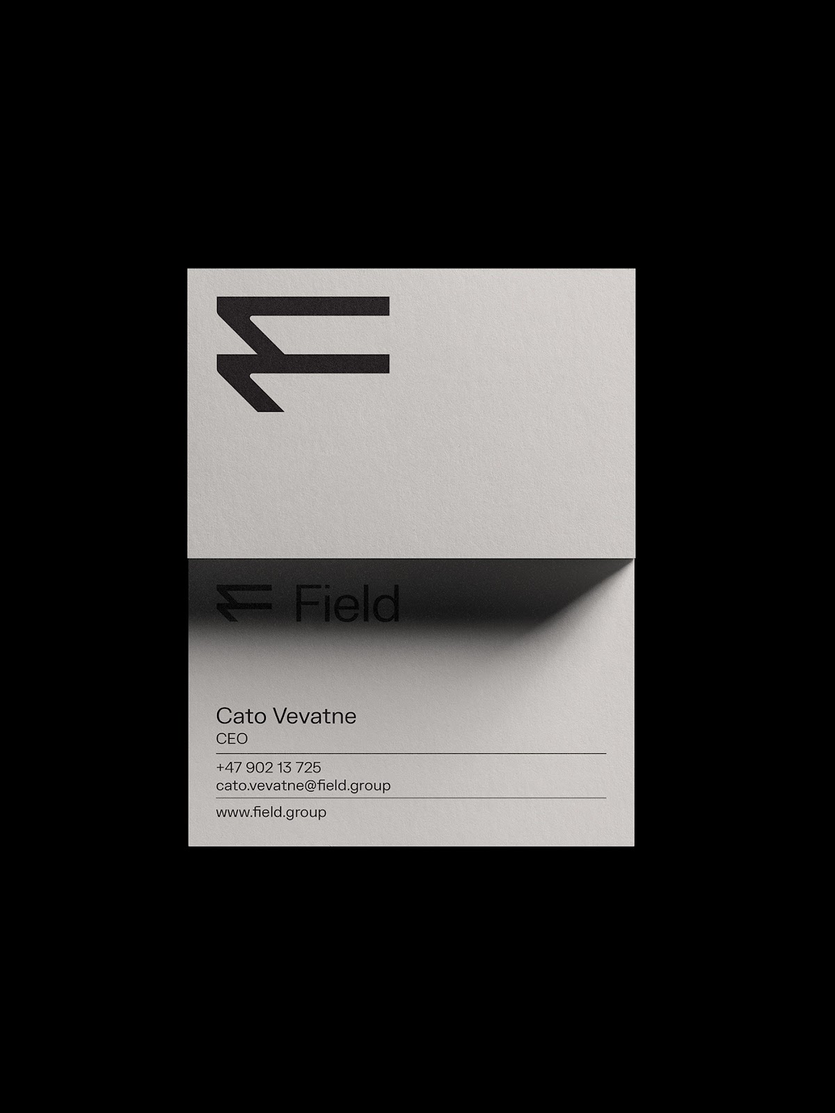
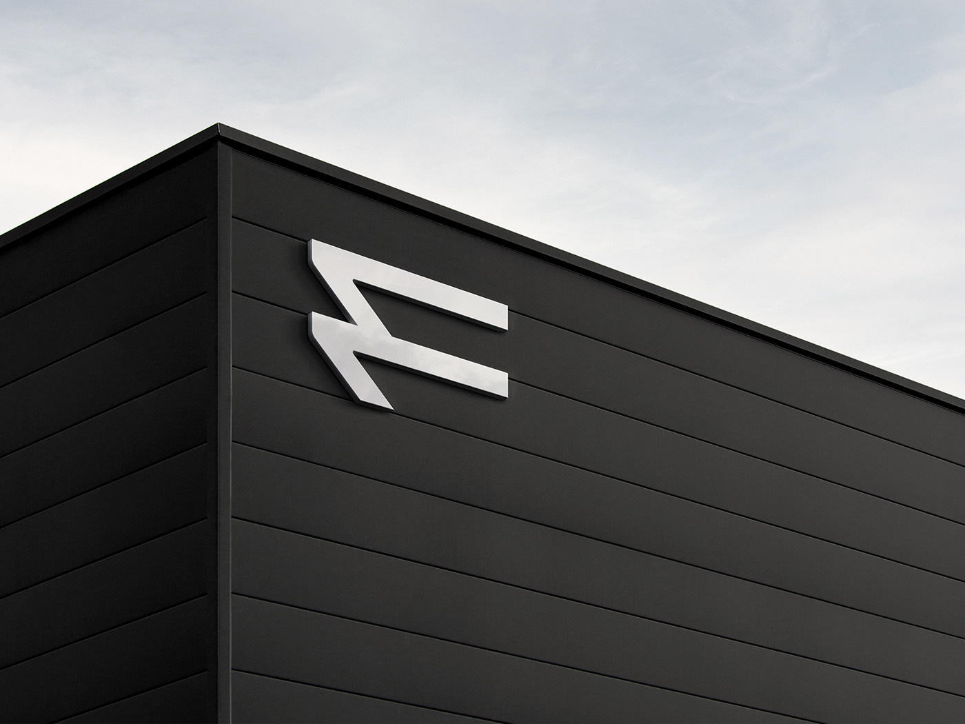
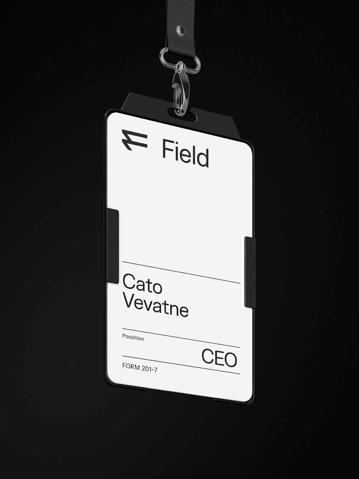
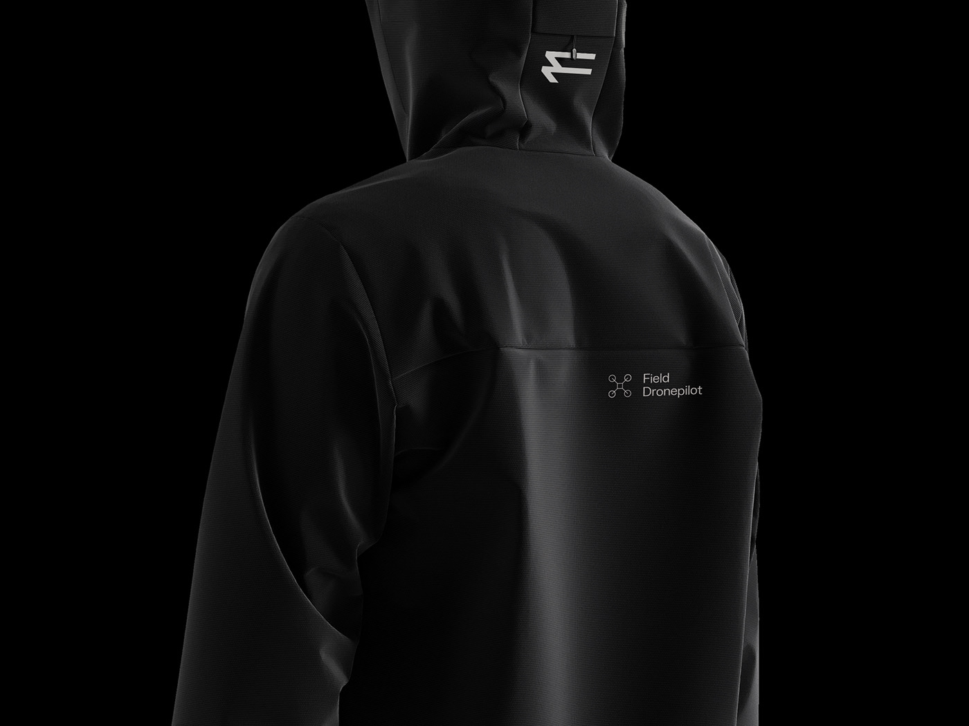
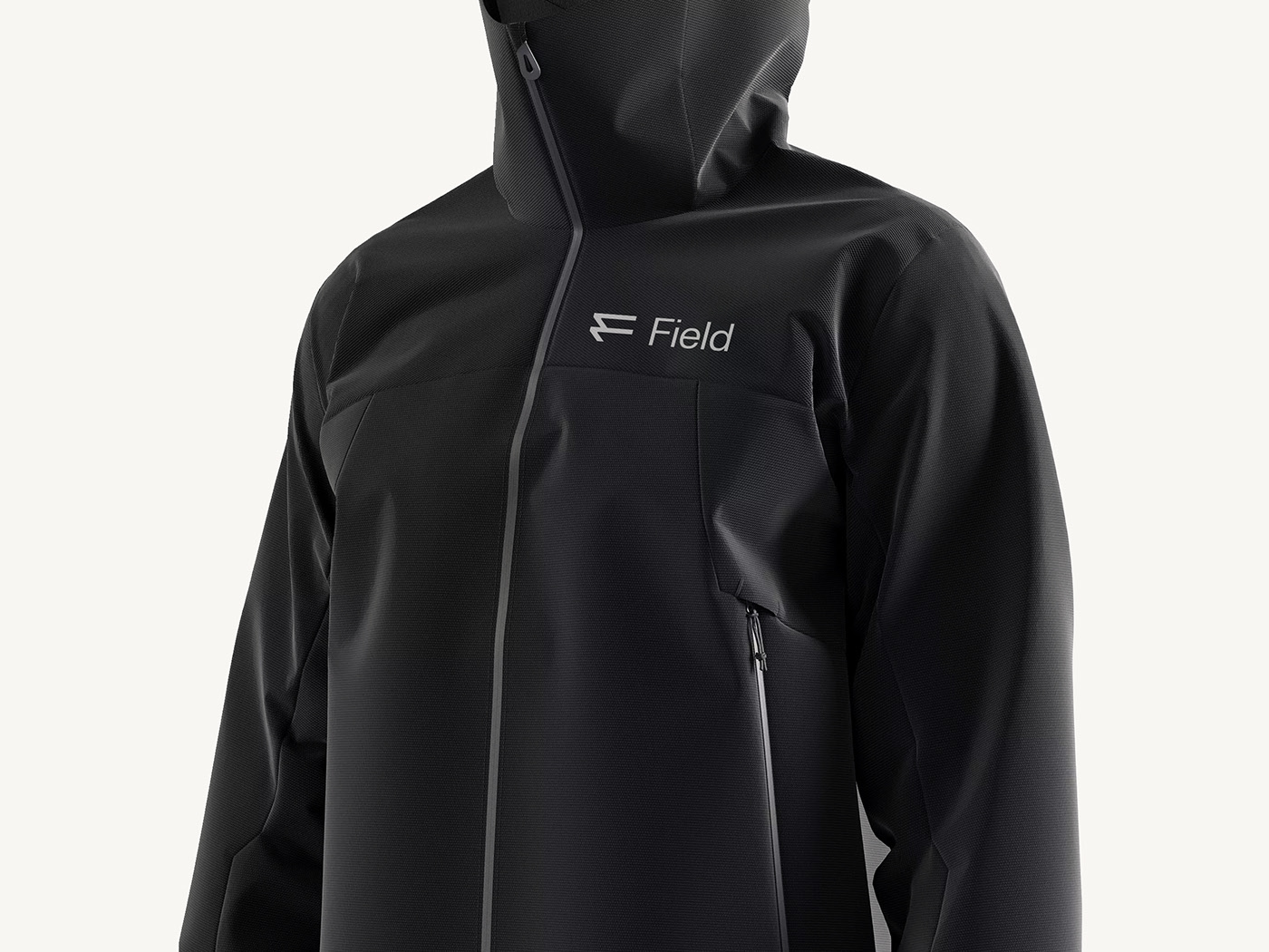
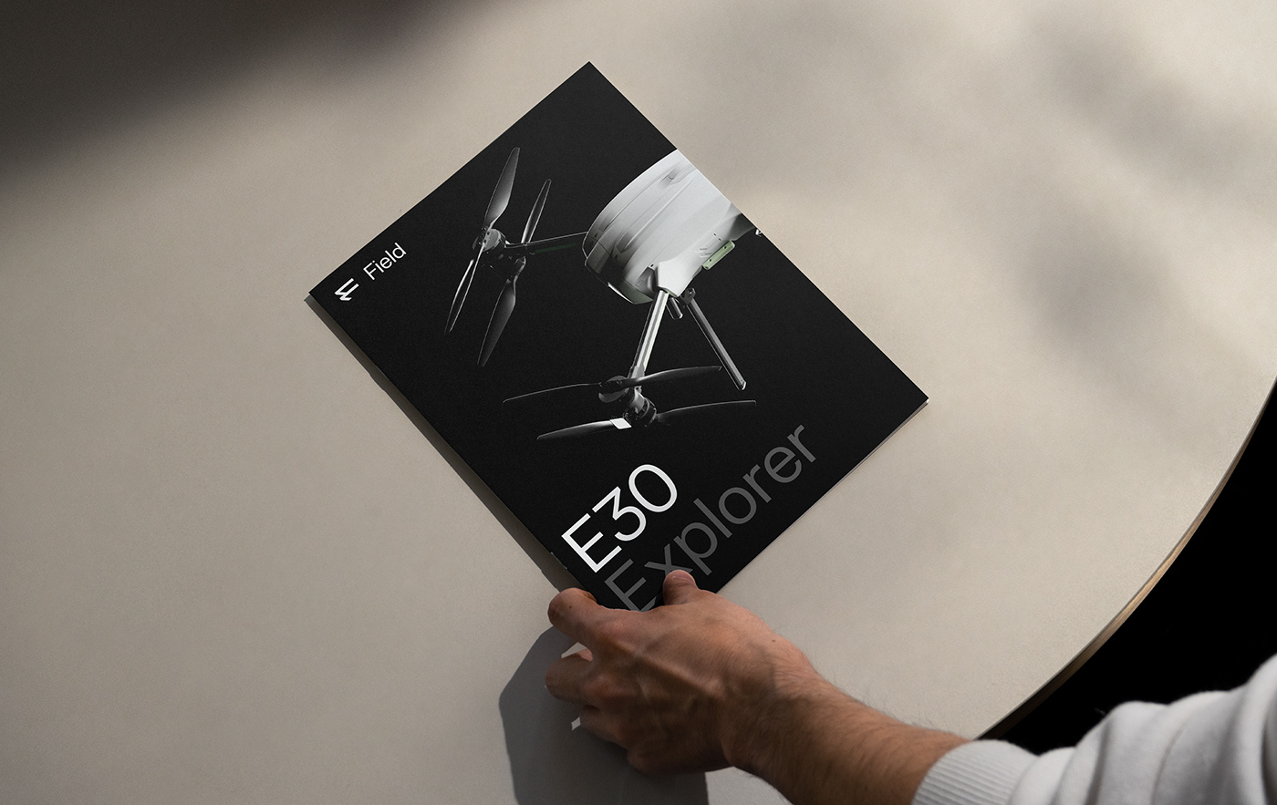
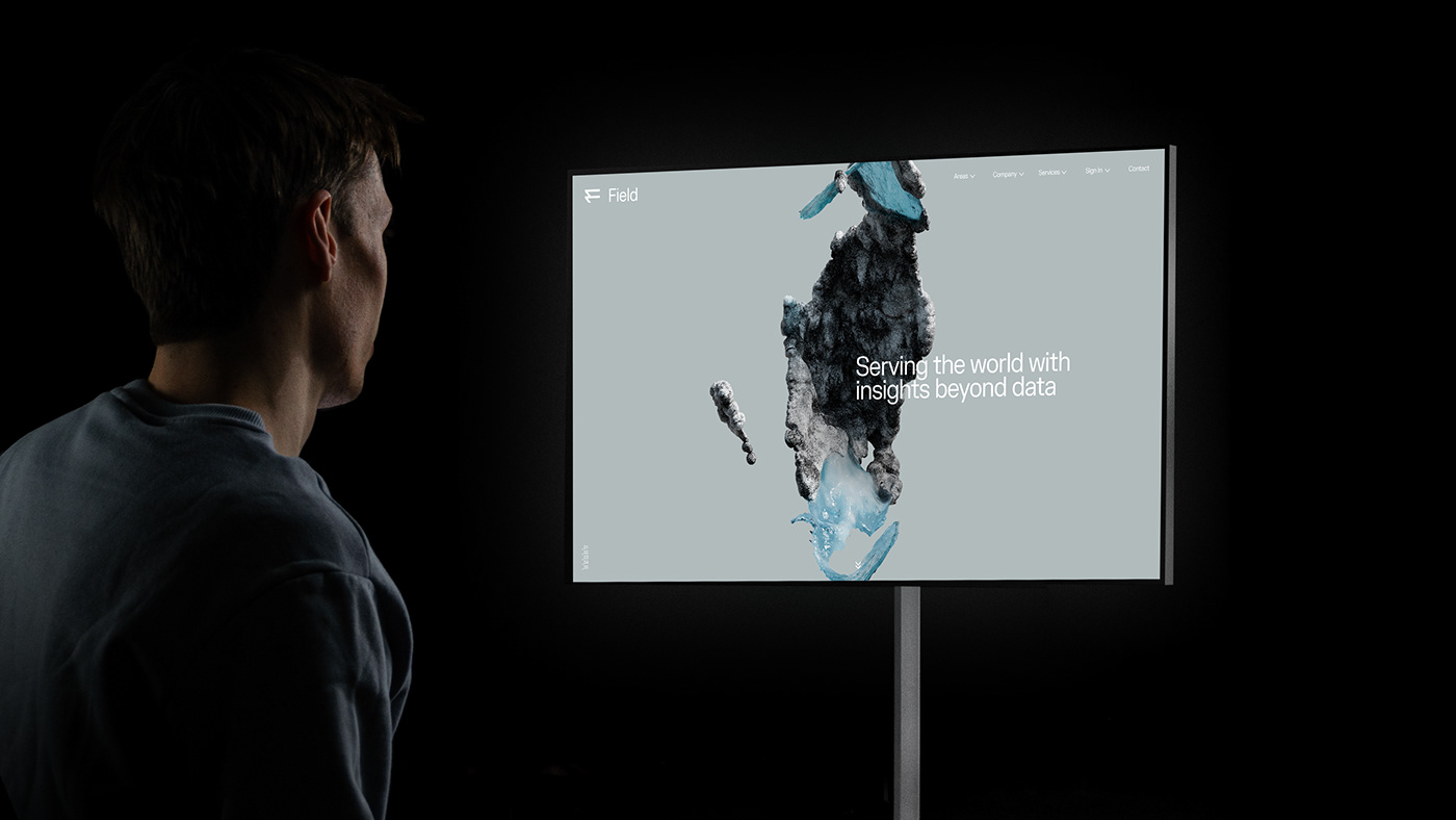
The logo, a stylized representation of a compass rose, evokes a sense of direction and purpose. It symbolizes Field's commitment to guiding clients through the complexities of geospatial data, much like a compass guiding travelers through uncharted territory. The color palette, a harmonious blend of deep blues and vibrant greens, mirrors the earth's natural hues, reaffirming Field's connection to geospatial technologies and environmental sustainability. These colors create a visual landscape that is both calming and inspiring. Typography, often an unsung hero in design, plays a crucial role in Field's visual identity. Studio Oker selected a typeface that exudes modernity and clarity, enhancing the readability of complex data-driven content—a vital consideration in the tech industry. But Studio Oker's contribution goes beyond aesthetics. Their collaboration with Field extends to the development of a comprehensive design system that covers everything from marketing materials to user interfaces. This consistency ensures that Field's message remains cohesive and impactful across all touchpoints.
Visual identity


Studio Oker is a design agency based in Stavanger, Norway. You can check out more of their works via the links below:
All product photos are used only for presentation for non-commercial purposes only. All rights reserved.


 — Visual Identity")


