by AoiroStudio
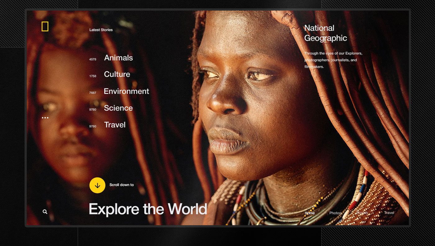
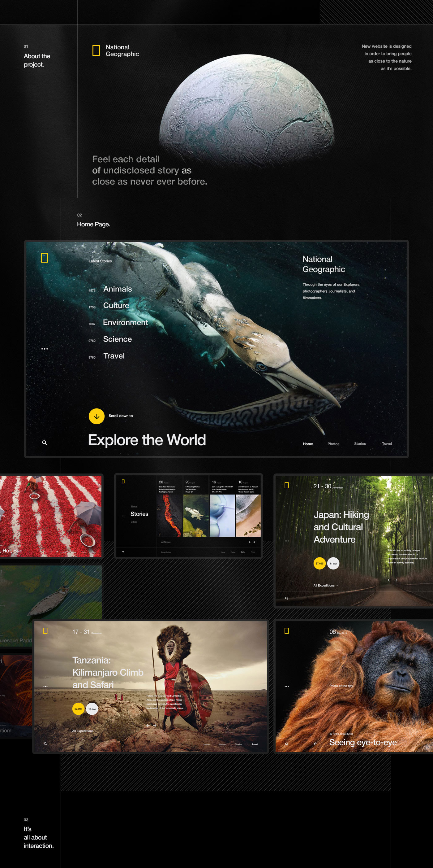
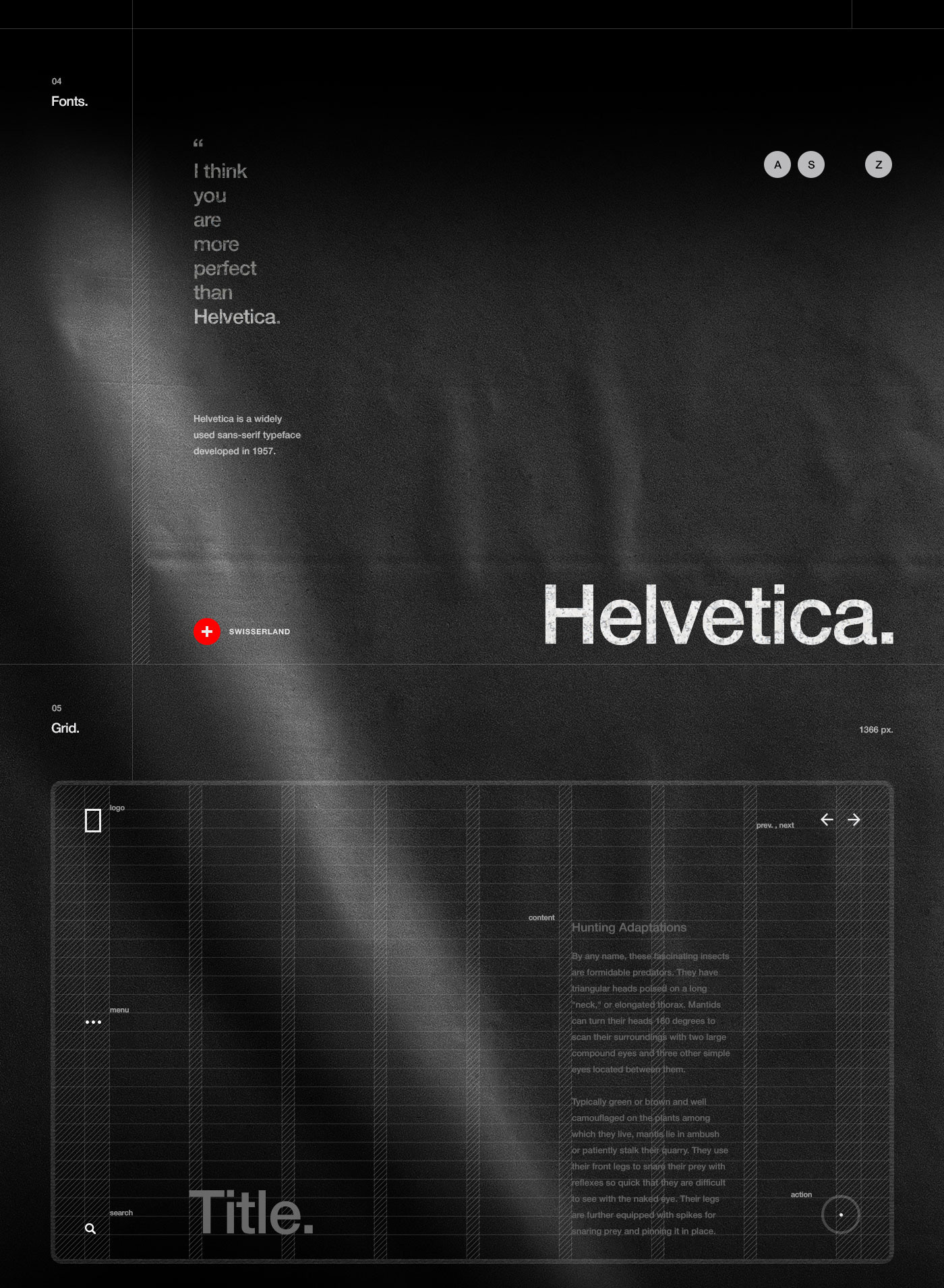
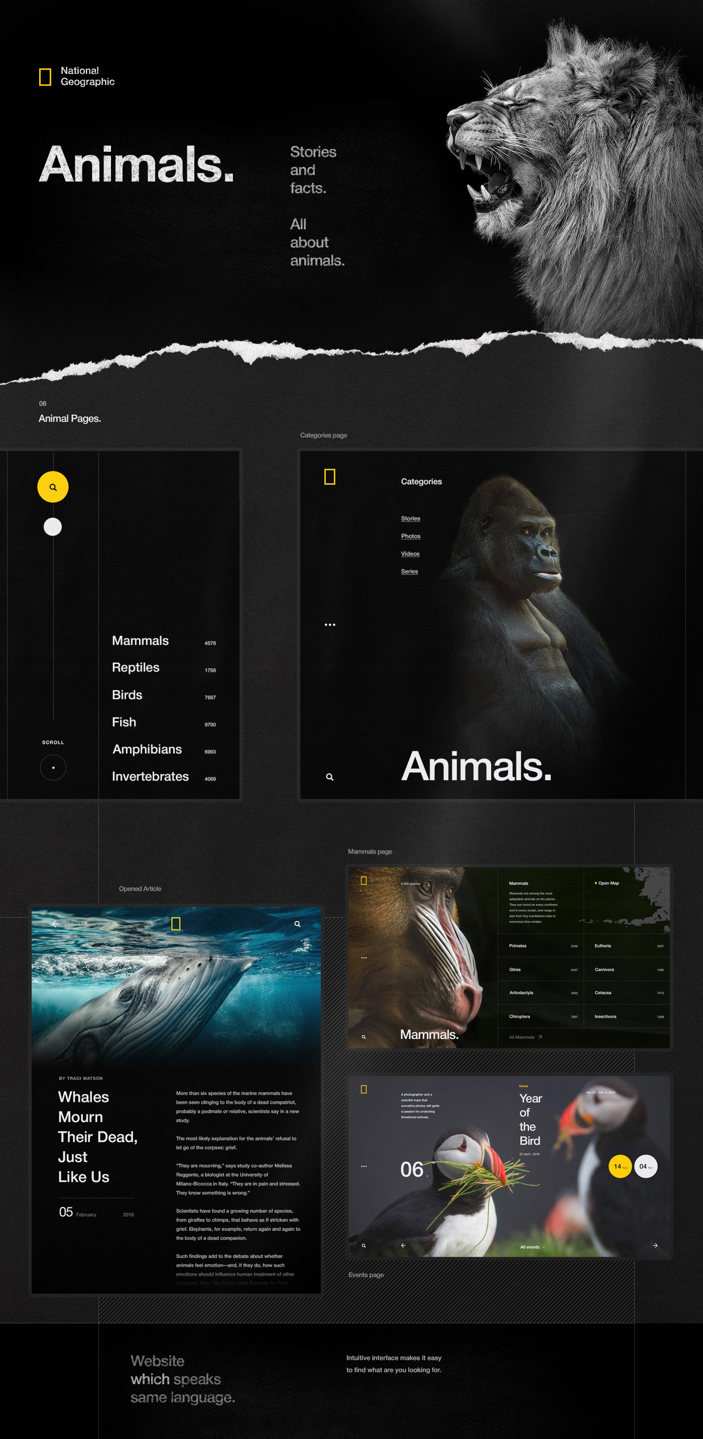
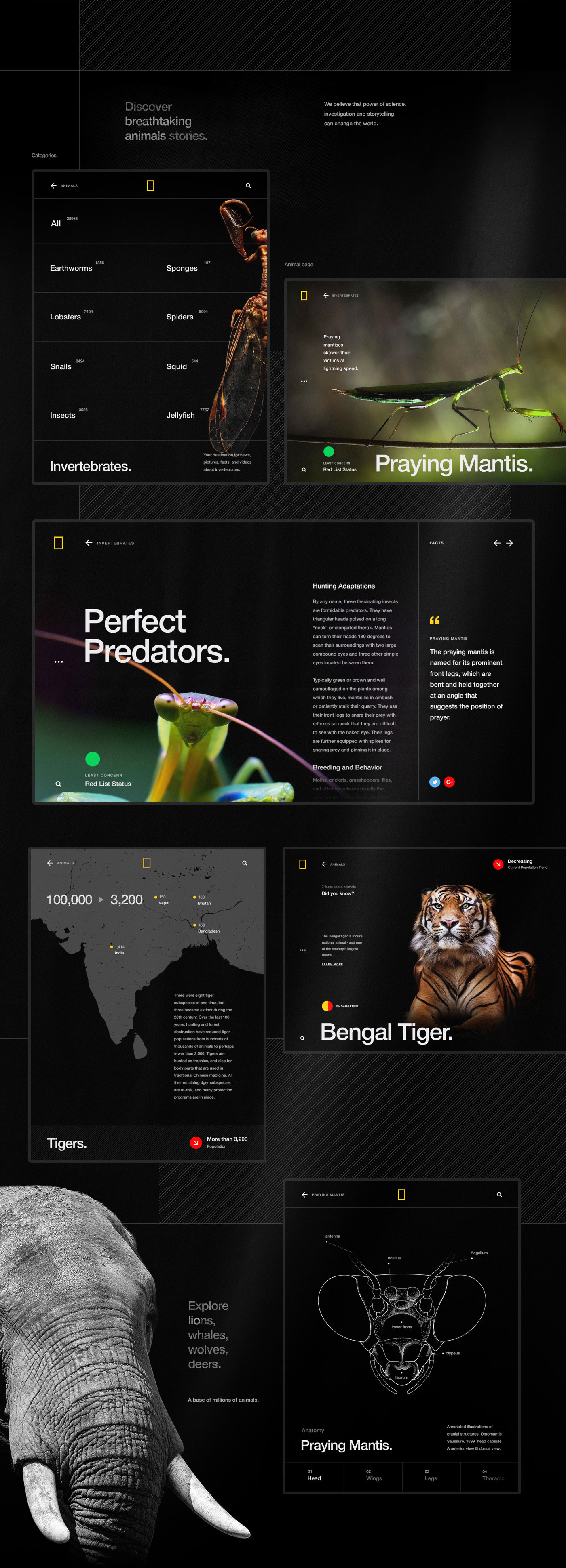
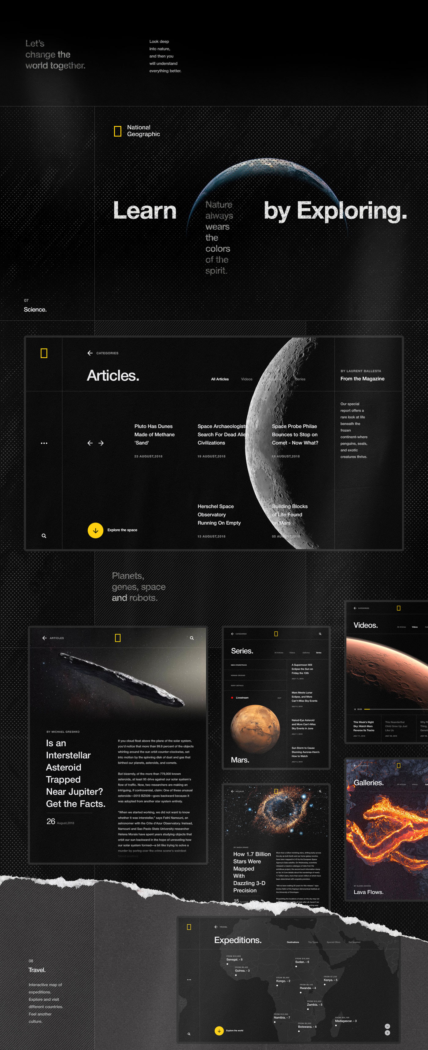
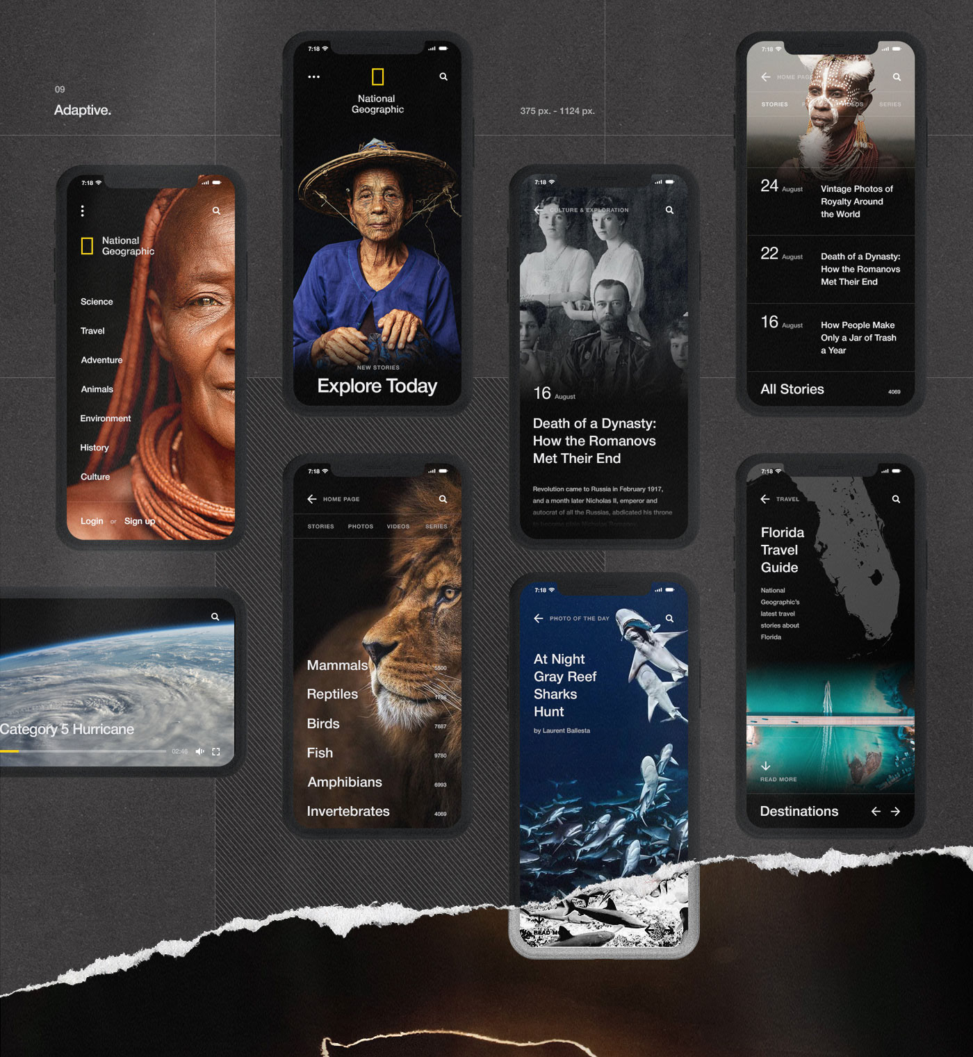
We are taking a look at this web design project by Dops Digital, a studio based in Lviv, Ukraine. This featured project is about either a concept or an upcoming new site for National Geographic. It's an overall lovely design! The idea as and I quote: "...in order to bring people as close to the nature as possible". Built with an 8-Point Grid, the visual approach will be mostly about vertical rhythm to play with the repetitive pattern. It's pretty neat! The team over Dops has done a tremendous job with the interactions, let's a look at the "search" for example. The UX pattern is different from what we are used to. With no input field and a smooth animation to trigger the "search". Along with more features, you should definitely check out the entire project.
