by abduzeedo
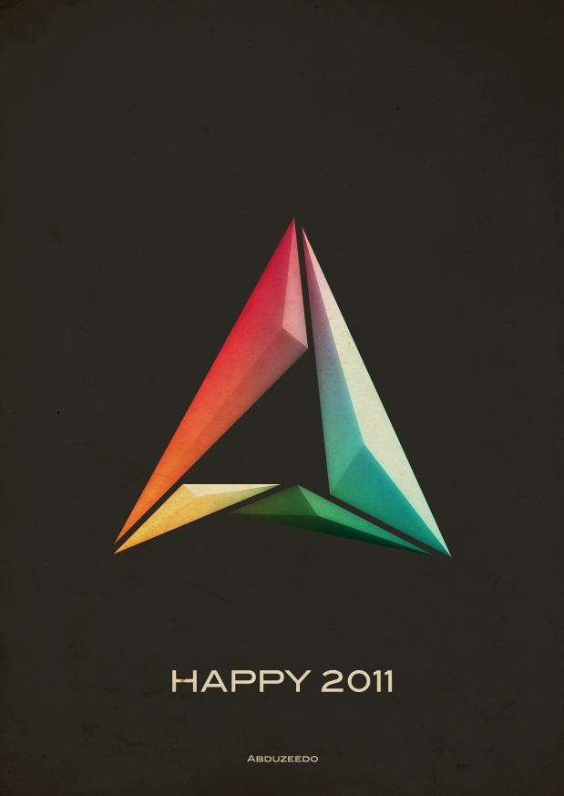
Last week I decided to come up with a new variation of the Abduzeedo symbol, as I have been doing this every year pretty much since the beginning of the blog. So for this year my ideas was to create something more minimalistic with a sort of vintage style. I also wanted to reduce the light effects, make them very subtle.
So in this tutorial/case study I will show you how I created the Abduzeedo 2011 symbol.
Step 1
Using Illustrator I started editing my 2010 black and white symbol. My idea was create a sort of crystal/3D effect for 2011 instead of light effects. I wanted something simple but still with a bit of the colors that we have been using for over 4 years.

Step 2
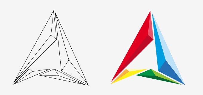
To create the crystal effect was pretty simple, I just created 3 copies of each element, in the image below you can see the red one. So once I had the 3 copies over the original I started editing the shape with the Direct Selection Tool (A). The idea of creating the crystal effect is pretty simple, just moved one vertice of one of the triangles and then another one of the other to align them. (1).
Another important factor is the colors, I used 3 shades of red in order to create the 3D effect. Also once you define the light source direction you will have to apply to all others.

Step 3
Here is the crystal in wireframes.
Step 4
Now it's time to go to Photoshop. I created a A4 document in Photoshop, then for the background color I filled it with #2f2f2f.
Step 5
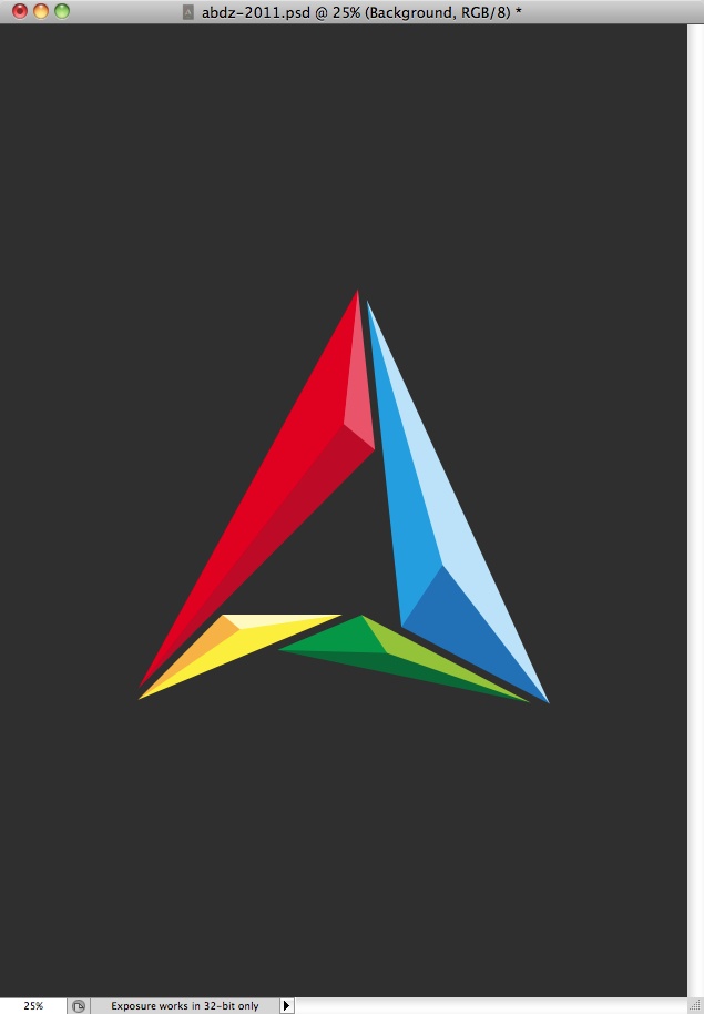
Here I copied the symbol in Illustrator and pasted it Photoshop. As you can see I kept the same colors.
Step 6
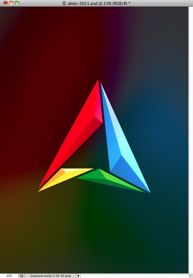
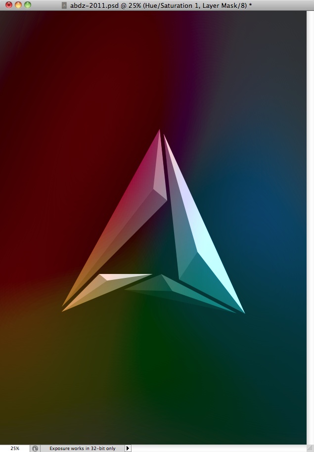
Duplicate the symbol and go to Filter>Blur>Gaussian Blur. Use 250 pixels for the radius, then do it again, the idea is create a gradient background with the symbol colors. I also duplicated this layer once in order to make the colors stronger. After that I grouped into a folder and changed the folder's Blend Mode to Vivid Light.
Step 7
Here I selected the original symbol that was in color and went to Image>Adjustments>Hue and Saturation. Then I reduced the saturation in order to transform it to greyscale.
Step 8
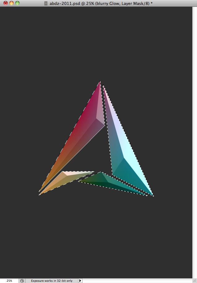
I didn't want to have a colorful gradient, so I created a marquee selection of the symbol. You can do that by clicking with the right button of the mouse over the thumbnail of the layer and select the option "Select Pixels". After that I selected the folder where I'd put the blurry layers of the previous step and applied a layer mask. (Layer>Layer Mask>Reveal Selection).
Step 9
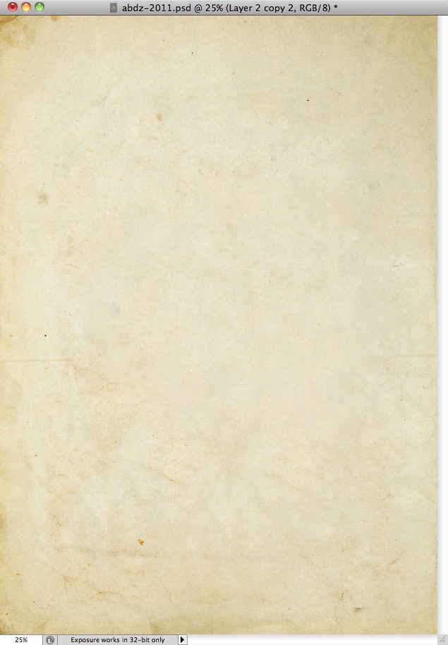
Here I started adding some textures. I used one from Shutterstock, you can find it at http://www.shutterstock.com/pic-26104718/stock-photo-old-paper-isolated…
Step 10
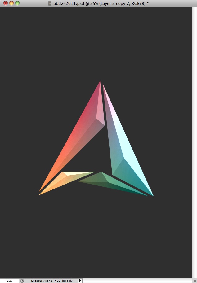
I moved the texture to the folder of the step 8. it was also beneath the other 2 layers inside that folder. As you can see it got an interesting effect already.
Step 11
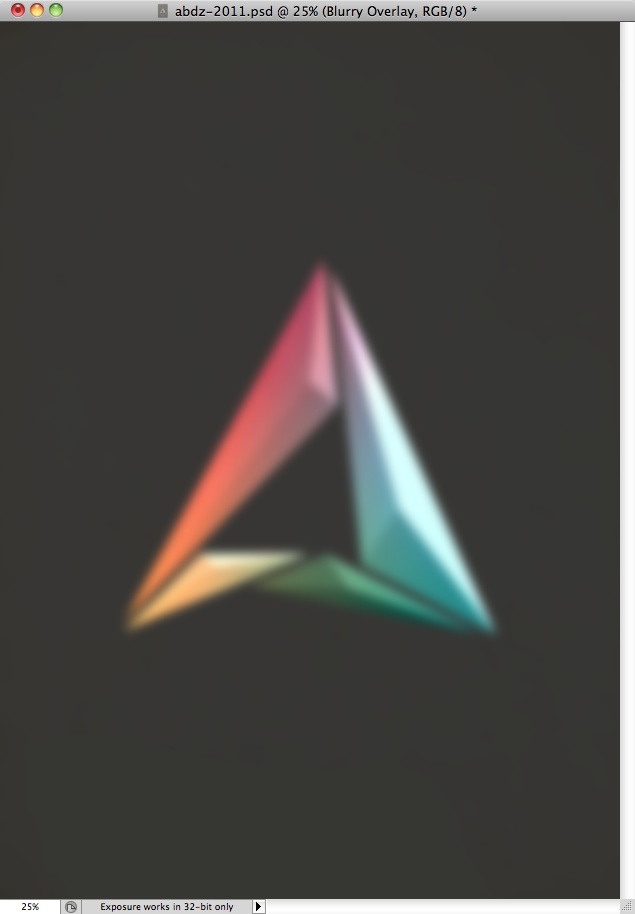
Here I selected all layers and duplicated them, after that I went to Filter>Blur>Guassian Blur. I used 15 pixels for the Radius.
Step 12
I used Overlay for the Blend Mode of the blurry layer, then once again I masked it in order to make the effect visible only over the symbol area.

Step 13
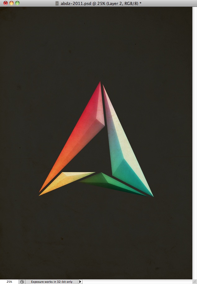
So in order to make the background less plain, I used the same paper texture I used before, this time on top of all the other layers. For the Blend Mode I used Multiply. I also duplicated it once and used 10% for the Opacity with the same Blend Mode.
Conclusion
So to finish the poster I added the words "Happy 2011" using BlairMdITC TT and then Abduzeedo right below with a smaller font size. As you could see the steps to create the effect were quite simple, however it took some time of trying combinations of blend modes and layer orders until I got the result I want. Once again, it's all about practing and learning.
