by abduzeedo
This weekend I started working on an Android mobile version of the site using the Material Design spec. The style-guide is super complete and covers a lot of basic visual design needs like grid system, typography and color palettes. Besides that Google was awesome to provide sticker sheets in Photoshop, Illustrator and Sketch. So for the next couple of weeks I will be exploring some new designs for Abduzeedo and will be sharing with you here.
In this first post I will share my first steps, downloading fonts, files and basic layouts. I would love to hear your feedback and also if you want to join the redesign of Abduzeedo please do share and we can definitely apply your design tips and give all the credits to you.
Getting started
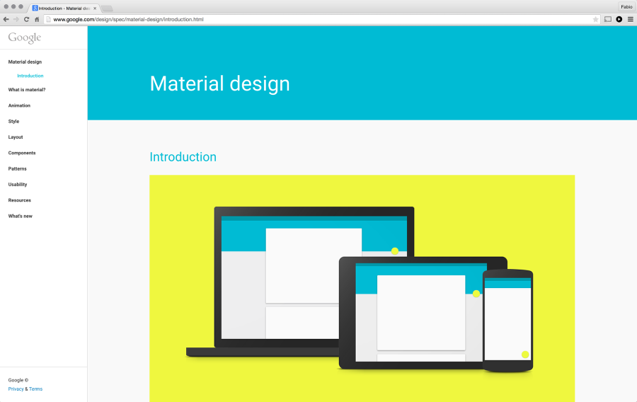
The first thing to do is head over to Google Design (http://google.com/design/) and check out the spec, communities and everything available. After that focus on the spec because there are so many cool things already done for you so you can spend time trying to solve your design problems and improving your product.
Typography
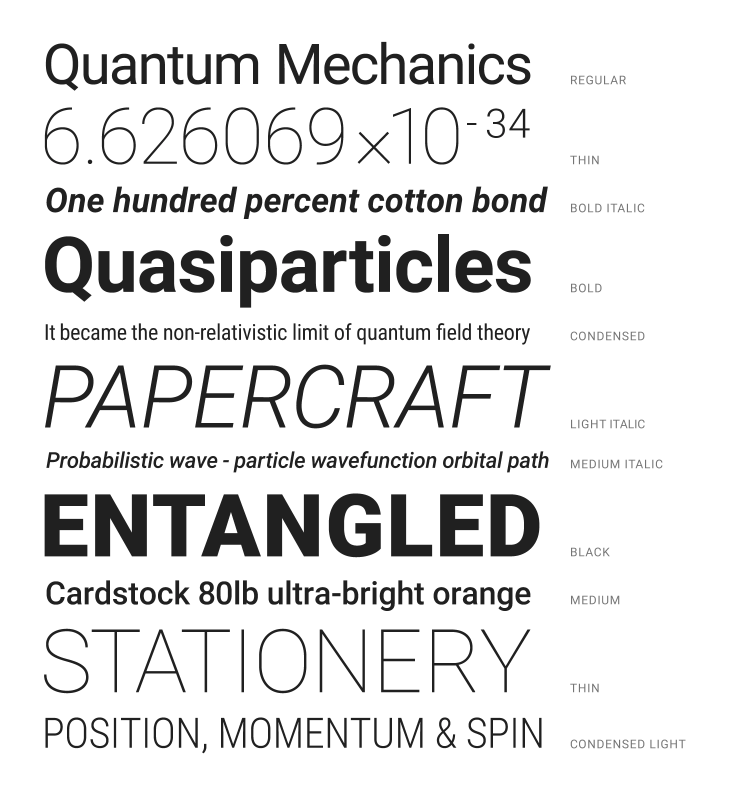
My idea is to design an Android app, so I will first try to stick with Roboto for the font, but later on I might try to bring back some of our current design which used Varela Rounded. So again, download the font and install it so we can get started.
Resources
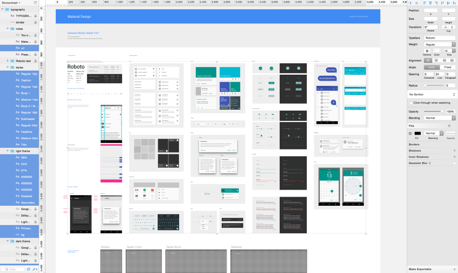
Besides downloading Roboto, make sure you get other resources available on the site as well, including layout templates, sticker sheets and icons. I downloaded the Components sticker sheet for Sketch for my project.

Example of the sticker sheet in Sketch. All components I need to start designing my mobile app.
References
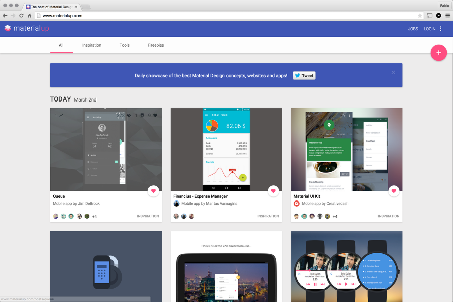
Another important thing is to know where to look for some references. Of course there are much more than just digital references but it's good to see what others have been doing with the Material Design spec. That said, Materialup is a great website with tons of amazing examples from visual to motion design.
Designing the app
Abduzeedo is a website that is all about images, we started it as a way to share images and other things that inspired us and because we decided to write it in english we were always trying to be short because of the limits of our english skills but also because we knew that there was a universal language commonly understood by all and images do an amazing job of speaking to that.
That said for the mobile app, based on stats, we believe there are some things we could explore:
- Horizontal navigation for different categories (tabs)
- Full screen images for the featured content like Flipboard
- Simple yet elegant grid for verticals.
Questions we always ask ourselves:
- Do we need description text besides the title?
- What metadata do we need to display?
- Could we not show title at all, just the image?
- How will we handle ads?
Those questions are extremely important for us to set some constraints. Advertising is always the most complicated, at least on desktop, due to the format sizes that usually are fixed and not responsive. For mobile, at least for the first part, I won't bother with ads. I know it's wrong but I want to focus on creating a super compelling visual experience.
The first thing I did was to get one layout template.
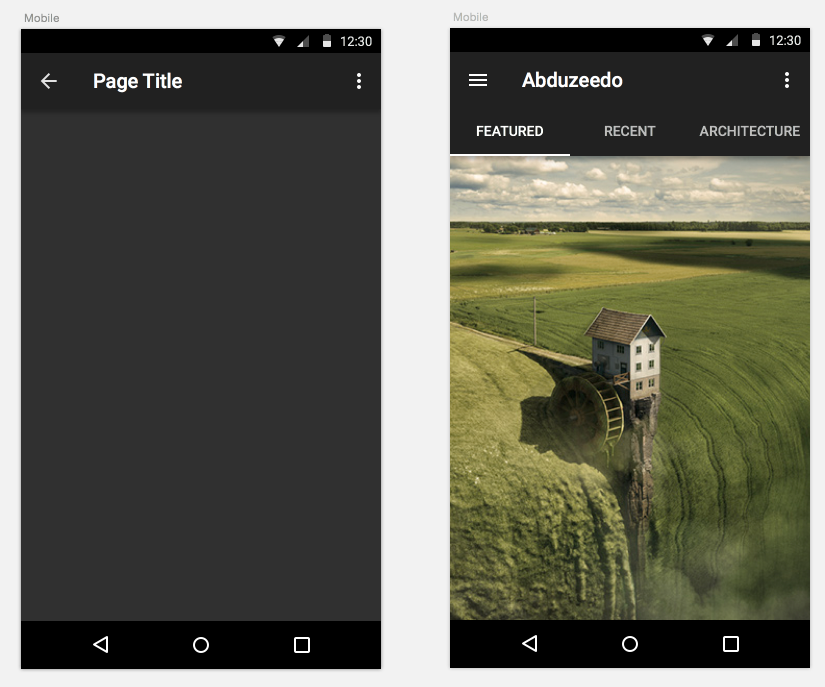
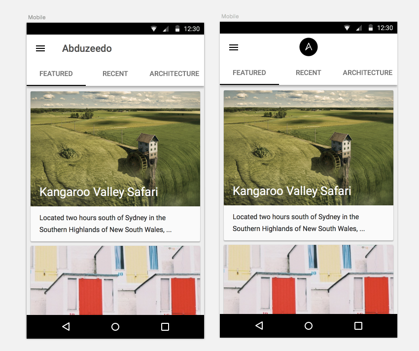
The dark theme looks interesting, but it's quite different from the desktop experience. I won't scratch it off my list but I decided to try a light theme using the tabs navigation. As you can see below, it definitely looks very coherent with our current experience. One version I also explored with the Abduzeedo symbol in the center of the app bar. I know that it's not in the spec, but as I said, I want to explore ways to apply the style but not get limited to it. Another thing that you can see in the mocks, is that I tried to use cards. I am not a fan of cards, but it's important to explore all possibilities.
Explorations
The navigation with tabs feels good to me, especially in apps like Newstand and Flipboard. There are a couple of issues I encountered:
- The navigation tends to take a lot of real state. Is there a smarter way to solve that? Facebook Paper does a great job with gesture navigation and pretty much a transparent UI.
- How discoverable will it be for the users and also how many tabs should the app have?
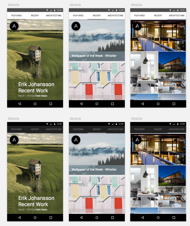
Below you can see some explorations with the Featured screen which would have 1-3 articles using full screen images with big and bold text. Swiping to the left we would have the Recent tabs, which is the current stream of our website. For this session my idea is to have full width content with 8dps space between content inspired by the Inbox.
For the vertical areas I explored a grid with just images. The idea sounded good in my head, but the first exploration looked a bit too overwhelming for the users, especially due to the lack of text. It's hard to understand what's going on.
These explorations gave me some clear understanding of the direction to follow and that I had to simplify the design even more.
Simplifying
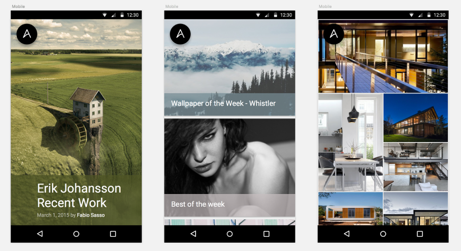
By removing the navigation the design gets to a level of simplicity that really pleases me. The featured screen really makes the image shine. The grid seems a bit weird, I tried to keep the 72dps left alignment for the title, it works for that screen, but for the Recent screen it was a bit to much, so I moved back to 16dps.
To increase contrast, I decided to put the text over the images on a overlay block using a color extracted from the image. The first one you can see has a green color. To make it more subtle I changed the opacity to 70%, that way we can see the photo but still read the text quite well.
The logo on the top right works really well, but I have to think about the navigation, that will be a much longer conversation
To be continued...
This is just the beginning of this process. I will try to keep this going for the next couple of weekends, going through the whole process and ending with dynamic prototypes. As I said, I would love to see you guys trying as well. I am curious to see what you guys would come up with for the Abduzeedo mobile design. So feel free to share with me via comments or via email at abduzeedo@gmail.com.
Thanks so much and till next Sunday.

