Abduzeedo Material Design - App Navigation
Last weekend I started the process to design the Abduzeedo mobile app and web for Android. The goal is to apply Google's Material Design style to the new app, but in order to do that we have to rethink quite a few things. The first thing we did last week was to get used to the spec, get files, assets and resources ready to start exploring. This past weekend, I spent more time thinking about how the navigation would be and then designing the look of the app.
In this post I will walk you through some of the basic concepts I have in my head for the navigation of the app.
Navigation
One of the apps that I think has a great navigation is Newstand and the Play Store. There are a few things that I like about them:
- Gestures for navigation
- Seamless transition for different verticalsl
- The experience feels natural
This model is not new, I remember some of the first iPad apps, was Wired Magazine, if I am not mistaken, used the same style. Actually magazines on tablets still use the same model. Vertical scrolling for the content about that topic and horizontal for different verticals.
Some things bother me a little bit:
- The horizontal navigation limits the interactions for the specific vertical, we wouldn't be able to have another horizontal navigation
- Discoverability: It gets complicated for users to see all categories, either horizontal or vertical.
- If users scroll 3 panels to the right, it would take them another 3 screens to expose the navigation.
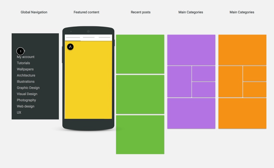
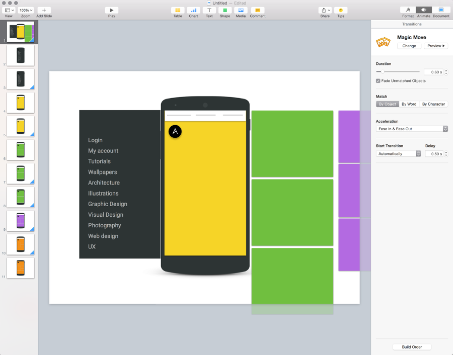
Simple prototype in Keynote
Keynote is a great tool for simple motion studies. You can simply create slides and use Magic Move to animate the objects from one slide to the other. Below you can see the simple prototype I put together to see how this idea would look.
Based on the blog's stats, we know that users pretty much pass the second pagination. We also know that they don't click on the navigation very often either. The site is pretty much what they see.
Because of that I think making the app more browsable will make a big difference. The cost of gesture seems to be much cheaper than the burden on clicks and page requests.
The top navigation still bothers me. I would love to have just the content, and not navigation at all. One of the apps that does that really well is Facebook Paper. I like the way they handle the navigation by using real content.
There are a few ideas to consider:
- Expose the navigation when user scrolls, both vertically or horizontally
- Use the pull to refresh style to expose the navigation
Based on simple keynote animations I think a mix of both cases might do the job.
The simple wireframes gave me an overview of how the navigation might work. In terms of UX/navigation, the app is quite straightforward and it won't have more than 2 levels of hierarchy. Users see an article teaser and then the full view. The full view might have some related articles, but the idea is that every article details would be a modal, by clicking on related articles, users would leave the modal. By clicking on a different article, users would go back to a modal again.
Next week my goal is to prototype this model with HTML and Javascript to test on my phone. Nothing fancy, I just want to see how it feels on hand. After that we can go back to visual and motion design. It's important now to see the big picture, before getting too immersed in the details.
