Discover the innovative branding and packaging design of Cerveja (048) by FatFaceStudio, transforming craft beer aesthetics.
In the evolving landscape of craft beer, one name stands out for its unique approach to branding and visual identity: Cerveja (048). This brand, born in Florianópolis, has embarked on a journey that transcends traditional brewing aesthetics, thanks to the creative prowess of FatFaceStudio.
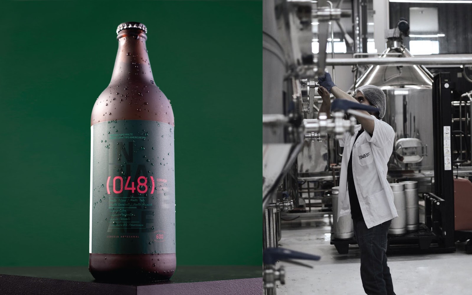
The inception of Cerveja (048) can be traced back to 2016, the brainchild of an engineer with a vision to revolutionize home brewing. Originally intended to simplify beer crafting with a compact, automated machine, this project soon morphed into a craft beer brand. The name '048' is a nod to its birthplace, embodying the spirit of Florianópolis.
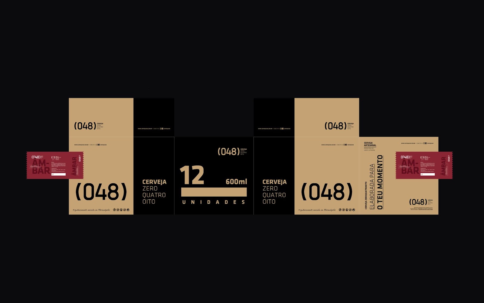
FatFaceStudio faced the task of crafting a visual identity that broke away from the norm. Their objective? To forge an identity that resonated with the sophistication and handcrafted ethos of the brand. This ambition was realized through a combination of illustrative elements and a minimalist design that echoes the precision and excellence of a laboratory.
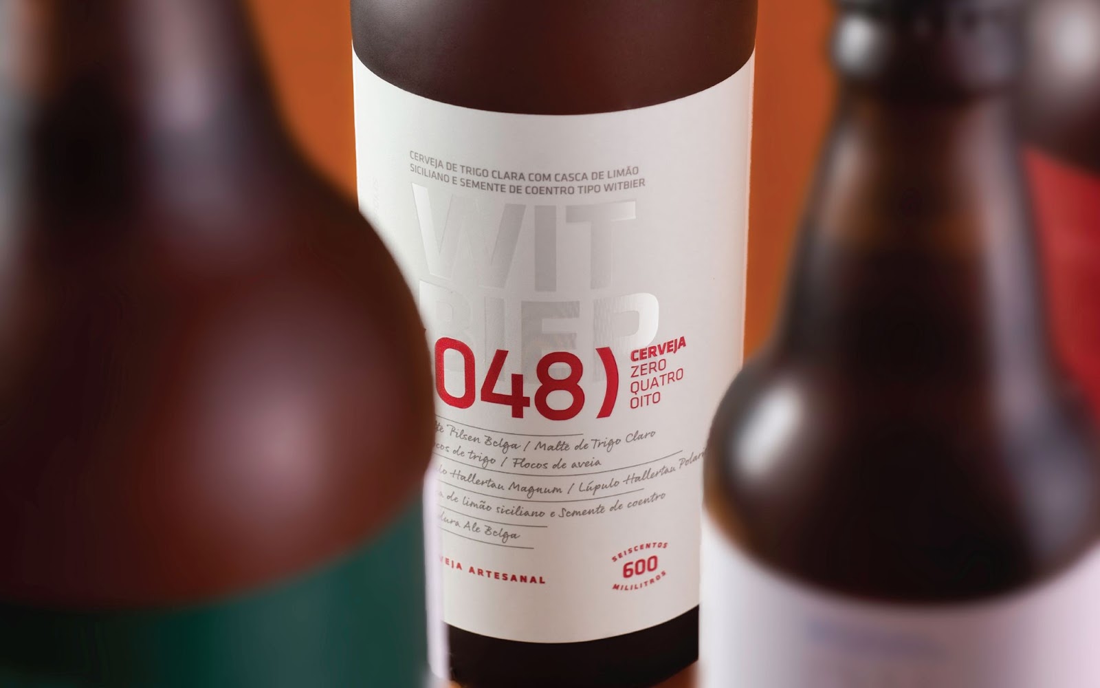
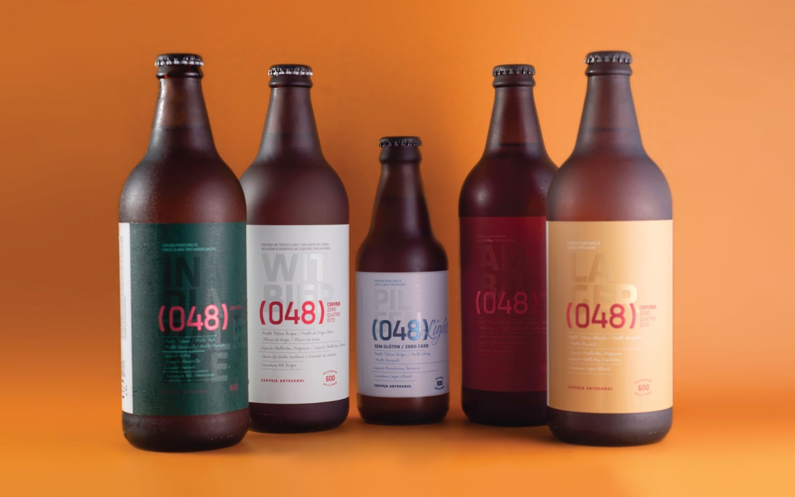
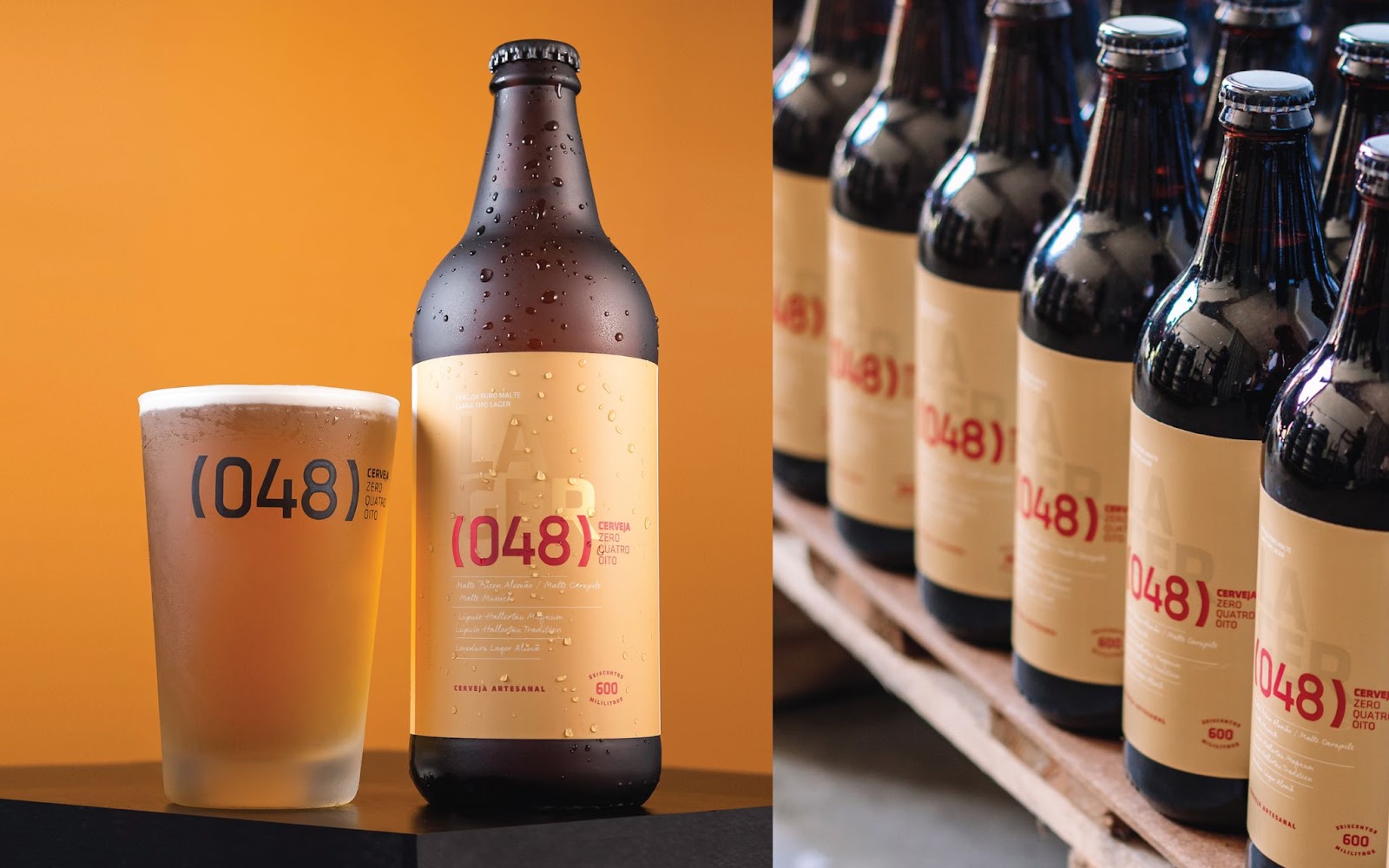
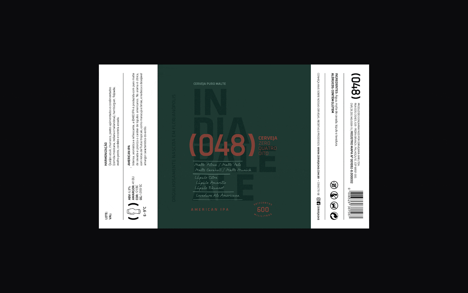
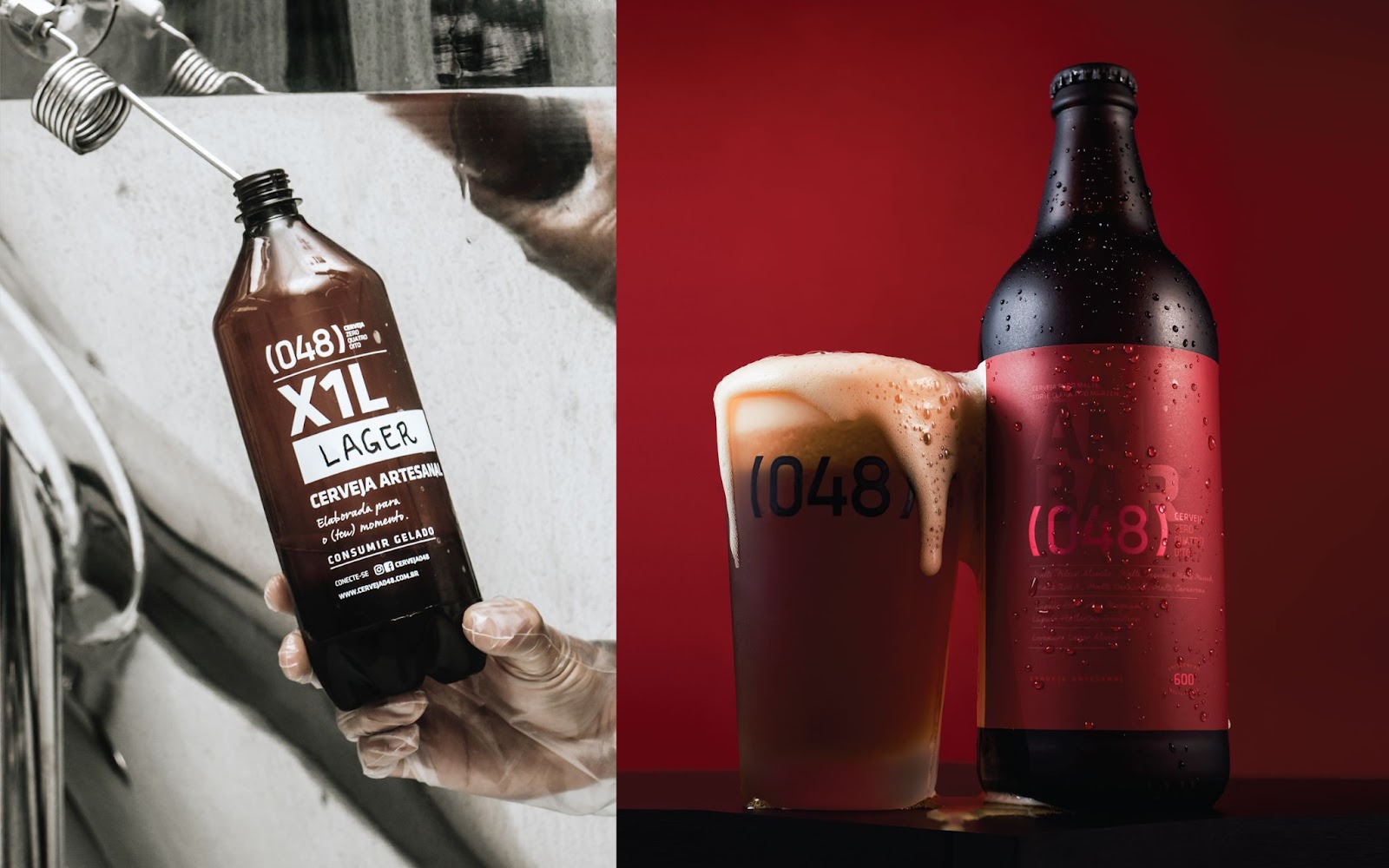
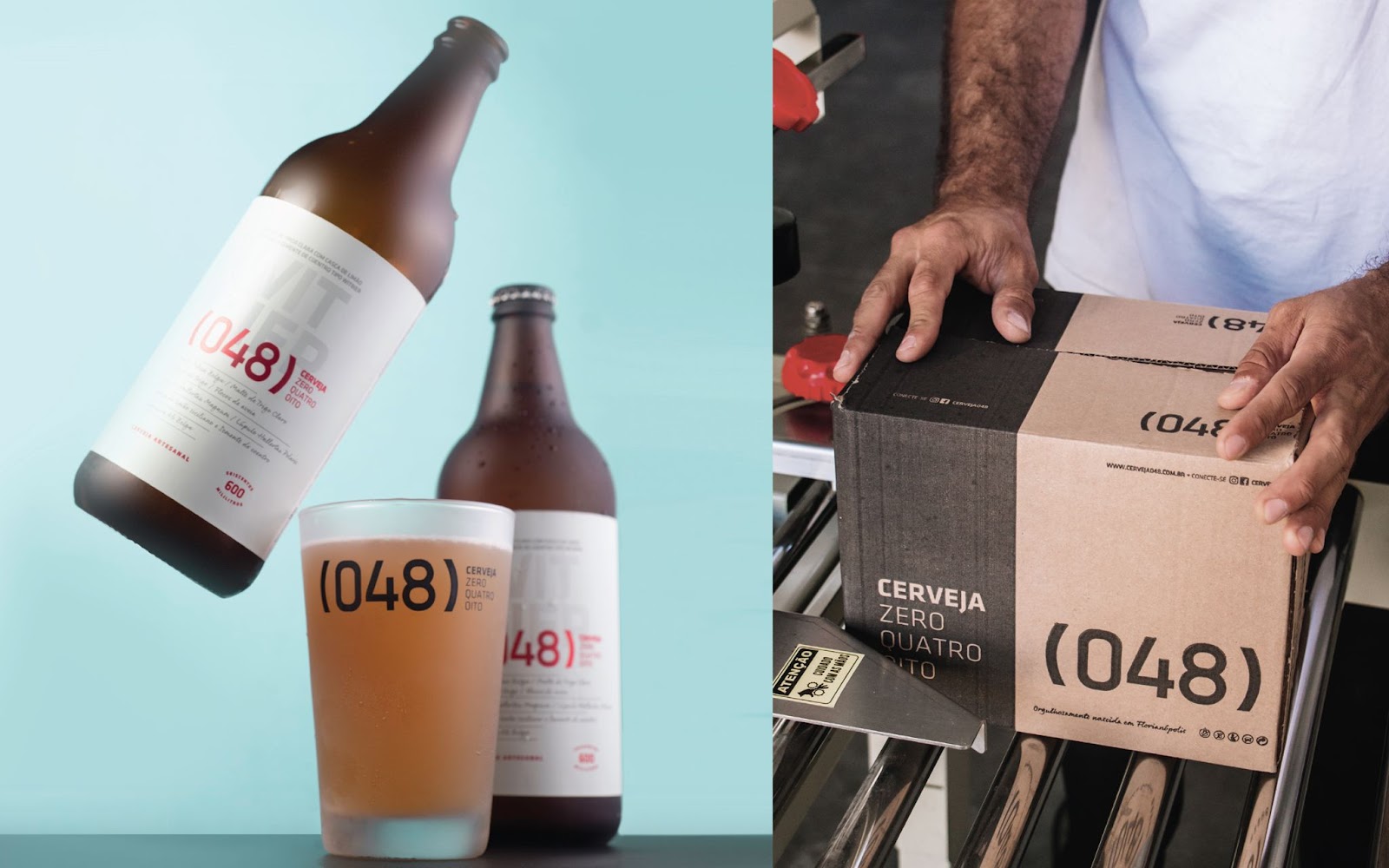
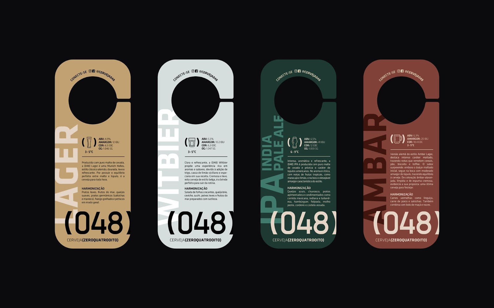
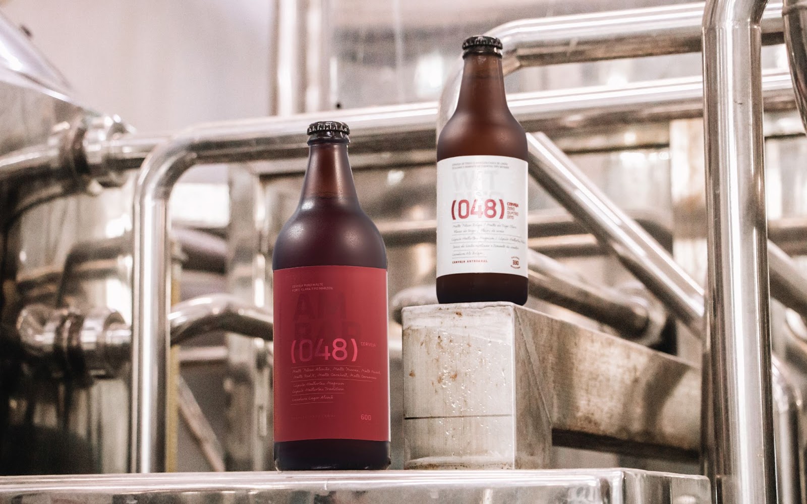
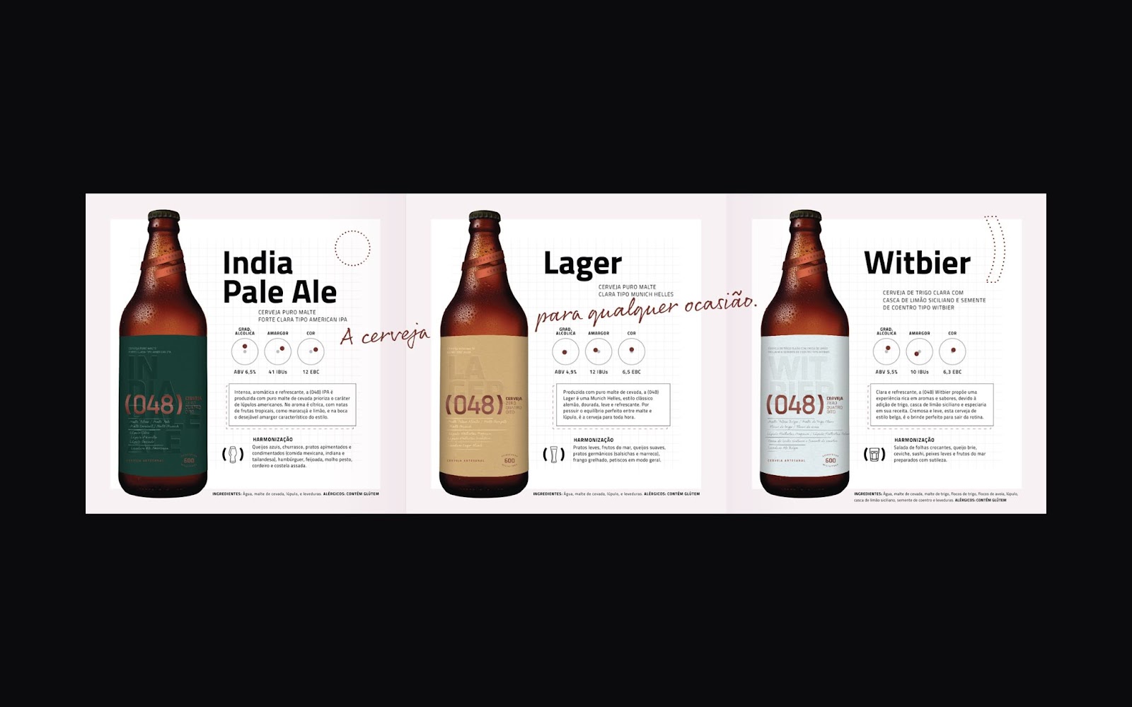
A key aspect of Cerveja (048)'s branding is its focus on affordability without compromising on quality. The flagship 600ml bottles are a testament to this, where attention to the graphic finishes of the labels was critical. The use of color as a distinguishing feature is particularly noteworthy, each palette reflecting the unique attributes of the beer styles.
Typography also played a pivotal role in the branding strategy. The use of a classical, technical font for the brand name and details, juxtaposed with a calligraphic font, exemplifies the blend of technical precision and the artisanal charm of handcrafting. Adding the recipes on the packaging was a strategic move to enhance transparency and connect with the audience.
Upon its launch, Cerveja (048) quickly captivated its target market. The elegant and approachable packaging design distinguished it from the more rustic or vibrantly designed craft beers. Its success was not just in sales but in setting a new standard in craft beer branding. The packaging of Cerveja (048) didn't just hold a beverage; it told a story of innovation, quality, and a deep respect for the brewing craft. This approach has become a cornerstone in the company's branding and communication strategy, making Cerveja (048) a notable case study in the design world.
Branding and packaging design artifacts
For more information make sure to check out FatFaceStudio website and instagram.


