by abduzeedo
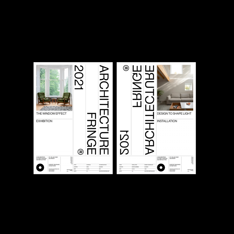
Maat Studio shared an art direction and branding project titled Eating Patterns. Featuring a colorful palette and simple, yet beautiful typography this project is an example of less is more and definitely deserves the feature here.
For more information make sure to check out Maat Studio on:
