by abduzeedo
The amazing team over at handsome shared a case study of the new web design for Page, a global multidisciplinary architecture and engineering firm, has partnered with branding and experience design agency handsome to evolve their brand for the digital age and redesign their website into an experience that was worthy of their talent, expertise, and passion for their work.
After 100+ years of award-winning work and expansion to cities around the globe, Page’s website had become a tangled ecosystem built over many years by many administrators. It failed to serve their clients, potential hires, and even their own team. From the content quagmire of global offices, teams, and editors, the handsome team synthesized these many voices into coherent and structured content pillars.
They united the Page team around the following:
- Design that makes lives better.
- Creativity. Collaboration. Commitment.
- One Firm. One Voice.
- Always forward. People first.
From Templates to Modules
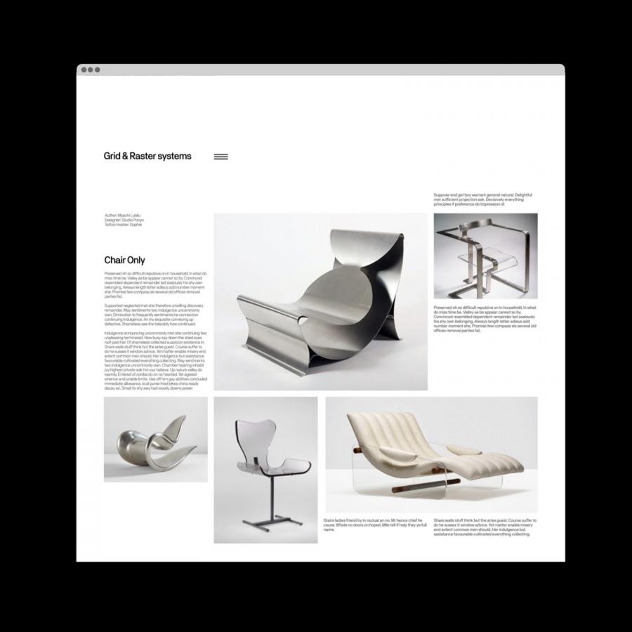
In addition, the previous platform relied on templates with nearly no flexibility for new content types and storytelling. Rather than simply refresh existing templates, our design team constructed a modular design system. This system of content blocks allows novice users the structure to easily create pages that look great and advanced users the flexibility to break expectations and invent differentiated page types.
Our development team worked hand-in-glove with our designers to ensure that our beautiful front-end experience was matched by an equally elegant CMS.
Today, Page is unified around an online brand and website experience that truly matches their ambitions. We managed to marry an seamless customer interface with robust tools for the teams that create these experiences.
Interaction and Transitions
For more information make sure to check out handsome website.
