Illustrator Quick Tips #1 - Complex Symbols with Pathfinder
Last week I posted an article showing some great logos using 3D effects and colorful gradients. There are quite a few ways to do create those effects in Illustrator, however for most of them you will have to use the Pathfinder tools. Because of that I will show you an example based on a few logos from that list.
References
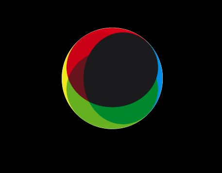
When I was looking for references for a logo design project that I'm still working on, I selected some awesome logos. Below you can see some of them. You can visit the sites of these logos at:
- Qwell - http://logopond.com/gallery/detail/14996
- Terra - http://www.terra.com.br
- South Creative - http://southcreative.com.au/
- Aramova - http://aramova.com/

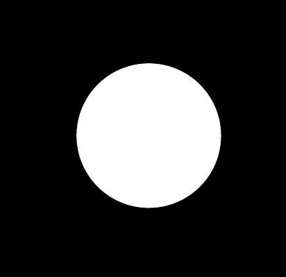
Step 1
Open Adobe Illustrator and create a new document. With the Ellipse Tool (L), create a circle.
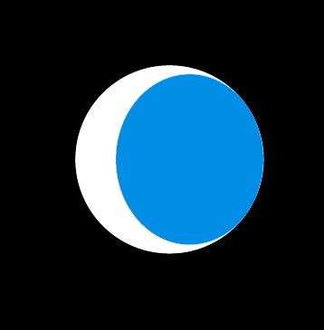
Step 2
Duplicate the Circle and resize it, but just the width. Align it to the Left. Also change the Blending to Multiply and use cyan for the color.
Step 3
Repeate the same process of the previous step, this time however reduce the height of the new circle. Also use green for the color. Use the image below for reference.
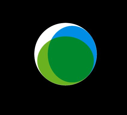
Step 4
Repeat the Step 2 again, this time align to the right and use yellow for the color.
Step 5
Repeat the Step 3 just aligning the new ellipse from the top. Use red for the color.
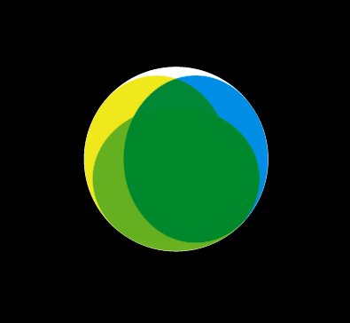
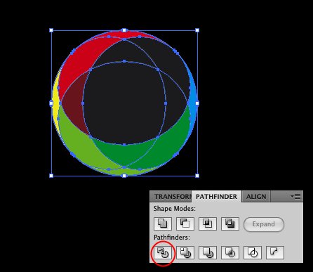
Step 6
Select all ellipses and go to the Pathfinder panel (Window>Pathfinder). Click on Divide, it's the first option in the Pathfinders. This command will divide all the elements allowing us to use different colors for each one.
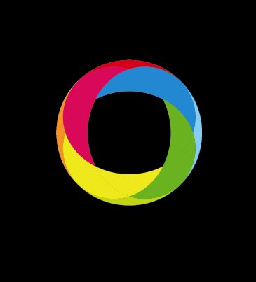
Step 7
Playing with the Abduzeedo colors.
Step 8
You can try gradients with the Gradient Tool (G) to create a nice 3D Effect.

Step 9
If you need the logo in one color over light or dark backgrounds, the best thing to do is add a stroke to the elements.

Conclusion
Even though it looks complex, this technique is quite simple and it results in a very nice effect. That's why we've seen more logos using it. Also one of the coolest things is that you can try different shapes and colors that will result in another type of effect. If you seen thee logos I used for reference, Terra, Qwell and South Creative, they use this effect just changing shape sizes and colors, while the Aramova, uses the same technique but forming a triangle instead of a circle.

