by abduzeedo
Discover how Orchidea Agency's redesign for Microkhim elevates pharma branding and packaging design, setting a new standard for clarity and aesthetics in the industry.
In the competitive pharmaceutical landscape, standing out requires more than just innovative products; it demands a visual identity that communicates trust, clarity, and sophistication. This is precisely what Orchidea Agency achieved with their latest project for Microkhim, a forward-thinking pharmaceutical company. The agency's strategic overhaul of Microkhim's branding and packaging design has not only revitalized the brand but also set a new benchmark for design excellence in the pharmaceutical sector.
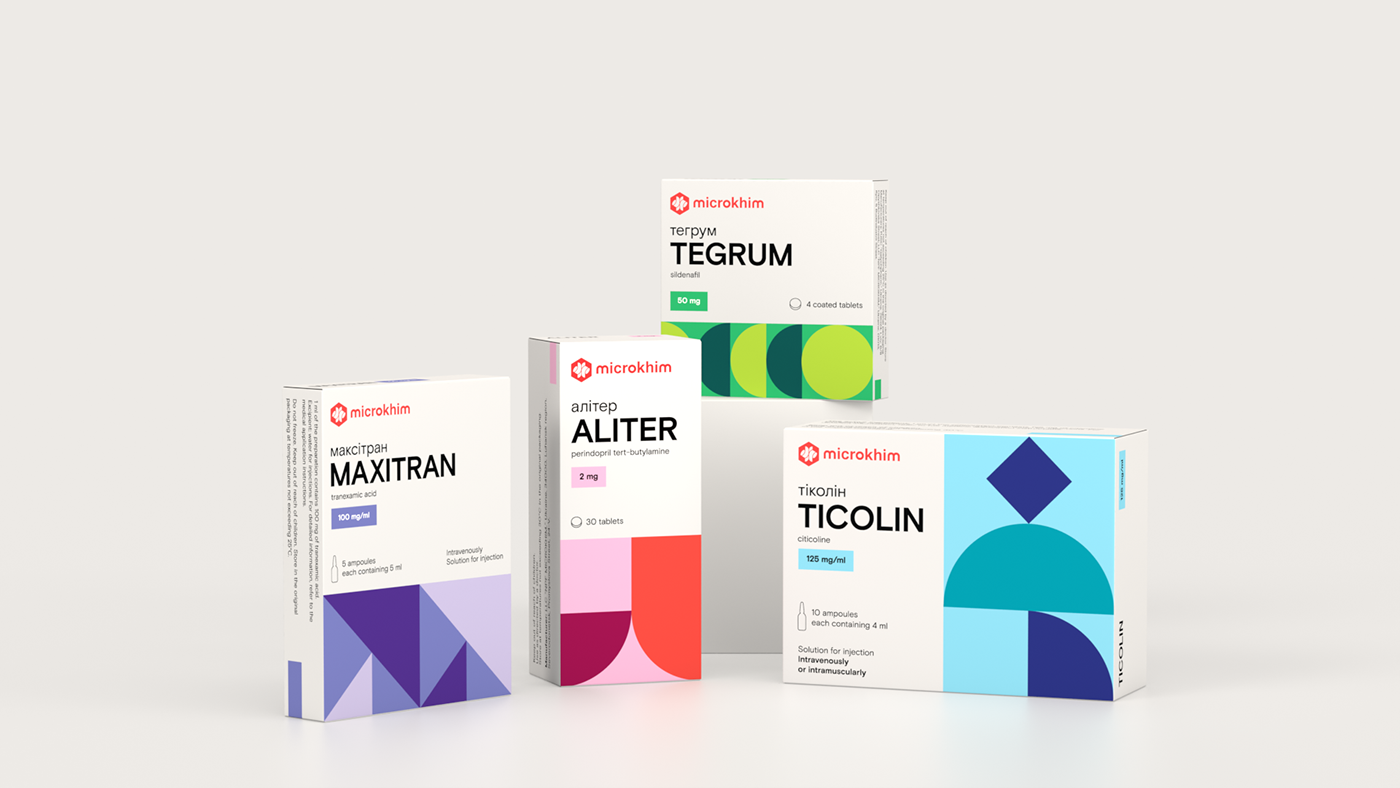
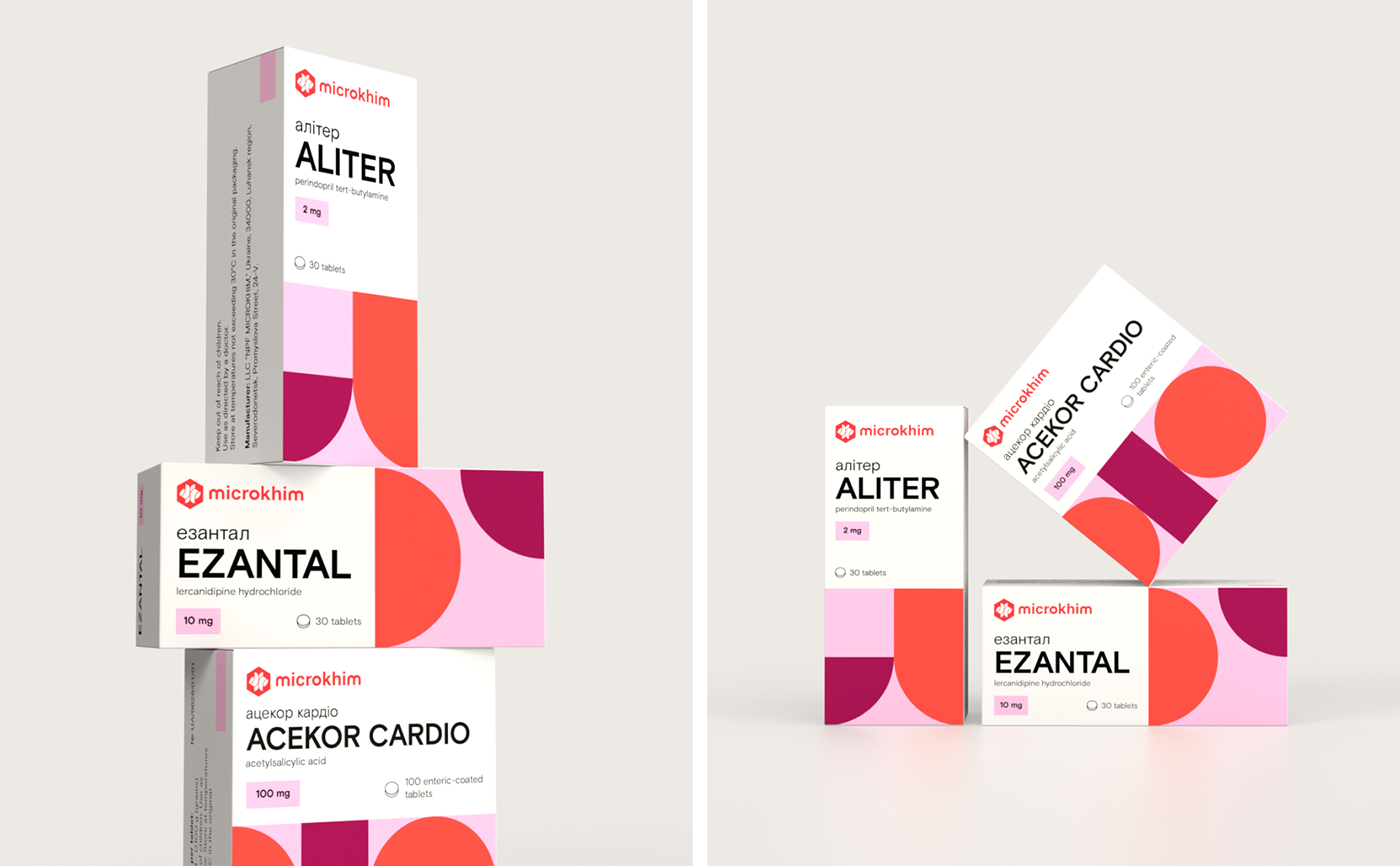
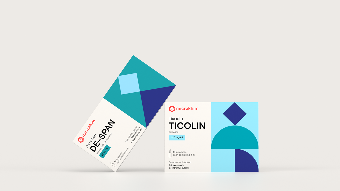
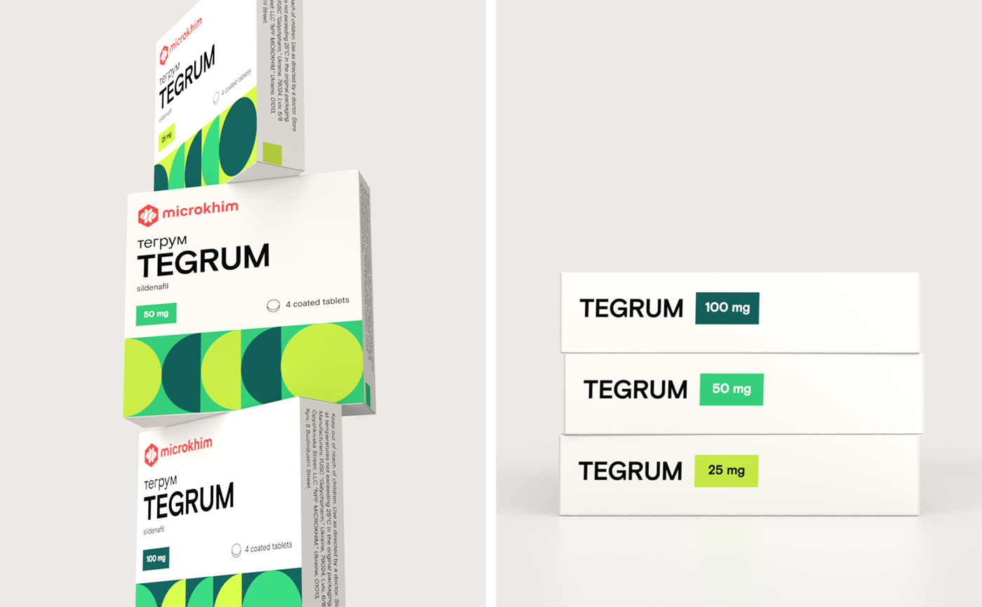
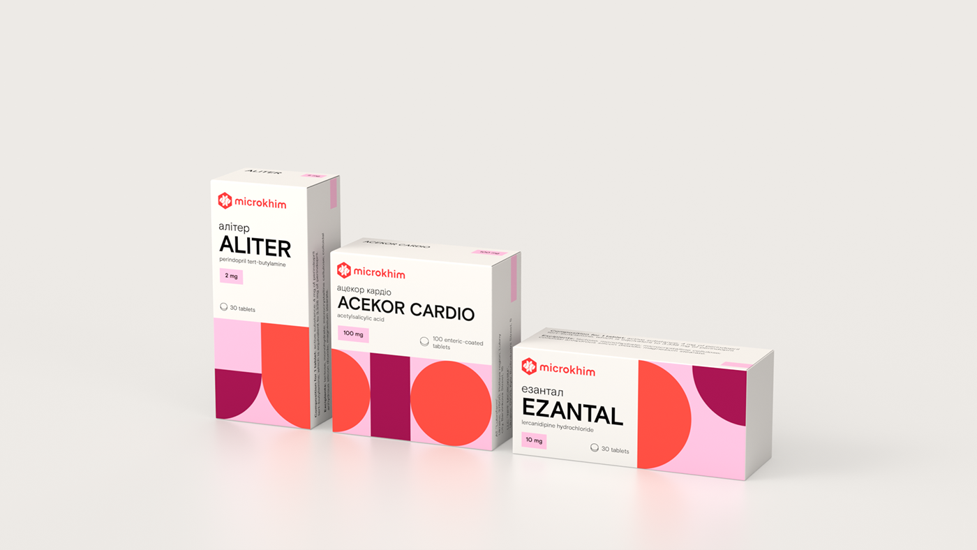
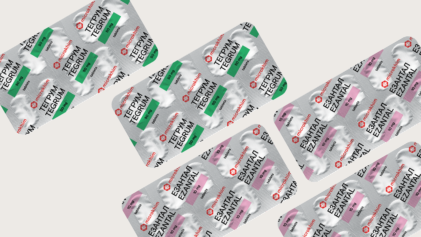
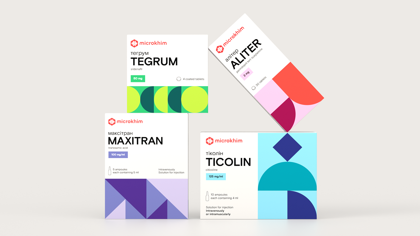
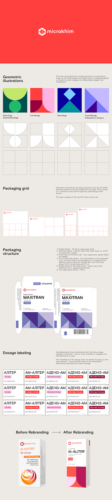
At the heart of this transformation is a commitment to simplicity and functionality. Orchidea Agency introduced a design system characterized by geometric compositions that utilize a minimalist palette of three colors. This approach not only enhances the visual appeal of Microkhim's products but also facilitates easier navigation for consumers. By assigning a unique color scheme to each pharmaceutical category, the design ensures that pharmacists and customers alike can quickly identify the type and dosage of medicine, thereby improving the user experience significantly.
The redesign also includes a comprehensive typographic system tailored to meet the practical needs of the pharmaceutical industry. This system prioritizes legibility and ease of comprehension, ensuring that vital information is accessible at a glance. Such meticulous attention to detail reflects Orchidea Agency's deep understanding of the challenges and requirements of branding and packaging design in the pharmaceutical context.
Orchidea's work for Microkhim exemplifies how thoughtful design can elevate a brand's market presence and consumer perception. By marrying aesthetic elegance with functional clarity, the agency has not only helped Microkhim stand out in a crowded market but has also demonstrated the power of design to transform the way pharmaceutical products are presented and perceived. This project serves as a beacon for brands looking to navigate the complexities of the pharmaceutical industry through strategic design, marking a significant milestone in the evolution of branding and packaging design within this niche sector.
Branding and packaging design examples
For more information make sure to check out Orchidea Agency website and Behance profile.


