by abduzeedo
When I was working on the new version of Abduzeedo, the current one, I decided to learn and use CSS 3 to enhance the visual of some elements. Instad of using images to create shadows and round corners I used CSS 3. Of course I knew that it would not be compatible to all browsers, more precisely, the Internet Explorer.
From the statistics of the site, the majority uses Firefox (51.05%), followed by Safari (25.38) and then Internet Explorer with only 11.73, I thought it would work alright, and for those readers that use other browsers they would be able to access the site but would not be able to see these little details.
So for this tutorial I will show you how I created some of the effects you see on the Abduzeedo UI. We will play with Box-Shadow, Round-Corners, Tex-Shadow and CSS gradients. The idea is to practice, in my opinion the best way to learn.
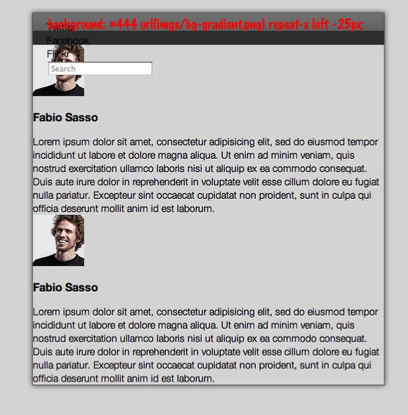
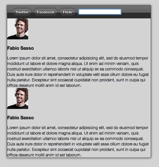
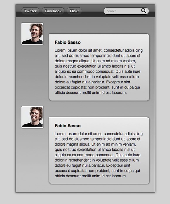
Final Result
This is the final result we will have by the end of this quick tutorial. The idea is to play a little bit with CSS3 even though this might not work perfectly on IE an Opera.
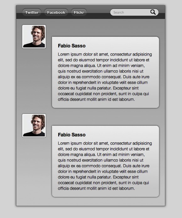
Click on the Image to see the DEMO - It works only in Safari, Firefox and Chrome
Step 1
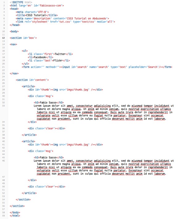
The first thing to do is to create the HTML file with our data. Also let's create the link to our CSS file (<link rel="stylesheet" href="tut.css" type="text/css" media="all">). There's great places to learn more about HTML and CSS, I recommend CSS Tricks, Nettuts, Smashingmagazine, W3C, 24ways, Woork and others.
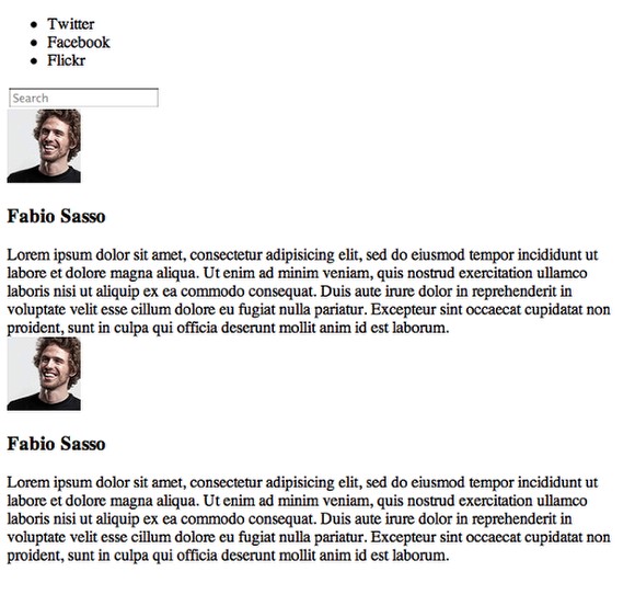
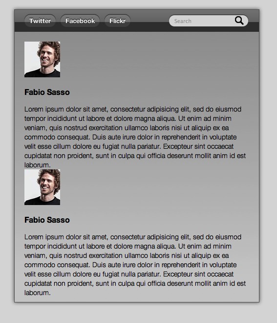
Below you can se the page without any style.
Step 2
Here's the HTML file, as you can see we're using HTML 5, once again to practice. That's the best thing of personal projects, we can practice and learn.
Basically we have a Section called "Box" where the content will be inside. Then we have the navigation (Nav), another section with the content (content) and then inside the content section we have the messages. We use the tag article to them.
Step 4
Let's start it by changing the "body" style. So let's define the font, the font weight, margins, paddings and the background color. It's really important that you have some CSS knowledge already, especially about the CSS Box Model to understand how Padding, Margins, Border, and sizes work. I highly recommend that you read this great article by Chris Coyer: The CSS Box Model
body{
	font: 14px/140% "Helvetica Neue", Arial, Helvetica, Geneva, sans-serif;
	font-weight: lighter;
	margin: 0;
	padding: 0;
	background: #ddd;
}
Now for the box we will play with a new CSS 3 property, Box Shadow. Basically we can add shadows to elements without using any image. It's pretty simple to use, you set the Horizonal Lenght, Vertical Lenght, Blur and Color.
Example: box-shadow: horizontal lenght vertical legnth blur color = box-shadow: 0px 0px 10px #666.
For more information about Box-Shadow check out this article: Box-shadow: shadow effect on elements in css3.
#box{
    display: block;
    position: relative;
    width: 500px;
    margin: 20px auto;
    border: 1px solid #666;
    -webkit-box-shadow: 0 0px 10px #666;
    -moz-box-shadow:0 0px 10px #666;
    box-shadow: 0 0px 10px #666;
}
Step 5
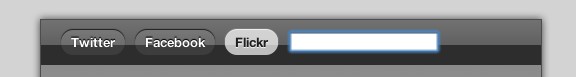
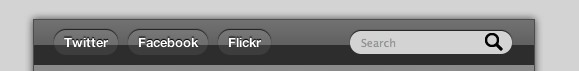
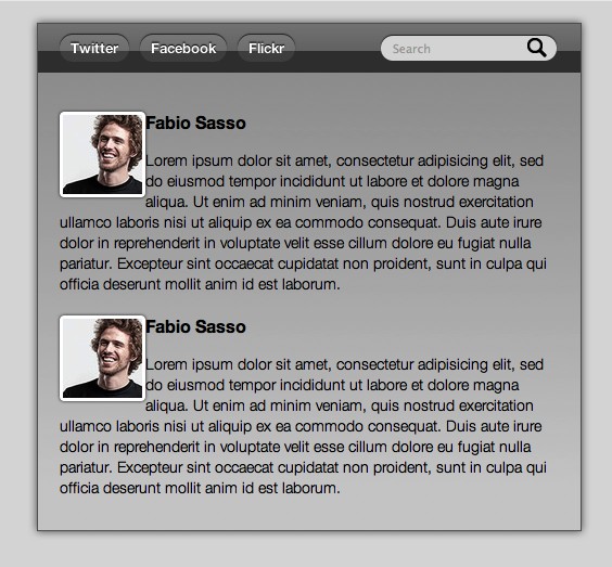
For the navigation I created a PNG image with alpha transparency to use to create bevel effect to the navigation bar.
nav{
    position: relative;
    display: block;
    clear: both;
    background: #444 url(imgs/bg-gradient.png) repeat-x left -25px;
    height: 25px;
    padding: 10px 20px 10px 20px;
}
I highly recommend that you use a RESET.CSS for your projects, but here I'm not using, so I will just reset the UL and LI behaviors in order to create my navigation buttons. To understand why we reset our CSS, read this article by Eric Meyer: CSS Tools: Reset CSS.
nav ul, nav ul li{
    list-style-type: none;
    padding: 0;
    margin: 0;
}
The goal of a reset stylesheet is to reduce browser inconsistencies in things like default line heights, margins and font sizes of headings, and so on.
Step 6
For the buttons we will use round corners, box-shadow and text shadow to create a very nice effect. Take a look at the code below. Text-shadow is pretty much the same as box-shadow but for text, it's the same syntax. Now the round corners is different and it's one of the most wanted effects, we won't need to add a lot of markup and images to create this effect anymore.
I recommend 2 articles about Round Corners: Border-radius: create rounded corners with CSS! and Have a Field Day with HTML5 Forms. The last one will cover another HTML 5 and CSS 3 new features.
nav ul li{
    float: left;
    background: #555 url(imgs/bg-gradient.png) repeat-x left -35px;
    padding: 0 10px;
    margin: 0 10px 0 0 ;
    color: #fff;
    font-weight: bold;
    height: 25px;
    line-height: 25px;
    font-size: 13px;
    cursor: pointer;
    -moz-border-radius: 20px;
    -webkit-border-radius: 20px;
    border-radius: 20px;
    -webkit-box-shadow: 0 -1px 1px #333;
    -moz-box-shadow:0 -1px 1px #333;
    box-shadow:0 1px -1px #333;
    text-shadow: #000000 0 -1px 1px;
}
Step 7
When the user hovers the button we will change the color of the background, font and effects.
nav ul li:hover{
    background-color: #ccc;
    box-shadow: 0 -1px 1px #fff;
    -webkit-box-shadow: 0 -1px 1px #fff;
    -moz-box-shadow: 0 -1px 1px #fff;
    color: #333;
    text-shadow: #fff 0 1px 1px;
}
Step 8
For the search field it's going to be pretty much the same, however we will use another image for the background, the magnifying glass icon, and position it on the right .
input{
    background: #ddd url(imgs/mglass.png) no-repeat 135px 2px ;
    outline: none !important;
    position: absolute;
    right: 20px;
    display: block;
    padding: 5px 10px;
    top: 9px;
    border: none;
    -moz-border-radius: 20px;
    -webkit-border-radius: 20px;
    border-radius: 20px;
    box-shadow: 0 -1px 1px #333;
    -moz-box-shadow: 0 -1px 1px #333;
    -webkit-box-shadow: 0 -1px 1px #333;
}
For the focus state let's just change the color of the backgroun.
input:focus{
    background: #fff;
}
Step 9
For the content let's play with gradients via CSS3. This will work only on Webkit based browsers. (Safari, Chrome, Webkit). Basically we set 2 or more colors that will create the gradient. I highly recommend that you take a look at this article: Introducing to CSS Gradients. Because only Webkit browsers will show the gradient I added 2 backrounds, the first one is set to grey (#ddd) and it will work on other browsers that will ignore the gradient.
section#content{
    display: block;
    position: relative;
    background: #ddd;
    background: #ddd -webkit-gradient(linear, 0% 0%, 0% 90%, from(rgba(100, 100, 100, .5)), to(rgba(90, 90, 90, .1)));
    padding: 20px 20px 10px 20px;
}
.clear{
    clear: both;
}
Step 10
For the thumbnails lets once again use Round Corners and Box Shadow. Besides that, use FLOAT:LEFT to align them to the left and a 3px solid white border.
#thumb img{
    float: left;
    border: 3px solid #fff;
    -moz-border-radius: 4px;
    -webkit-border-radius: 4px;
    border-radius: 4px;
    -webkit-box-shadow: 0 0px 3px #333;
    -moz-box-shadow:0 0px 3px #333;
    box-shadow:0 0px 3px #333;
}
Step 11
The idea for the messages is to create a dialog box. Apply the Round-corners to all sides but the top left. Also I added the Box Shadow, and the CSS Gradient.
div.msg{
    float: right;
    width: 320px;
    padding: 20px;
    background: #f0f0f0 -webkit-gradient(linear, 0% 0%, 0 90%, from(rgba(100, 100, 100, 0)), to(rgba(90, 90, 90, .2)));

    -webkit-box-shadow: 0 0px 5px #333;
    -moz-box-shadow:0 0px 5px #333;
    box-shadow:0 0px 5px #333;

    margin-top: 40px;

    -moz-border-radius-bottomleft:0px;
    -moz-border-radius-bottomright:10px;
    -moz-border-radius-topleft:0;
    -moz-border-radius-topright:10px;

    -webkit-border-top-left-radius: 0px;
    -webkit-border-top-right-radius: 10px;
    -webkit-border-bottom-left-radius: 10px;
    -webkit-border-bottom-right-radius: 10px;

}
As I didn't reset my CSS, the H3 was using the browser default style for it. So I had to change the margin to 0 and for the padding I changed the top, right and left to 0 just adding 10 pixels for the padding bottom.
h3{
	     padding: 0 0 10px;
	     margin: 0;
}
Step 12
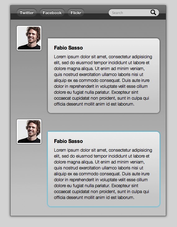
One of the coolest things about CSS 3 is that we can play with shadows and also create glows by just changing the color of the box-shadow.
div.msg:hover, #thumb img:hover{
    -webkit-box-shadow: 0 0px 5px #0cf;
    -moz-box-shadow:0 0px 5px #0cf;
    box-shadow:0 0px 5px #0cf;
}
Conclusion
Once again the idea of this quick tutorial is to show you the possibilities, there's much more to learn and of course everything has to be tested to make sure that it will work fine on different browsers. It is all about practicing.
Click on the Image to see the DEMO - It works only in Safari, Firefox and Chrome


