Super Cool Retro Poster in 10 Steps in PhotoshopListThumbs

Super Cool Retro Poster in 10 Steps in Photoshop

August 17, 2009

A couple of weeks ago Amanda (@amlight) published a few articles showing stylish posters and albums with a very retro style, very simple but at the same time really cool. The articles really inspired me so I decided to create an Abduzeedo poster for myself just to play with Illustrator and Photoshop.

So in this tutorial I will show you how to create a very cool poster in just 10 steps. We will use Adobe Photoshop and Illustrator, but you may use other tools. I'm working on the Pixelmator version as well.

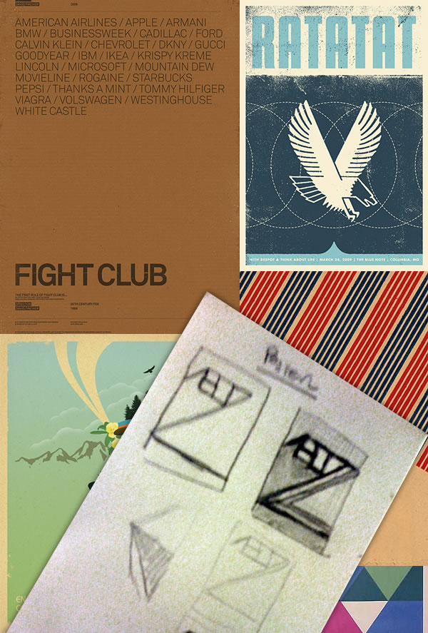
Inspiration and Sketches

Super Cool Retro Poster in 10 Steps in Photoshop

Step 1

After a few ideas on paper it's time to start designing it. For the base of the typography I used Illustrator. So I searched on Google Images for "Avant Garde" and select an image that had the "A" with the style I wanted. Then in Illustrator, using the Pen Tool (P) create the "A". You can hold the SHIFT key to make sure the lines are straights.

With the "A" done, select the Type Tool (T) and type the BDZ using the font Avant Garden.

Super Cool Retro Poster in 10 Steps in Photoshop

Step 2

Select the text created and go to Type>Create Outilines. Then with the Direct Selection (A) select the vertices of the base of the Z and the move them down like the image below.

Super Cool Retro Poster in 10 Steps in Photoshop

Step 3

Now open Photoshop and create a new document, I used A4 for the size. Then fill the Background layer with a brown (#573E2A). After that copy the text created in Illustrator and paste it in Photoshop as Shape Layer. That way we can keep playing with the vectors using the Path Selection Tool (A) and Direct Selection Tool (A).

With the Direct Selection Tool (A) move the base of the A, the straight one move all the way down until it reaches the base of the "Z" (1) and the other move all the way to the edge of the document (2). Using the Pen Tool (P) and create some points at the top of the B and make it go all the way to the top (3).

Super Cool Retro Poster in 10 Steps in Photoshop

Step 4

With the Direct Selection Tool (A) select the B element and copy and past it in a new layer. Then with go to Layer>Layer Style>Color Overlay. Use #FC9E1D for the color.

Super Cool Retro Poster in 10 Steps in Photoshop

Step 5

With the Lasso Tool (L) select the area below the A exactly like the image below. Then create a new layer and fill it with white. Just the selected area.

Super Cool Retro Poster in 10 Steps in Photoshop

Step 6

Go to Layer>Layer Style>Color Overlay. Use green for the color #6F7A38 and Multiply for the Blend Mode. Then select Pattern Overlay. For the Pattern select the Graph Paper. It's under the Color Papers preset. Also increase the Scale by 300%.

Super Cool Retro Poster in 10 Steps in Photoshop

Step 7

Now let's add some text. For the font I used Dirty Headline, you can find it at dafont.com. Place the text in the green area like the image below. Also you can add a very subtle shadow. Go to Layer>Layer Styles>Drop Shadow. I used 35% Opacity, 2 pixels for the Distance and 10 pixels for the Size.

Super Cool Retro Poster in 10 Steps in Photoshop

Step 8

It's time to add some textures. The one I used is from Shutterstock and you can download it here http://www.shutterstock.com/pic-35221027/stock-photo-old-paper.html

Place it in your document on top of the other layers, then change the Blend Mode to Multiply. Also go to Image>Hue and Saturation and reduce the saturation so the image won't get it to yellowish.

Super Cool Retro Poster in 10 Steps in Photoshop

Step 9

Now you may add some dirty elements using Brushes like to make the lines less uniform for example. I used some brushes from Eduardo Recife's Misprintedtype site. http://misprintedtype.com

Super Cool Retro Poster in 10 Steps in Photoshop

Conclusion

In less than 10 steps we're able to create a really cool retro style poster, very stylish. The secret is simplicity, color and textures. Of course you might like it without the brushes and dirty effects, or you want to try different colors, I created 2 other versions with cold colors and also playing with a photo in the background. Now it's all about playing and testing different variations. I'll print a copy for me, and hang it on my wall. :)

Super Cool Retro Poster in 10 Steps in Photoshop

Version 1

Super Cool Retro Poster in 10 Steps in Photoshop

Version 2

Super Cool Retro Poster in 10 Steps in Photoshop

Version 3

Super Cool Retro Poster in 10 Steps in Photoshop

Download the Photoshop File

Download the Photoshop file used for this tutorial

About the author

User picture

My name is Fabio Sasso, I'm a graphic/web designer from Porto Alegre, Brazil and I'm the founder of Abduzeedo. I hope we can share lots of information, tips, and ideas through Abduzeedo. Also you can follow me on Twitter or my personal site at http://fabiosasso.com.

Sponsored Links:

More content from:

Help us to share this!

45 Comments

Sneh | LBOI Blog08/17/2009

Wow this is a cool tut! Simple and so very effective! Retro Rules!!

Sean Smyth08/17/2009

Fantastic final result. Really simple, clean and just nice.

toilet08/17/2009

Looks great! Will definitely try this out soon.

hassan-0508/17/2009

very helpful to me

zeemiDesign08/17/2009

Looks amazing!

Billar08/17/2009

Vaya estilazo

Anonymous08/17/2009

nice ))

dxnxnx08/17/2009

Nice tutorial!

lordCovenant08/17/2009

im'a try this out! this one's a great tut! simple and effective i may say. . .

great job man!

DeX08/17/2009

very nice ;]

colaja08/17/2009

whoa! lovely! thanx :)

BogDinamita08/17/2009

omg lovely

Raineshine08/17/2009

love the second version. Awesome tutorial.

EMC08/17/2009

Nice, but why you didn't just use the real Avant Garde font?

diogo08/17/2009

very nice, specially version 2!

Shenanigans08/17/2009

This was really cool, i love making retro designs. I was curious about the brushes though, do you have a tutorial or something that explains it? I would love to learn how to use the brushes to do things like that. Thanks and keep up the awesome work :)

MisterG08/17/2009

ISO50 has great examples of this type of work check it out at http://blog.iso50.com/

Max(Logged-out)08/17/2009

2nd version is best i say! good work!

Anonymous08/17/2009

version 2... but i don't like the tension between the D and the Z. Right where they meet it feels awkward, because none of the other letters have the ligatures (connection). I might figure out a way for the other letters to interact, or separate the D and Z somehow, perhaps follow the outer curve of the D and cut into the top of the Z with that same curve?

aoutt08/17/2009

The one after the conclusion; version 0? Lol, that's a cool one..

David Richmond08/17/2009

definitely version02 is my favorite. the cloudscape adds an airy organic depth that a lot of great posters have.

B-8208/18/2009

it looks more "ABD7" than "ABDZ" anyway, really nice tut ;)

Anonymous08/19/2009

What color did you use for the 2 blue colors and the red in the 2nd version? I can't figure the dark blue especially!

madastro08/19/2009

very nice retro treatment, thanks for sharing!

Derryl08/20/2009

Where can I find that font "Avant Garden"? I've seen it used before but I've never been able to locate a copy.

I tried a few Google searches but still came up fruitless... thanks!

Anonymous08/20/2009

The second one looks really good.... where did you get the clouds from??

graphis08/21/2009

simple yet informative..thanks for sharing!

Anonymous08/21/2009

Klasse! Wirklich super tutorial!

Anonymous08/22/2009

I really want to know the font. ISO is using it also..., but i cant find this amazing font.

Neempop08/22/2009

I've been meaning to do something like this! thanks for reminding me. Like the graph paper texture overlay a lot!

Avant Garde 4 Lyfe08/24/2009

font is ITC Avant Garde Pro ..should be nobrainer for every designer heh

yata08/24/2009

I love your Idea! I normally dont even bother to leave comments, but I wanted to let you know that you hit the nail on the head!
YATA Wholesale Korean Fashion is one of chinese leading Wholesale Clothing distributors of women's clothing and Korean fashion Wholesale bring you stable quality at wholesale prices.

Cauê08/25/2009

cool

Giancarlo Bianco09/02/2009

I can't find AVANT GARDEN font anywhere. Please help.

discohospital09/04/2009

I made this with a little help from this tutorial :)
http://acidburnbaka.deviantart.com/art/Vertigo-135786693

Macola09/05/2009

Excelente tutorial.... show us more...

Jasmin Halkic09/06/2009

Wow, nice!

Anonymous09/12/2009

"ont is ITC Avant Garde Pro ..should be nobrainer for every designer heh"

Which avant garde has that A? ITC AG with such an A? Nope

annashush09/18/2009

wow.nice.

ruby09/21/2009

Super cool. I likey!
Version 2 is the best I think. Great tutorial, really simple and effective

clippingimages10/04/2009

Very creative tutorial , simple and nice to learn. Thanks for sharing this nice tutorial.

Beto Abreu10/10/2009

Gostei.Muito bom. Estava procurando algo assim para produzir material sobre atividade cultural.

Anonymous10/28/2009

Looks great man!
Greetings frpm Sweden...

/Nick

muratha11/04/2009

Hi
Thanks for your great tuts and inspiration
I have made one for me that i m pretty happy (sorry for my bad english)
Have a look
http://www.joska-potin.com/cool-retro-poster#more-111
If you think that it is not appropriate let me no
Regards

lili11/09/2009

Hello... thank you fantastic & easy ^^ gracias!!

Post new comment

The content of this field is kept private and will not be shown publicly.

Icon Ads Wall

  • Openjobs - Oportunidades de Emprego para Profissionais de Talento
  • Zee - Irrezeestível Design Digital
  • Tradd.us - Contextual Translator
  • DesignFlavr, Inspirational Art and Design served daily
  • Signalnoise.com | The art of James White
  • Alberto Seveso - Illustrator
  • Description: Award Winning Portfolio and blog of Web Developer Anthony Woods

Do you want to advertise here?