Graphic design is an ever-evolving field, and every now and then, a new technique or style emerges that captures the imagination of designers around the world. One such example is Pointed Typography, created by Txaber, a renowned graphic designer. This unique approach to typography is built from a grid of dots, and it's a fresh take on an age-old tradition.
The concept of Pointed Typography is relatively simple, yet extremely fresh and beautiful. The grid of dots serves as the building blocks for each letter and number, and then scaling is applied to create the desired size and shape. This approach allows for a great deal of flexibility, making it possible to create letters and numbers with a range of thicknesses and styles. It's an incredibly versatile technique that allows designers to experiment with a wide variety of visual styles.
The Pointed Typography font is eye-catching and instantly recognizable. Its unique style is perfect for a wide range of applications, from advertising to branding. It's a modern take on typography that can breathe new life into any design project.
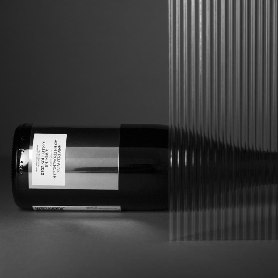
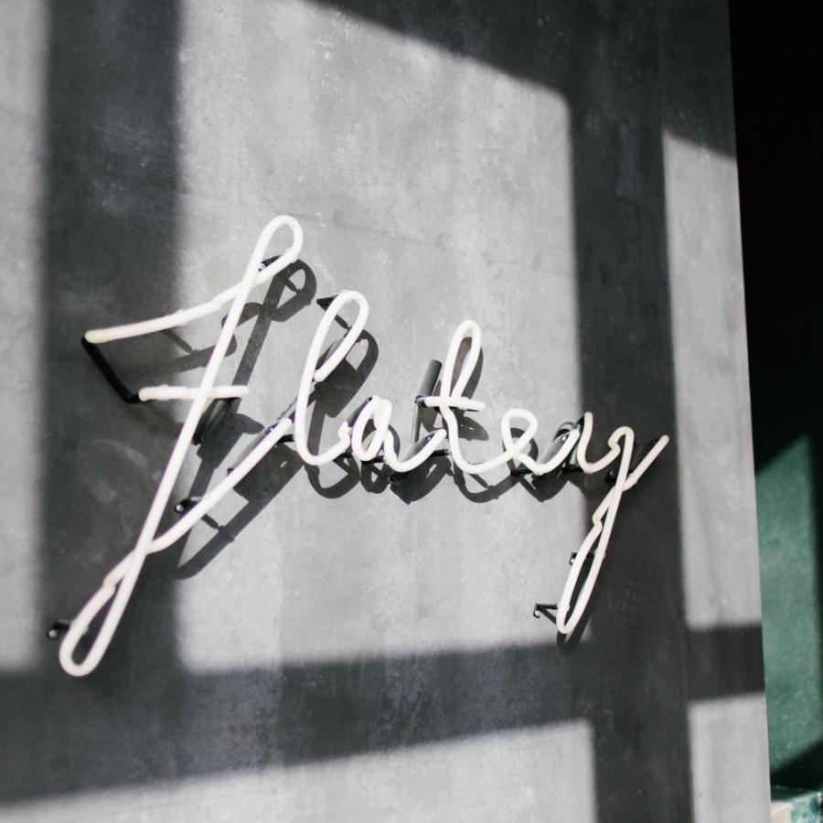
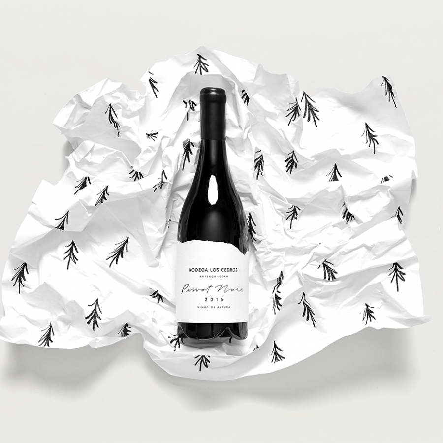
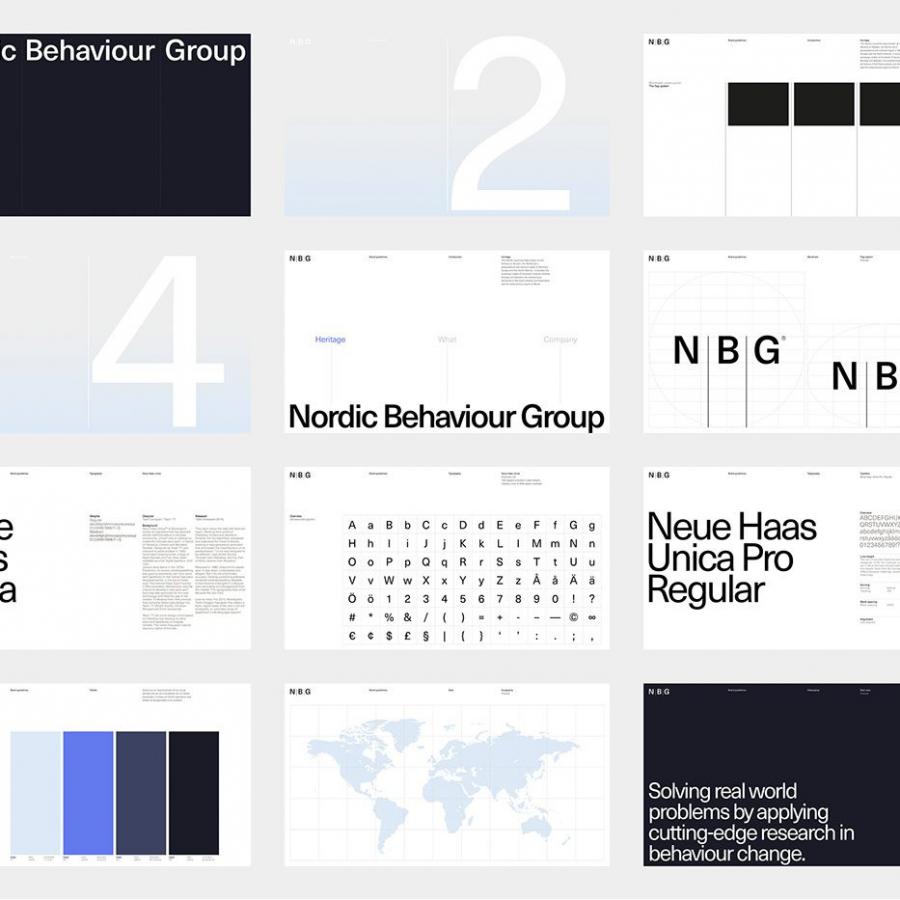
To showcase the versatility of Pointed Typography, the designers over at Txaber has included several fictitious exercises with different marks. These exercises demonstrate the font's adaptability, as it can be used to create everything from minimalist designs to bold, attention-grabbing graphics.
Overall, Pointed Typography is a prime example of how modern design techniques can reinvigorate traditional practices. Its unique style and versatility make it a valuable tool for any designer looking to push the boundaries of typography. Whether you're working on a branding project or creating eye-catching visuals for a product, Pointed Typography is sure to capture the attention of your audience.
Graphic design and typography
For more information make sure to check out Txaber website or follow them on Behance and Instagram.
