by abduzeedo
I started Zee back in 2004 with a friend of mine, Fabiano Meneghetti. Throughout these years we have learned a lot, from our successes and of course from the failures. It's part of the game right, even though we try to succeed more than fail. One of this mistakes, was to partnership with people that did not share the same thoughts that we have, with different perspectives and ideas.
Because of that, Zee had been suspended for 6 months. But after this period we thought that our way of thinking and everything we had gone through was worth it and could have not been simply forgotten. Abduzeedo, for example, was born after a robbery at Zee.
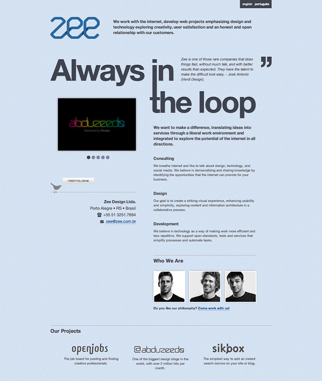
Now we are back with Zee and we want to show you how we created our new website.
Goals and Inspiration
Our goal for the new site was that it would have to be super simple. Also we wanted to show that we were still in the game, that we’re always in the loop. That was the tagline we used for the teaser page and kept for the site.
- Simplicity
- One Page Only
- Big Slogan
- Short Texts
- Magazine Style
The simplest way to achieve simplicity is through thoughtful reduction. - The Laws of Simplicity
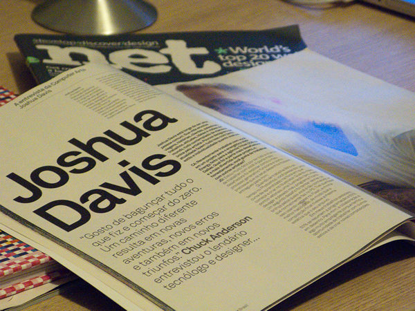
We had some ideas in mind however our inspiration came from magazines and books, we wanted a big text for the slogan, and short texts describing what we do and who we are.
Portfolio
For the portfolio we wanted to show a few works but keeping the user at the same page. From our statistics we knew that the visitors didn't spent too much time on the site, therefore, they couldn’t see all the information we had.
Team
As the site would have only one page we decided to use only thumbnails for the team section. We hid the descriptions and then showing only via Javascript when the visitor hover the image.
The photos were taken by John Arlington, an excellent photographer friend of ours. We believe that a professional photo gives much more value to the design, and that’s why we contacted him.
Layouts
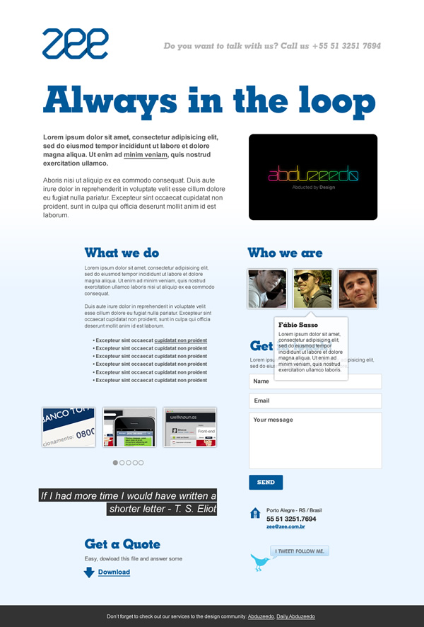
First idea after adding all the elements in the document. We didn't like the fonts though

Second idea was with a different background and sort of a sheet of paper.
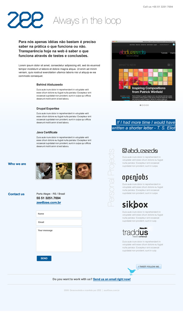
Basically the second idea without a different background. Still it wasn't exactly what we were looking for.
Creating the Site in Photoshop
Step 1
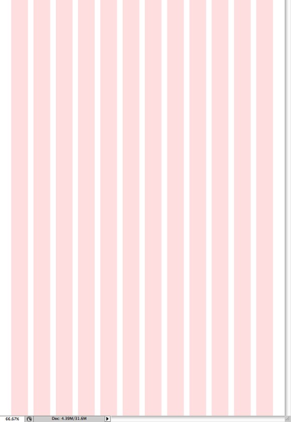
First thing we did was to get a template model, we have been using a lot the 960 Grid System (http://960.gs/). So open the Photoshop Template to have the guides for reference.
Step 2
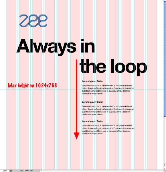
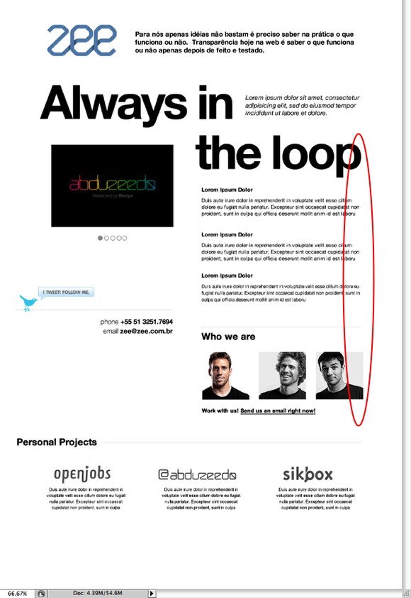
We started playing with the logo and slogan, we broke the slogan in 2 lines so we could use one of the blocks as reference of width for the other texts, in this case the "the loop" block. We didn't pay attention to the text size because we were just laying down the elements.
Step 3
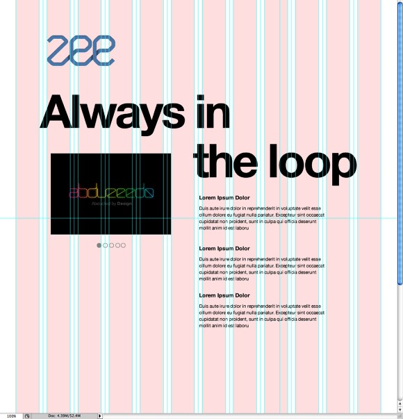
Using the Rectangle Tool (U) we added a placeholder for the portfolio, in this case with the Abduzeedo logo. It's aligned in the center of the word "Always". Also with the Ellipse Tool (U) we created a basic navigation system inspired by the Apple iTunes Store.
Step 4
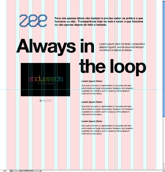
Now we added a text that will describe what we do right next to our logo. For the font size we used 17. Also right next to the words "always in" we added another block of text that is a placeholder for a clients citation.
Step 5
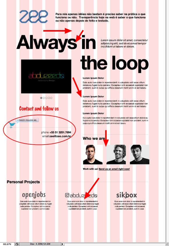
We tried to create a nice flow so the visitor would read the Logo and the text that describe our company, then our big slogan, our services and expertises with the portfolio for reference, then who we are and finally some personal projects.
Step 6
A few adjustments especially the text alignments.
Step 7 - Adding Colors
We added a very light blue for the background and also a dark blue for the texts.

Step 8
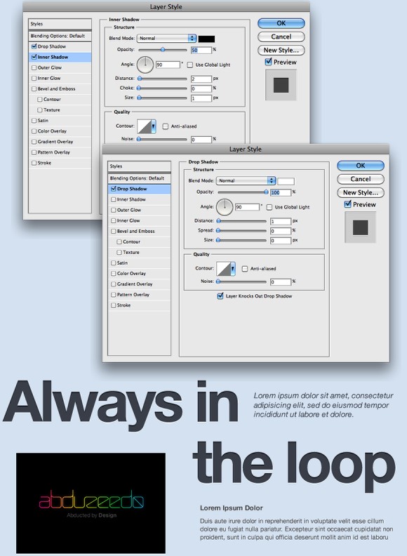
To create a nice effect on the slogan we started by adding a Drop Shadow via layer style, we used white for the color, 90º for the Angle, 1 pixel for the Distance and 0 for the Spread and Size. Also for the opacity we used 100%. After that we added the Inner Shadow. This time we used black for the color, 50% for the Opacity, 90º for the Angle, 2px for the Distance, 0 for the Choke and 1 px for the Size.
Step 9
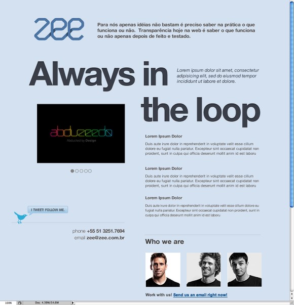
For all texts we added a white shadow like we did in the previous step. That will be done with CSS later on when we will be doing the HTML part.
Step 10
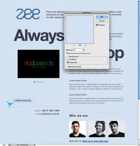
We wanted to use some textures that's why we added the noise (Filter>Noise>Add Noise) on the background. We used 2% for the Amount and Gaussian. After that we added the same noise effect on the big slogan text.
Step 11
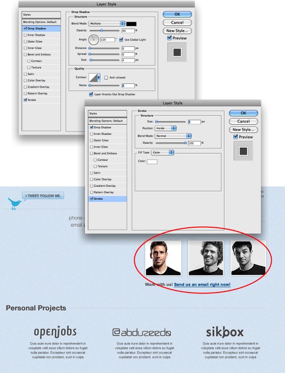
With Layer Styles we added a white stroke and a shadow on thumbnails. Use the image below for reference.
Final
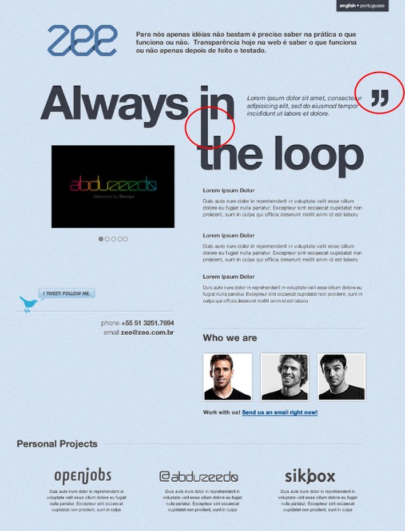
We added a few elements like the connection between the "in" and the "the". Also the quotes and the language navigation at the top. Basically this layout was used for reference for our HTML/CSS version. We did this version pretty quickly using Skype and sharing screen but we knew that a few things would change because of the texts and the versions, like the portuguese that required a new slogan.
Conclusion
With the layout done in Photoshop we created the HTML and CSS for the site. Most of the shadow effects were created using CSS3. Also we used Javascript for the tooltips and portfolio effects. We will publish a tutorial on how we did this part very soon.
HTML sites
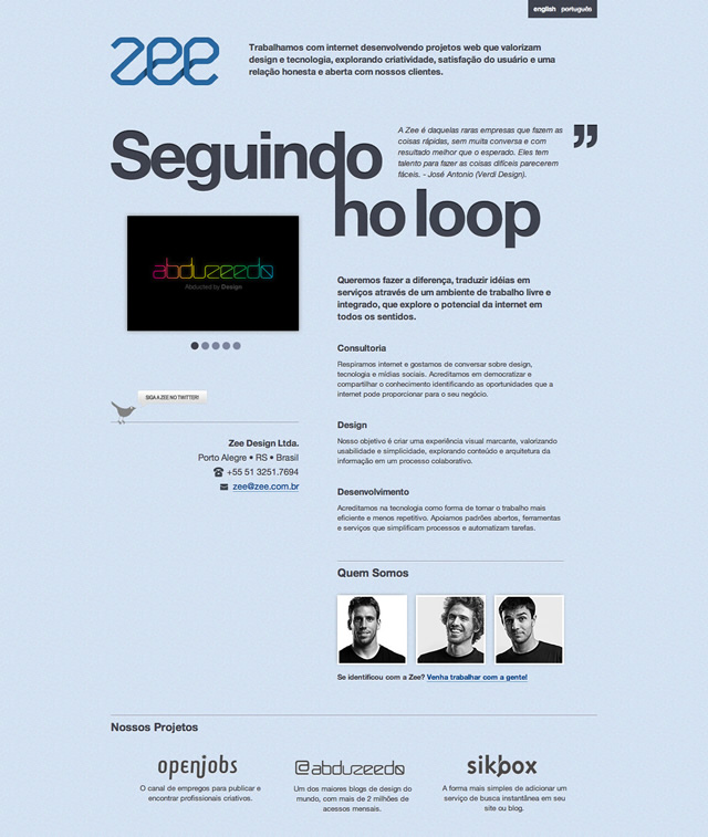
Portuguese version with the new slogan
English
Details
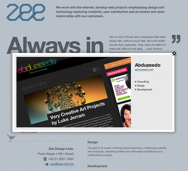
Portfolio work description
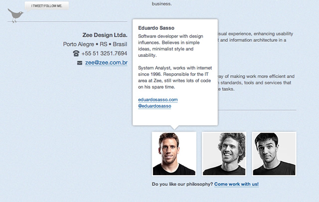
Team description
For more details visit the Zee website at http://zee.com.br
