by abduzeedo
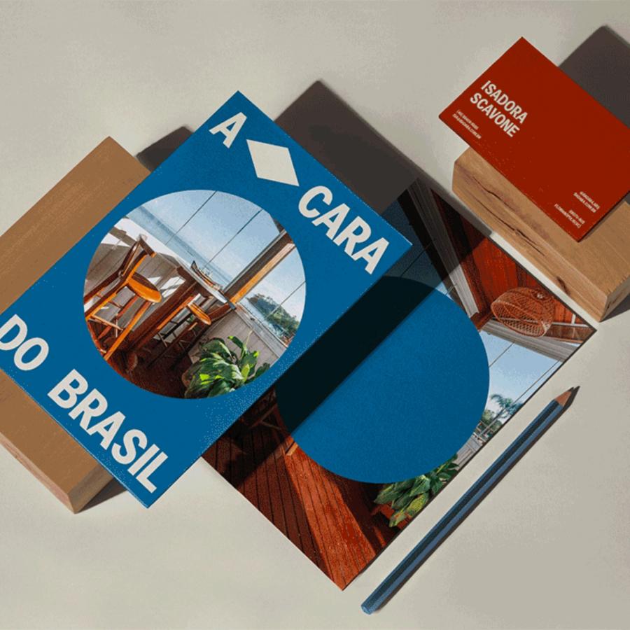
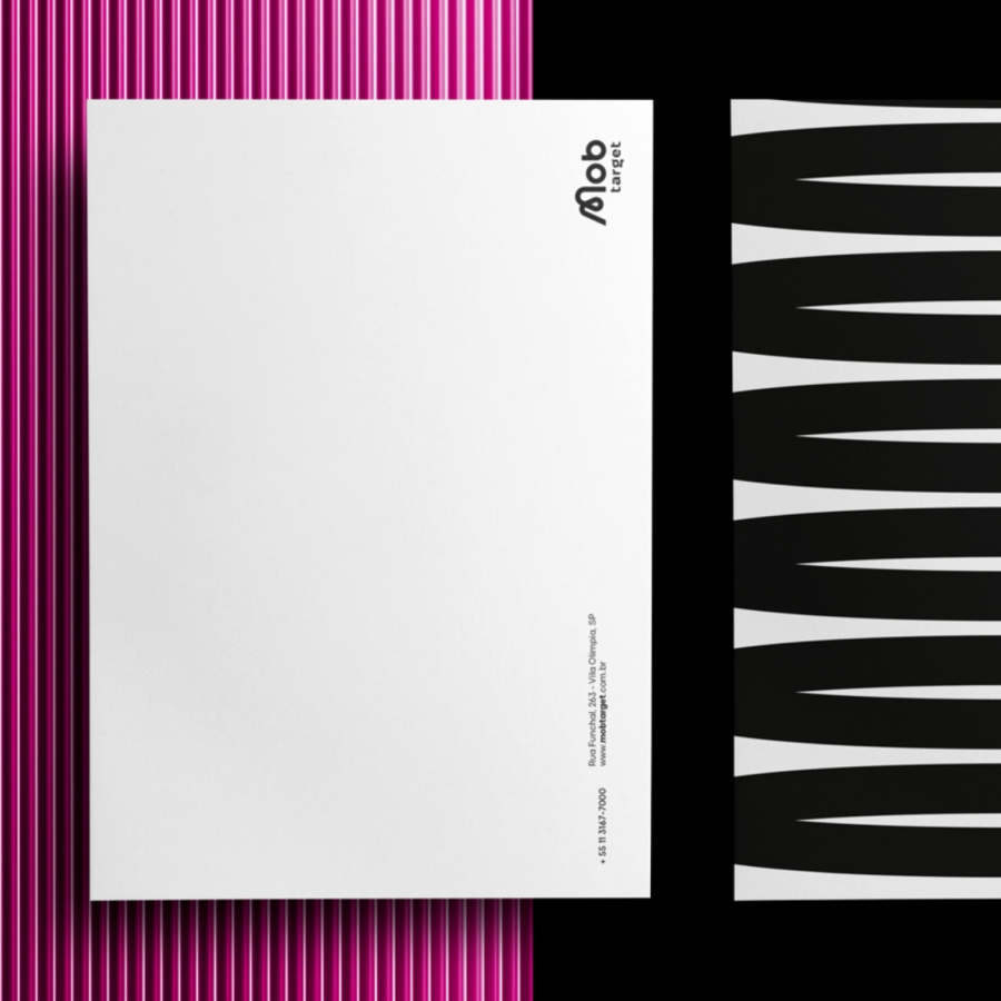
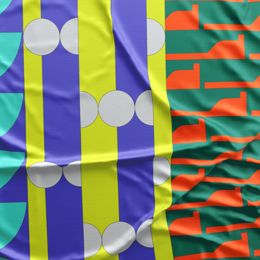
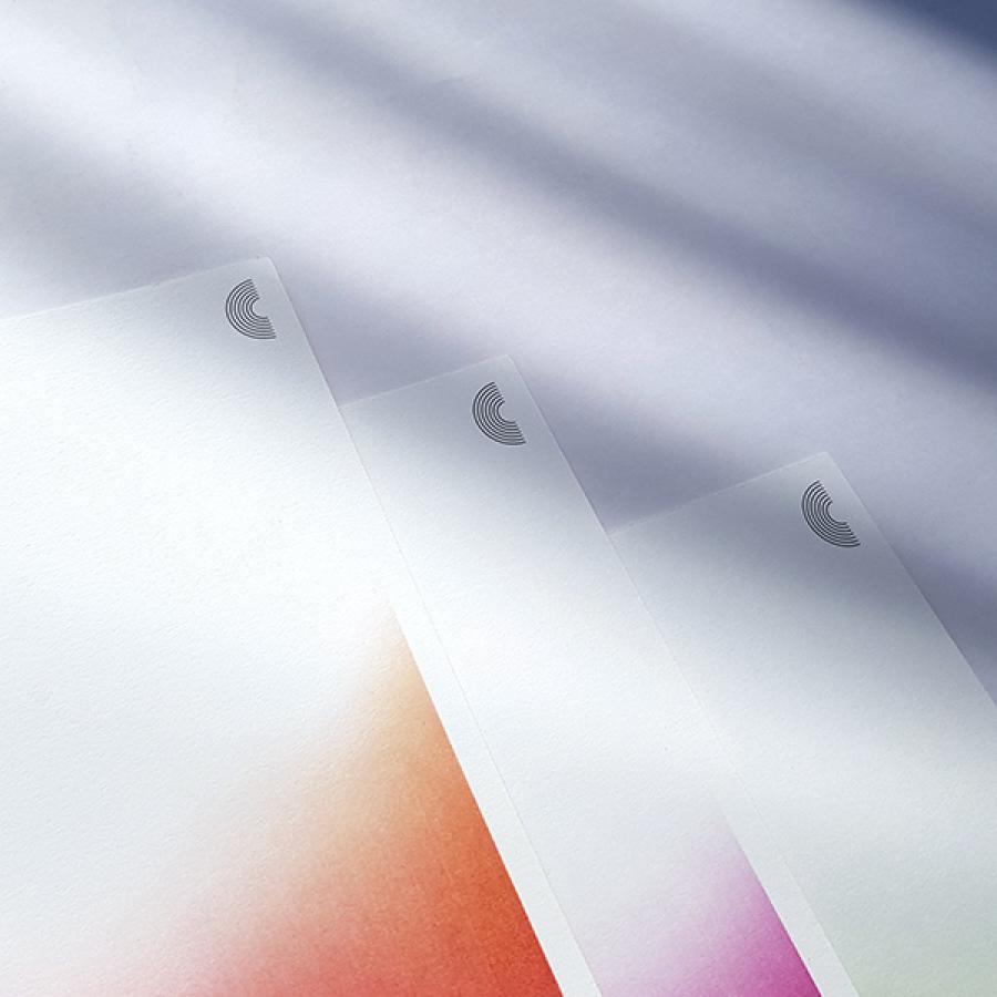
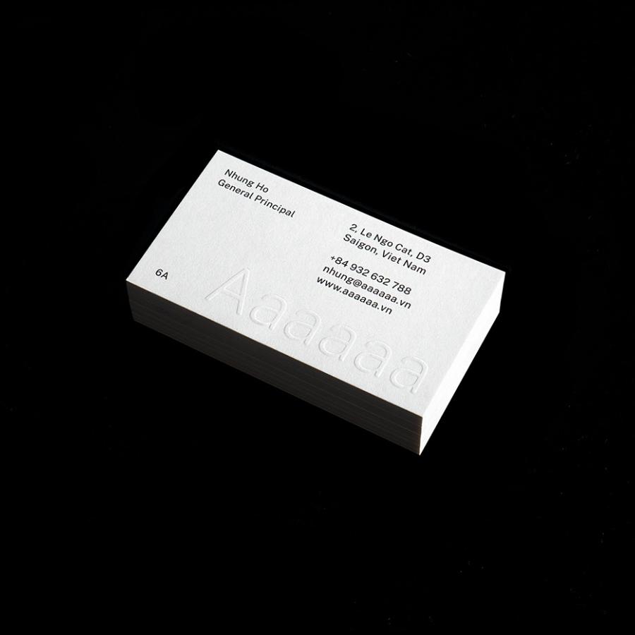
Odecraft Studio shared a new branding and visual identity project on their Behance. Featuring bold typography and color the work for Zuno Tea is fresh but not trendy. I especially love the take on the Swiss style with some different treatments for the start/geometric look.
For more information make sure to follow @ODECRAFT
