by abduzeedo
In the realm of architecture, where structures meet artistry and functional design intertwines with aesthetics, the brand identity holds paramount importance. Santiago Nicolas Smud's recent branding project for the iconic Martín Gómez architectural firm is a testament to this harmonious interplay.
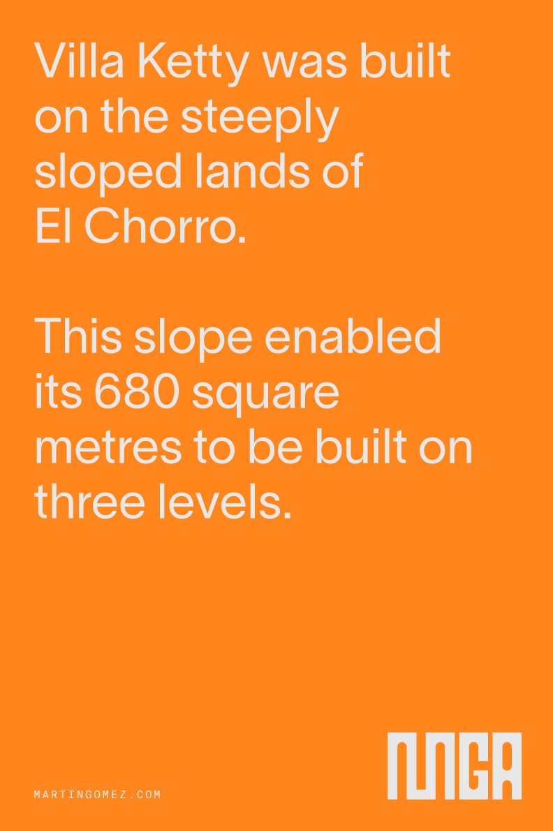
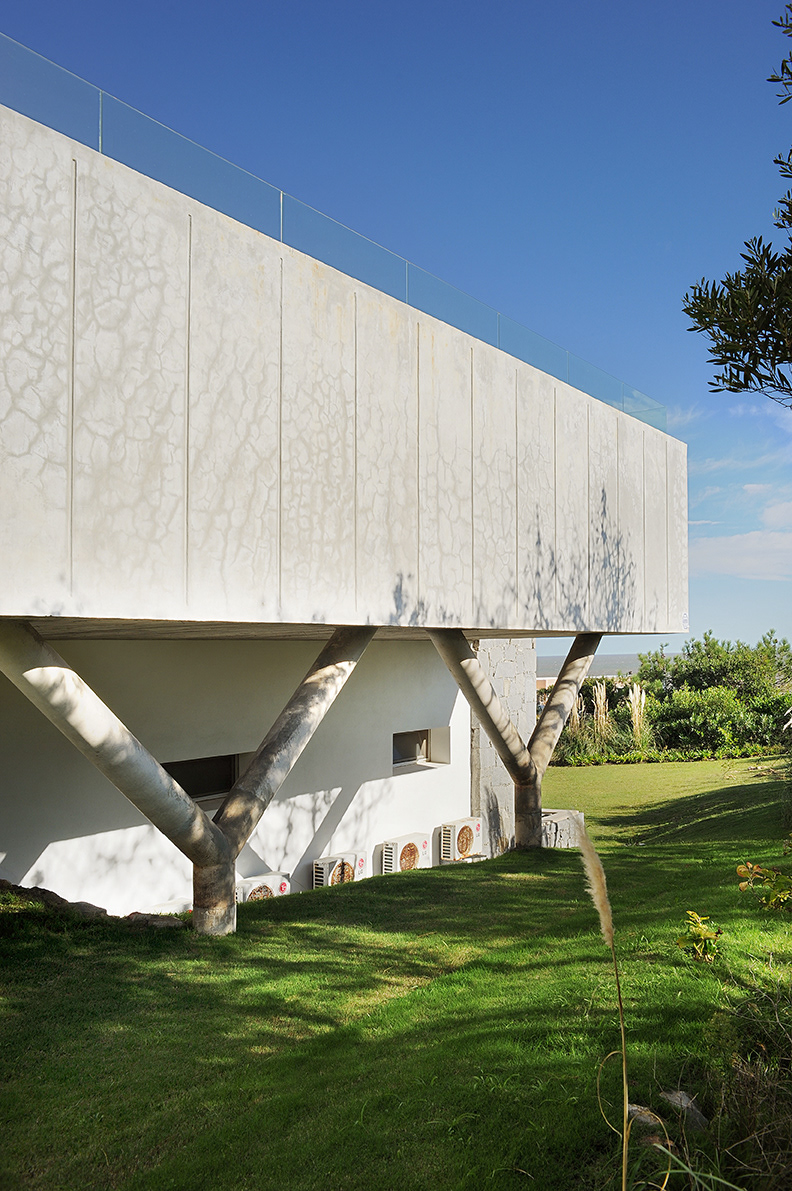
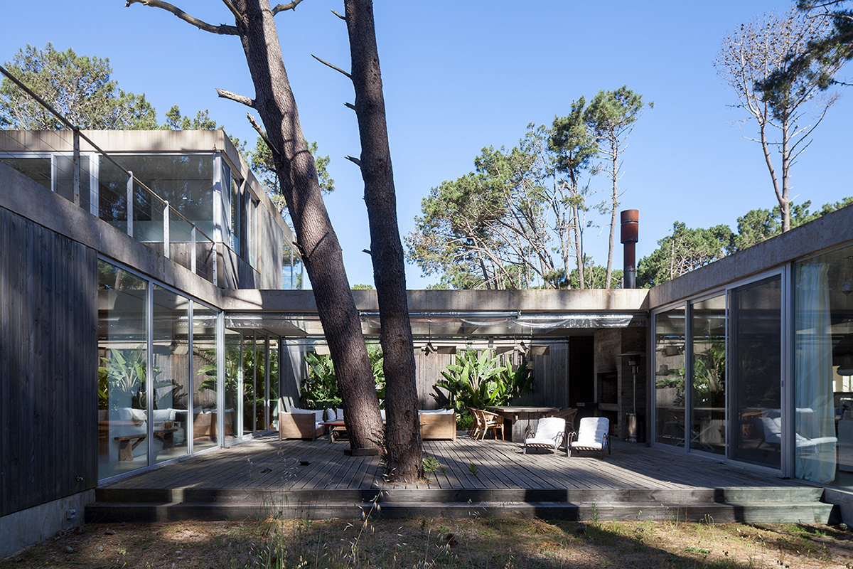
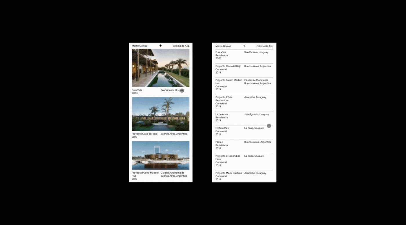
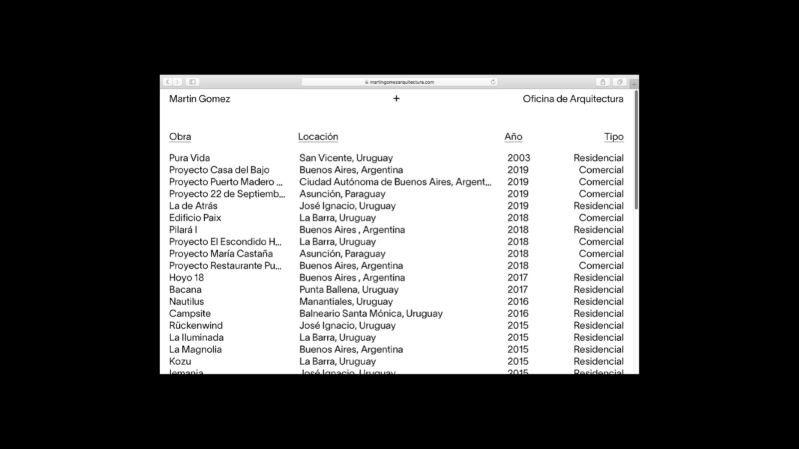
Martín Gómez is not just an architectural firm; it is a legacy. Spanning over three countries - Argentina, Uruguay, and Paraguay - and boasting a rich history of more than three decades, the firm has cemented its reputation in crafting architecture that fosters a deep connection with nature and emphasizes enhancing the quality of human life. In essence, the buildings they create are not mere structures but poetic narratives of the relationship between humanity and the environment.
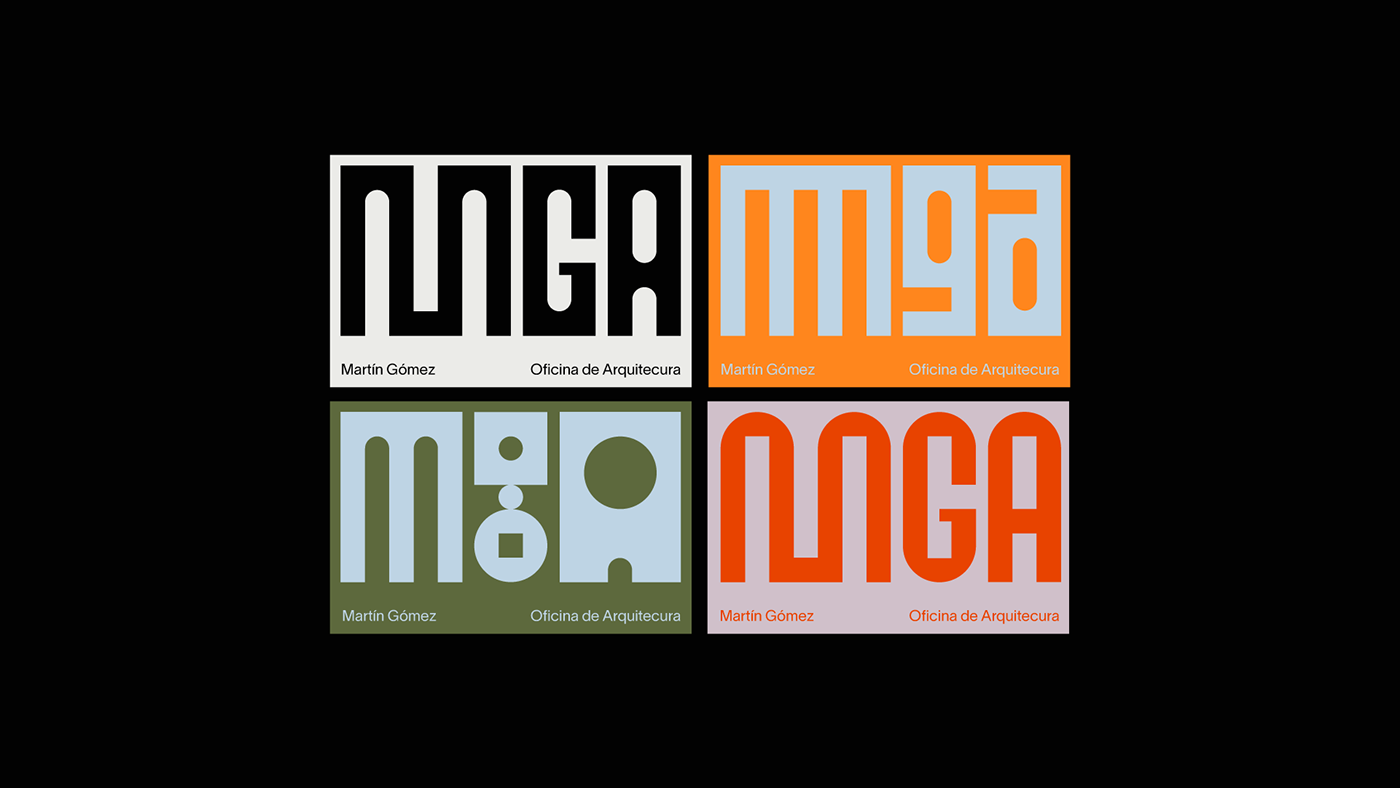
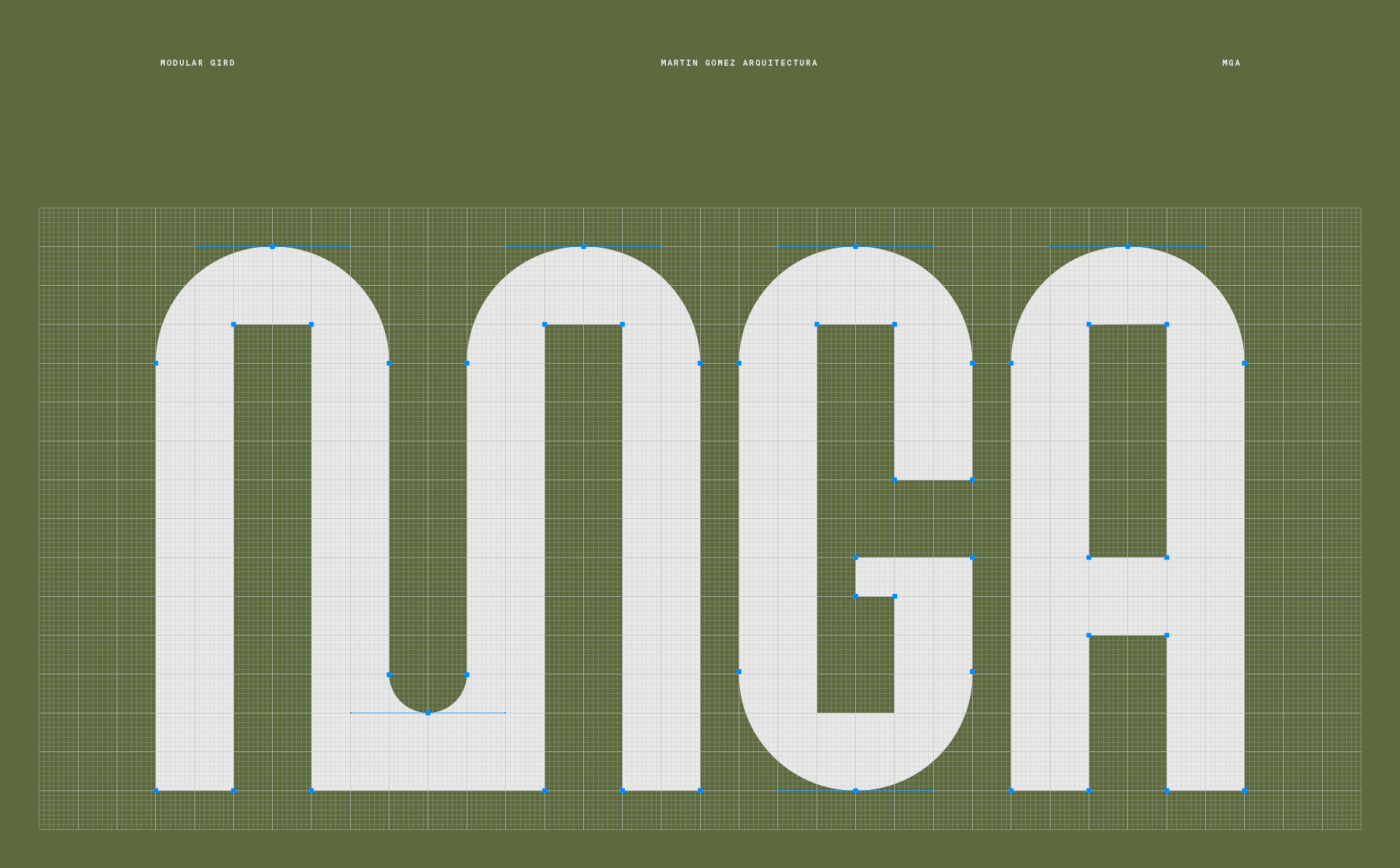
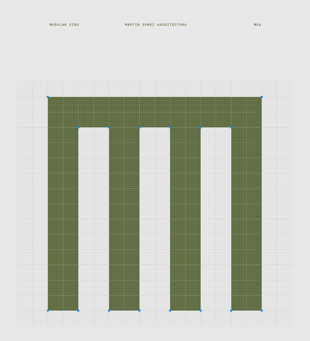
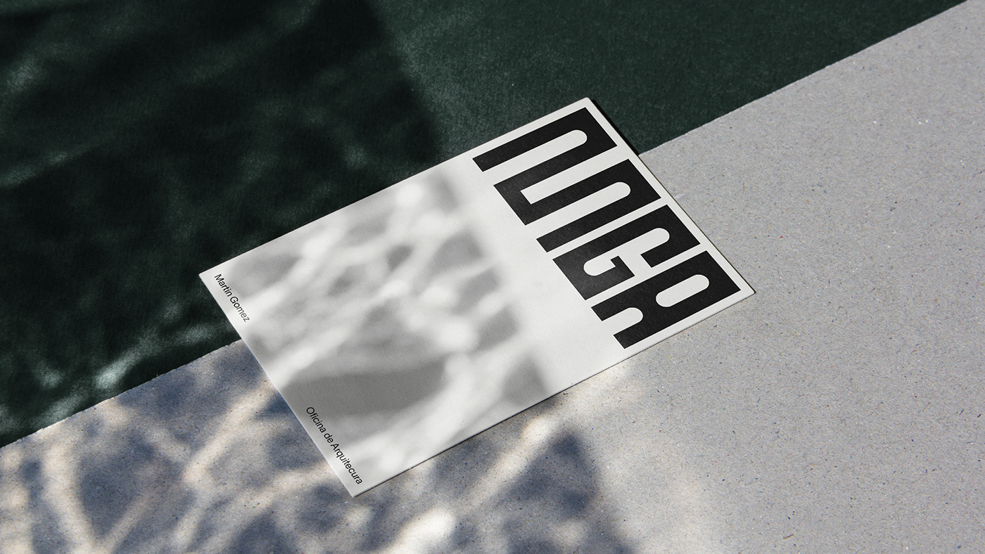
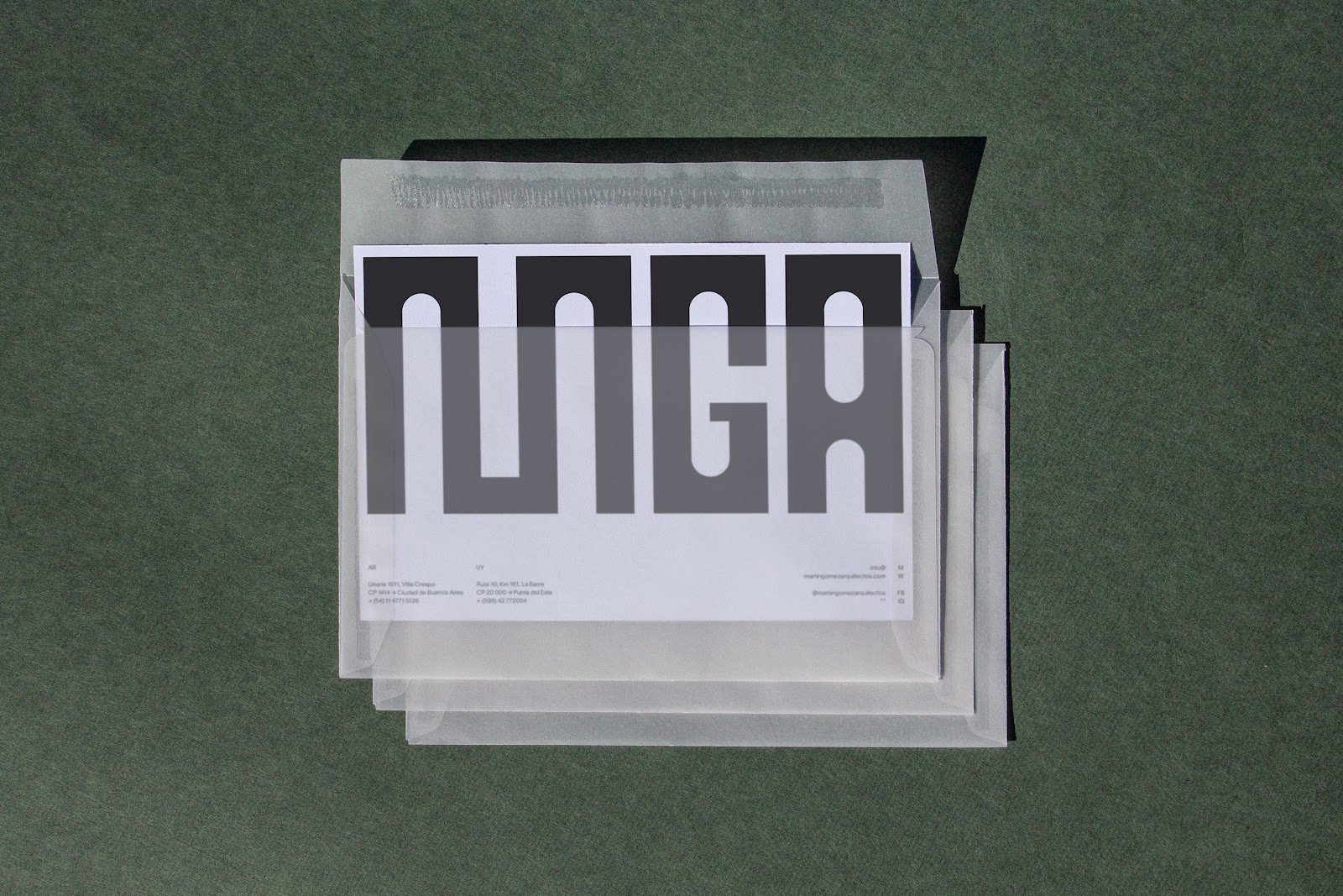
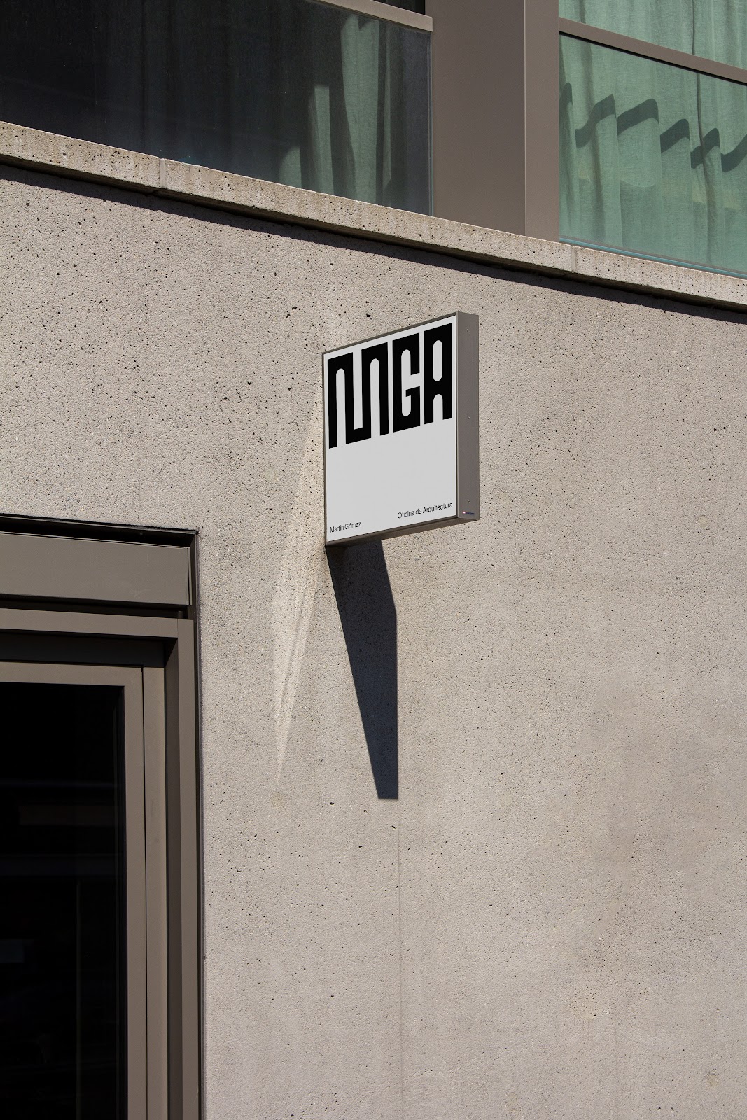
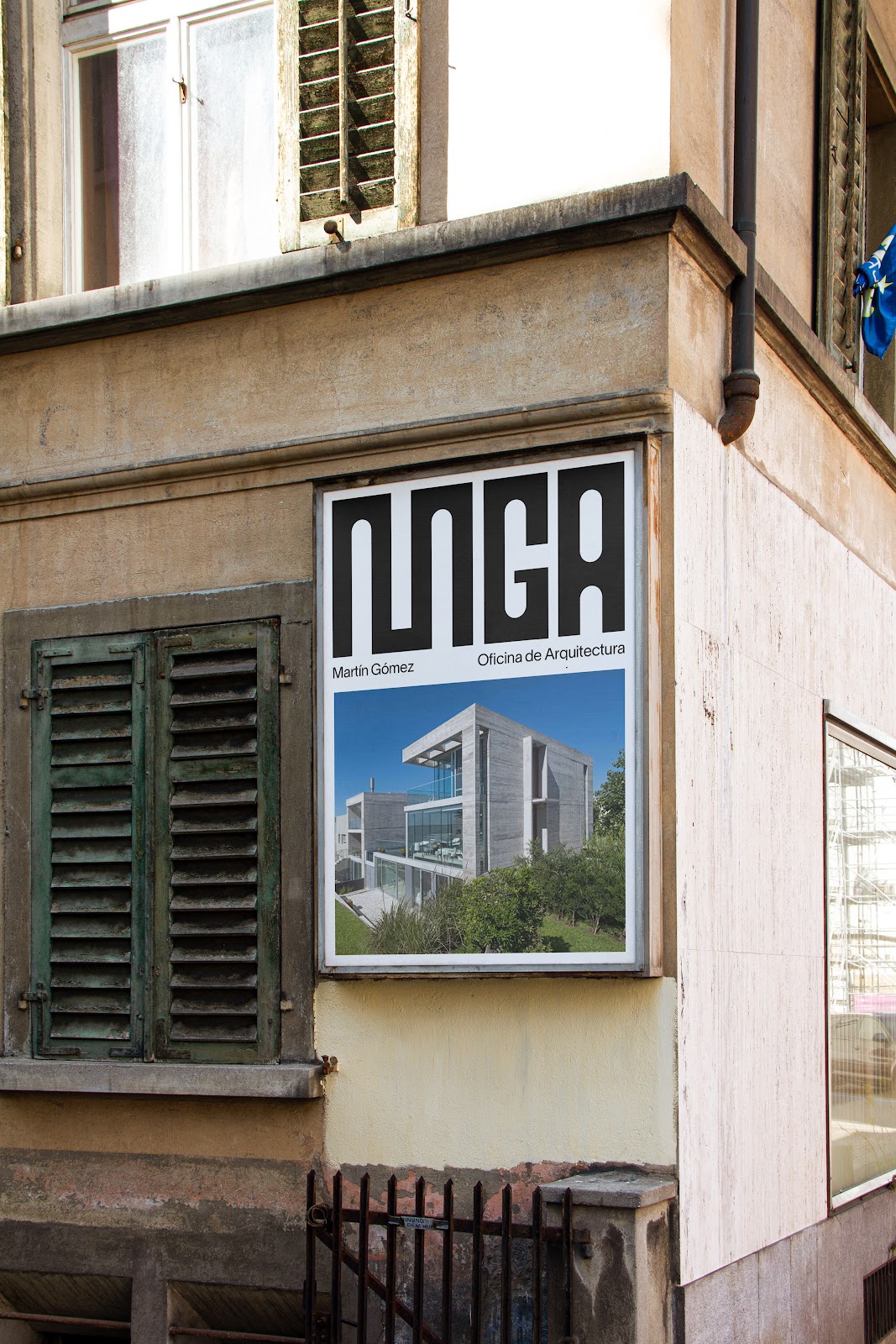
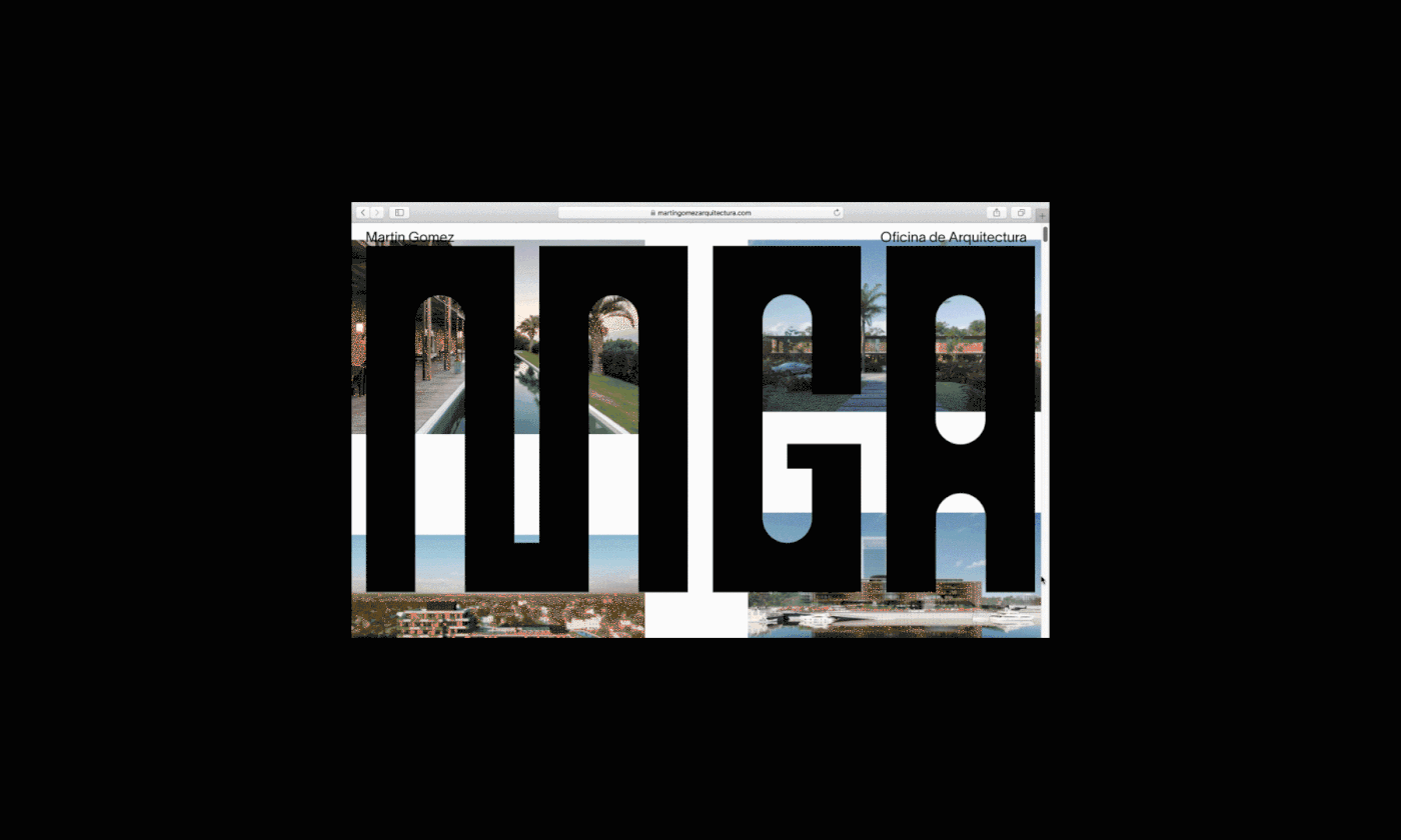
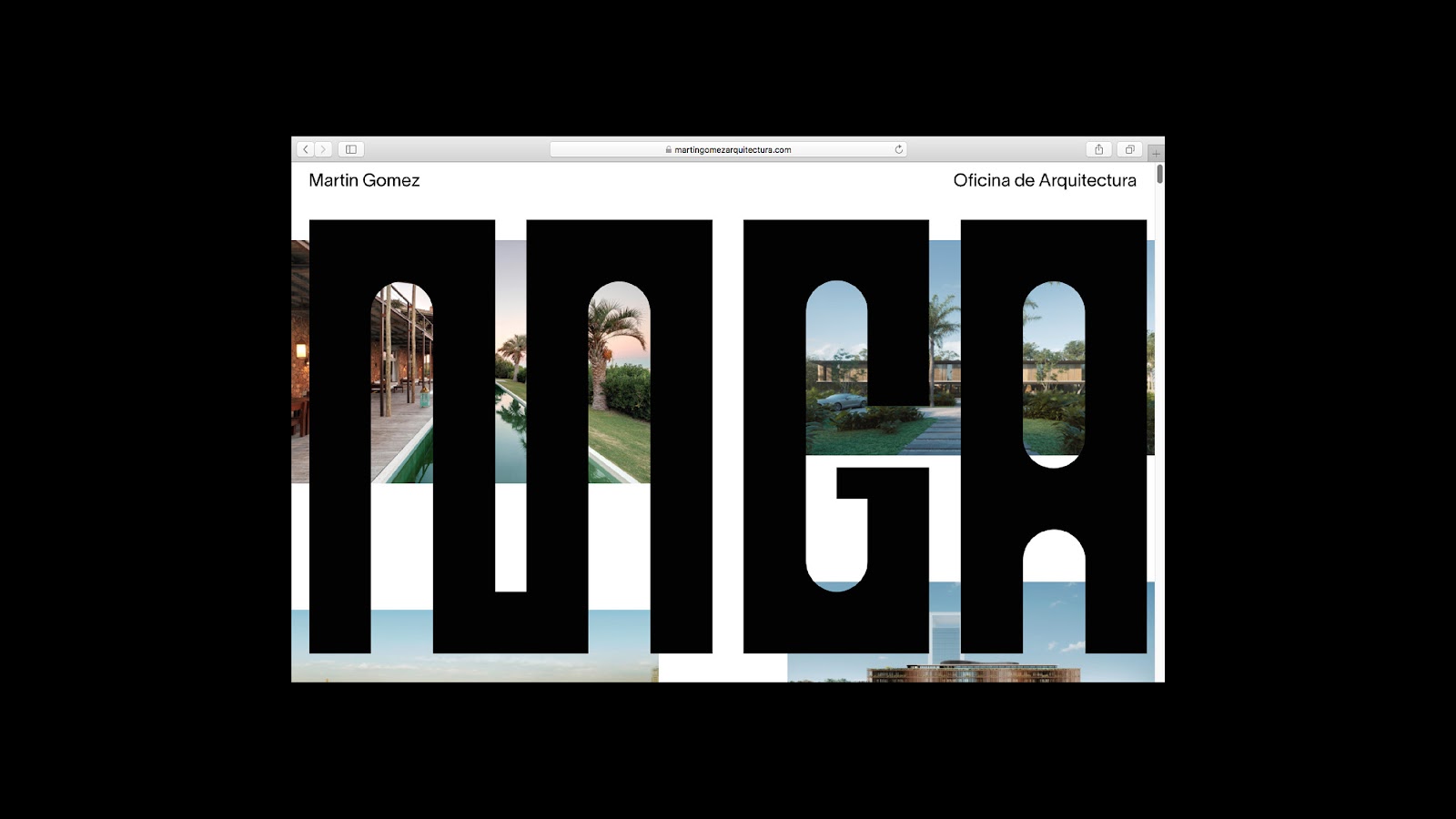
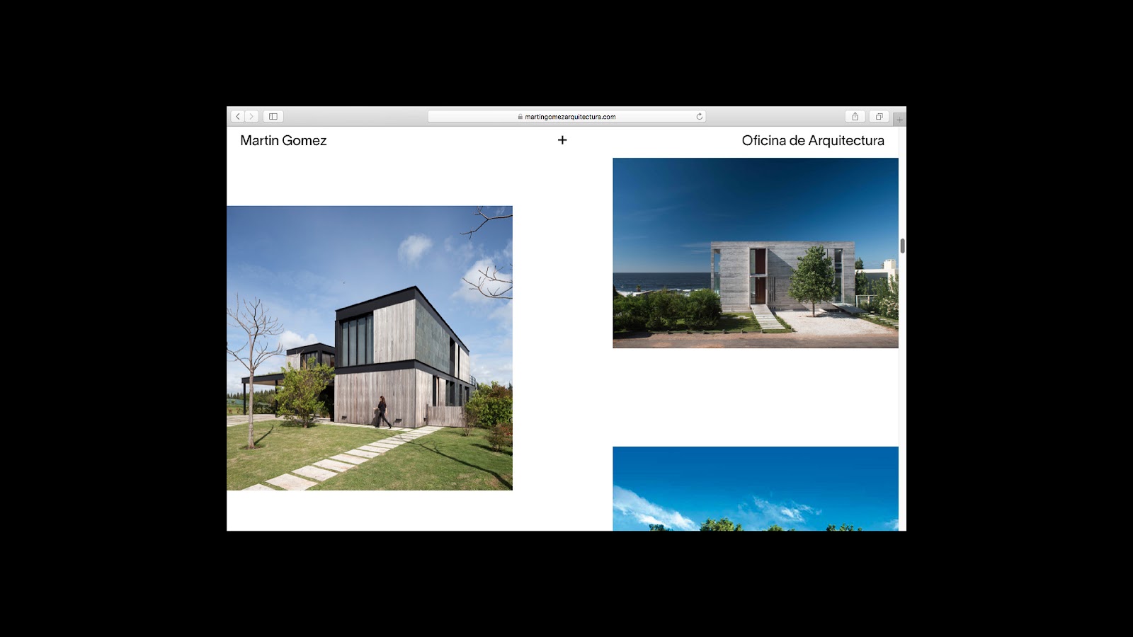
Entrusted with the Herculean task of creating a brand identity that encapsulates this rich legacy, Santiago Nicolas Smud went above and beyond to create a dynamic and versatile visual grid. Drawing inspiration from the myriad geometric shapes and structures that Martín Gómez projects are renowned for, Smud developed a grid that captures the firm's initials in an array of interpretations. This approach beautifully mirrors the versatility and diversity of the firm's architectural endeavors. Each rendition of the initials, like the firm's projects, is distinct, yet they all seamlessly align with the overarching brand philosophy.
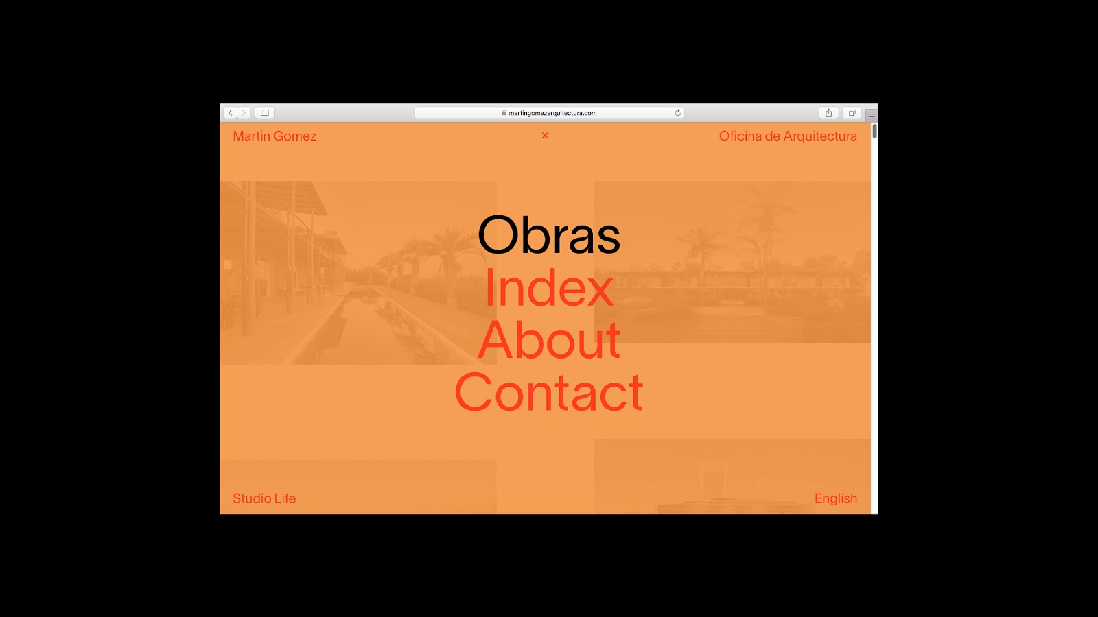
The genius of Smud's design lies in its adaptability. The dynamic grid system he has crafted can be molded and adapted across various platforms and mediums, ensuring that the brand's essence remains consistent and unmistakable. The visual language, while deeply rooted in geometry, resonates with the ethos of Martín Gómez: commitment to nature, human-centric design, and architectural excellence.
In conclusion, Santiago Nicolas Smud's branding and visual identity project for Martín Gómez is more than just a design; it's a celebration of the firm's principles, history, and vision. Through this brilliant collaboration, the architectural giant's identity is set to resonate with audiences, old and new, across South America and beyond.
Branding and visual identity artifacts


Credits
- Client: Martin Gomez Oficina de Arquitecutura
- Agency: Santiago y Nicolás
- Art and Creative Direction: Nicolás Smud
- Production: Sol Pergierycht
- Brand Design: Nicolás Smud
- Graphic Design: Delfina Lopez Davio
- UX/UI: Nicolas Smud, Juan Pinkus
- Programming: Juan Pinkus
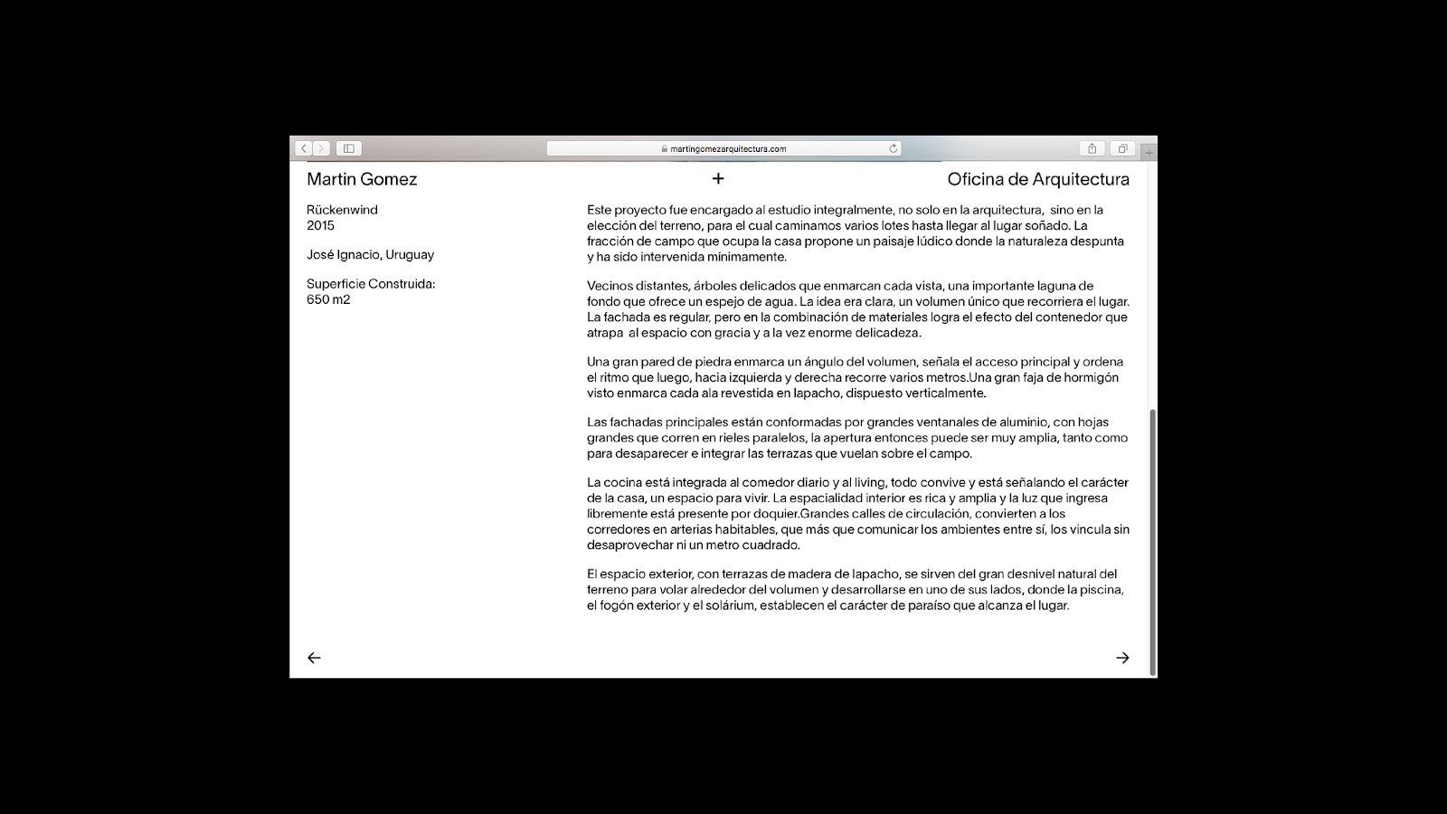
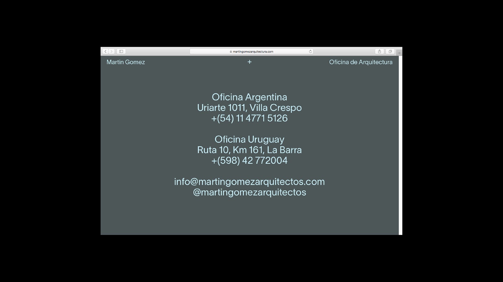
You can check out the work at https://martingomezarquitectos.com/ - for more information visit Nicolás Smud website or follow him on Behance.


