by abduzeedo
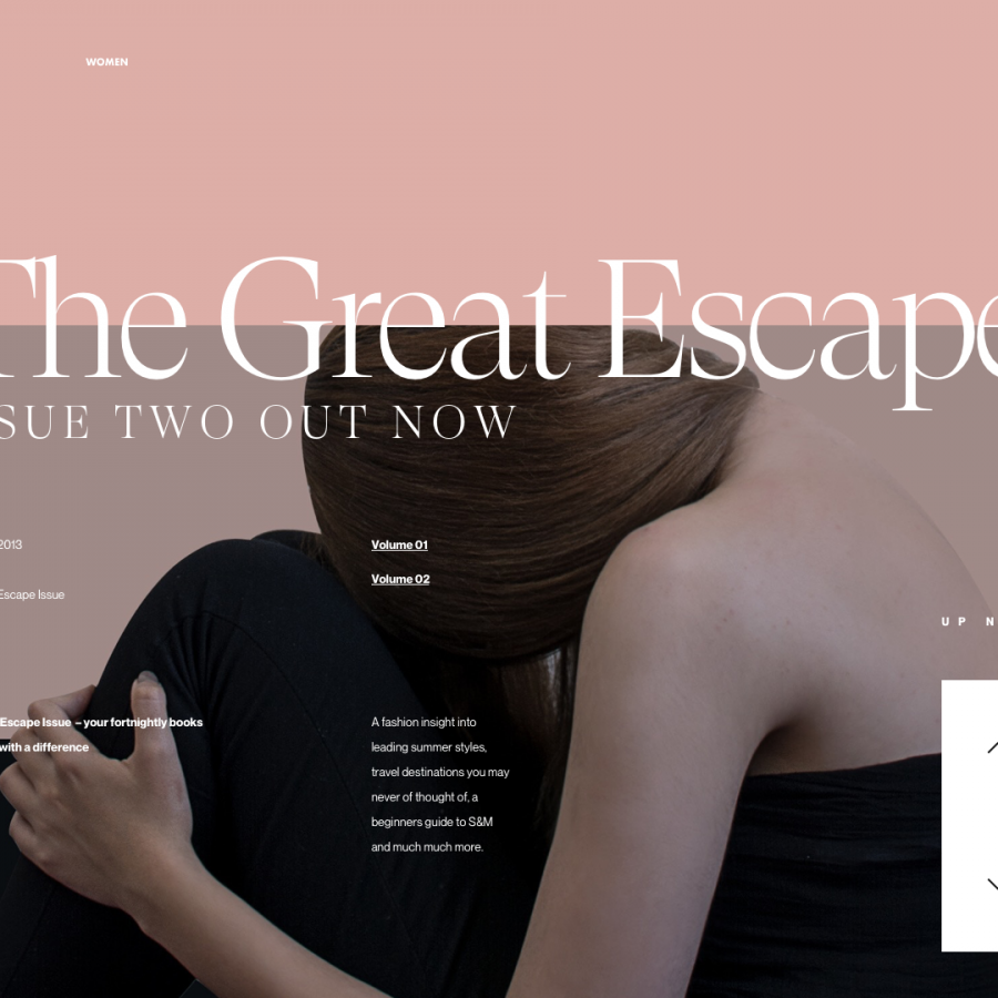
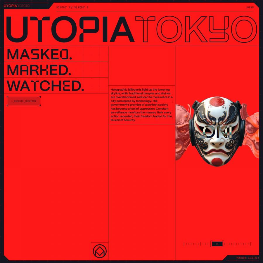
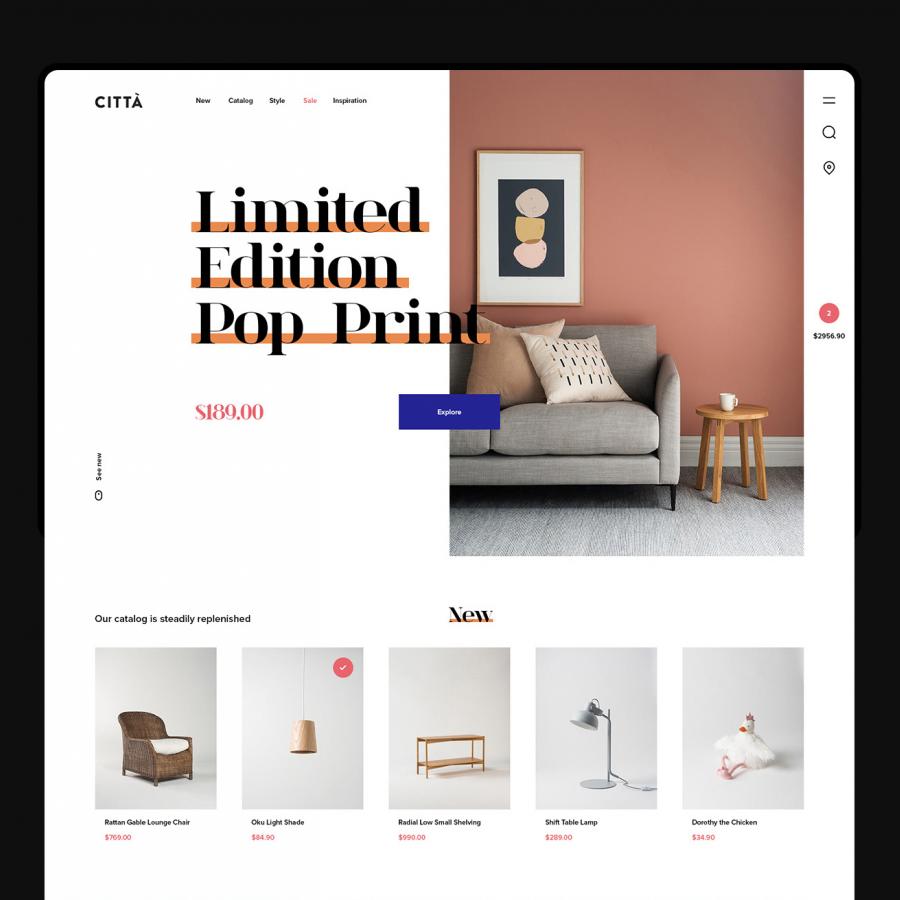
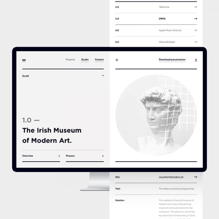
Concept projects are always fun, there’s no doubt about that statement. We can explore our creativity without much constraints and that helps us to learn new things that might be or not useful in the future. When I saw the amazing web design project for a concept design for Rock in Rio shared by Set Sargsyan I knew I would have to share it. Visually speaking I think it’s wonderful. There are so many things done to make it look more editorial, some of those I personally tried on the Abduzeedo design without much success. Nevertheless take a look at the screenshots below and share your thoughts with me via Twitter, FB, Instagram, LinkedIn…
Web Design
Follow Set Sargsyan hand-picked UX/UI moodboards used for this project
