by abduzeedo
Daniel Freytag and Greig Anderson shared an incredible branding and visual identity project they worked on for Rapscallion Soda, a drinking company that specializes in fresh fruit, low sugar sodas, handmade in Glasgow, Scotland. They're a new kind of soft drink - better ingredients, better tasting, better for you. Rapscallion.com
Approach
Rapscallion started punting handmade soft drinks down an alleyway in Glasgow back in 2016.
Their goal was simple: make the best tasting drinks possible without using artificial ingredients. Fast forward to 2020 and Rapscallion are growing, moving into a 1500 sqft railway arch in the Gorbals, more reminiscent of a scientific lab than a brewery.
Consumer tastes have also changed. They’re now actively seeking out low-sugar, well crafted alternatives to mass produced sugar-laden brands. The time was right to redefine the Rapscallion brand.
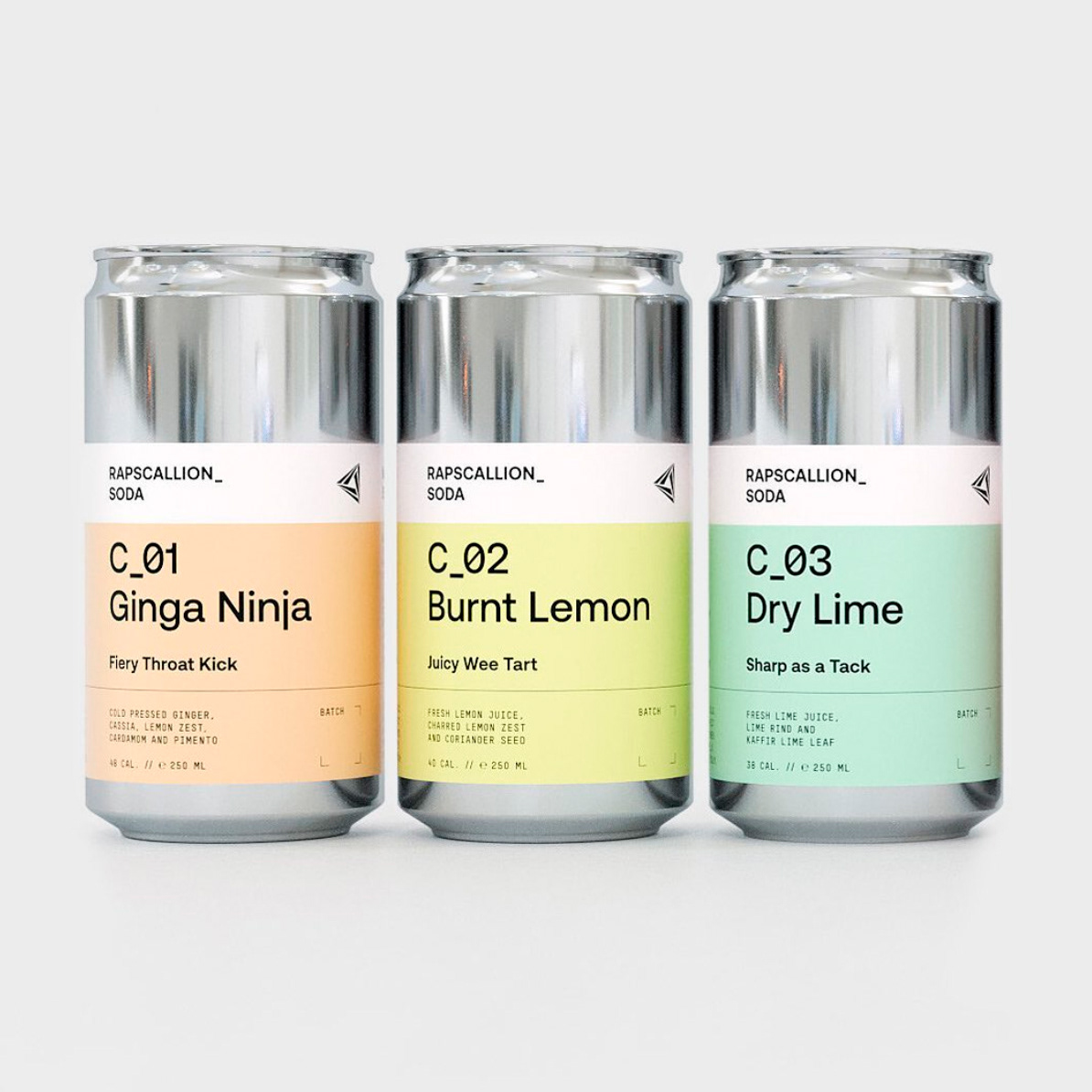
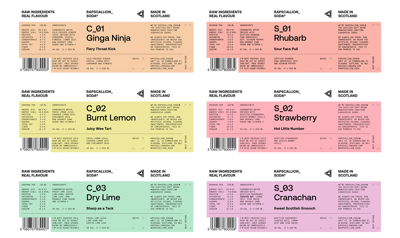
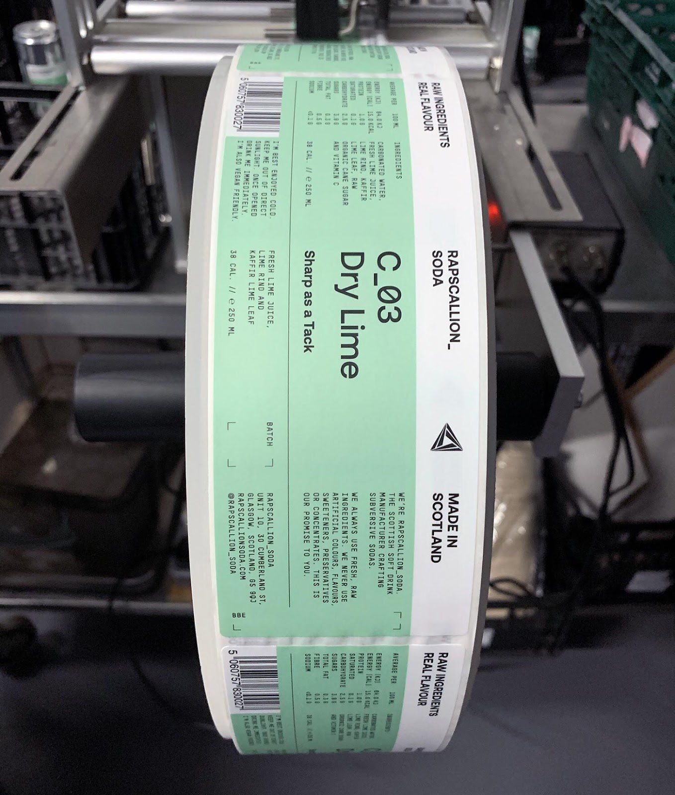
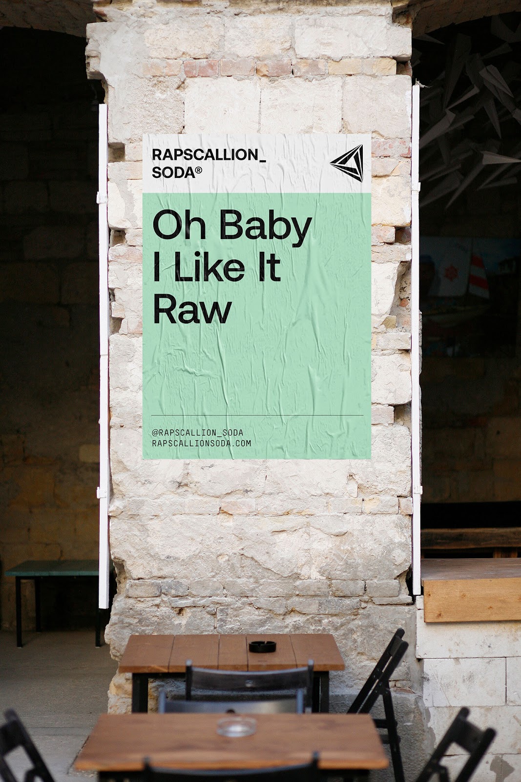
We've been working with founder Gregor Leckie to create a punchy new packaging design (new 250ml can) with real shelf standout. We wanted to build on the subversive nature of the Rapscallion name and better communicate the all natural ingredients. A product naming strategy was developed to work alongside a distinct and rebellious brand voice.
A sterile approach to layout, bold use of color and minimal type treatments help to differentiate core range and seasonal product lines. The deliberate short stop label highlights the cans base metal, hinting at a more clinical and scientific approach to production.
Project summary
- Visual Identity
- Packaging
- Merchandise
Project team
- 3D visualisations: Render Studio
Branding and Visual Identity