by abduzeedo
Discover how Nummies leveraged branding and visual identity to transform the superfood market, making health products appealing and unique.
In a market brimming with health-focused products, Nummies emerges as a beacon of innovation and appeal. Designed by Sweety & Co. in the United States, Nummies redefines the approach to superfoods, intertwining taste and nutrition in a remarkable way. This article explores how Nummies' branding and packaging design sets it apart in a competitive landscape.
Nummies, a mushroom-based superfood and vitamin company, confronts the challenge of distinguishing itself in a saturated market. The brand aims to provide nutrient-rich alternatives in a convenient and flavorful form, deviating from conventional health food perceptions. The challenge was significant: to communicate the authenticity and credibility of the brand while capturing consumer interest in a market flooded with similar claims.
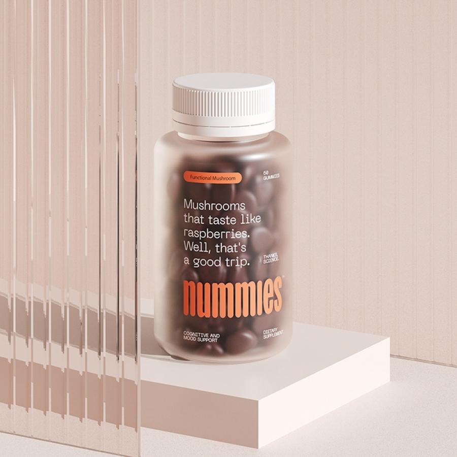
Sweety & Co.'s solution was a bold reimagining of branding and packaging design. Nummies' visual identity is instantly striking, whether encountered on store shelves or through e-commerce platforms. The design transcends the typical pharmaceutical and scientific aesthetics associated with health products. It instead opts for a vibrant and engaging visual language that captures attention and piques curiosity.
The packaging design is a blend of scientific credibility and approachable charm. It features irreverent, straightforward text, connecting with consumers in a direct and engaging manner. This approach not only differentiates Nummies from its competitors but also makes the product approachable to a broader audience, including those typically indifferent to health products.
Furthermore, the design retains common attributes of the health product category but reinvents them to be uniquely Nummies. The visuals developed for Nummies express the brand essence with a fresh and original approach, bringing a new perspective to the category. The goal was to make the brand not just visible but inviting and desirable, especially to an audience that usually shows little interest in healthy products.
In conclusion, Nummies’ branding and packaging, designed by Sweety & Co., demonstrate the power of creative visual identity in transforming perceptions of health products. The design succeeds in making healthy choices appealing, setting a new standard in the superfood market.
Branding and visual identity artifacts
For more information make sure to check out Sweety & Co. website at http://swt.co/
