by abduzeedo
Explore how Embacy crafts a high-tech brand identity for Kinescope, blending retro Kodak Super 8mm vibes with a modern RGB-inspired kinetic design language.
Kinescope is redefining the digital video landscape with a professional infrastructure that remains accessible to businesses of any scale. The challenge for the design team at Embacy was to visualize a product that is both technologically advanced and remarkably user-friendly. They needed a visual soul that could bridge the gap between complex video engineering and simple, intuitive utility.
The solution emerged from the very device that gives the brand its name. A kinescope converts electrical signals into light, a process the design team used as a core metaphor for versatility. The primary visual driver is a kinetic system inspired by the three additive color channels: Red, Green, and Blue. When these colors overlay in the brand’s motion work, they create white, symbolizing the all-in-one nature of the platform.
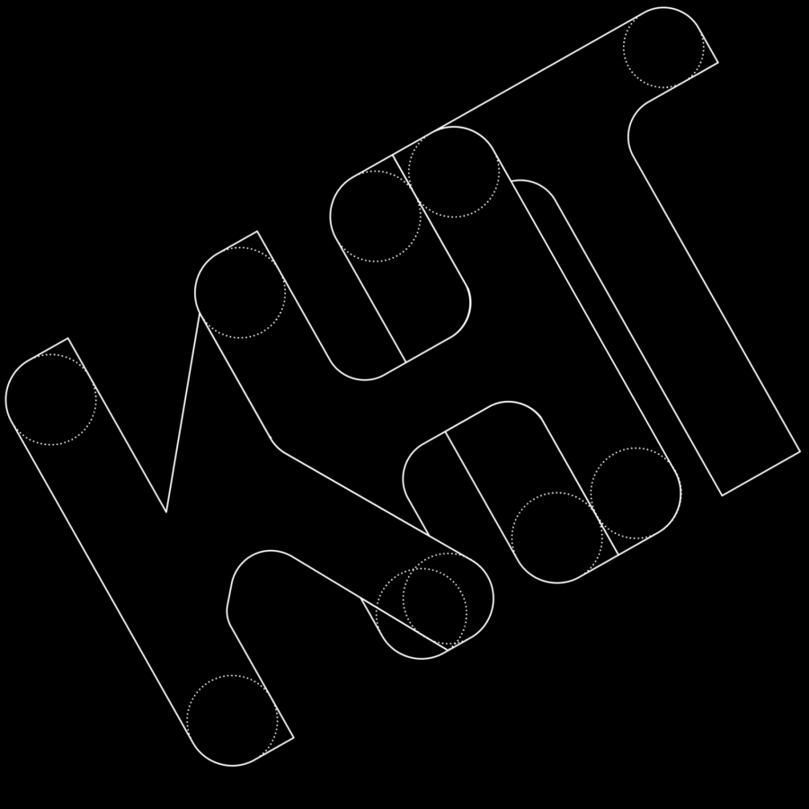
The logotype is a masterclass in meaningful minimalism. It features a simple line that transforms into the silhouette of a Kodak Super 8mm camera. This choice adds a layer of stylish retro nostalgia to an otherwise high-tech brand. Embedded within the mark are three distinct dots. These dots represent the three pillars of the Kinescope service: it is customizable, built for any business, and serves as an all-in-one tool. When viewed together, they form a "play" sign, anchoring the identity in the universal language of video.
Typography and layout in the project follow a structured, modern grid that feels as precise as the code powering the platform. Embacy moved away from corporate jargon to let the visual elements speak. The pattern system is a direct evolution of the logo, using simple shapes that can be scaled or masked to create complex 3D visual effects. This flexibility ensures the brand looks consistent whether it is on a mobile screen or a massive digital billboard.
By leaning into the "kinetic" nature of the identity, the designers created a brand that feels alive. It doesn't just sit on a page; it moves, shifts, and adapts, mirroring the way video content flows through Kinescope’s infrastructure. The result is a brand identity that differentiates itself from competitors by honoring the history of film while looking firmly toward the future of the internet.
Credits: Embassy, https://embacy.io/
Brand Identity


