by abduzeedo
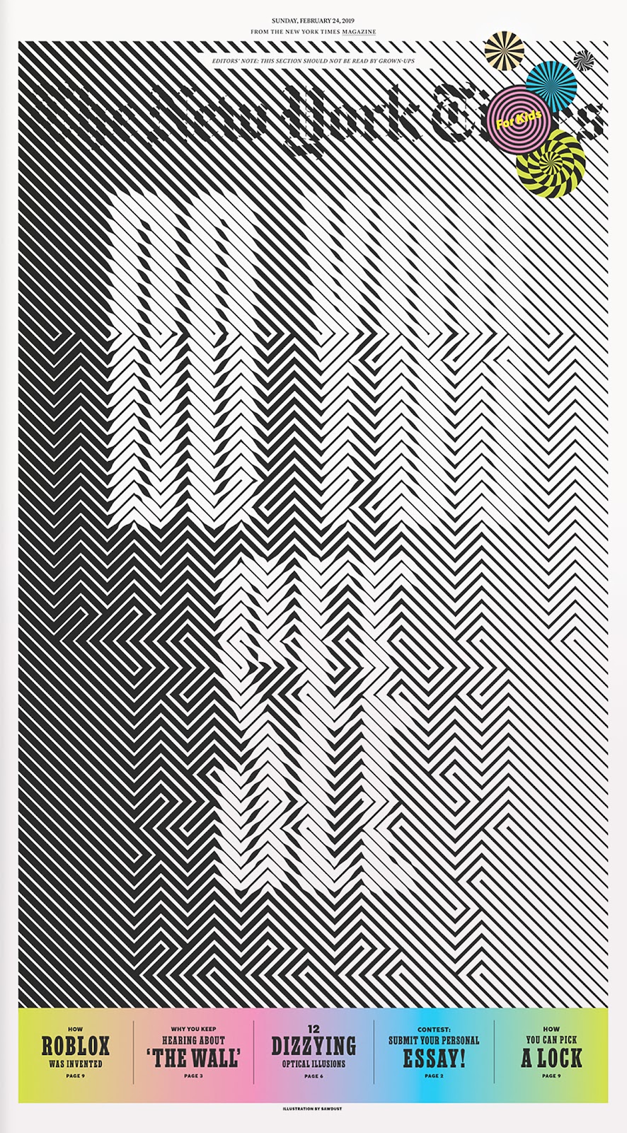
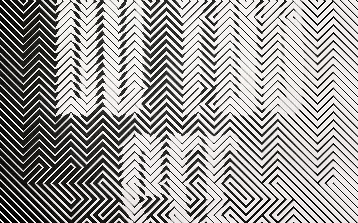
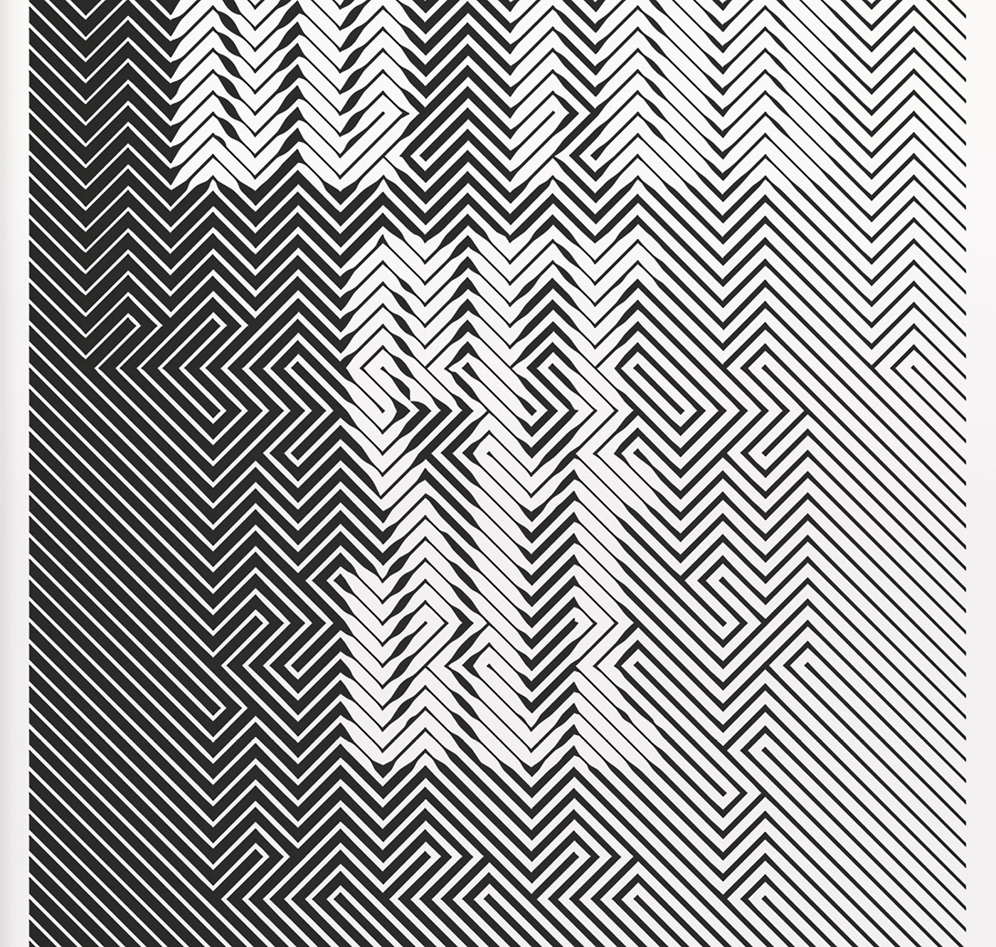
A couple of days ago I posted an article about some graphic design explorations using lines and other simple elements on a grid, like plus signs or dots. There were tons of really awesome ideas, however all of them were very abstract. One could ask me, how can we apply that to a real project. For my surprise, – Sawdust – had the answer right in my face. They posted a typography project on Behance titled: “Cover typography for The New York Times for Kids”. The project consists of 12 optical illusions created with lines with different stroke weights, as they mentioned: that will leave you feeling dizzy.
12 optical illusions that will leave you feeling dizzy.
Sawdust is the creative partnership of Jonathan Quainton and Rob Gonzalez. We specialise in bespoke and innovative typography, brand display typefaces, visual identities and image-creation for clients including: Nike, Wired, The New York Times, Apple, Converse, Adidas, Coca-Cola, and more.
For more information make sure to check out http://www.madebysawdust.co.uk
Credits:
Art Director: Debra Bishop
Typography