by AoiroStudio
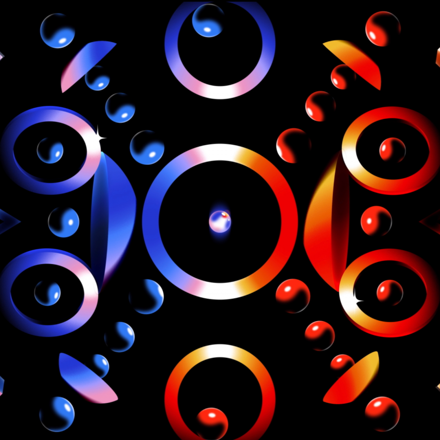
Let's take a pause and look at this illustration series by Oleg Belinsky named Futurism vs. Passeism. You'll notice the mixture of that black solid color, geometrics, lighting and gradients are just a combination of a stunning stylish art. I really love the tone and the details given to the white colour, just add an incredible final touch. I wish there was more of this series but time will let us know and I can't wait to see more of Oleg's work in the near future. Hope you dig it as well!
Published on Behance, this is the work from Oleg Belinsky who is a designer from Salaspils, Latvia. Being living close to the Baltic Sea, inspiration must have been coming from your surroundings. You should definitely follow his work.
Abstract Illustration

