Illustrator Quick Tips #2 - Scatter BrushesListThumbs

Illustrator Quick Tips #2 - Scatter Brushes
Brushes are very useful in Photoshop. We may create all sorts of effects, from clouds to grunge brushes and many others. In lllustrator it is no different, actually it's easier to create and use brushes than in Photoshop because you can preview how they will look and edit them in real time, what makes a big difference. Creating brushes is really simple: just drag a shape to the brush panels and that's it! You got yourself a brand new brush.
Step 1
Open Illustrator and create a new document. Type the text you want or use your logo. I've used the Abduzeedo logo for this one.
Step 2
Create some basic shapes that will be used to create the brushes. I've used an ellipse, a triangle and a square. Then go to Window>Brushes to open the Brushes Panel. With the Brushes Panel opened now just drag the shapes into it to create a new Brush. A dialog box will appear, then choose New Scatter Brush and press OK.
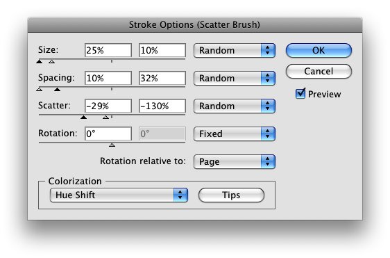
Step 3
Let's edit the first Scatter Brush. You will have 4 main settings: Size, Spacing, Scatter, and Rotation. Change the size, spacing and scatter to Random and use the values below. Also for the Colorization use Hue Shift.
Step 4
Apply the brush to the logo. I used a light blue for the stroke.
Step 5
Repeat the same thing using the triangle brush, you may open the Edit Dialog Box by double clicking on the brush. Use yellow for the color.
Step 6
Now let's edit the square brush, repeat the same technique used for the other brushes and use pink for the color.
Step 7
Click on the Brush Library Menu icon (1) and select Decorative then Decorative Scatter to open that library. Select the Dot Rings brush (2). Then edit the brush and once again play with the Size and Spacing, after that just apply it to another copy of the logo.
Step 8
Now just align the 4 different versions of the logo and you will have a very nice effect. You may try differentthe stroke orders, like pink in the front or yellow for example.
Step 9
Just another variation using only the dot rings brush and then apply a Gaussian Blur (Effect>Blur>Gaussian Blur) to some elements to create a depth of field effect.
Conclusion
The brush engine in Illustrator is as powerful as in Photoshop or maybe even more powerful because we can edit the stroke settings anytime. It's a nice technique and if you want, you can expand the appearance creating shapes from the stroke and apply the 3D extrude filter to create a very cool effect.
Click here to download the AI file
Click here to download the Illustrator file used for this tutorial


26 Comments
Nice technique. I'll have to put this in the favorites for future reference.
cool tutorial!
all of these tuts/tips are crazy helpful/inspiring.
the tut file is missing :(
Wonderful effect! Thanks for sharing :D
i made a few scatter brushes a few days ago, weird.
This may be too obvious, but how do you do step 4? How do you "apply" the brush to the logo?
this will be very helpful!! thanks!
Ok, I love this brush effect, but i think illustator is better than photoshop. So I think I'm tired and I don't know what I mean. Sorry! XD
C U !
Nice trick :D, the download links dont work :(
Nice. Great tutorial. Thanks!
Great tutorial, thanks.
I am very new to using illustrator and got a bit stuck as the illustrator file mentioned above is no longer available.
I would love some pointers on how to get text into illustrator and have the brushes go around it like they did in your tutorial.
thanks,
Matt.
Matthew,
Make sure you have 2 different text boxes with the same text. Make one white and one black. If you are using a black background you want to apply the "scatter brush" to the black text. Do to this, select the black text > select the scatter brush you made in the brush pallete. This should apply the brush for you.
In order to align it with your white text, select both text boxes (make sure your "Selection Tool" is selected). Once you have both text areas selected, use the "Align" feature to align.
nice tutorial...i'm a newbie in using illustrator...still trying to use it each time..
Nice tutorial. The AI file is missing by the way.
Thanks
nice tuto ;)
Nice result and great tutorial. Here is what I came up with:
http://www.flickr.com/photos/34207052@N02/3336076125/
Note: I am still learning how to use Illustrator, so not everything is as I wanted it to be.
Comments how to improve it are always welcome.
link for AI broken :( --- still a sweet & short tutorial.
Muito bom, realmente é fantástico, não conhecia o illustrator, agora estou começando a usá-lo para trabalhar com arts vetoriais, parece ser muito melhor que o Corel.
Wonderful result Fabio!
use this to link to the files used in the tutorial.... there just misplaced in the site
http://www.abductit.com/files/tutorials/Illustrator_Quick_Tips__2_-_Scat...
Nice use of decorative scatter in strokes... Looks cool with a black background!
very nice! thank you!
the link to the ai is wrong though.
its here: http://www.abductit.com/files/tutorials/Illustrator_Quick_Tips__2_-_Scat...
Dude That Was Cool and Simple.
Keep Up The Good Work
brilliant little tutorial.
I've actually done this effect in designs the tear-your-eyes-out-one-at-a-time way before because i didn't know this. That is quite a few hours of my life wasted. But never again now!
:D
great tutorial ... but can someone tell me what's the name of the font ?
Post new comment