by abduzeedo
Last Saturday I went to the movies to watch Wall Street Money Never Sleeps. It was a nice movie, even though I was expecting something much better in terms of story and special effects, there were some cheesy ones, however in the end during the credits the design they created a really nice animation with money illustration, I don't know the name of the effect in english, but I loved it, so I came back and decided to try to do that in Photoshop.
So in this tutorial I will show you a nice technique to create a simple money style illustration using a regular photo, it's not as perfect as the money illustrations we see in the dollar bill for example, but it's a quick tip. There might be different ways so if you know another one share with us, this was the one I came up with and it's very easy.
Step 1
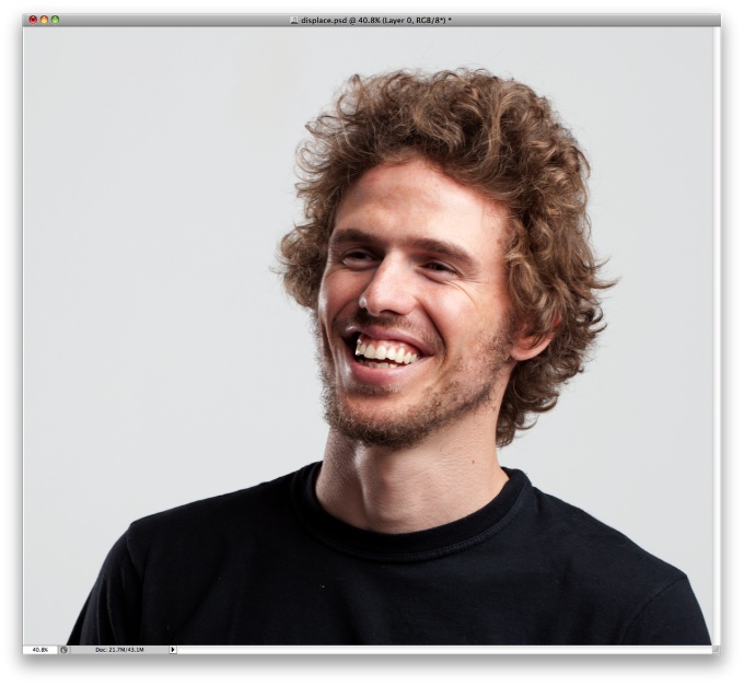
Open Photoshop and use a photo that you have or want to apply the effect, in this case I will use of myself, the one I use on Twitter. This photo was taken by John Arlington and you can get more info about him at http://dbox.com.br
Step 2
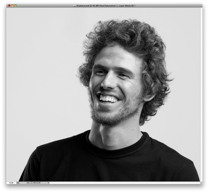
Go to Image>Adjustmenst>Desaturate.
Step 3
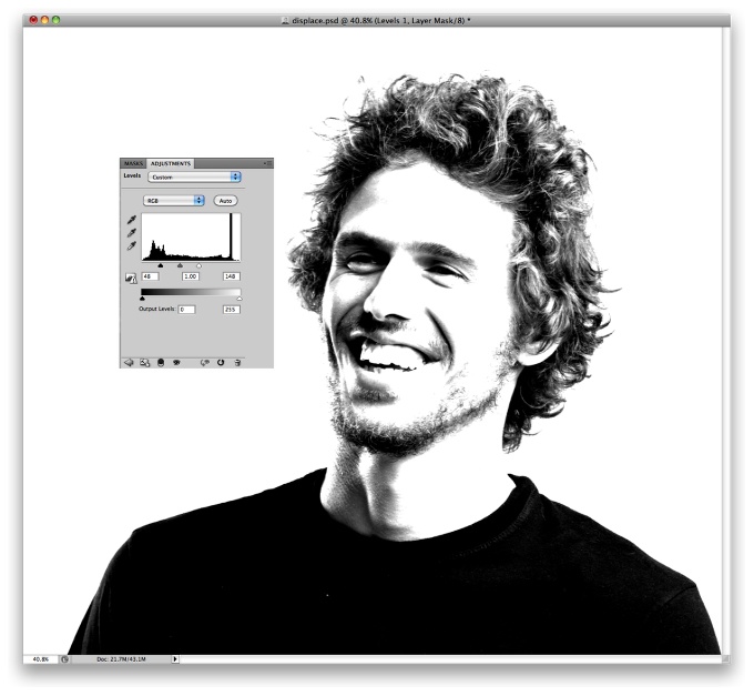
Go to Image>Adjustments>Levels. Change the black input to 50 and the white to 150, also, change the grey input to1.
Step 4
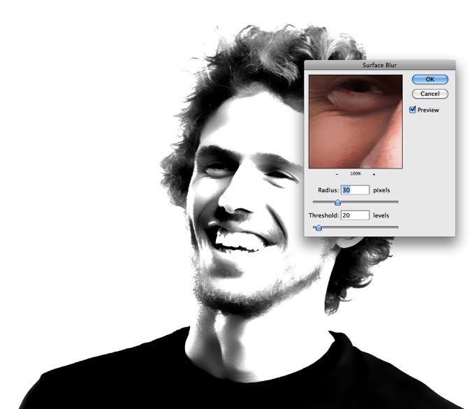
Go to Filter>Blur>Surface Blur. Use 30 pixels for the Radius and 20 for the Threshold. Save this PSD file as Displace.psd. We will use 2 files for this tutorial, one will be the displace and the other the real design.
Step 5
Undo some of the steps until you get the greyscale image. Save it as me.psd. Then go to Image>Adjustments>Levels. Use 15 for the black input, 1 for the grey and 205 for the white.
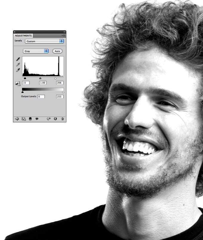
Step 6
Go to Image>Mode>Greyscale, then go to Image>Mode>Bitmap. Use the default settings, my output is 240 pixels/inch because my input is the same, so that value will vary depending on the input you have. Also for the Method use Halftone Screen...
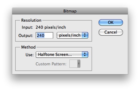
Step 7
The next dialog box will be the Halftone Screen settings. Use Line for the Shape and 30 lines/inch for the frequency. Also, change the Angle to 0. Tip: Depending on the resolution of your image the frequency might change, so you will have to try some values until you get the best result.
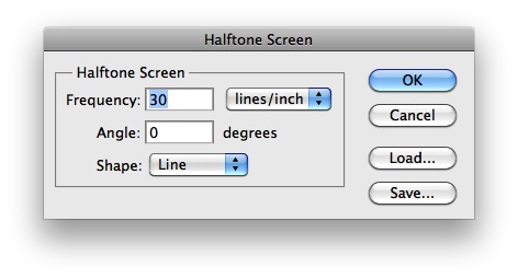
Step 8
This is the result you will have after you change your document to Bitmap mode. Now let's change it back to Greyscale. Go to Image>Adjustments>Greyscale.
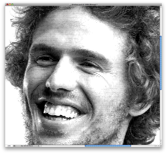
Step 9
Go to Filter>Blur>Gaussian Blur. Use 0.5 pixels for the Radius. You can use 1 as well. All these values will vary depending on the resolution of the image you are using.
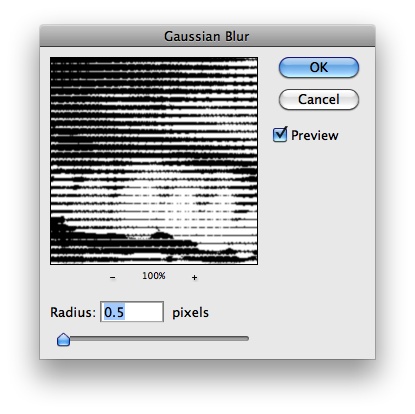
Step 10
Go again to Image>Adjustments>Levels. Change the white input to 110.
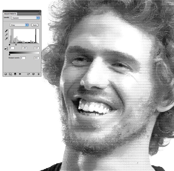
Step 11
Go to Filter>Distort>Displace. Use 1 for the Horizontal Scale, 3 for the Vertical and then Stretch to Fit and Wrap Around for the other options. Press OK. Another dialog box will open to select the Displace map. Select the Displace.psd file we created in the step 4.
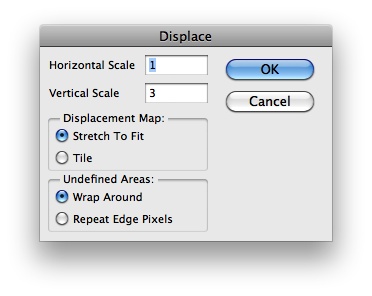
Step 12
Now the displace filter will distort the image so the lines won't be uniform and horizontal.
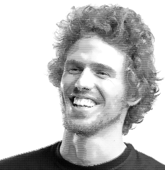
Conclusion
Now you can add your logo and play around with other effects. The displace filter is one of the coolest filters in Photoshop because we can create tons of different effects with it, like this tutorial. As I mentioned before the whole idea for this tutorial came when I was watching the credits of Wall Street Money Never Sleeps move where they show some money designs.

Detail
You can play a little bit more increasing the level and also the gaussian blur.
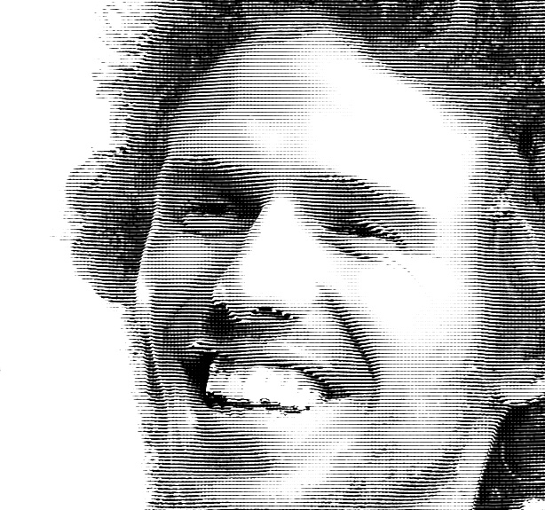
Another Example
Here you can see another version using a paper texture and then with Hue and Saturation I gave this green tone to the design. Also use color burn for the blend mode for the image layer that will be on top of the texture.

Detail 2
