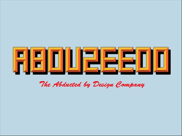
by abduzeedo
Last weekend I was, once again, stuck waiting more than 4 hours in aiports. So I was checking out some skateboard deck designs and found an amazing one from Girl Skateboards. The cool thing about that design was the effect, reminded me of those old signs that were painted on the walls, in old factories and industries.
So in this tutorial I will show you how to create an effect pretty similar to that one, but the idea of this tutorial is to show you how to select the correct Blend Modes when playing with textures. Also we will use Illustrator to create the font for our sign, in this case with the word Abduzeedo, of course :)
Step 1
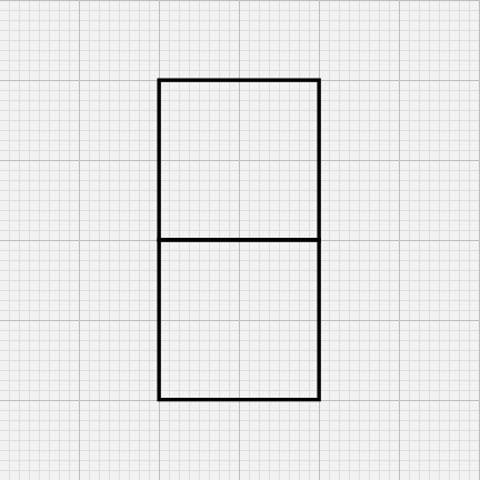
Open Adobe Illustrator and create a new document, then go to View>Show Grid, then View>Snap To Grid. After that with the Rectangle Tool (M) create 2 squares like the image below. Use only stroke and leave it without fill.
Step 2
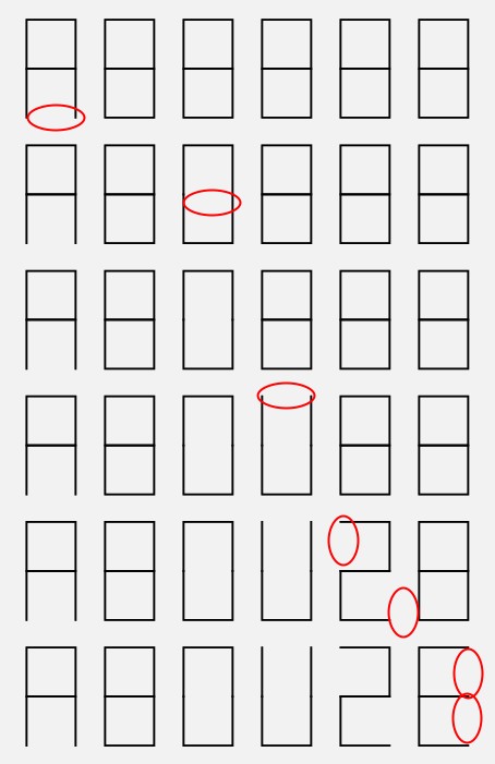
Basicaly what we did in the first step was to create a module for the letters. Now duplicate 4 times to have modules for the letters A, B, D, U, Z, E. With the Direct Selection Tool (A) start deleting segments of the module in order to create the letters. It's really simple and won't take you more than 5 minutes.
Step 3
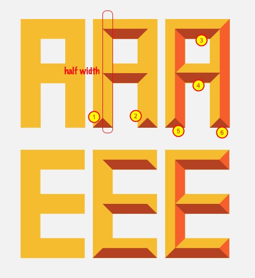
Now increase the stroke to something like 50-60 pts. After that go to Object>Path>Outline Stroke. The stroke now will be transformed in a object with fill.

Step 4
To create the 3D effect is pretty simple and we will use the Rectangle Tool (M). First thing is to create some references like the triangles 1 and 2. Then it's easy, it's just create other segments and with the Direct Selection Tool (A) you can edit the vertices. If you want to add points use the Pen Tool (P). Also I used 2 shades of orange, one lighter and one darker. So the light is coming from the top so the darker will be always at the bottom (3-6).
Step 5
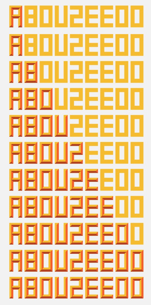
Here is just an idea of the whole process, once again, it's not complicated and it's a good exercise if you want to practice a little bit of Illustrator.
Step 6
For the O you can go to Effect>Stylize> Round Corners. Use a small value, something like 2 or 3 for the Radius. Also duplicate the word Abduzeedo and fill it with black, go to Arrange>Send Back so it will be behind the 3D text. After that just add a little text using a Brush Script Std Medium font with red and just add a very light blue background.
That's it, the illustrator part is done and it's a quite cool design already.
Step 7
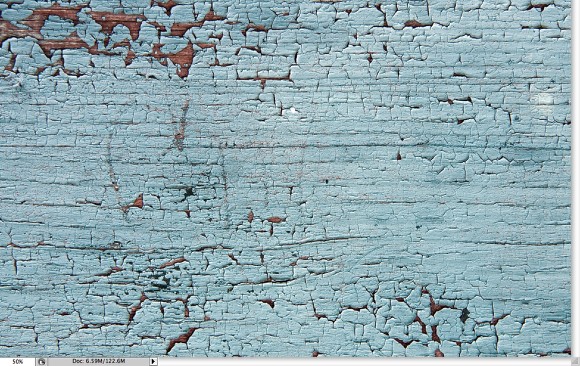
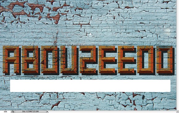
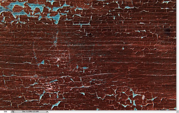
Now go to Photoshop. Create a new document. I'm using 1920 x 1200 pixels for the size. After that import a nice wooden texture with some peeling paint. The one I used is courtesy of Shutterstock and can be downloaded here.
Step 8
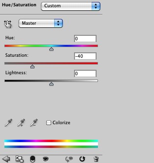
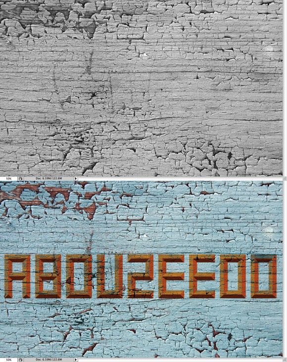
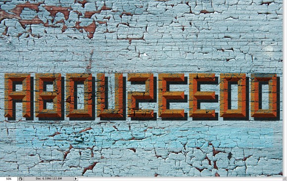
Let's reduce a bit of the Saturation. Go to Image>Adjustments>Saturation. Change it to -40. That will make the blue a bit more grey.
Step 9
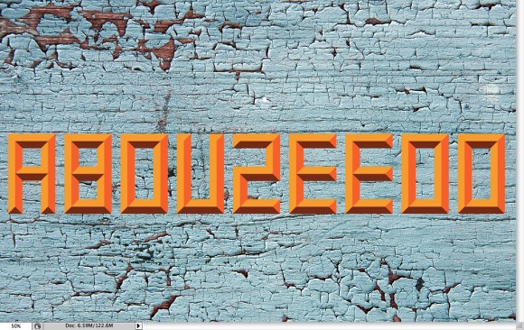
Copy the Abduzeedo word from Illustrator and paste it in Photoshop. Choose Paste as Smart Objects in case you need to change the colors.
Step 10
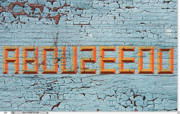
Duplicate the wooden texture and move it to the top, in front of the Abduzeedo word and go to Layer>Create Clipping Mask. Change the Blend Mode to Darker Color. The cool thing is that we get the blues and the brows of the peeling texture instead just black or dark shades if we had used Multiply for example. It's a great Blend Mode for this type of aged design.
Step 11
Duplicate the texture and go to Image>Adjustments>Desaturate. Put it on top of the othe texture again as a Clip Mask. This time however change the Blend Mode to Multiply. The idea is to darken a little bit the word Abduzeedo.
Step 12
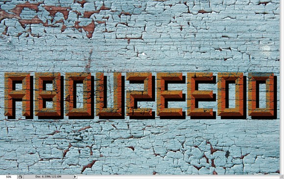
Copy the shadow in Illustrator and paste in Photoshop behind the Abduzeedo 3D word.
Step 13
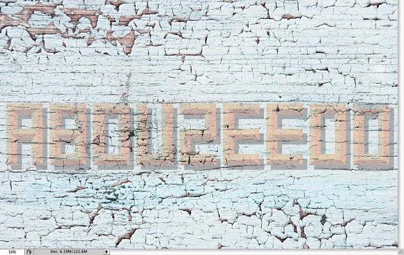
Duplicate the background texture and go to Image>Adjustments>Desaturate. After that go to Images>Adjustments>Invert. Arrange the texture so it will be in front of the shadow layer.
Step 14
Go to Layer>Create Clipping Mask. After that change the Blend Mode of the texture layer to Lighten. The Lighten Blend Mode is perfect because it will show the texture and lighten the very dark vector shadow, making the effect much more realistic.

Step 15
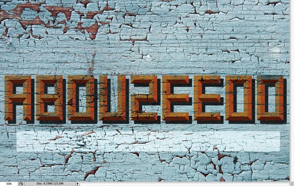
With the Rounded Rectangle Tool (U) create a white rectangle below the the Abduzeedo word.
Step 16
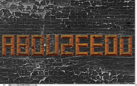
Duplicate again the background wooden texture and go to Image>Adjustments>Invert.
Step 17
Move the inverted text layer so it will be in front of the white rectangle. Go to Layer>Create Clipping Mask. After that, change the Blend Mode to Difference.
Step 18
Duplicate the background texture again and go to Image>Adjustment>Desaturate. After that go to Image>Adjustments>Levels. Increase the white input so the color of the texture turns to white.
Step 19
Go again to Layer>Create Clipping Mask. Also reduce a little bit of the Opacity to 70%.
Conclusion
Now just add the final text again repeating the same process we did for the word Abduzeedo. The blend modes will be almost the same, but now we understand how the Darker Color and the Lighter Color work; and specially which cases to use it. Of course you can apply them in totally different ways, that's the best thing about Photoshop, you can always find new ways and solutions for the same problem. It's all about playing.
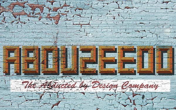
Click on the image for full preview
Download the Photoshop File
Click here to download the Photoshop file used for this tutorial


")


