by ibby
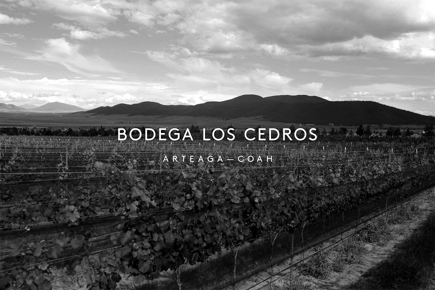
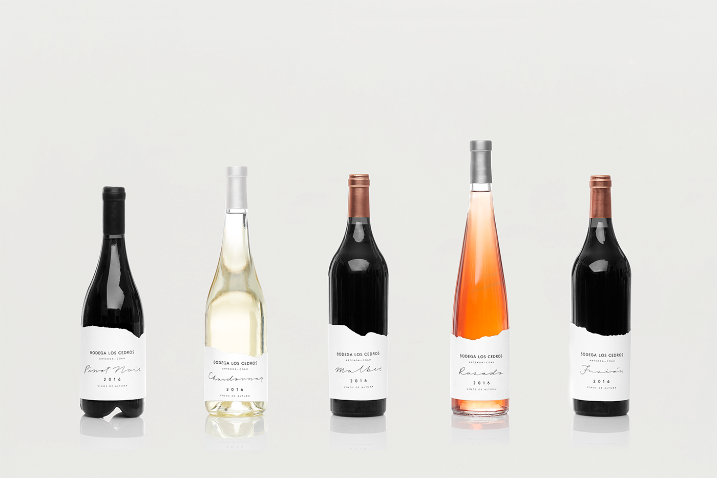
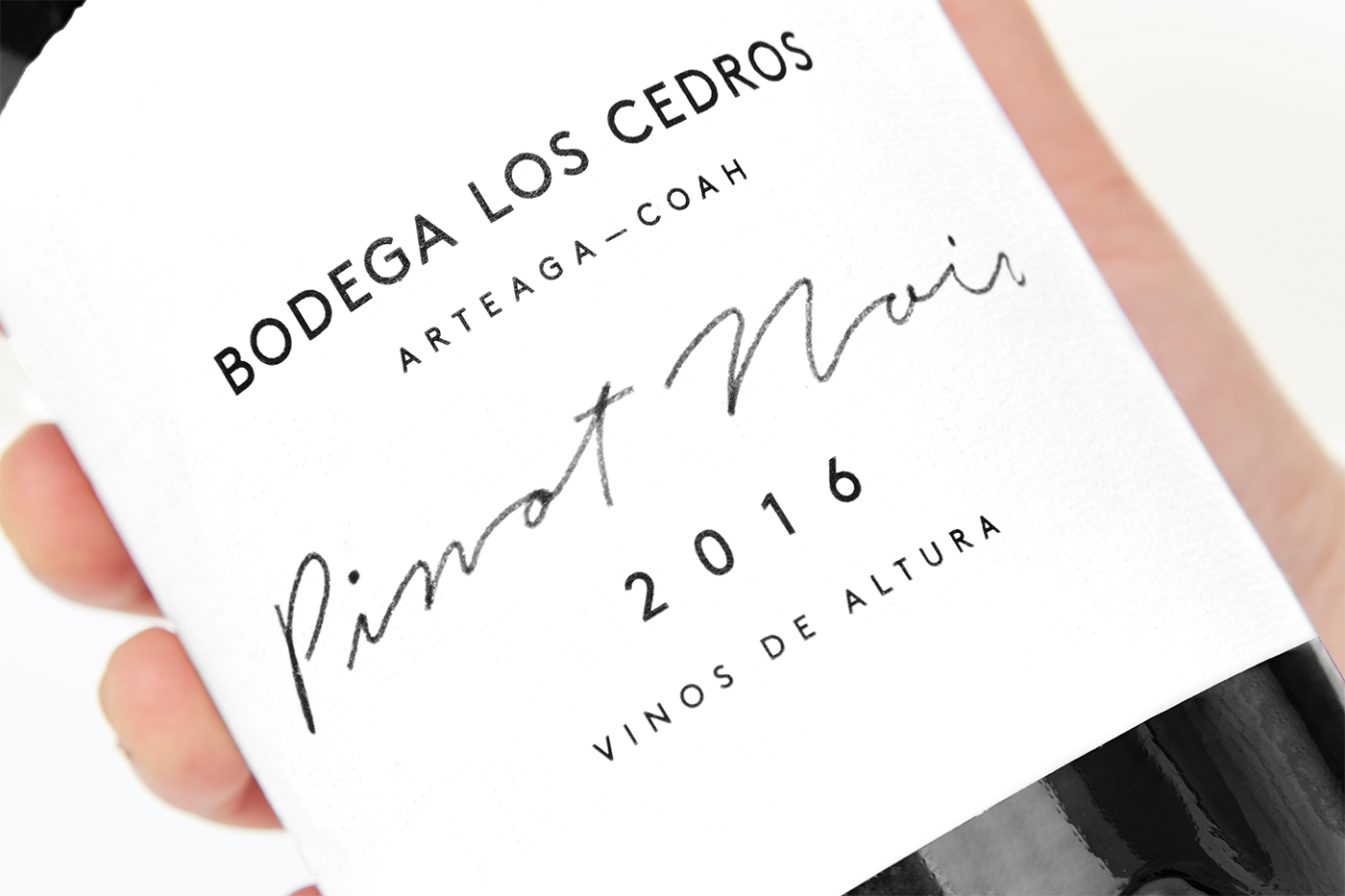
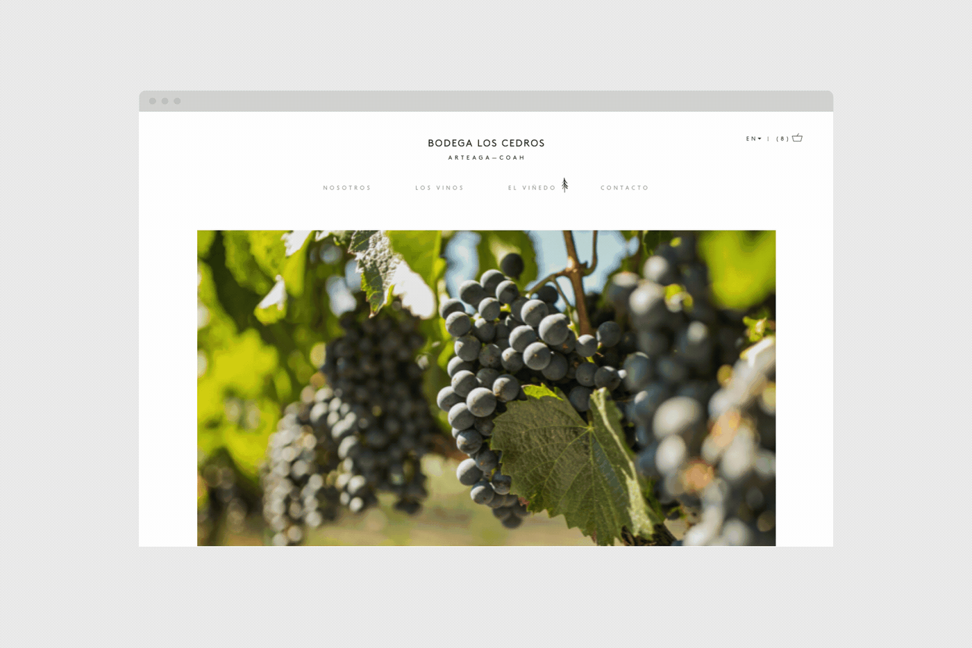
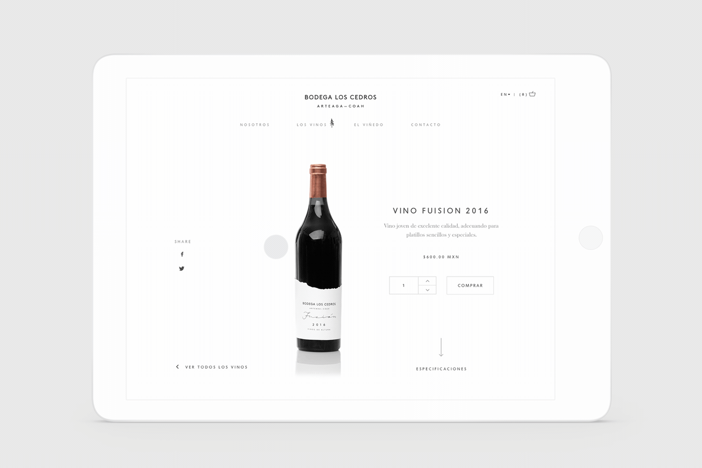
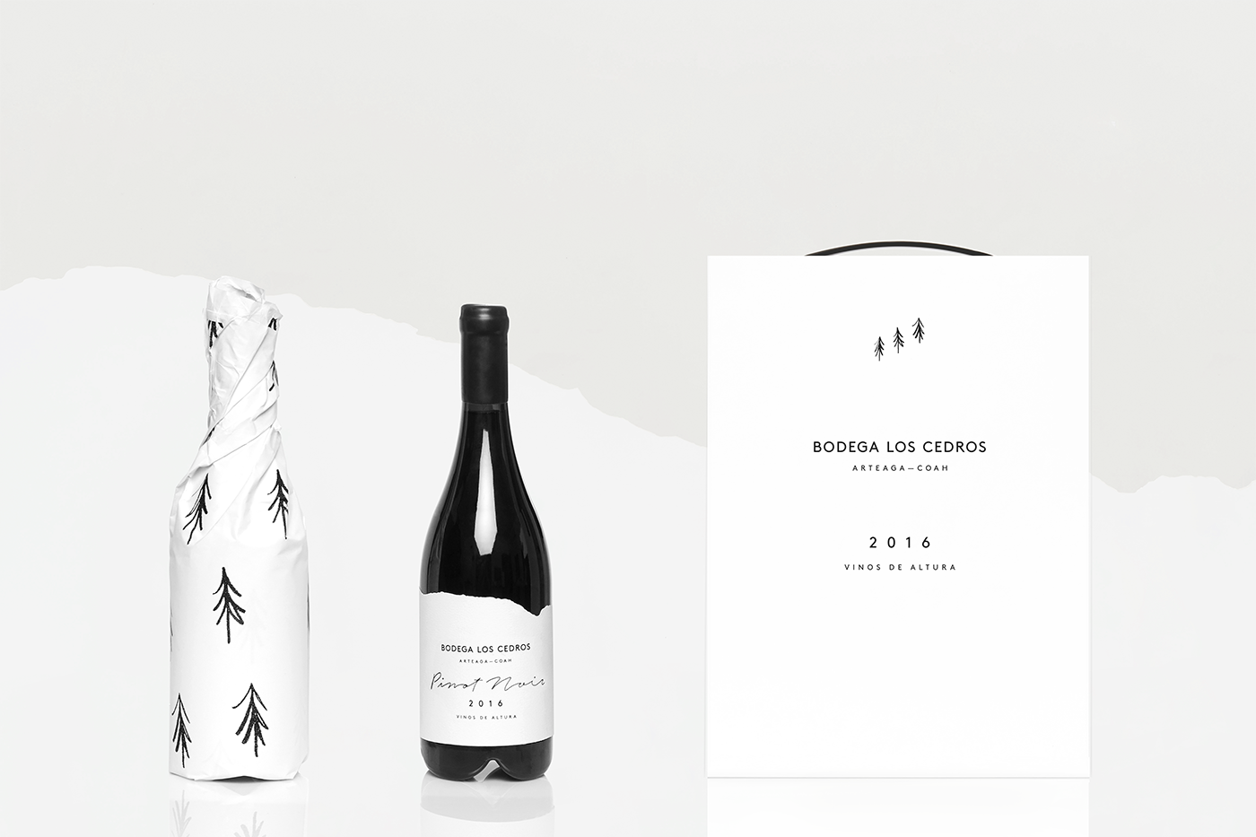
Bodega Los Cedros is a Mexican vineyard located in the mountains of Arteaga, Coahuila. The origins of the name derive from a passion and dream of a family to produce high quality wines within a region more than 100 years old named "El Cedrito." Enter the talented team at Anagrama Studio to bring the branding vision of this magical place to life by tapping into the geographical location of the vineyard for inspiration. The end result, a beautiful brand identity that employs the characteristic components of the area such as climate, altitude, flora and fauna. We particularly love the simplicity of the logo highlighting three pine trees as the brand's distinctive icon along with the wine label and die-line mimicking cloud shapes. From a typographic standpoint, we can enjoy a sans serif that adds a touch of modernity while the script gesture preserves a more organic touch showcasing the brand's marriage of simplicity and elegance. The color palette is nice and neutral enabling a spotlight on the diverse wine color tones while accentuating the contrast between bottle and label. Cheers to the Anagrama team for a beautiful execution celebrating this beautiful wine label.