by abduzeedo
Last week I was talking to Aloa, one of the Abduzeedo writers, and he was showing me some images that he thought were cool for tutorials, one of those had this mix of vectors and gradients but very geometric. It was a nice inspiration so I decided to do something mixing Illustrator and Photoshop.
In this tutorial I will show you how to create an abstract image for a poster using Illustrator and Photoshop. We will do all the vectors and shades in Illustrator then in Photoshop we'll give to the image a nice retro style using some textures and brushes.
Step 1
Open Adobe Illustrator and with the Rectangle Tool (M) create some rectangles. Make sure they are aligned and, also, that you have different heights and widths. Use the image below for reference. Tip: you can duplicate the rectangles by holding the ALT key and moving the object.

Step 2
Select a few rectangles, move them to the right holding the ALT key to duplicate them. Now you will have 2 columns.

Step 3
Repeat the same thing, but now to the left to create a third column.

Step 4
Again repeat the same thing you did in the previous steps, now to create the fourth column. Notice that I also added a few new rectangles. You can create more rectangles or columns if you want as well.

Step 5
Select the first column and go to Object>Transform>Shear. Use -40 for the Shear Angle and Vertical for the Axis.

Step 6
Repeat the Shear transformation to the other columns. Use 40º, -40º, 40º and -40º for the angles.

Step 7
Now start filling the rectangles with gradient and solid colors. I used 3 colors to create the shades. Pink, Yellow and Cyan. Use the Gradient Tool (G) to create the gradients, such as: Pink to Yellow and Cyan to Yellow. Also leave some white rectangles.

Step 8
Apply line patterns to some elements. I used the Basic Graphic_Lines library that comes with Adobe Illustrator. Just go to Window>Swatch Libraries>Patterns>Basic Graphic_Lines. Use different patterns to the elements (1-4).

Step 9
One of the best features in the new version of Illustrator is that now we can have different opacity for the gradient colors. What I did here was pretty simple. Duplicate some rectangles and move them to the opposite column so the angle will be the opposite. Then add a Gradient from Black to Black but in one end change the opacity to 0, so it will be from black to transparent. That will add a nice style to some areas of the image, creating nice shades.

Step 10
Now just create a black rectangle beneath the vectors so you can make some adjustments. Notice that the there are more elements like black rectangles. Here you work on the final adjustments and details, because in Photoshop you won't be able to edit the elements, unless you come back to Illustrator using the Smart Objects feature.

Step 11 - Photoshop
Select all vectors but the black recangle. Copy them in Illustrator and then open Photoshop. Create a new document. I used the A4 format. Fill the Background layer with a very dark grey #080a0f, then paste the vectors as Smart Objects.

Step 12
Duplicate the vectors layer, that is a smart object then go to Filter>Blur>Gaussian Blur. Use 20 pixels for the Radius and change the Blend Mode of the layer to Screen. For the opacity use 80%.

Step 13
Create 6 rectangles and fill them with a gradient from Black to Transparent. You can use Black and White with Multiply for the Blend Mode. Just make the Gradient size different for each element like the image below (1-6)

Step 14
Now lets add some space effects. First, create some stars using the Noise Filter. You can follow that from another tutorial I wrote you can find it at http://abduzeedo.com/surprise-behind-curtain-photoshop, the Step 3. Also let's use a nice flare effect. I used a photo to do that, you can find it at http://weheartit.com/entry/327989. Place the image and just change the Blend Mode to Screen.

Step 15
To get a very vintage style to the image I used a paper texture. You can download it at http://www.danevins.com/_wizardimages/old_paper.jpg. Change the Blend Mode to Multiply and the Opacity to 80%.

Step 16
Create a new layer right below the paper texture. Then using some Grunge Brushes paint some areas to give that old style effect. Use white for the color, but as the layer will be beneath the paper the color will be a sort of beige. Tip: The brushes I used are from misprintedtype.com, created by the Master Eduardo Recife.

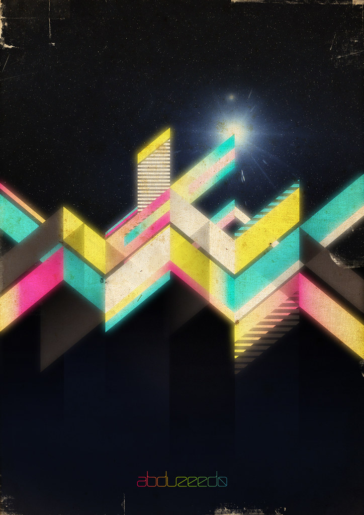
Conclusion
The new version of Illustrator has very useful features, like the opacity in gradients. Also the Smart Objects integration between Illustrator and Photoshop allows us to edit vectors in illustrator while working on the image in Photoshop, what is really useful too. I'm a big fan of vintage style images and in this tutorial I showed some techniques to create that. I hope you like the tutorial. Enjoy.
Download the PSD File
Click here to download the Photoshop file used for this tutorial.


