by abduzeedo
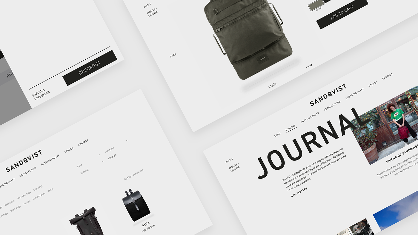
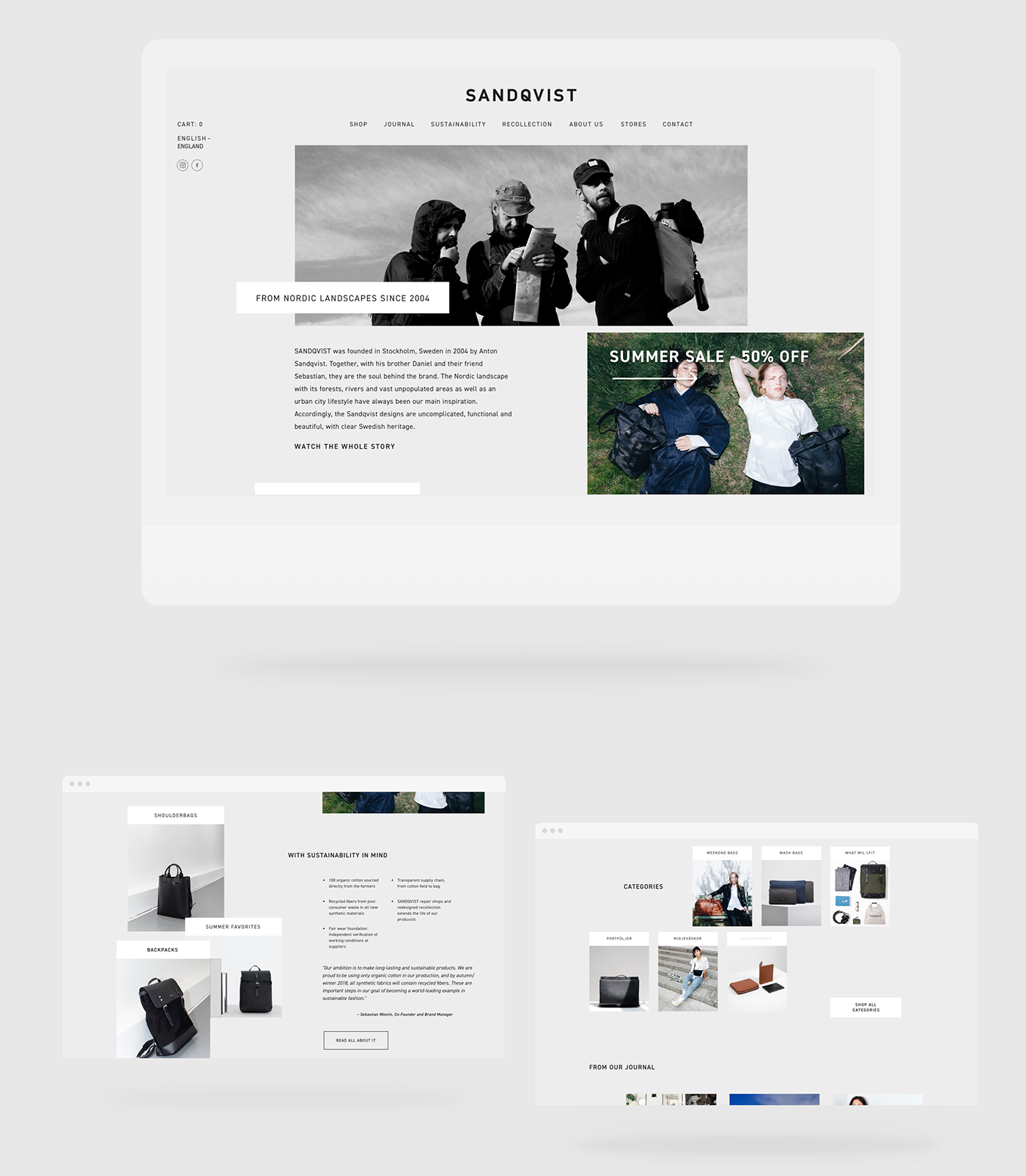
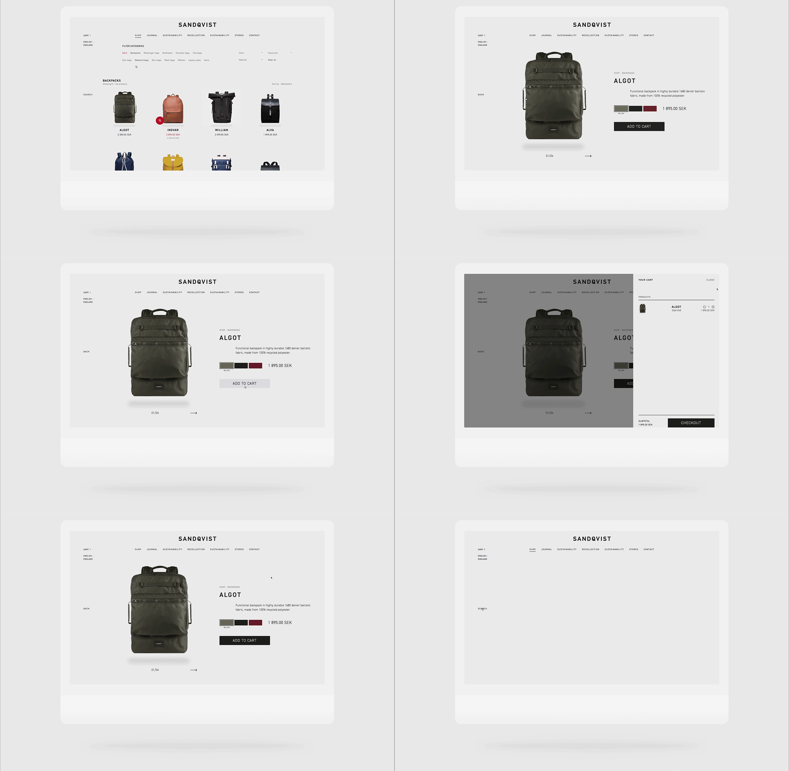
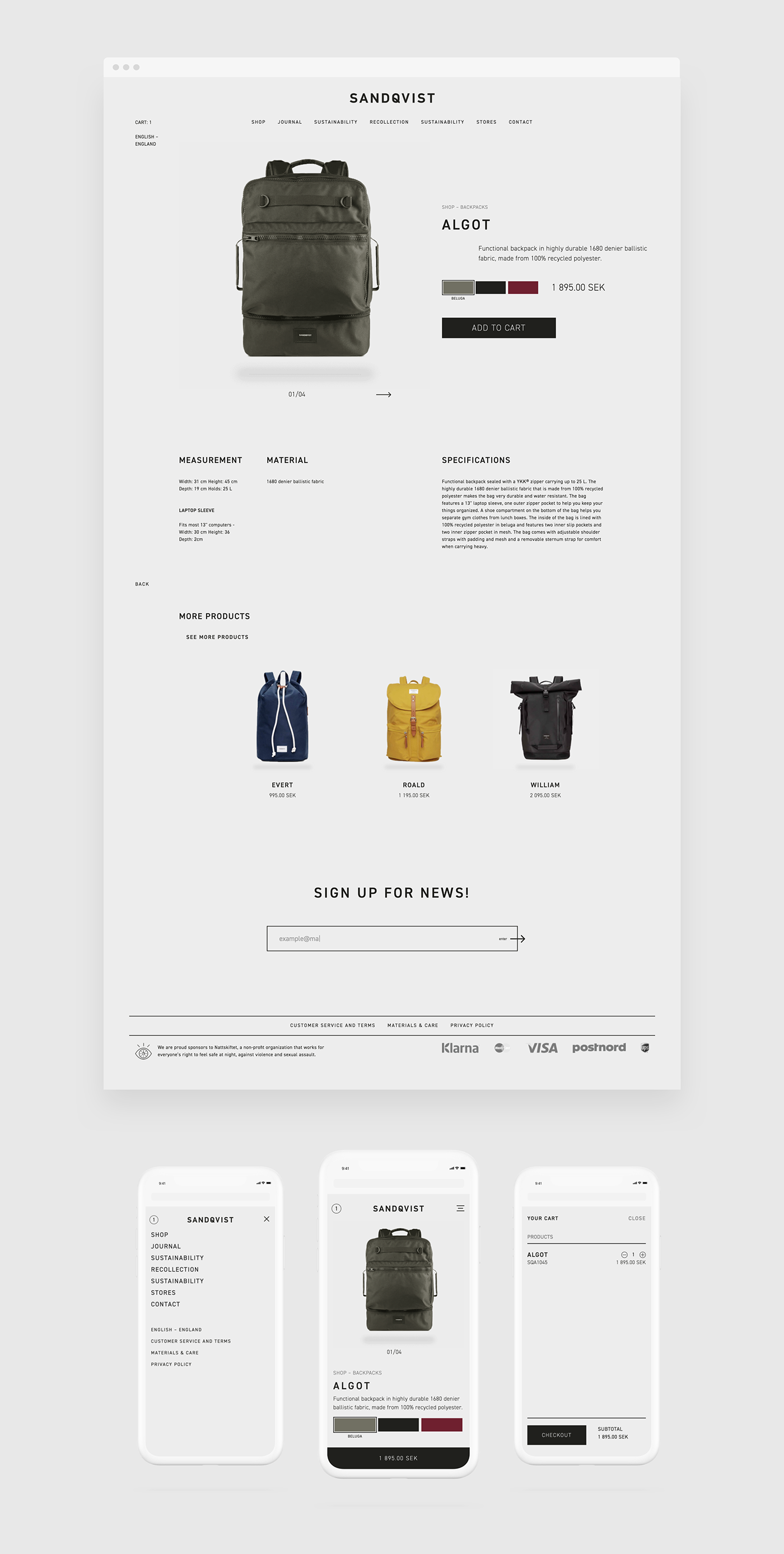
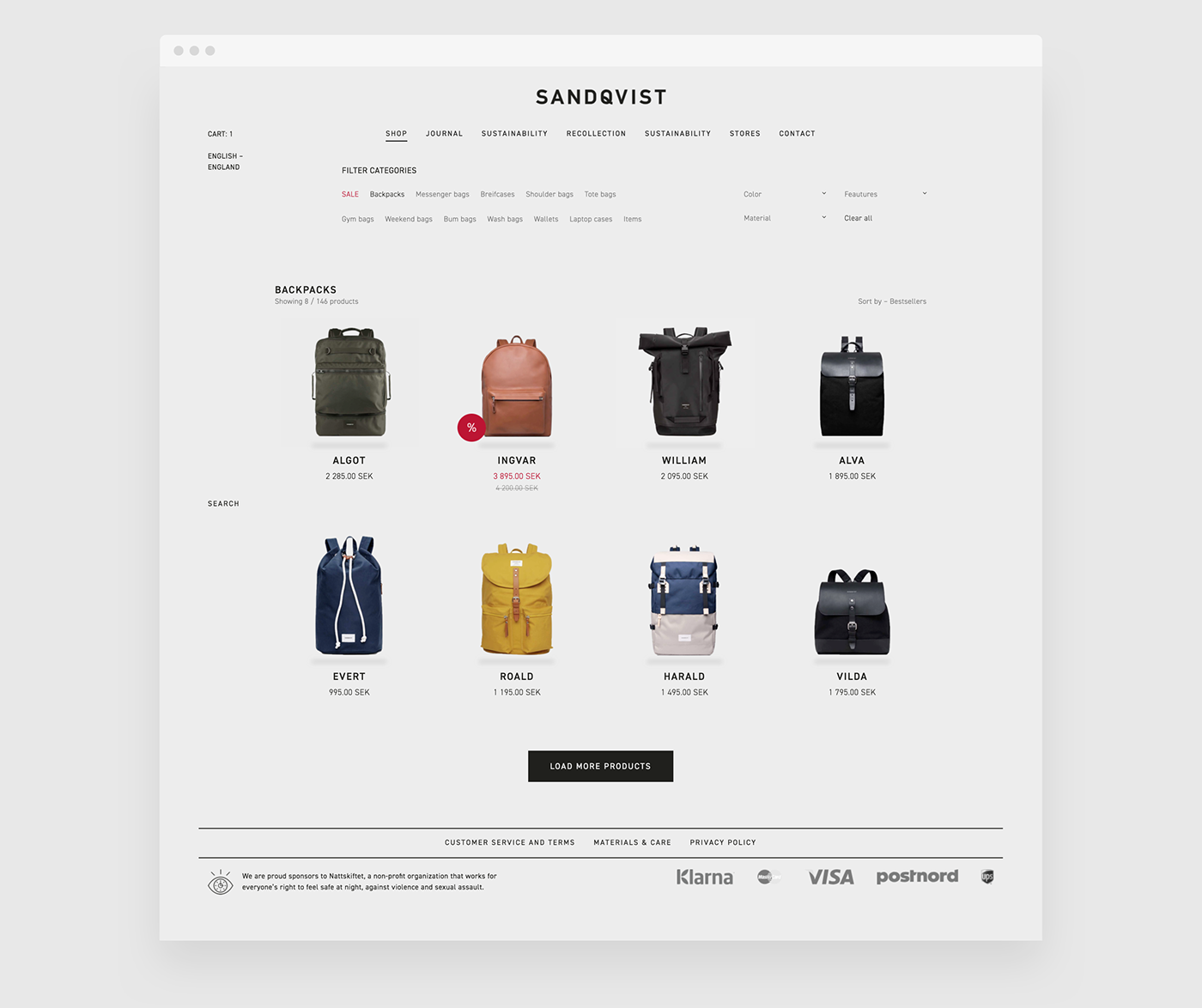
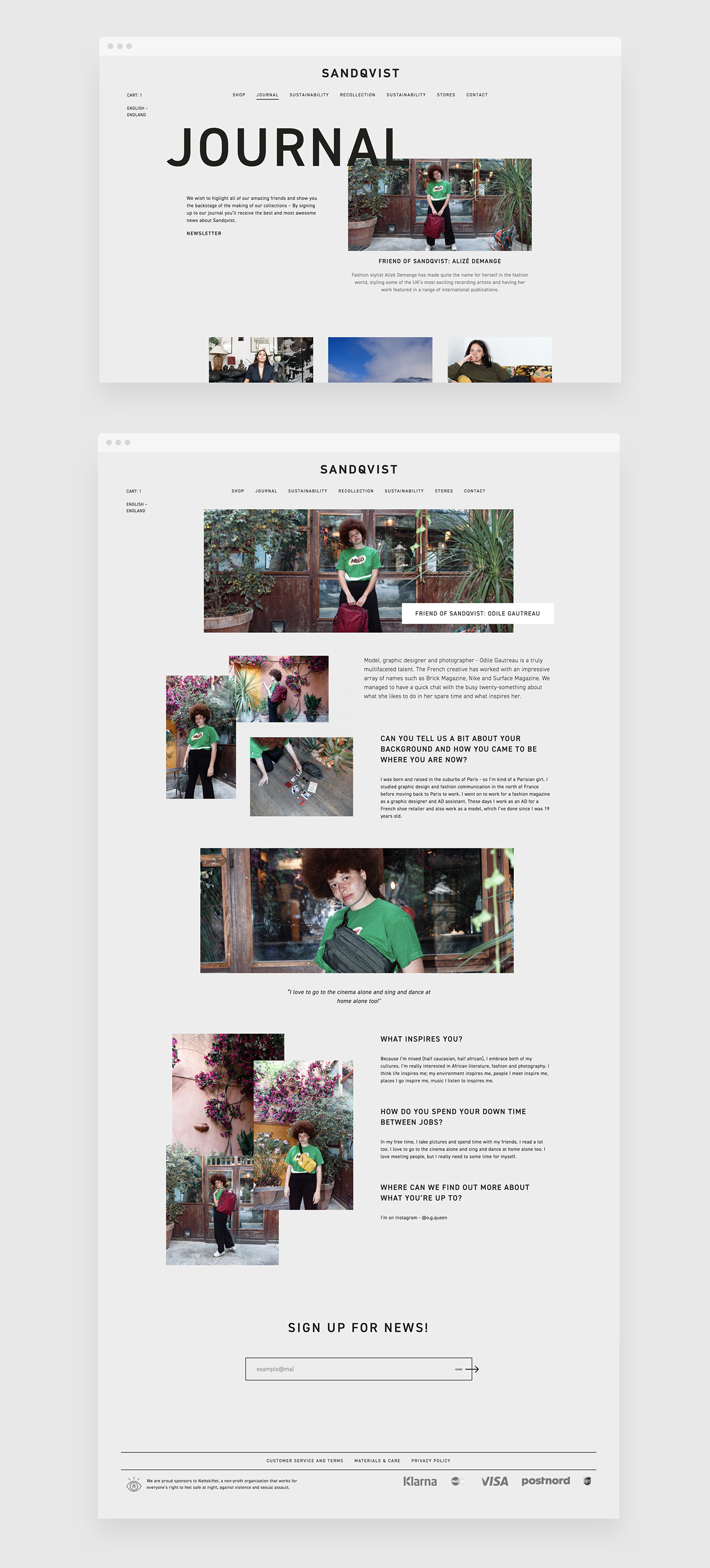
Lucas Olsson shared a really cool web design concept for the Swedish brand Sandqvist. There are a lot of things to love about this project, I would highlight the minimalist look with excellent typography and of course the black and white theme. As you probably already know, I am a fan of that look and have been trying to explore it here for Abduzeedo. Another awesome thing about this project is that Lucas went beyond mocks and created a fully working and responsive prototype using Webflow.
Everything is built in webflow and can be seen at http://sandqvist-redesign.webflow.io/
Web design




Visit other social media sites or follow him on:
