by abduzeedo
We live in a data-driven era. Data drives the world. We talk about flattening the curve for the terrible COVID-19 pandemic, I have Analytics on ABDZ to see how the total number of visitors use the site. Data works best with massive sample sizes. It shows trends, and allows us to forecast outcomes. It also gives us amazing flows of data visualization like this project that Crisb Marquez shared on Behance.
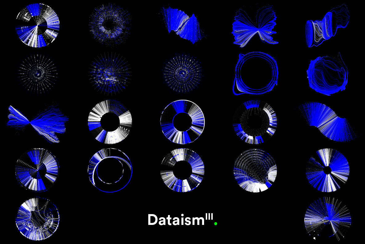
I have no clue what the data is showing but damn it looks good. There’s not a lot of information on the post. I could gather that it’s called Dataism III , designed by Jacek Podkowinski and that the product download contains 22 files. Basically, Dataism III is a vector collection contains 22 experimental artworks featuring unusual data flow visualization, particles and charts. It is also powered by YWFT.
Dataism III is a vector collection contains 22 experimental artworks featuring unusual data flow visualization
Data Visualization