by abduzeedo
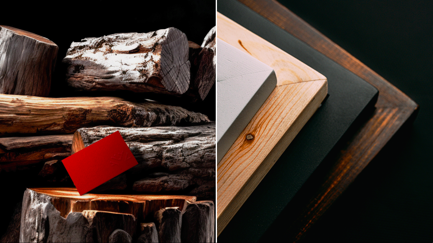
Felipe Vargas, recently undertook a captivating branding and visual identity project for Ébano, a distinguished Brazilian wood furniture brand located in Angola's bustling city of Luanda. With a primary focus on serving the Brazilian community residing in Angola, Ébano realized the need to reposition itself in the market to gain a competitive edge and connect with its target audience after over 8 years of operation.
To initiate the brand's transformation, Felipe Vargas Design embarked on an in-depth analysis of the local market, trends, competitors, and target audience. Armed with valuable insights, they embarked on a series of naming exercises to discover a name that would embody the brand's journey thus far while seamlessly fitting into its new phase.
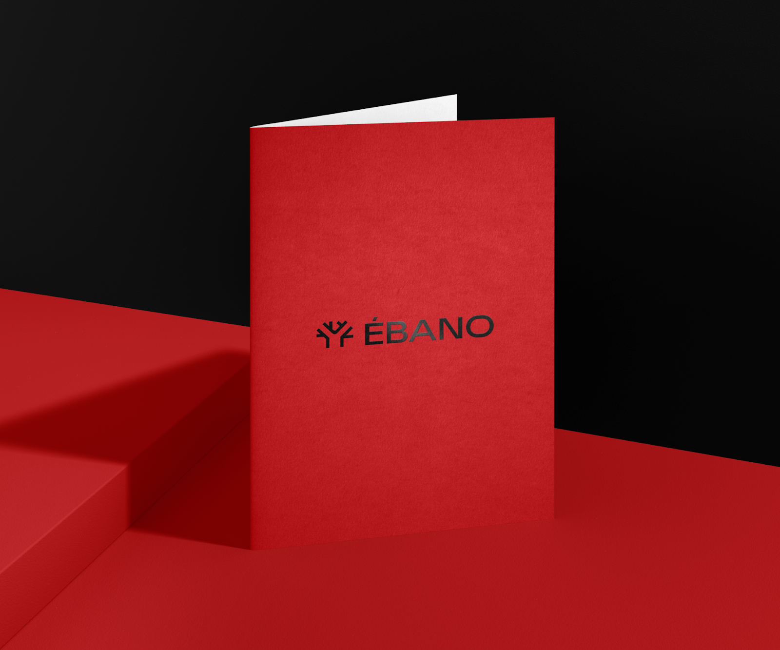
After careful consideration, the perfect name emerged—Ébano, inspired by the rich African wood known as ebony. Ebony possesses a distinctively dark and dense color, signifying nobility and often employed by African artisans to create magnificent statues. Furthermore, the word "Ébano" holds a connotation of affection, perfectly encapsulating the brand's dedication to providing quality wood furniture that evokes warmth and emotional connections.
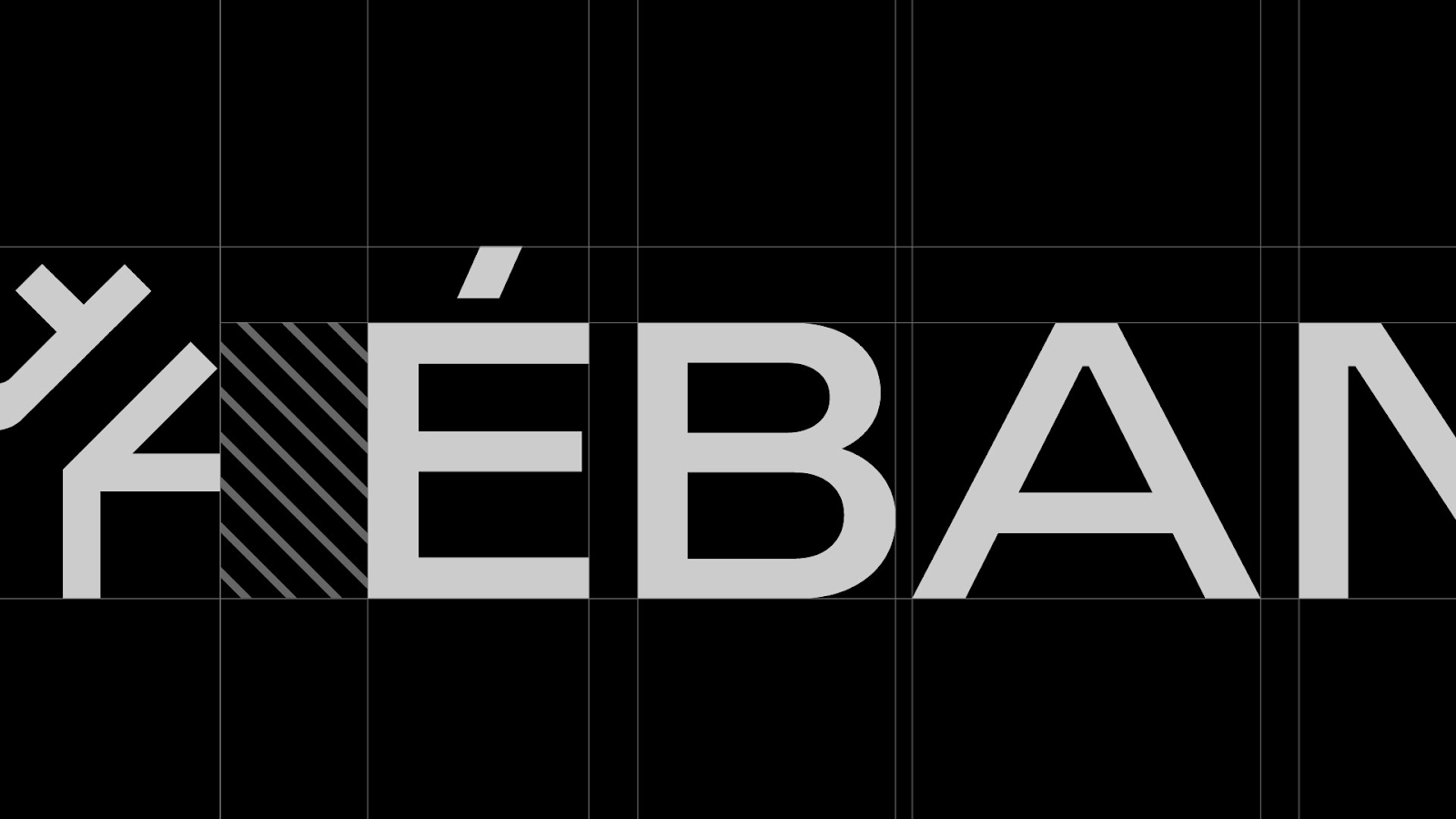
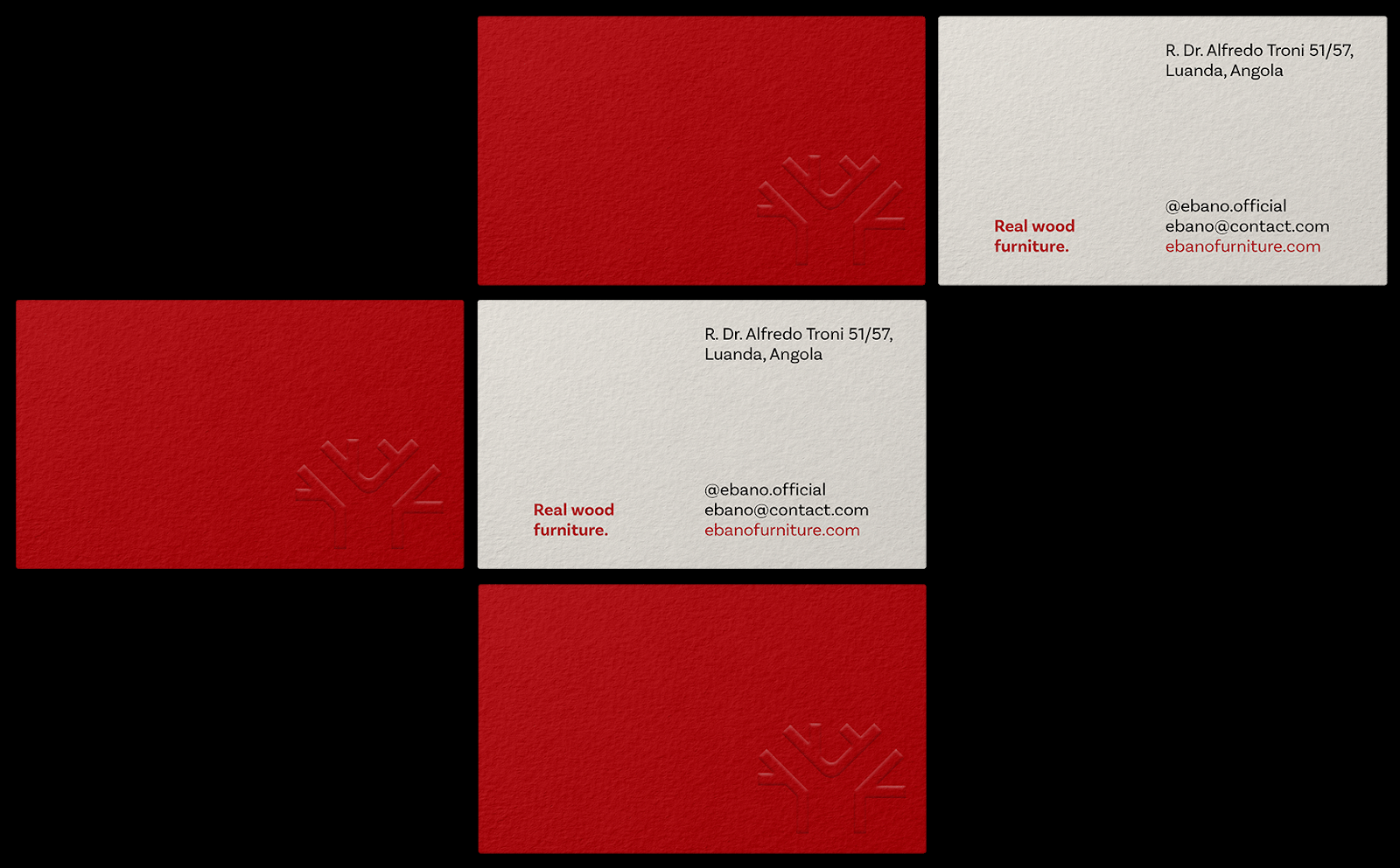
Moving on to the brand's visual identity, Felipe Vargas Design drew inspiration from the iconic Baobab tree, deeply rooted in African culture and history. The logo design mimics the Baobab tree's majestic form, with a long trunk and branches that converge at its apex. This symbolism represents Ébano's cultural significance and its role as a witness to African heritage.
Incorporating elements of asymmetry, the logo reflects the natural variations found in trees, where no two branches appear identical. Furthermore, the design incorporates geometric shapes inspired by mathematics and the precision associated with furniture craftsmanship. These elements come together to create a harmonious blend of organic forms and structured geometry, reflecting the essence of Ébano's artistic creations.
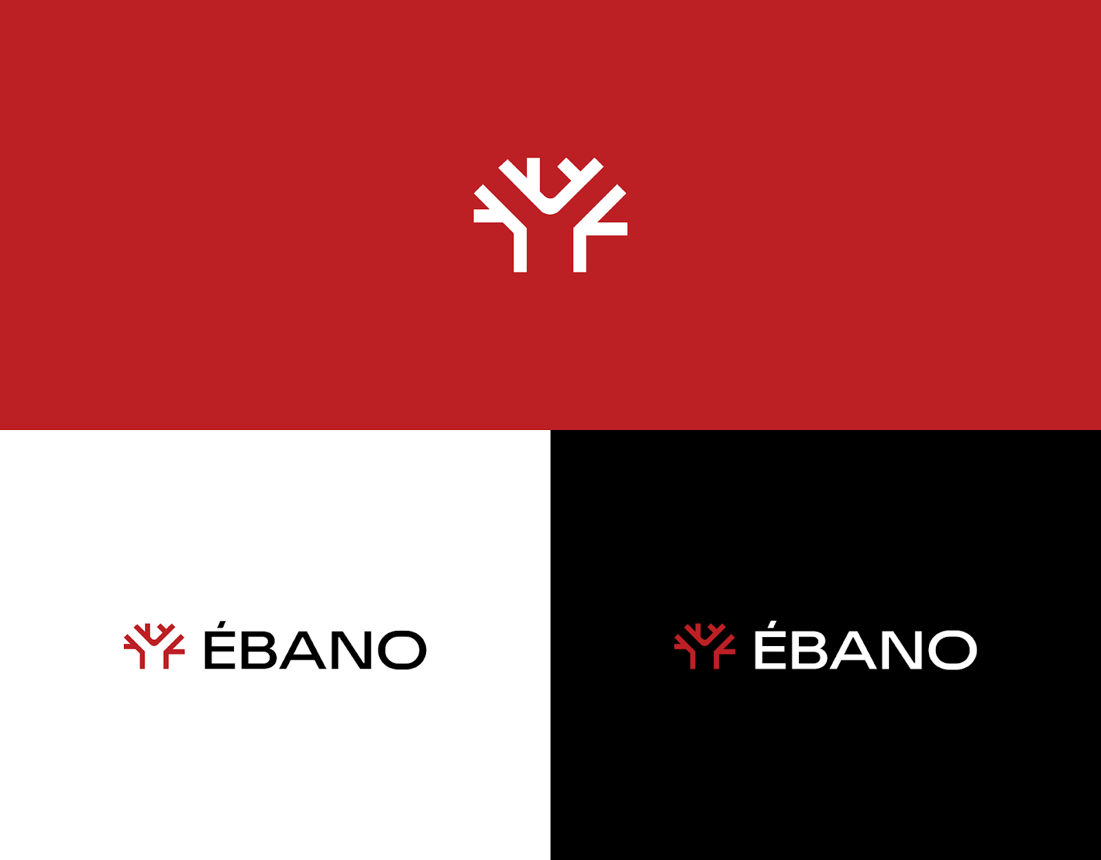
The logo's typography features a striking geometric font with capital letters, exuding magnificence and authority—essential attributes that align with Ébano's brand positioning. The selected font, Widescreen from the esteemed foundry Dalton Maag, adds a touch of sophistication and ensures a visually impactful representation of the brand.
In a nod to the brand's history, Felipe Vargas Design retained the colors from Ébano's previous logo to ensure a smooth transition during the redesign process. Additionally, strategic research highlighted the continued importance of the color red within the industry, further cementing its presence in Ébano's new visual identity.
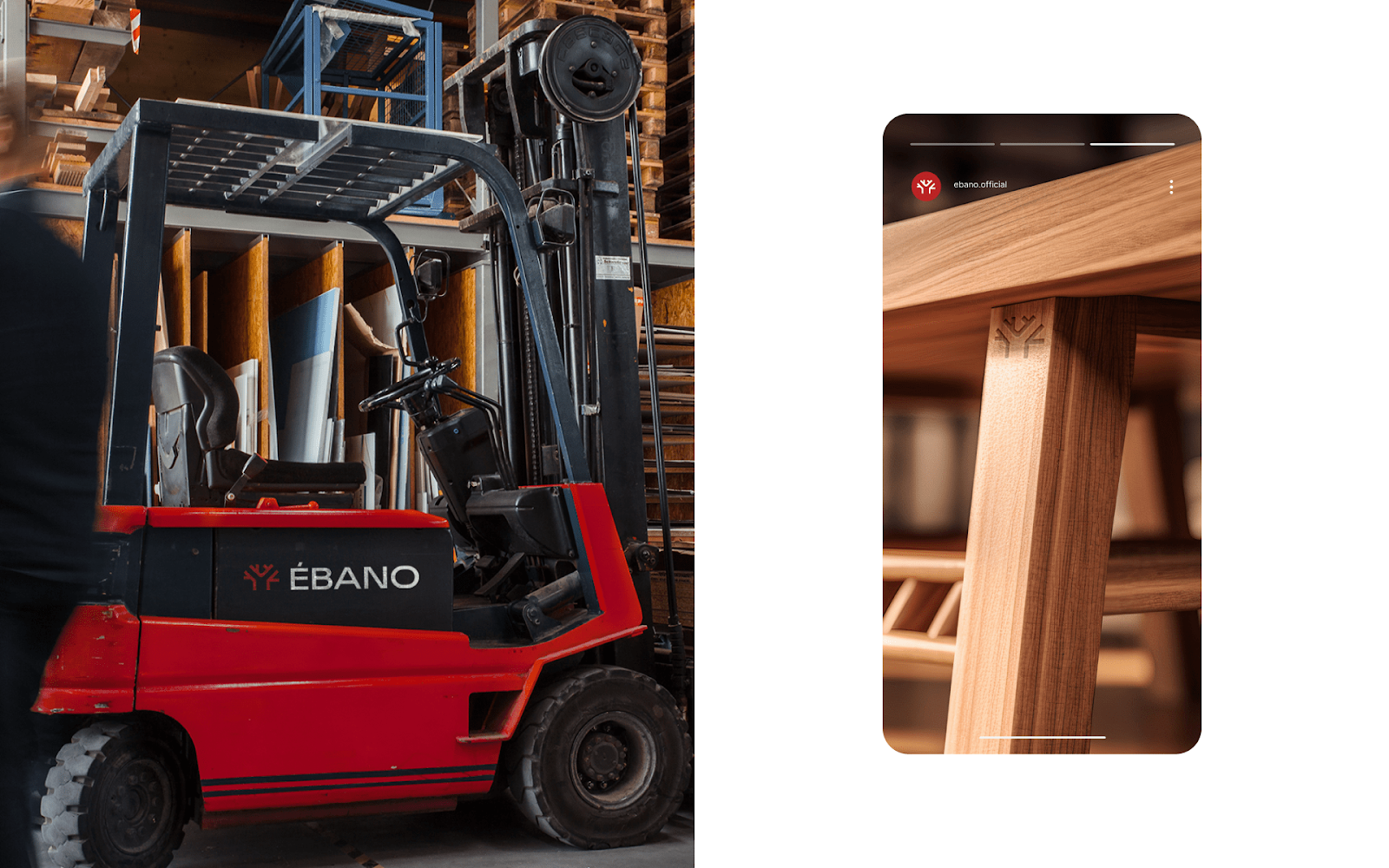
The collaboration between Ébano and Felipe Vargas Design has resulted in a captivating brand transformation, elevating the wood furniture brand's position in the market. With a compelling name, an evocative logo, and a meticulously crafted visual identity, Ébano is poised to captivate its Brazilian clientele in Angola, establishing itself as a symbol of elegance and craftsmanship in the realm of wood furniture.
Branding and visual identity artifacts
For more information make sure to check out Felipe Vargas’ website or follow him on Behance.