by abduzeedo
Journey through SleepFuel's branding transformation, where sleep is not just rest, but a catalyst for an energetic tomorrow.
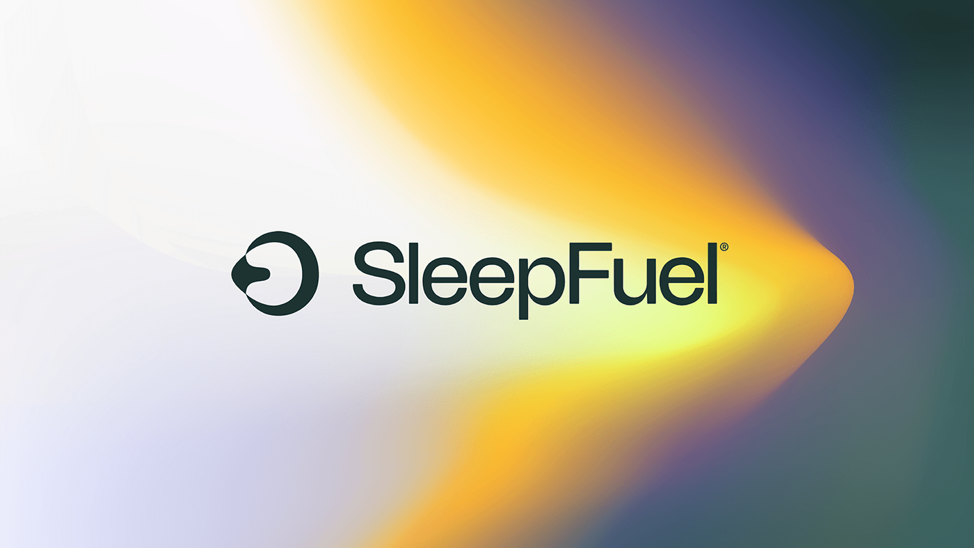
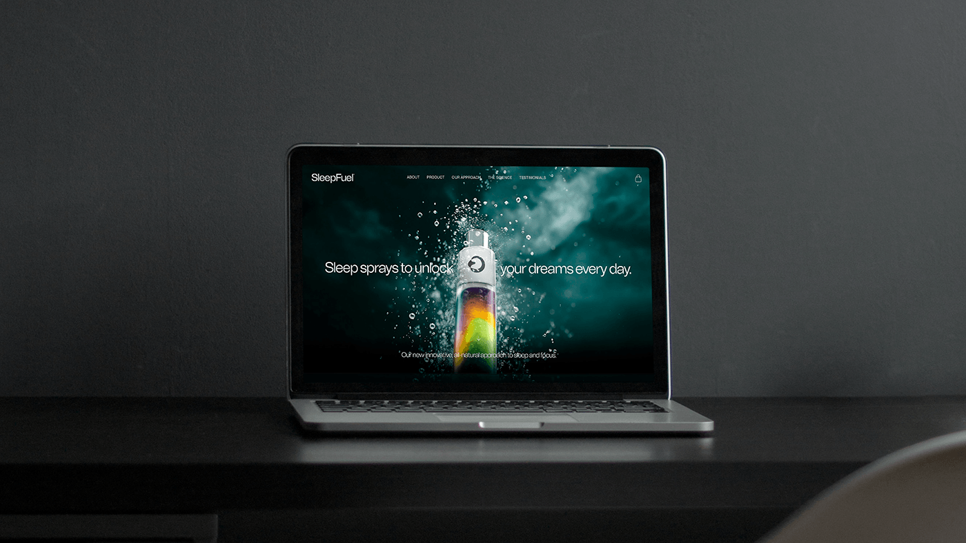
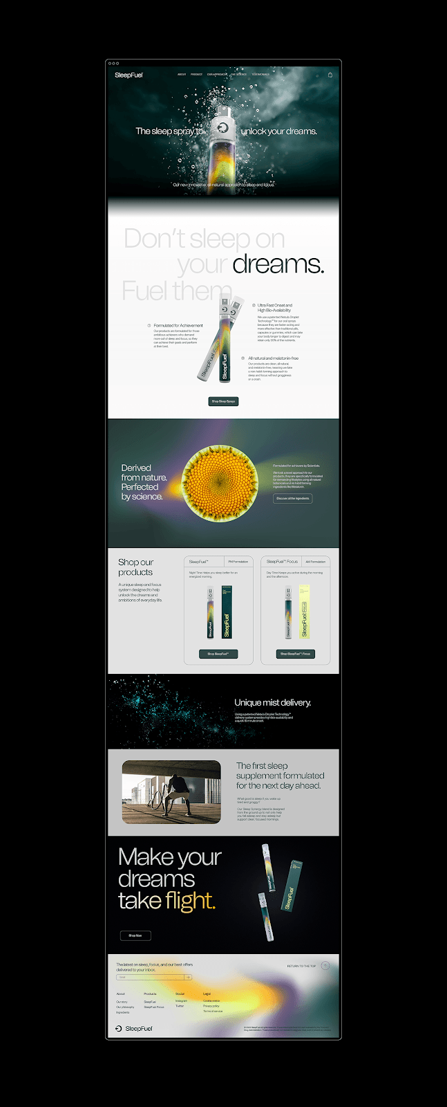
In the competitive health supplement market, SleepFuel™ emerges as a trailblazer with its distinctive branding and visual identity designed by Othila / Creative House. Targeted towards ambitious individuals, SleepFuel™ is not merely a sleep supplement; it's a symbol of energy and drive.
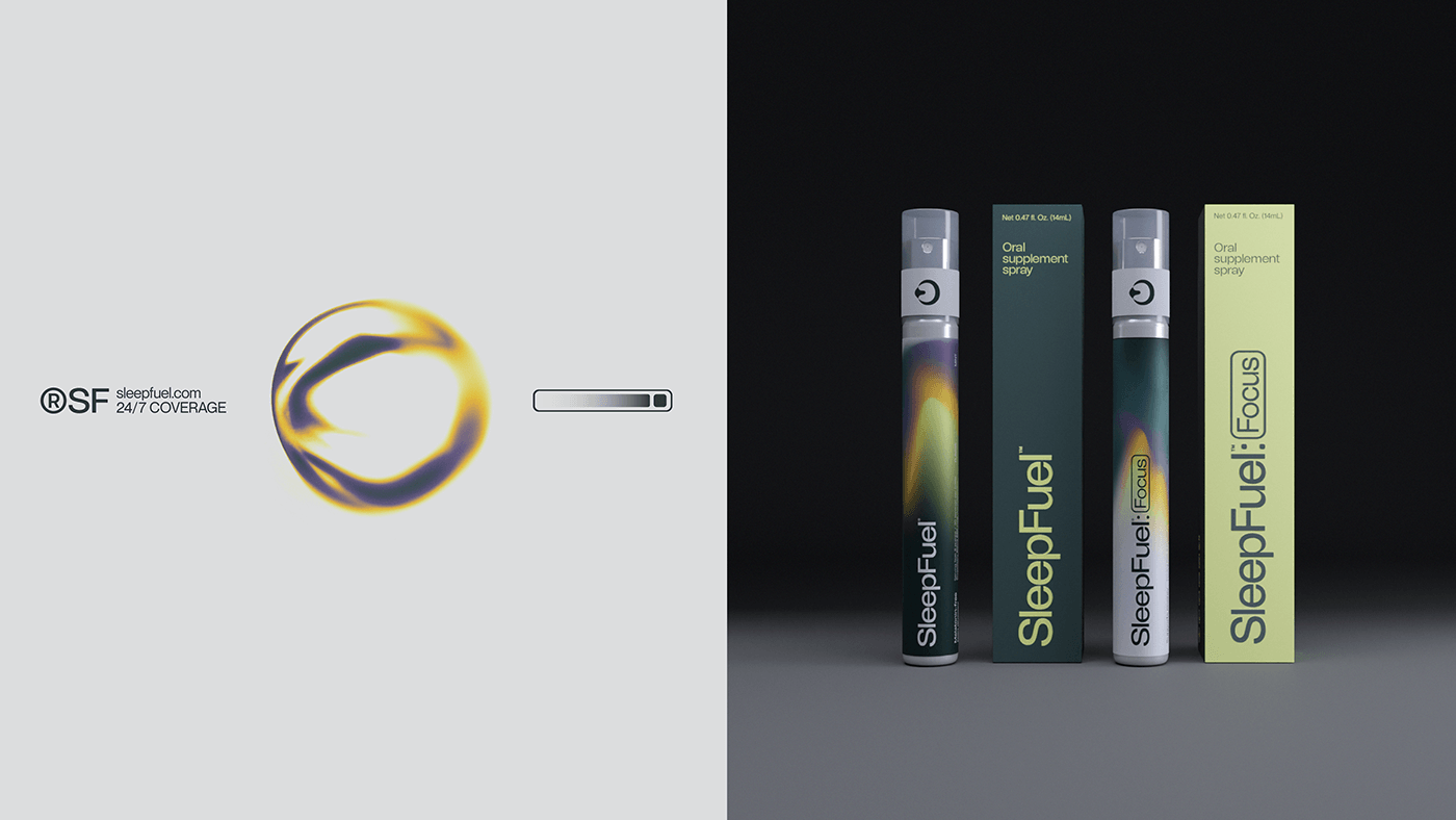
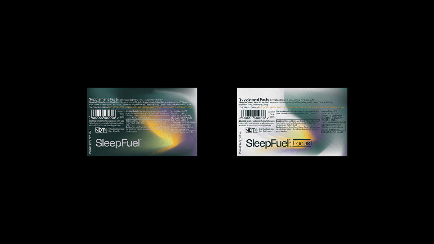
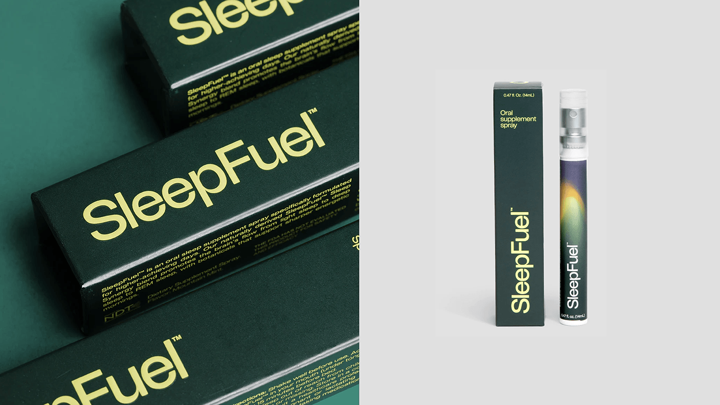
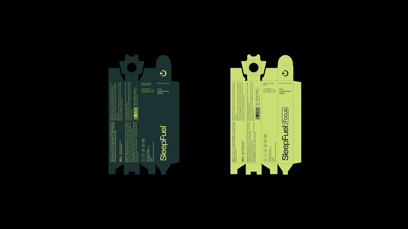
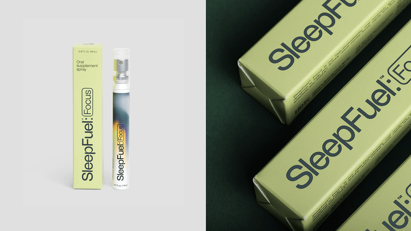
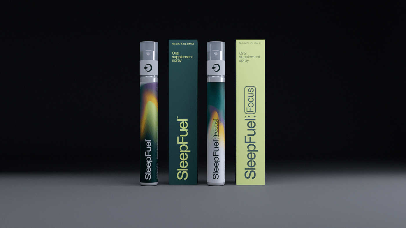
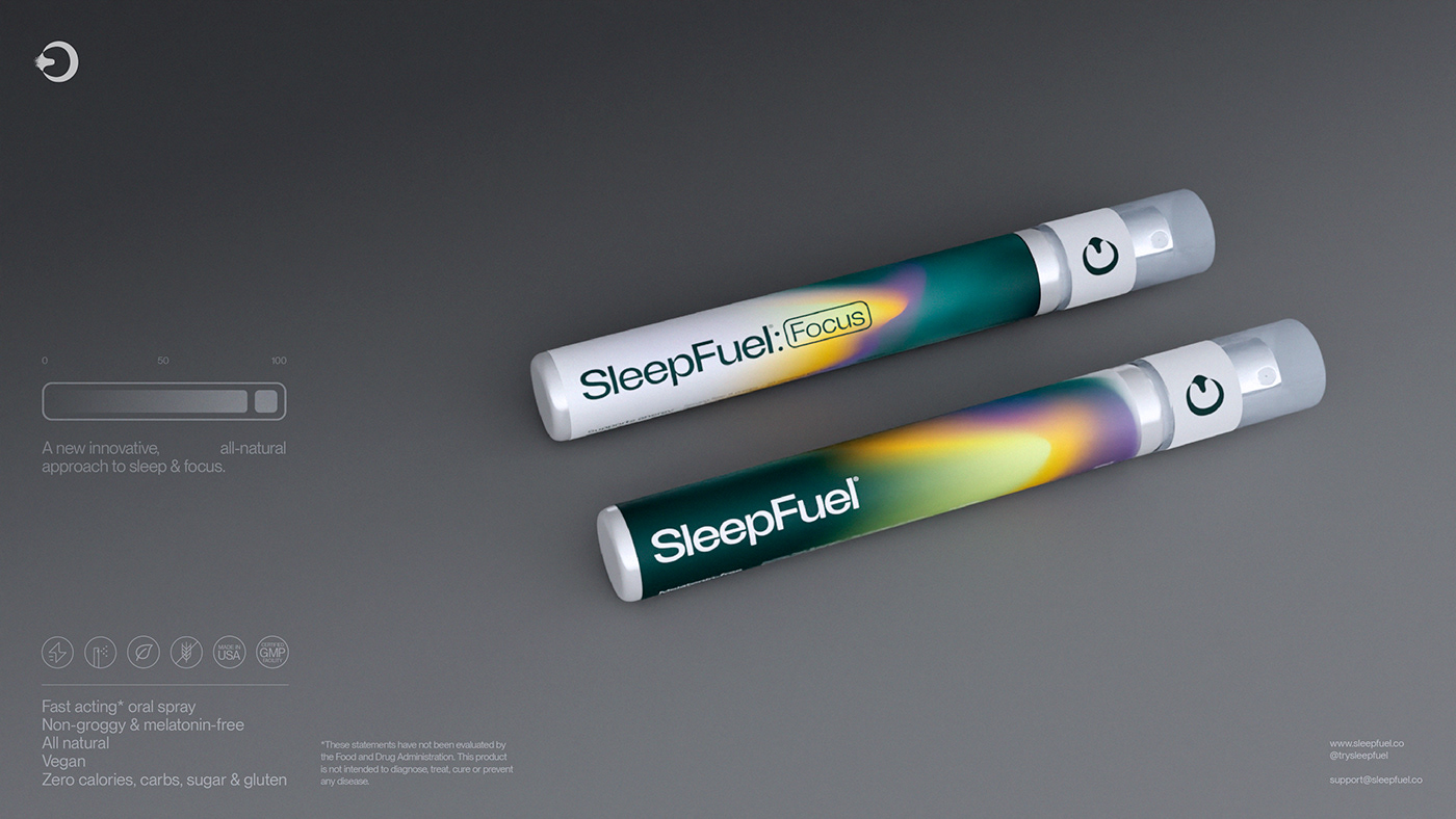
SleepFuel™ and SleepFuel:Focus, its daytime counterpart, are uniquely positioned in the market. Their packaging, reflecting the natural cycle of sunset-to-sunrise and sunrise-to-sunset, encapsulates the essence of the products. This design approach sets SleepFuel™ apart from the typical, softer visual themes seen in sleep aids, aligning more with the lifestyle and aspirations of its target audience.
This branding strategy is a testament to Othila / Creative House's expertise in creating a visual narrative that resonates with consumers. The firm has skillfully navigated the challenge of presenting a supplement as a crucial component of a high-energy lifestyle. Their design philosophy extends beyond mere aesthetics; it's about crafting an identity that speaks directly to the heart of the brand's ethos.
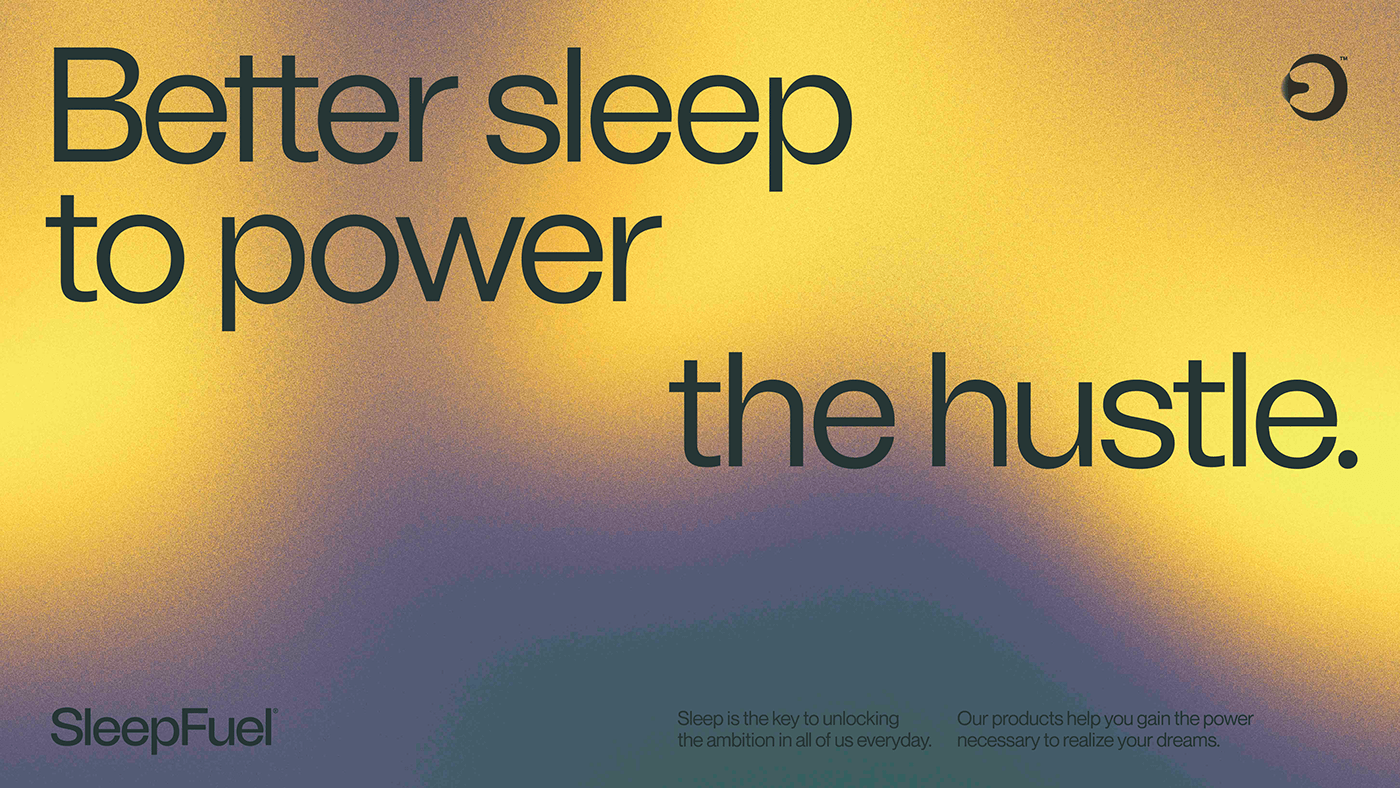
The success of SleepFuel™'s branding lies in its ability to communicate a clear message: sleep is not just a passive activity but a critical element of a productive and energetic life. This perspective shift is crucial in a market saturated with similar products, giving SleepFuel™ a unique edge.
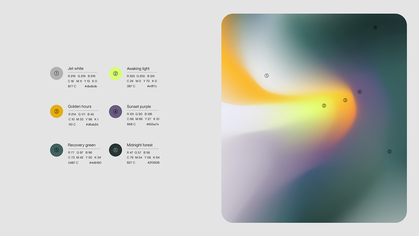
Moreover, the branding's visual elements, from the color palette to the typography, are meticulously chosen to convey the product's dual nature — restorative at night and energizing during the day. This thoughtful design approach not only enhances the product's appeal but also ensures it stands out on shelves and in digital spaces.
In conclusion, SleepFuel™'s branding and visual identity showcase how innovative design can redefine a product's place in the market. It's a vivid example of how visual storytelling can be leveraged to connect with a specific audience, positioning a brand not just as a product but as an essential part of a lifestyle.
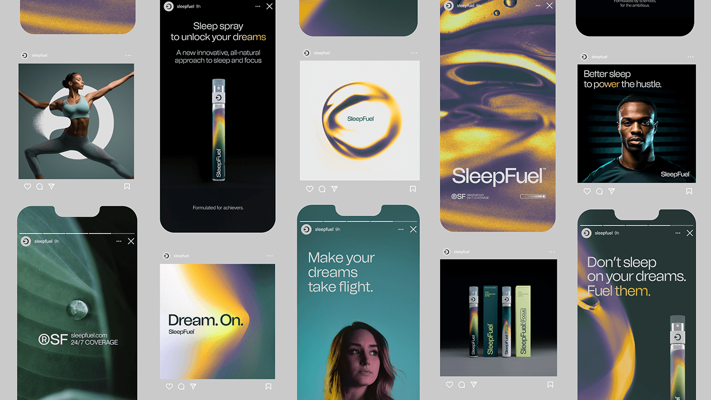
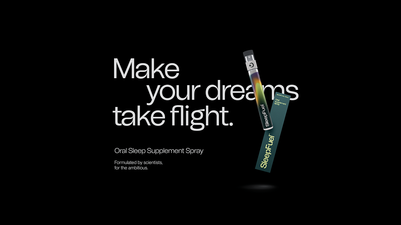
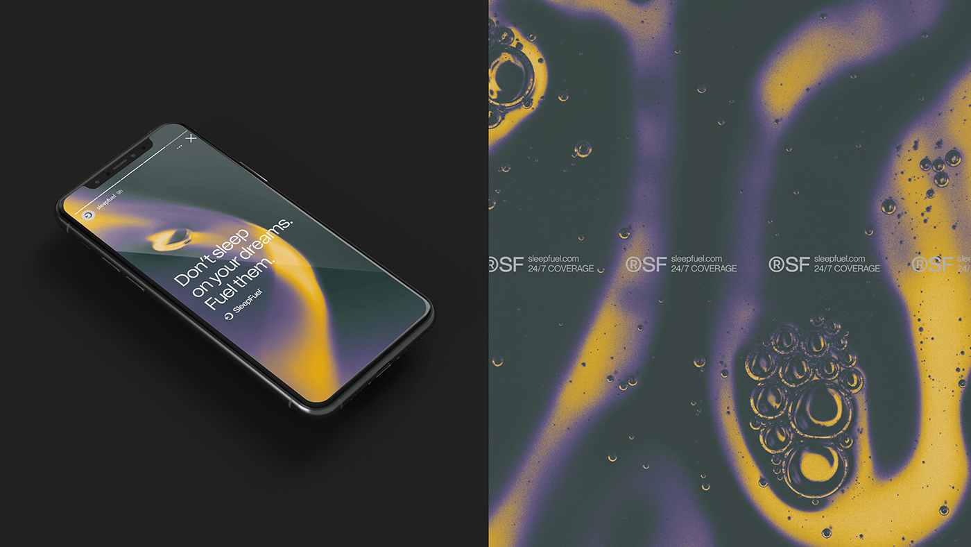
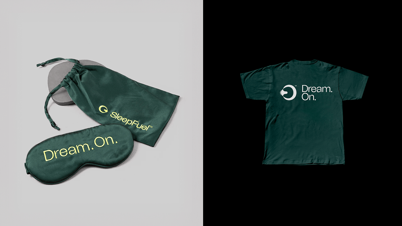
Branding and visual identity artifacts
For more information make sure to check out Othila / Creative House website and Behance profile.


