by abduzeedo
Explore the vibrant and playful branding and packaging strategy behind Gishi, a wellness brand offering fungi extract gummies. Learn how they transformed a mundane supplement into a must-have lifestyle product.
In a market saturated with wellness products, Gishi, a brand specializing in fungi extract gummies, sought to break the mold. To achieve this, they enlisted a creative team to design a branding and packaging strategy that would set them apart. The challenge was clear: transform Gishi from just another supplement into a lifestyle statement.
Transforming the Pill Bottle
The journey began with the packaging. The traditional pill bottle, often associated with medicine, needed a complete makeover. By incorporating a vibrant color palette and playful illustrations, the designers transformed the packaging into something eye-catching and modern. This strategic move shifts the perception of Gishi's gummies, making them feel less like a supplement and more like a lifestyle product.
Minimalism with a Twist
Typography played a key role in communicating Gishi's brand message. The chosen typeface, Banana Grotesk, is minimalistic yet creative. The designers subtly incorporated angled titles for certain elements, adding a playful touch that complements the brand's visual language. This balance of clarity and creativity perfectly captures Gishi's appeal to a modern, style-conscious audience.
A Color Story
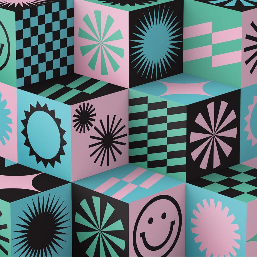
Each mushroom variety in Gishi's product line is represented by a distinct color, creating a visually appealing and informative packaging system. To avoid overwhelming the design, black and white elements are integrated into the layout. This creates a sense of balance and allows the vibrant colors to shine without feeling chaotic.
Playful Illustrations and Icons
Custom illustrations and icons further distinguish Gishi from its competitors. These playful elements add a touch of personality and reinforce the brand's approachable nature. Beyond their decorative function, the illustrations and icons also serve as functional tools, guiding the user experience and making the brand instantly recognizable.
Gishi's branding and packaging strategy is a testament to the power of thoughtful design. By embracing vibrant colors, playful illustrations, and creative typography, Gishi has successfully elevated its products from a simple supplement to a must-have lifestyle item. The brand's fresh and approachable aesthetic not only captures attention but also communicates its unique value proposition in a crowded marketplace. Gishi demonstrates that even in a saturated market, creativity and innovation can transform a brand into something truly exceptional.
Art direction & Graphic Design: Cindy F. & Milagros Malone.
