"Hustle": A Dive into Lettering and Typography in Home Offices
Explore Bruno do Nascimento's "Hustle" - a poignant reflection on remote work through lettering and typography, blending colors and emotions.
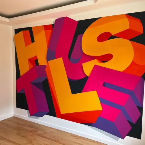
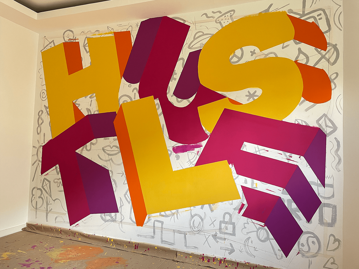
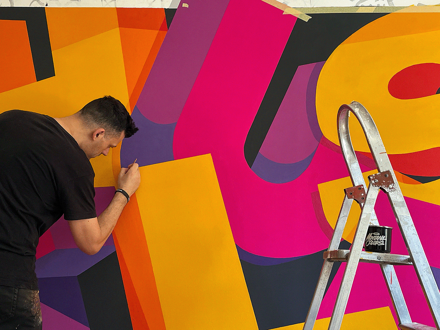
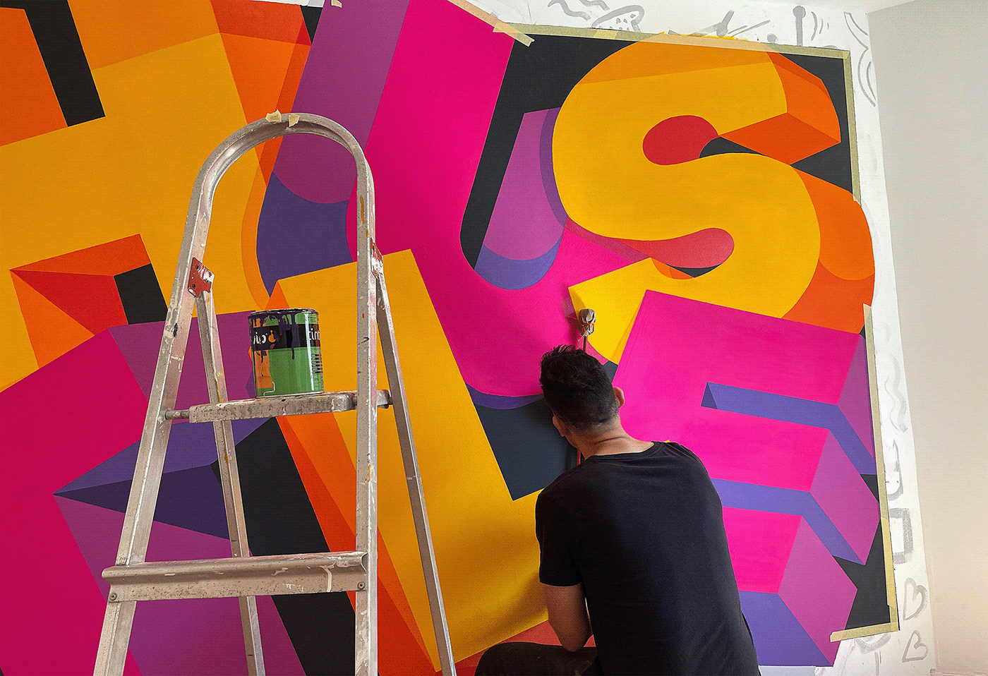
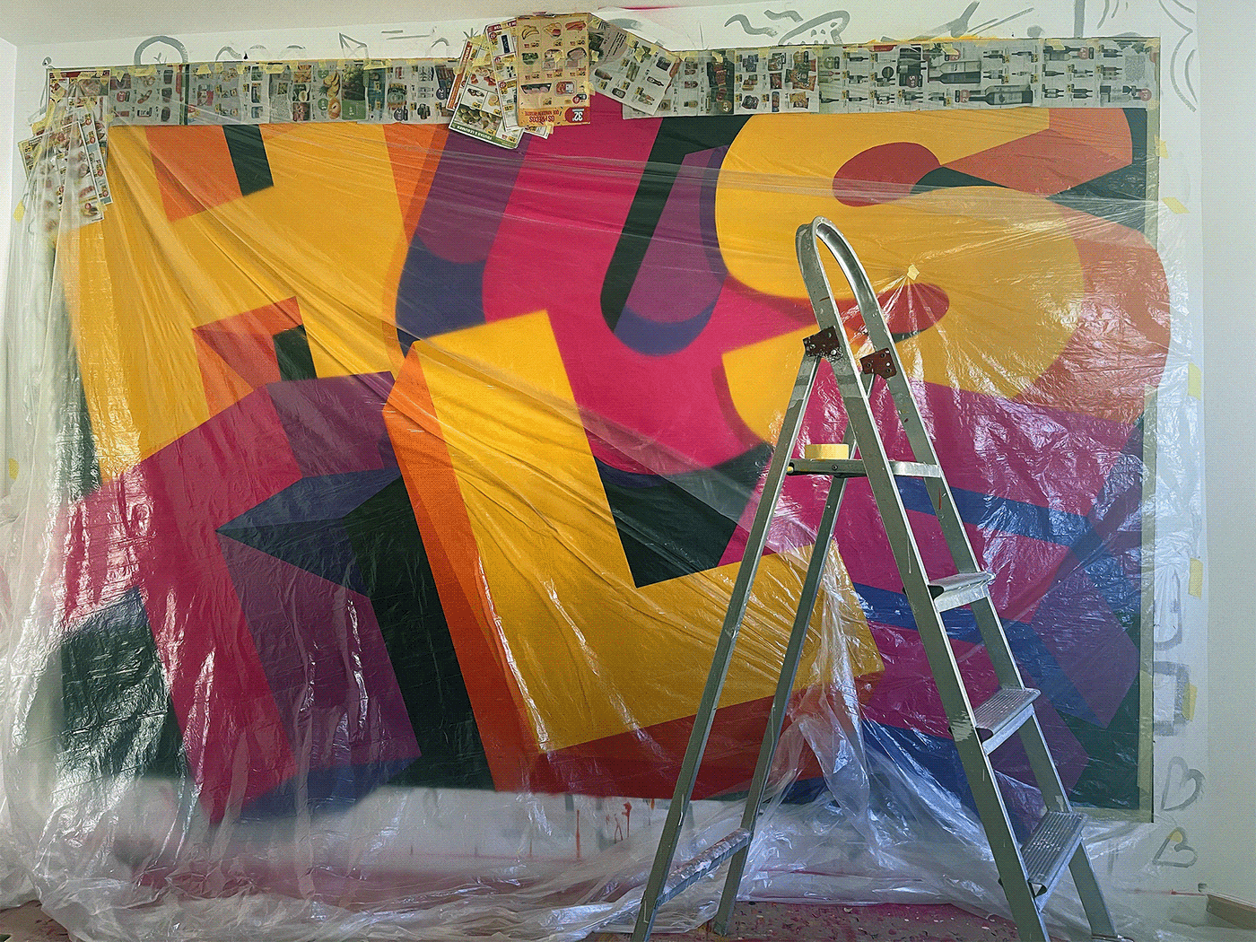
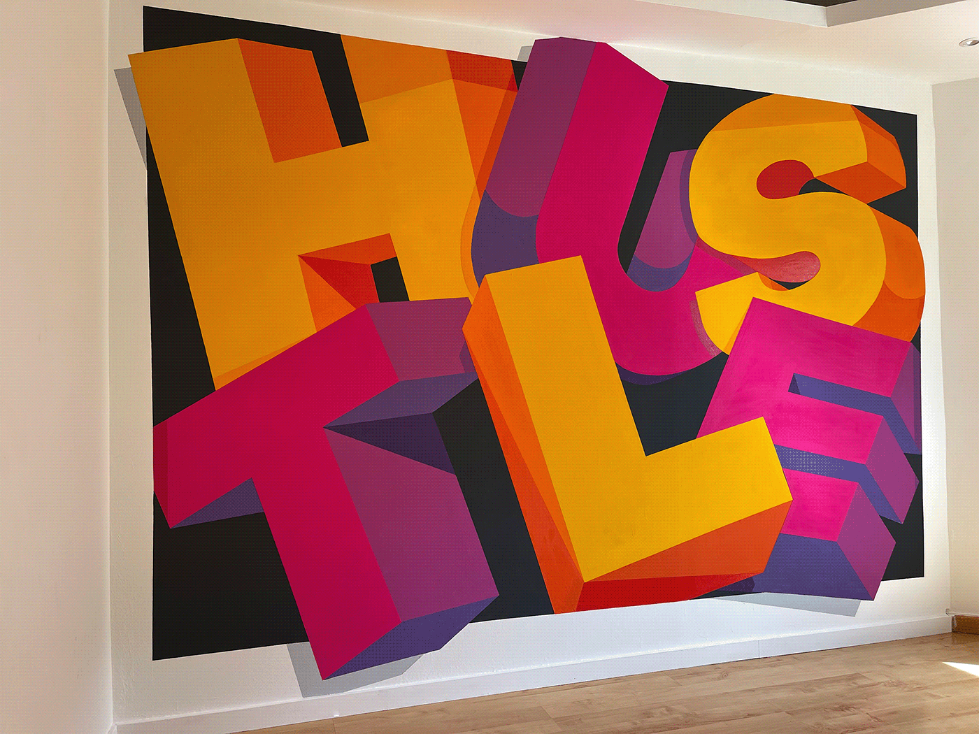
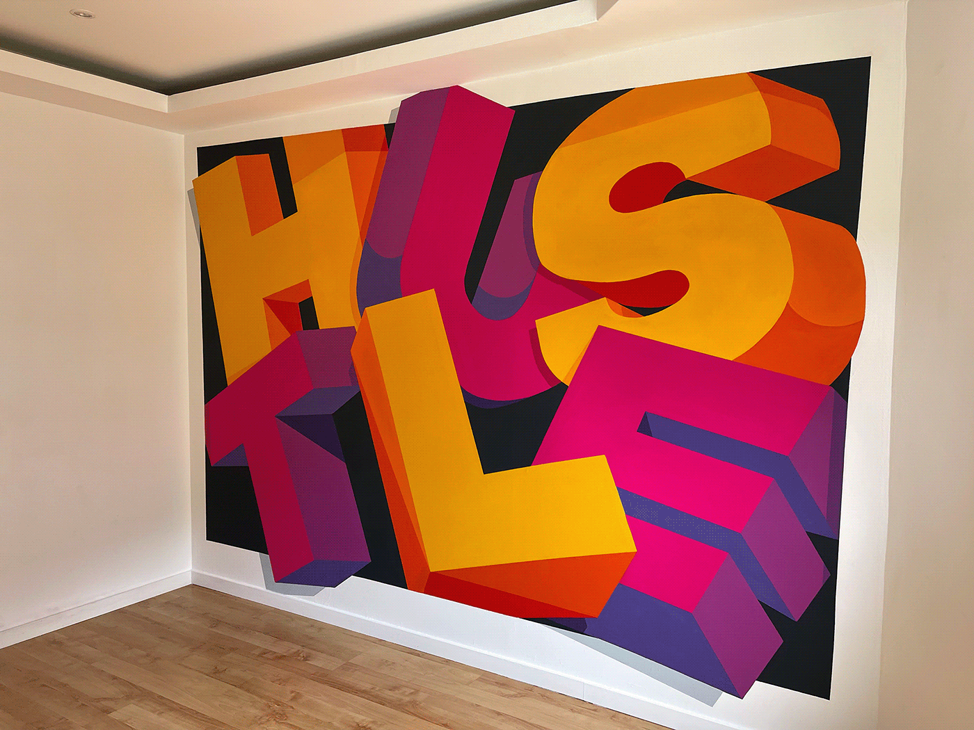
In the shifting sands of today's work environment, remote work is the rising tide, with home offices becoming cherished personal spaces. For designers and artists, these spaces aren't just functional – they're deeply personal canvases reflecting their professional journey. This ethos is epitomized by Bruno do Nascimento's choice to inaugurate his home office with a unique piece of lettering and typography – "Hustle".
The word "Hustle" isn’t selected arbitrarily. It encapsulates the essence of what Bruno, and many like him, engage in day-in and day-out in such spaces. For at least five days a week, this room witnesses relentless passion, commitment, and, yes, hustle. This isn't just a word on the wall – it's a declaration of intent.
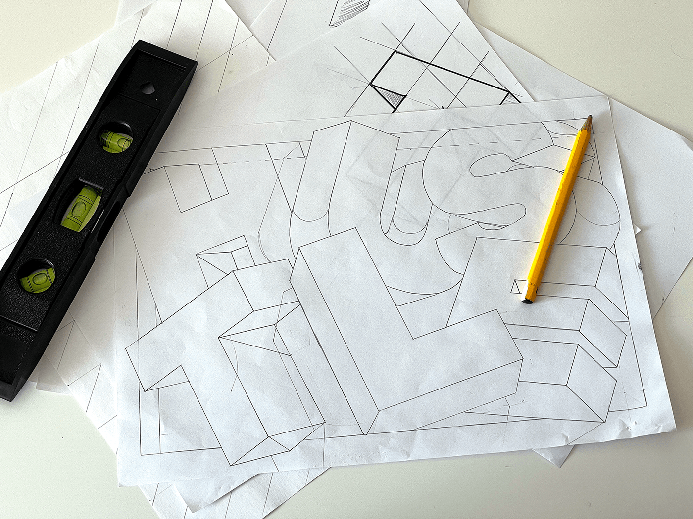
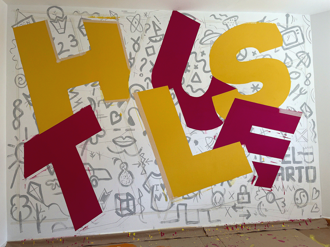
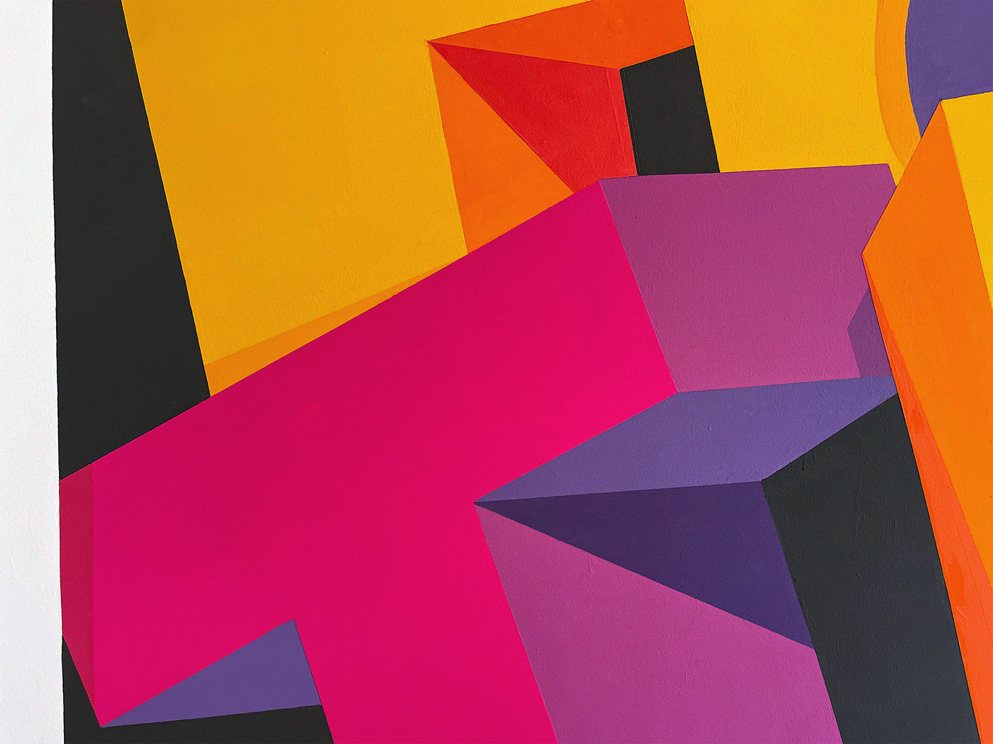
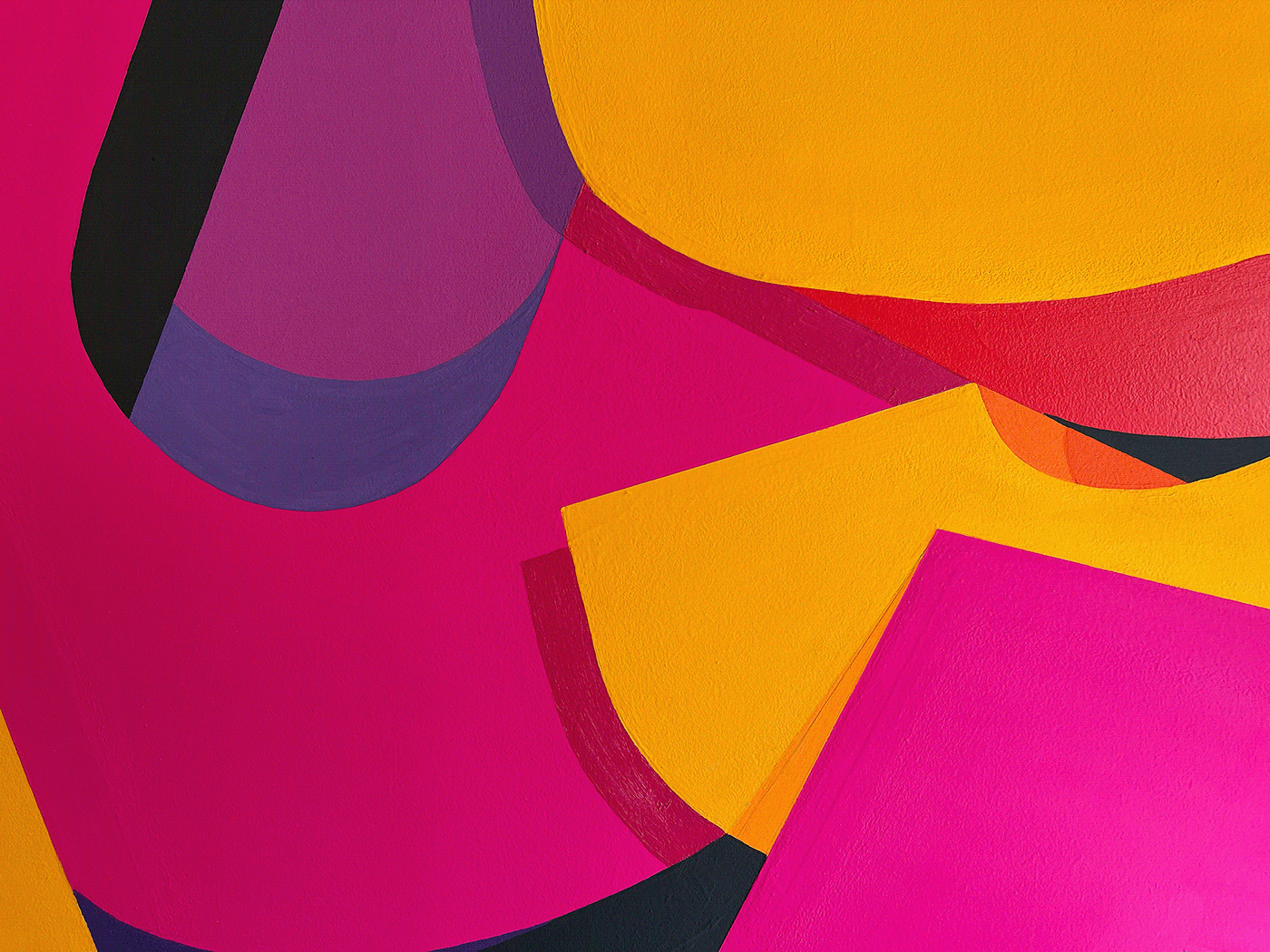
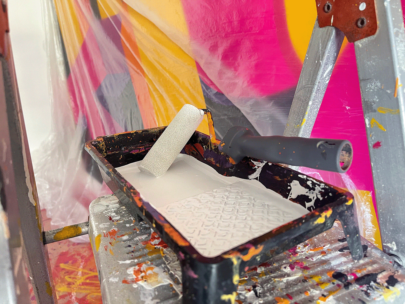
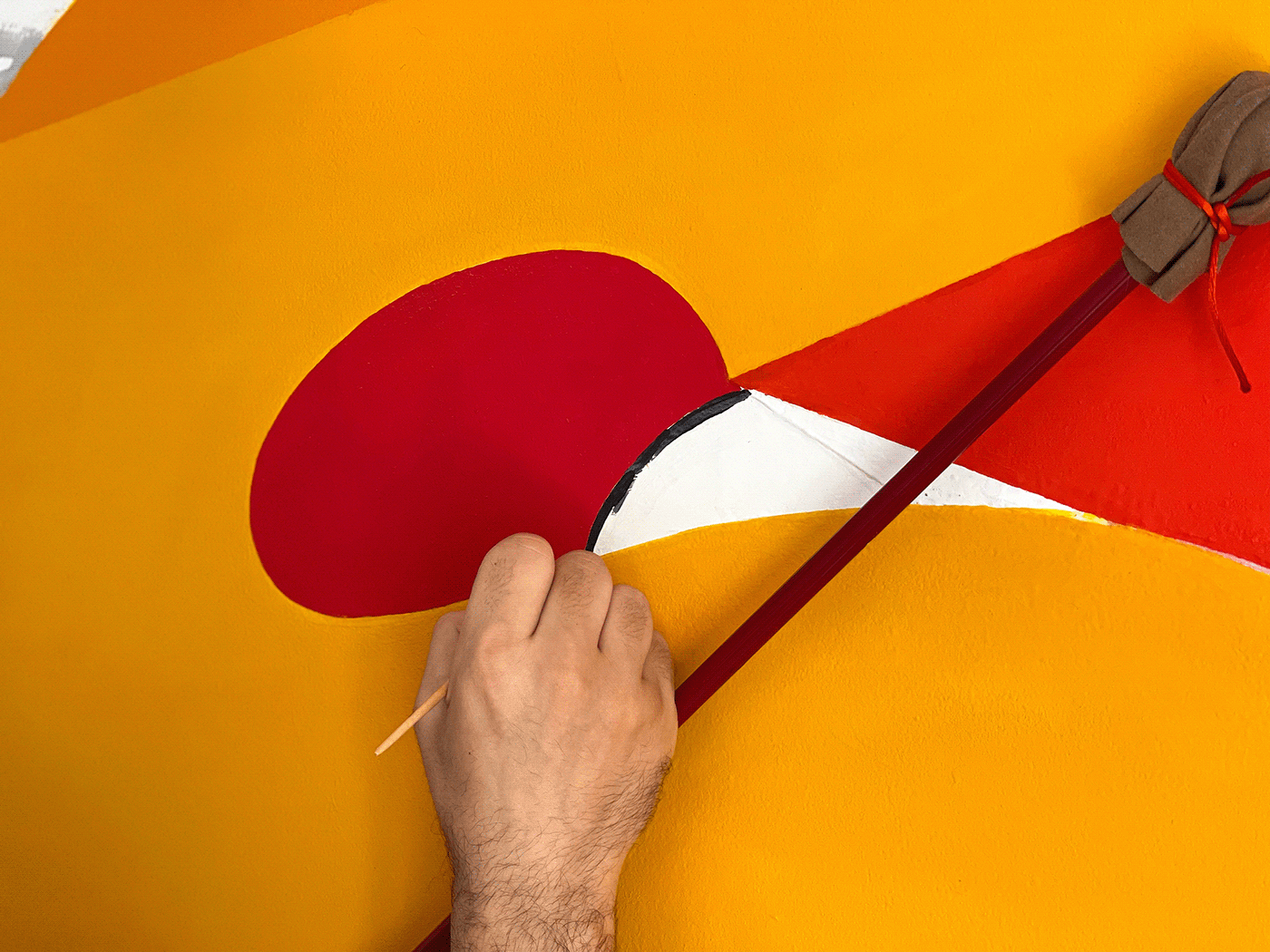
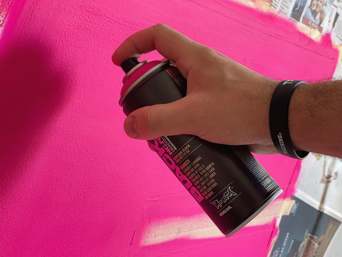
However, what makes this piece exceptional isn't just the choice of word, but its execution. The distinction between the three lighter letters and the three darker ones is a masterstroke. It's a visual narrative, where colors subtly portray the unpredictable nature of a workweek. With the lighter shades representing the "good days" and the darker tones alluding to the challenging ones, the palette becomes an honest chronicle of remote working's emotional roller-coaster.
Bruno's use of Adobe Capture to derive this color palette adds another layer to this narrative. The juxtaposition of colors doesn’t just represent days but emotions, ambitions, setbacks, and victories. And the undulating layout? It's not just a design choice; it symbolizes the ebb and flow of a typical workweek, reinforcing the tumult that often characterizes our professional lives.
Bruno do Nascimento’s “Hustle” is more than a piece of art – it’s an experience, a reflection, and a testament to the life of a remote worker. As we continue to adapt to new working environments, such pieces remind us of the beauty and chaos of the professional journey.
Video and photo credits go to the artist himself, and the accompanying music track by Gramatik titled "Victory" adds a final touch to this immersive experience.
Lettering and typography artifacts
Credits
- Video Editing & Photography : Bruno do Nascimento
- Music Track : Gramatik - “Victory”
For more information make sure to check out Bruno Do Nascimento website or follow him on Behance.