by abduzeedo
Discover the essence of 'Simply's' branding and visual identity, a case study in minimalist design and impactful typography, designed by Berriel Brands.
In the world of digital design, the pursuit of simplicity often leads to the most compelling visual identities. This concept is vividly embodied in the branding and visual identity of 'Simply', a digital agency hailing from Belgium. Designed by Berriel Brands, the 'Simply' logo offers a masterclass in typographic elegance and minimalist design principles.
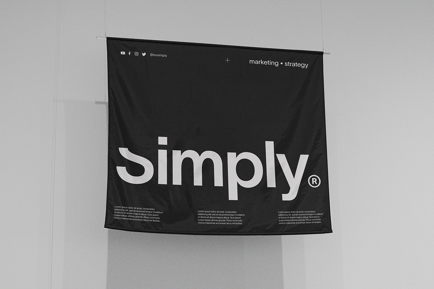
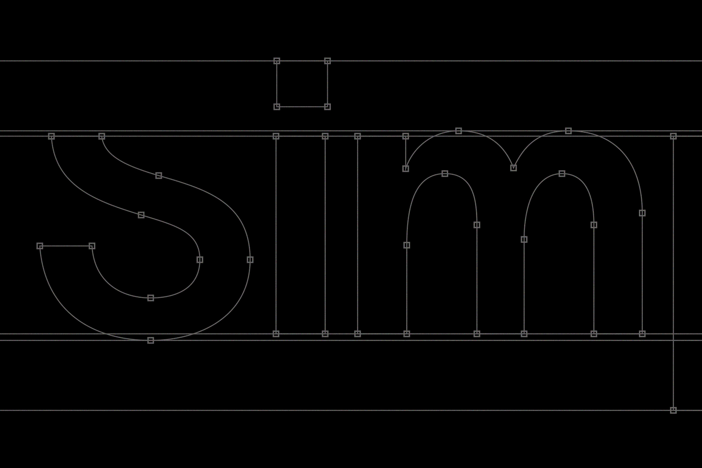
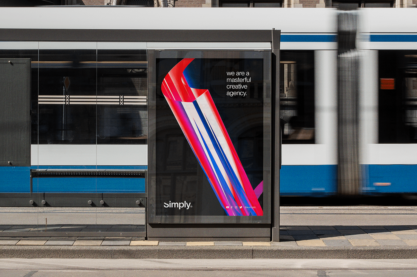
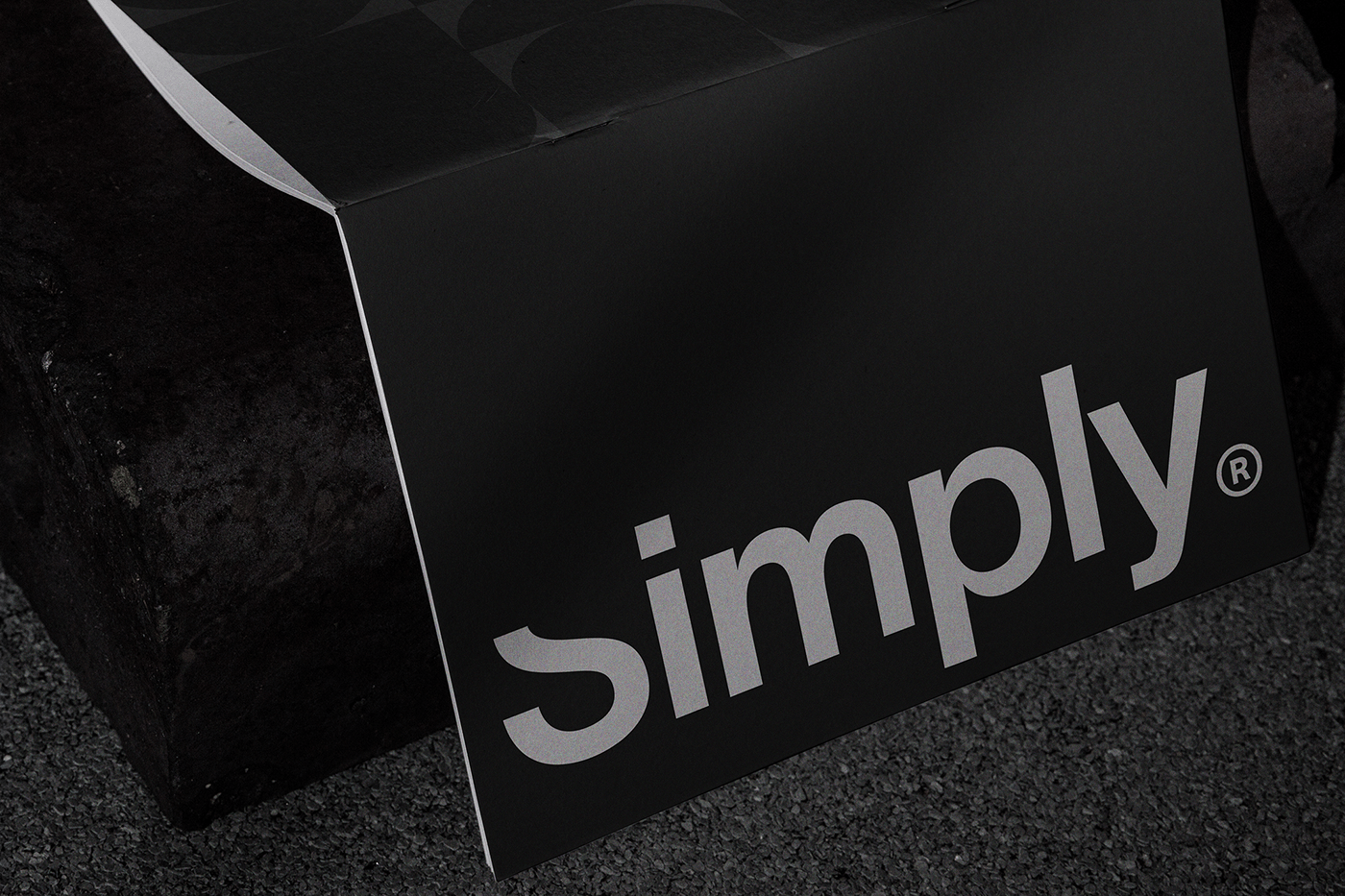
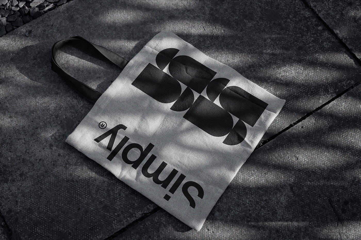
The logotype of 'Simply' is a study in refined simplicity. It features a sans-serif font, chosen for its clean lines and modern appeal. The distinctive treatment of the letter 's' is particularly noteworthy. The top third of this character is meticulously cropped, aligning seamlessly with the tops of the lowercase letters that follow. This subtle yet striking alteration not only draws the eye but also integrates the elements of the logo into a cohesive whole.
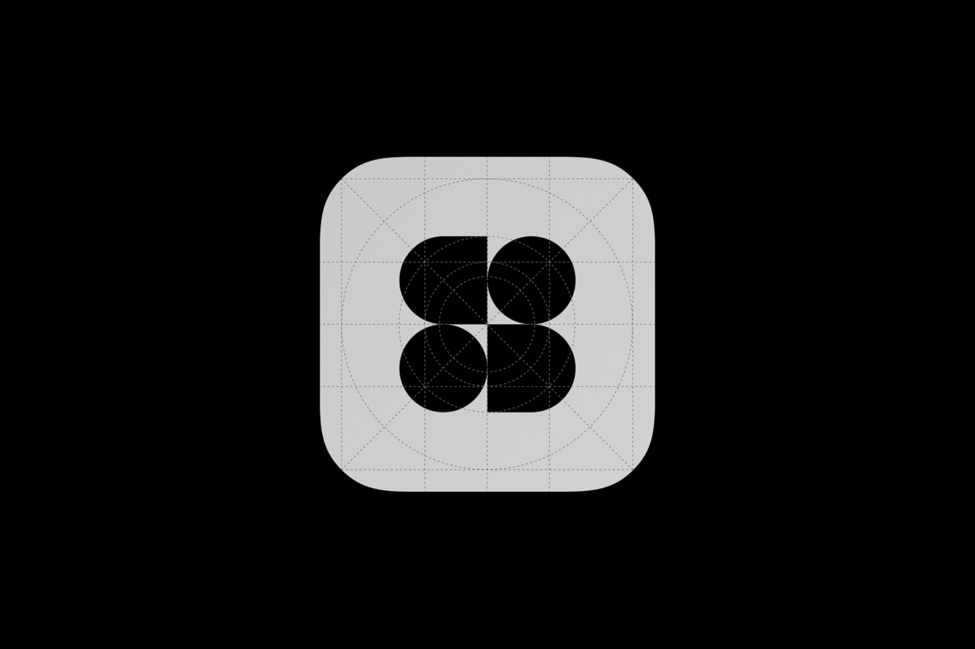
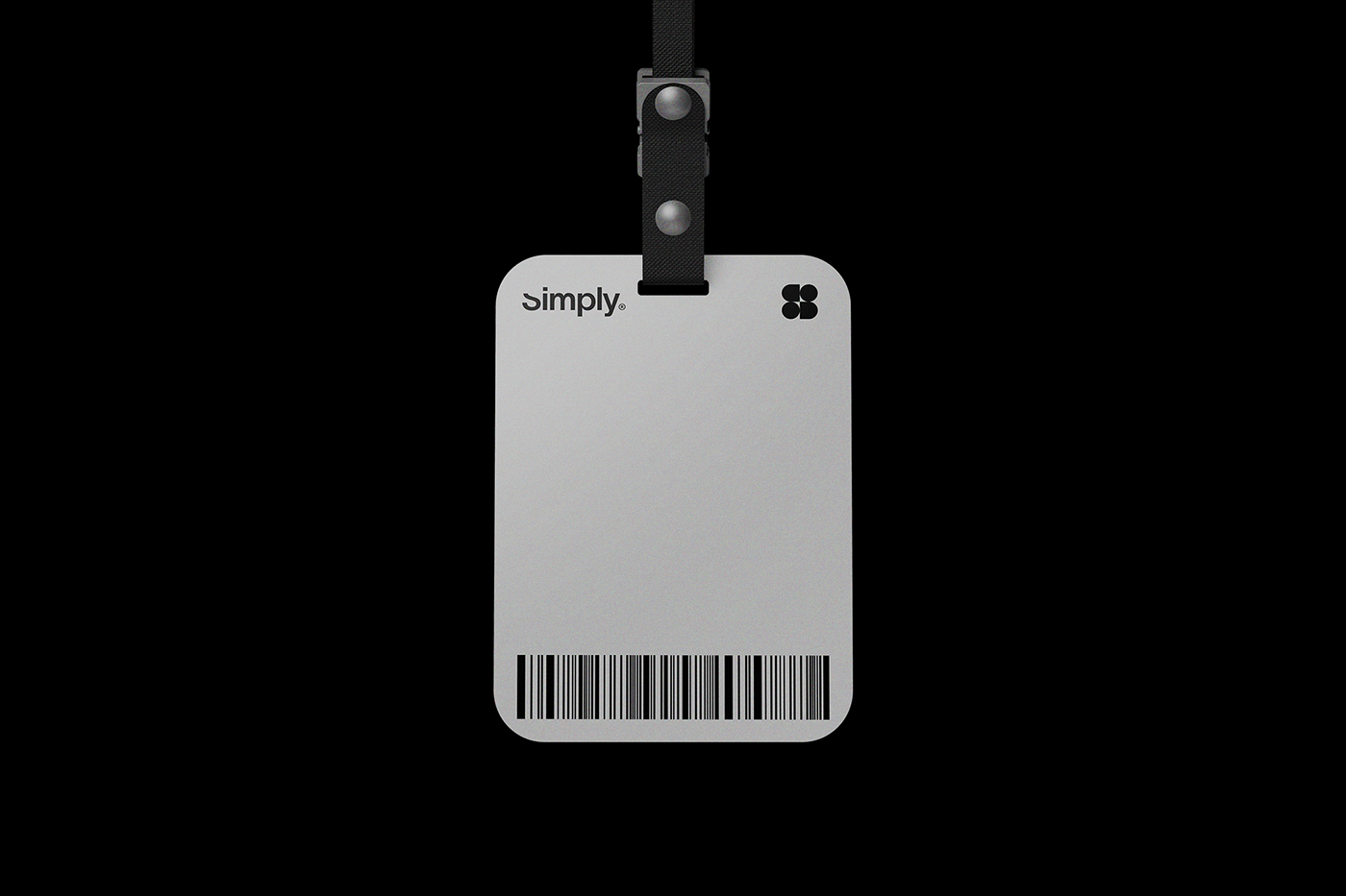
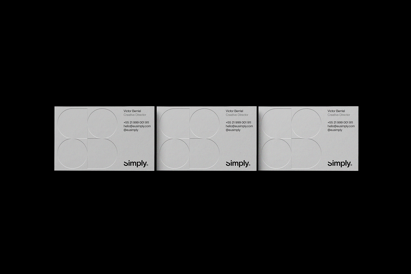
Accompanying the logotype is a symbol crafted from a 2x2 grid. This grid contains a unique combination of shapes: a square with a rounded left side and a circle in the first row, followed by another circle and a square with a rounded right side in the second row. This arrangement creates a balanced yet dynamic visual element that complements the simplicity of the logotype.
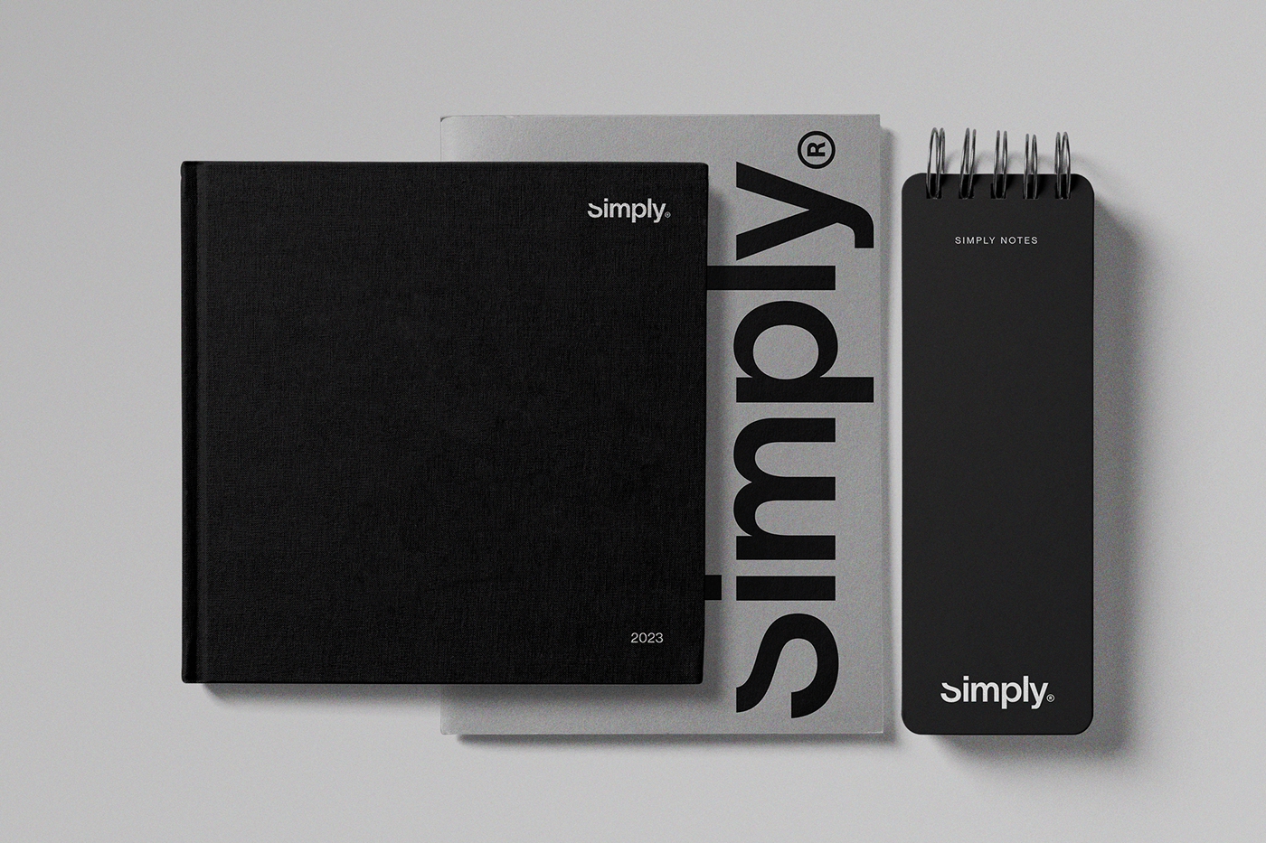
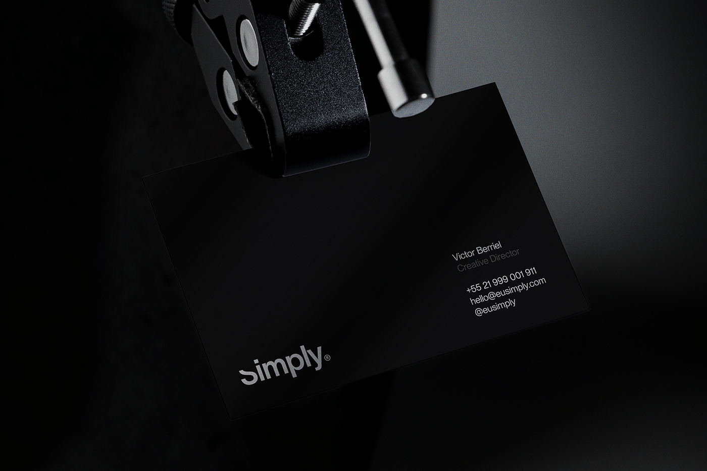
The color palette of 'Simply' is as minimalist as its typography. Predominantly black and white, with strategic use of grey, it exudes a classic, timeless feel. This restrained color scheme ensures that the focus remains squarely on the typography and symbolic elements of the design.
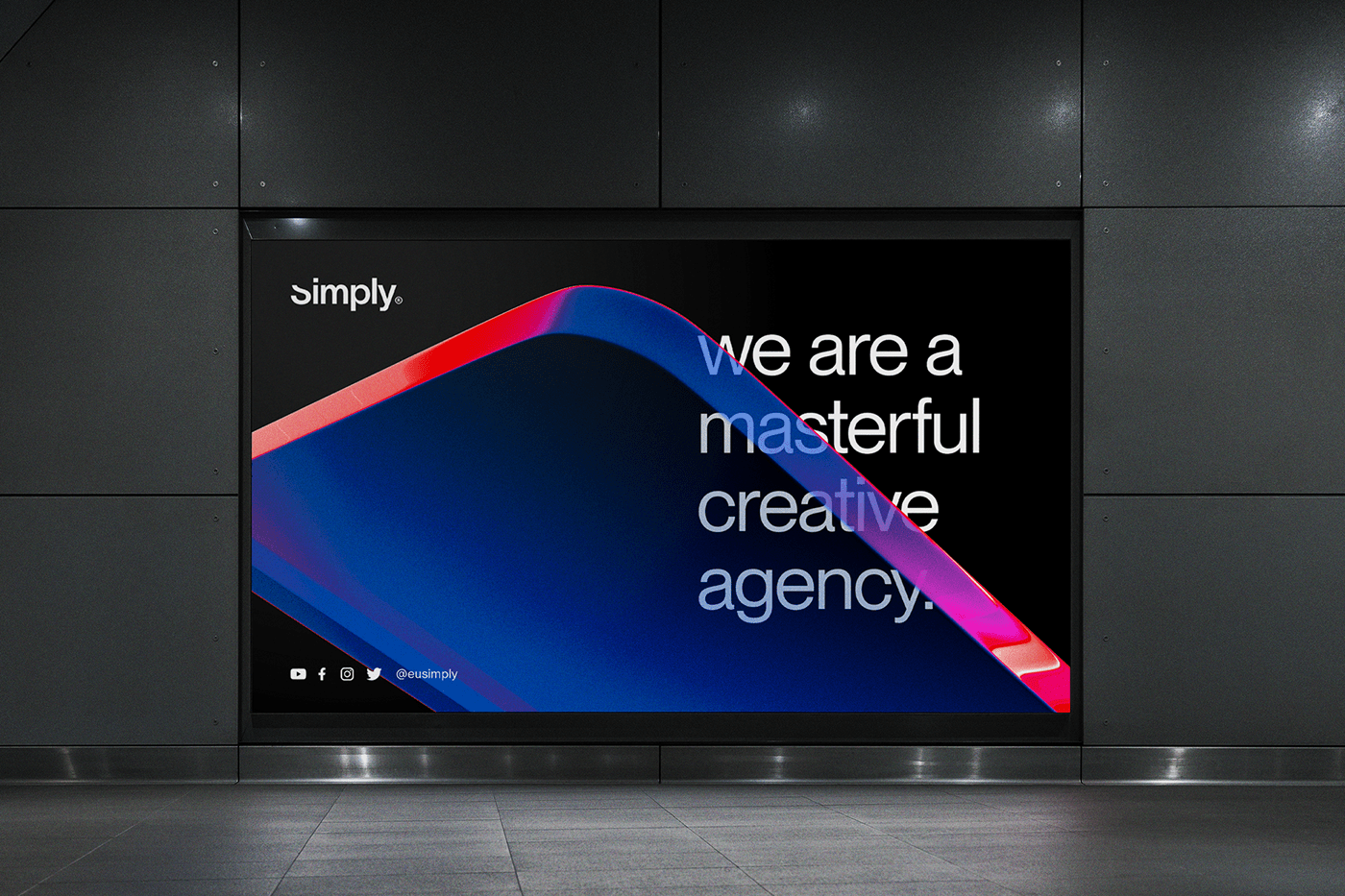
Further enhancing the brand's visual identity, the designers at Berriel Brands have incorporated abstract 3D illustrations in vibrant colors for the background of complementary materials. This adds a layer of depth and vibrancy to the branding, providing a striking contrast to the otherwise monochromatic main elements.
'Simply's' branding and visual identity serve as a testament to the power of minimalist design. It underscores how a focused approach to typography, color, and symbolic imagery can create a brand identity that is both memorable and elegant. As we explore these design choices on abduzeedo.com, we see a vivid example of how less can indeed be more in the realm of digital design.
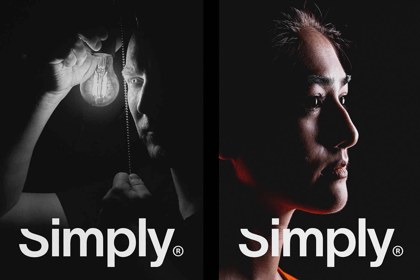
Branding and visual identity artifacts


For more information make sure to check out Berriel Brands website and Behance.