by AoiroStudio
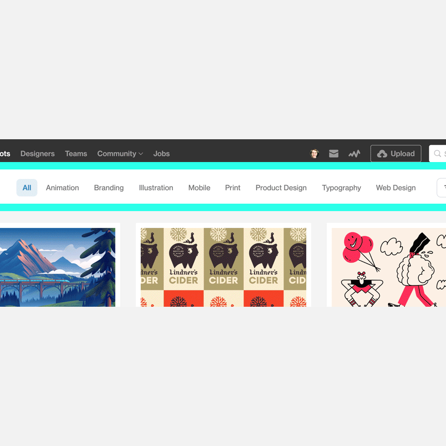
Our friends from Dribbble have introduced some fresh features on their platform that we (us) designers dearly use every single day. They are exciting features! I especially love the new "shot categories" where you have a take at browsing design inspiration easier. I personally feel it's a big update from previous "browsing navigation" and there is definitely a small learning curve. The importance of secondary items are justifiable, it's definitely an improvement compared to other design "newly" updated platforms. Read the entire announcement here!
We’re actively listening to all of your insightful suggestions to ensure that Dribbble is your go-to destination for design inspiration and to further your design career. We’ve been hard at work and are thrilled to share a few very exciting updates.
In their words
Shot Categories
The Dribbble community is full of talented designers uploading all types of amazing work – far too much for just one popular feed to do them justice. To help spread the love to all the inspiring design on Dribbble, we’ve launched Shot categories. These new categories make it easier than ever to browse design inspiration in the areas that interest you the most, from animation to typography, mobile design to web design, and more.
Shot Filters
Shot categories were just the first step in our mission to make it even easier to find great design inspiration on Dribbble. We’ve also added brand new Shot filters. While browsing or searching, you can now easily drill down to find Shots that have a specific tag or color, or Shots containing free downloads. Further, our new “Made With” filter allows you to specifically view Shots uploaded from our custom integrations for popular tools like Figma or Sketch, and more.
Available for Hire
We know that a designer’s workload can change day-to-day, so we’ve added a new one-click toggle for changing your “available for hire” status. Whether you’re ready for your next big career leap or you couldn’t possibly take on one more freelance project, this toggle makes it easier than ever to keep your availability settings up to date.
App Update
Both our Android and iOS apps got huge updates focusing on UX enhancements and a fresher UI. Loads of improvements and features found its way into this release and we’re very excited to share them with the community. Some noteworthy updates include:
- We brought back the tab bar to make it much easier to move between Shots, Activity, Uploading, and Messages.
- With the reintroduction of the tab bar, we removed the hamburger menu. You can now access your profile by simply tapping on your avatar in the top left area of the app.
- We’ve improved the Shots navigation by introducing a sub-navigation—you can now easily switch between your Following, Popular, and Recent feeds.
- We brought back pinch to zoom on individual shots.
- Video support is here! You can now view video shots in all their glory.


