by abduzeedo
LIn the bustling heart of Portland, the discerning eye will find CAFEAKS, a boutique coffee shop that stands out, not just for its aromatic brews, but for its impeccable branding and packaging design, crafted by the celebrated minimalist graphic designer, Zhangtao.
From the outset, Zhangtao's design approach paid homage to Portland's unique regional cultural character. The letter logo of CAFEAKS is an emblem of meticulous craftsmanship. With strokes that are thick, friendly, and immediately striking, it exudes warmth and vitality, reminiscent of a freshly brewed cup of coffee on a chilly Portland morning. The composition primarily leans on English, reflecting the locale, but is subtly accented with Chinese, paying tribute to Zhangtao's cultural lineage and introducing an international flavor.
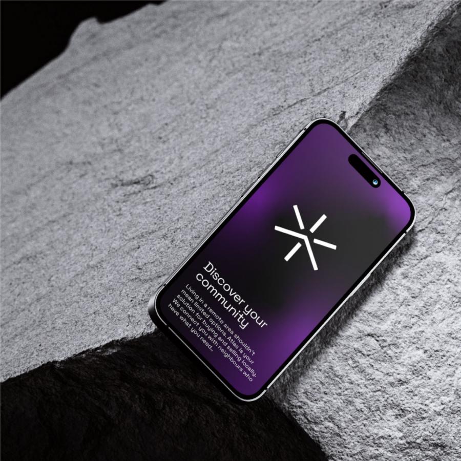
But Zhangtao’s ingenuity doesn't end there. He incorporated the letter 'x' as a central graphical motif in the brand's visual narrative. This seemingly simple character serves a dual purpose. On one hand, it symbolizes the ritual of connection—two lines intersecting, much like the connection between the coffee shop and its patrons, or perhaps the meeting of cultures in this globally connected age. On the other, the 'x' signifies the unknown, hinting at the limitless possibilities of coffee flavors waiting to be discovered at CAFEAKS.
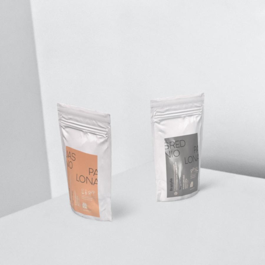
The packaging of the coffee products further epitomizes Zhangtao's minimalist aesthetic. Stripped of unnecessary embellishments, the design features a clear and intuitive information layout. Customers can, at a mere glance, discern the quality and essence of the coffee they're about to indulge in.
In a world overflowing with design clamor, Zhangtao's work for CAFEAKS serves as a beacon of minimalist elegance. It is a testament to the power of simplicity, proving that sometimes less truly is more.
Branding and visual identity
For more information make sure to check out 张韬 zhangtao website or Behance profile

