by abduzeedo
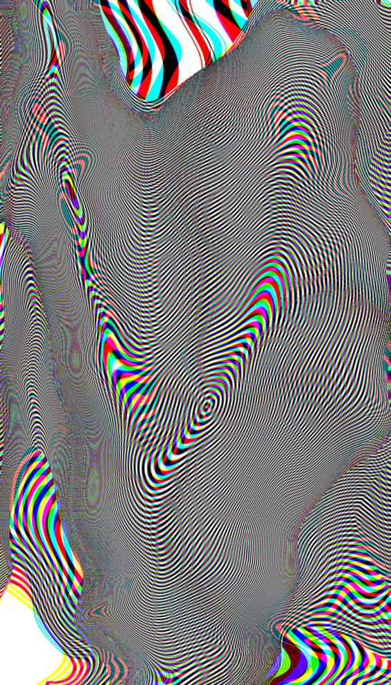
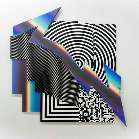
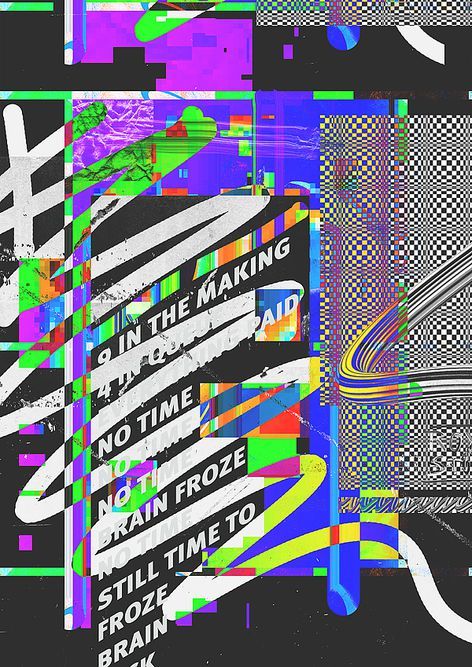
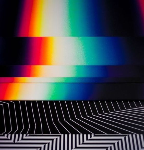
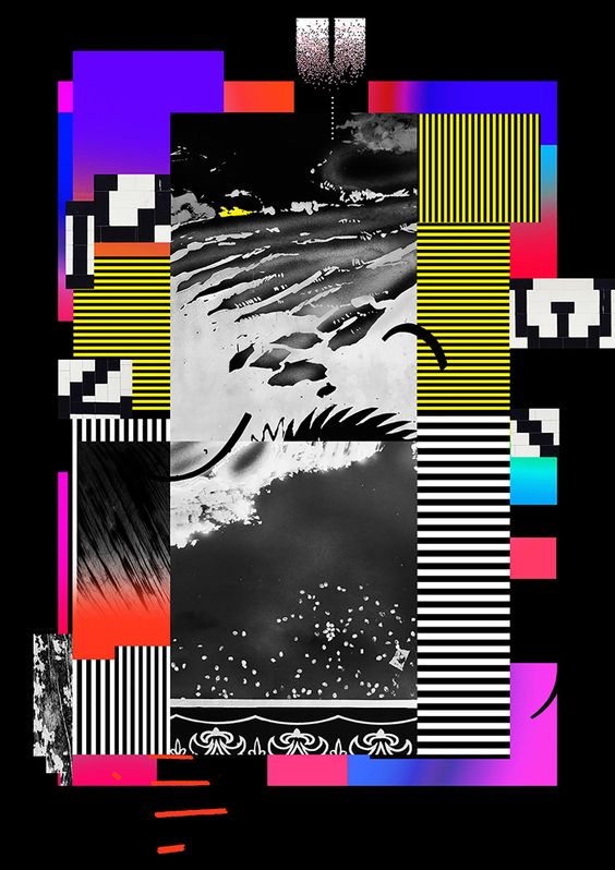
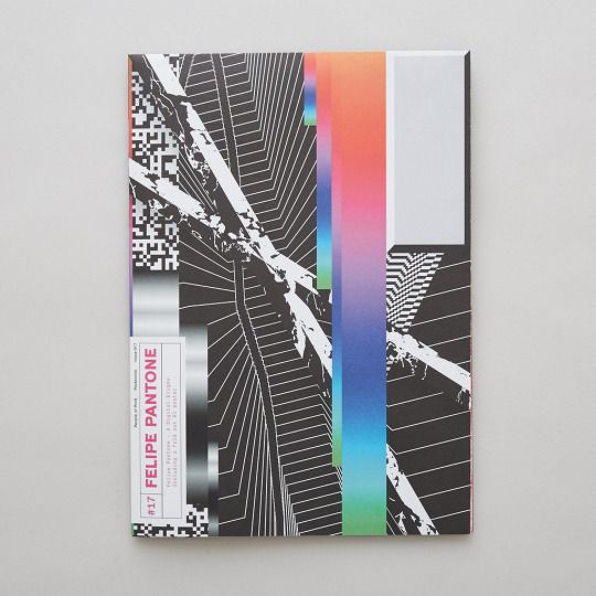
We have been posting a series of posts featuring graphic design and web design work that, in a way, brings back the 90s in terms of aesthetics and style. It’s hard to define that, it might vary from person to person. For me, while the 80s was all about neon, futuristic computer-generated images with chrome, unicorns running across a digital grid, and of course the RGB colors. The 90s is the complete destruction of the form. Typography is pushed to the limit of being even legible, forms are deformed and distorted. You also notice some effects like when the CMYK colors are printed with problems in the alignment, with color leaks, light leaks, textures, and dirt.
For this post, I would love to share some examples of this style. They are not from the 90s per se, however, they illustrate quite well what I just describe. Make sure to click on the link to visit the authors. Disclaimer, they are images I found on Pinterest.
90s Graphic Design Look