by abduzeedo
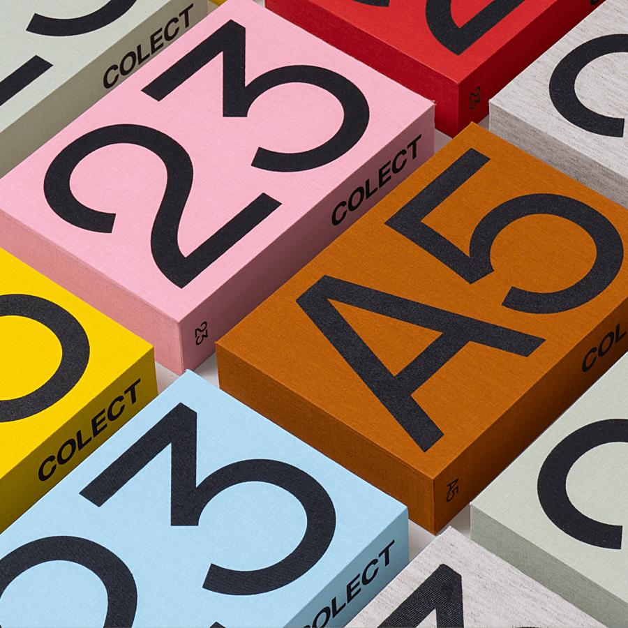
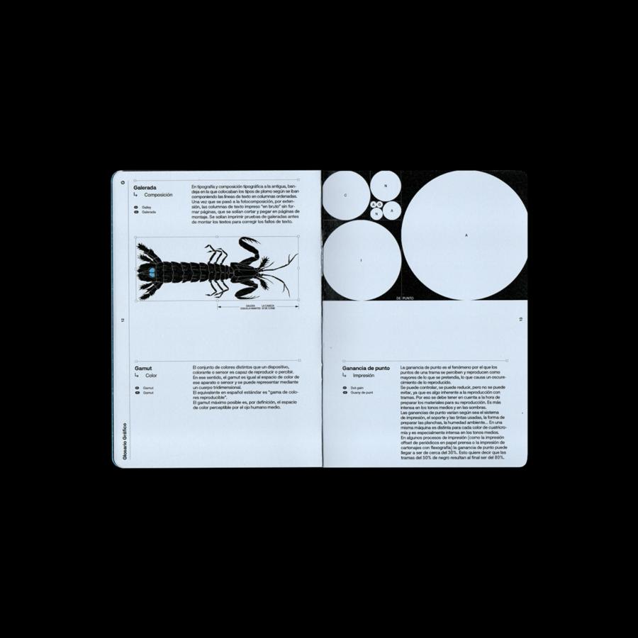
Ezequiel Cafaro was called to design the poetry collection for Editorial Salto de Página and redesign the seal brand. For the collection system Ezequiel and team generated "a color palette of images that do not exist", indefinite, but that could be anything you imagine. "We leave it to your discretion” — he adds. The layout of these palettes is ordered by a base grid that freely modulates the spaces of each deck, and that allows the generation of patterns and textures and all the combinations that we want.
For the brand the goal was to incorporate something from the world of editing and orthotypography, such as the ¶ calderón sign (used in ancient times to mark the different paragraphs) and the non-printable characters of editing programs. And if one does not know anything about this, the calderón reminds the letter «P» of «Page»
For more information make sure to check out Ezequiel on:
