by abduzeedo
Onco Inc.'s branding and visual identity go beyond capsule homes, weaving a future of minimalism, dynamic circles, and vibrant colors, challenging "punk and grey" trends and embracing tradition with modern innovation.
Onco Inc. isn't just building compact, tech-savvy homes for the space-conscious present. They're crafting a vision of the future, one where design dances with technology and tradition intertwines with innovation. Their latest offering – the capsule homes – are a testament to this philosophy, packed with smart features and wrapped in a minimalist aesthetic that speaks volumes.
Editorial Elegance: Onco Inc.'s design language is a masterclass in clean lines and uncluttered spaces. Think high-end magazine layouts, where typography and white breathe life into minimalist compositions. This editorial approach lends a touch of sophistication and refinement, setting them apart from the sterile futurism of chrome and glass.
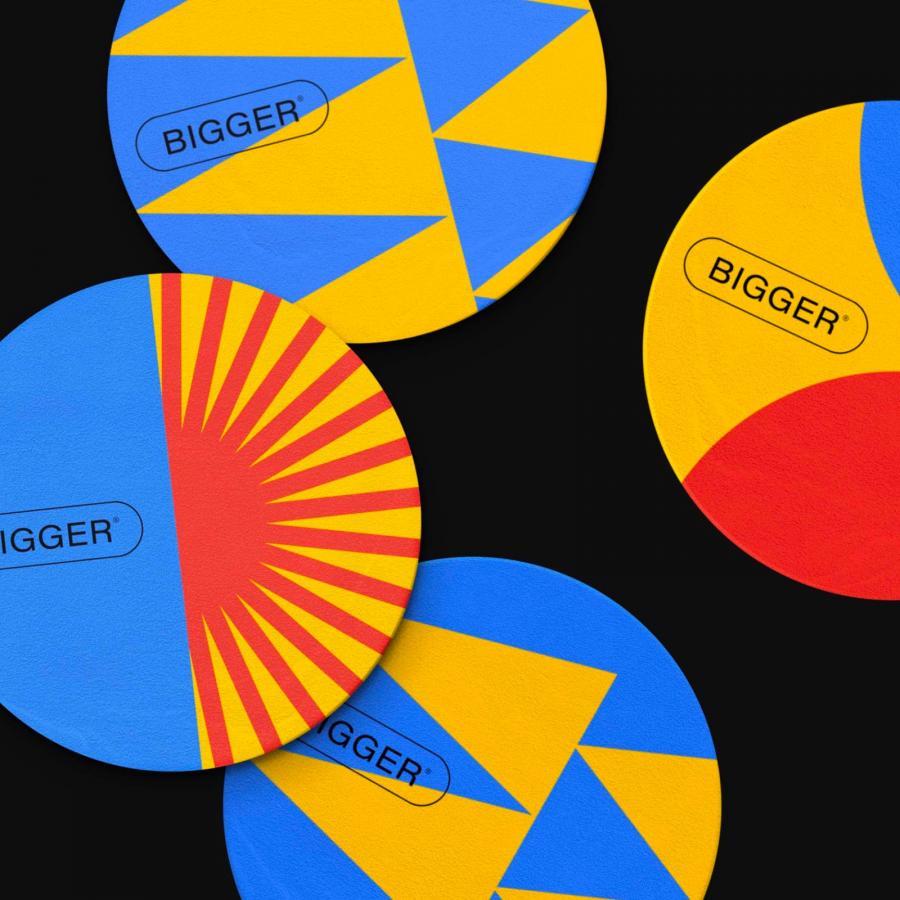
Circles in Motion: But Onco Inc. branding isn't just about static beauty. They infuse their design with dynamism through circles and lines in perpetual motion. These elements aren't mere decoration; they symbolize the interconnectedness and fluidity of our modern world. Imagine a single circle morphing into a network, lines pulsing with energy, hinting at the constant evolution and interaction that defines our lives.
A Burst of Color: Forget the cold, grey palettes of stereotypical futuristic design. Onco Inc. explodes with vibrant hues, a defiant splash of optimism against the monochrome backdrop. This isn't just about aesthetics; it's a statement – a challenge to the notion that the future must be devoid of warmth and joy. Their color palette is a celebration of life, a vibrant canvas for the possibilities that lie ahead.
Beyond the Punk and Grey: Onco Inc. doesn't subscribe to the "punk and grey" future some envision. They champion approachability, injecting their design with a sense of liveliness and playfulness. It's a future where technology isn't cold and alienating, but rather an extension of ourselves, woven into the fabric of our lives with a sense of harmony.
Rooted in Tradition: But Onco Inc.'s vision isn't just about looking ahead. They weave threads of their Korean heritage into their design tapestry, seamlessly blending historical elements with contemporary principles. It's a unique fusion, a respect for the past that doesn't stifle innovation, but rather propels it forward with a richer, more meaningful perspective.
Onco Inc.'s branding and design isn't just about capsule homes; it's about crafting a future that feels both familiar and exciting, where technology enhances life without sacrificing warmth, and where tradition inspires innovation without being trapped in the past. It's a future we can all embrace, one circle and vibrant line at a time.
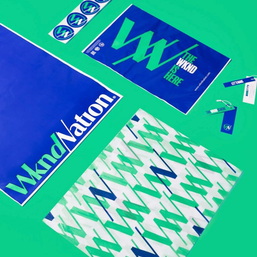
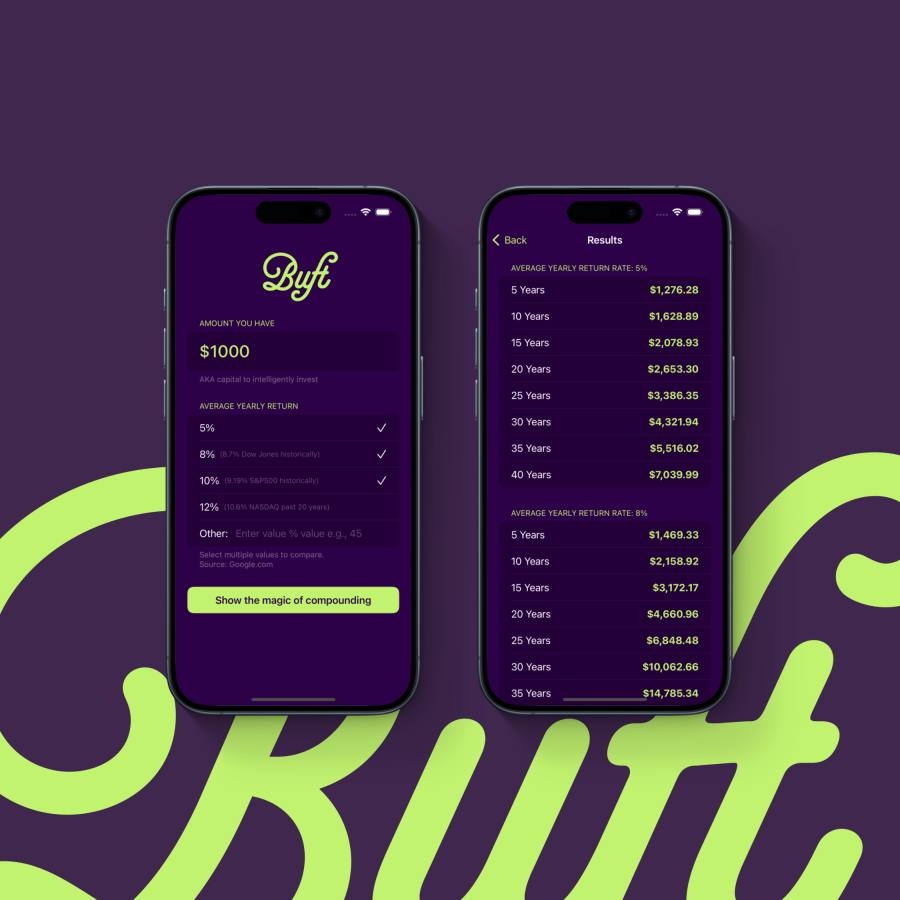
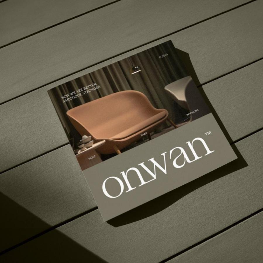
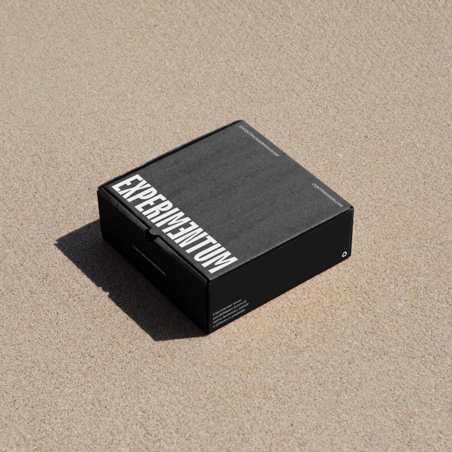
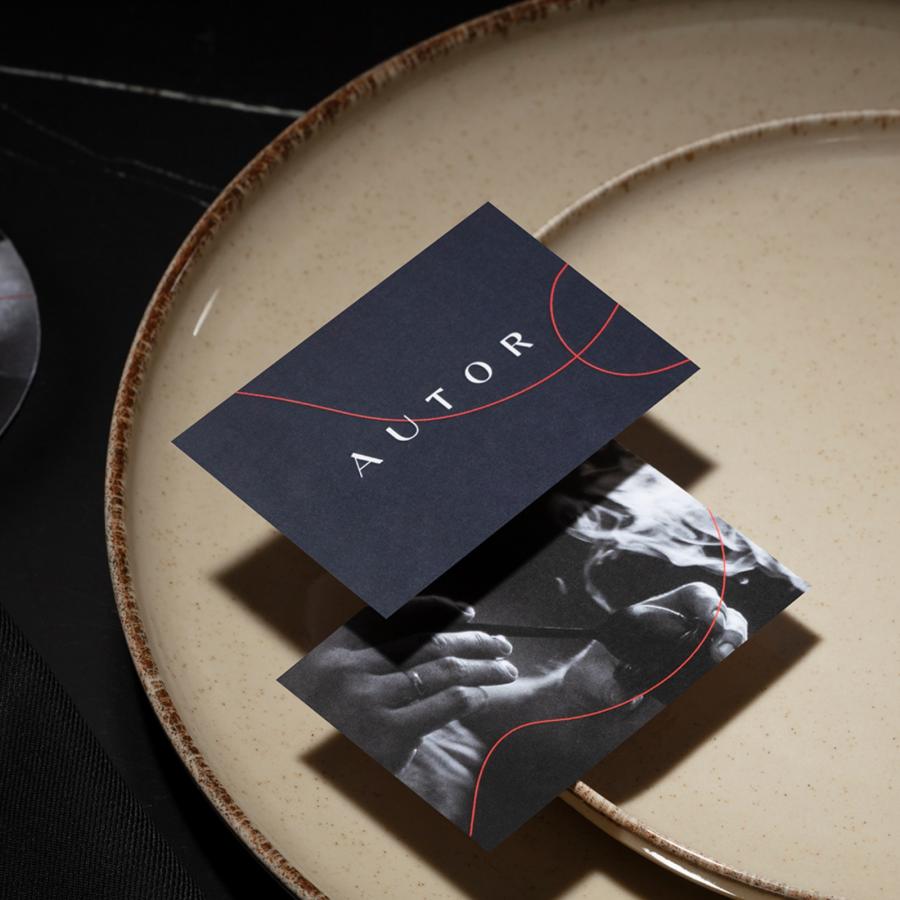
Branding and visual identity artifacts
For more information make sure to check out Lotipa Studio on Behance and Instagram (@lotipastudio)
