by abduzeedo
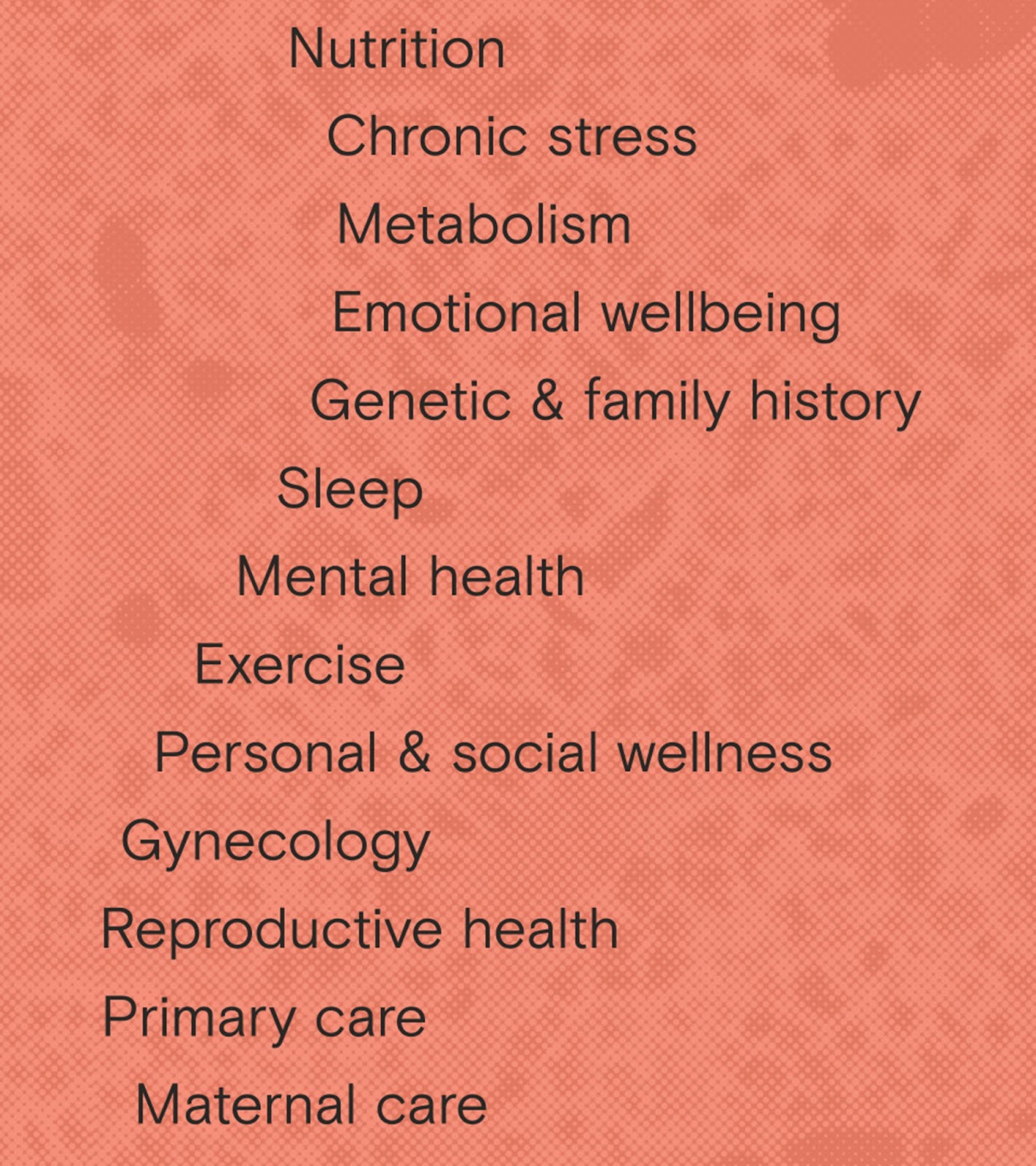
A resource, finally. Carolyn Witte and Felicity Yost started Tia in 2017 to address the medical needs of a long-ignored, painfully neglected segment of the healthcare population: women. A focused beginning. They started with a WebMD-style texting platform aimed at younger millennials and zoomers. The goal: to normalize conversations about topics such as birth control and gynecological care. Demand for more services. As the Tia team rapidly expanded beyond a texting platform into in-person and digital care, they realized the need to broaden not only their geographic reach but their target markets as well.
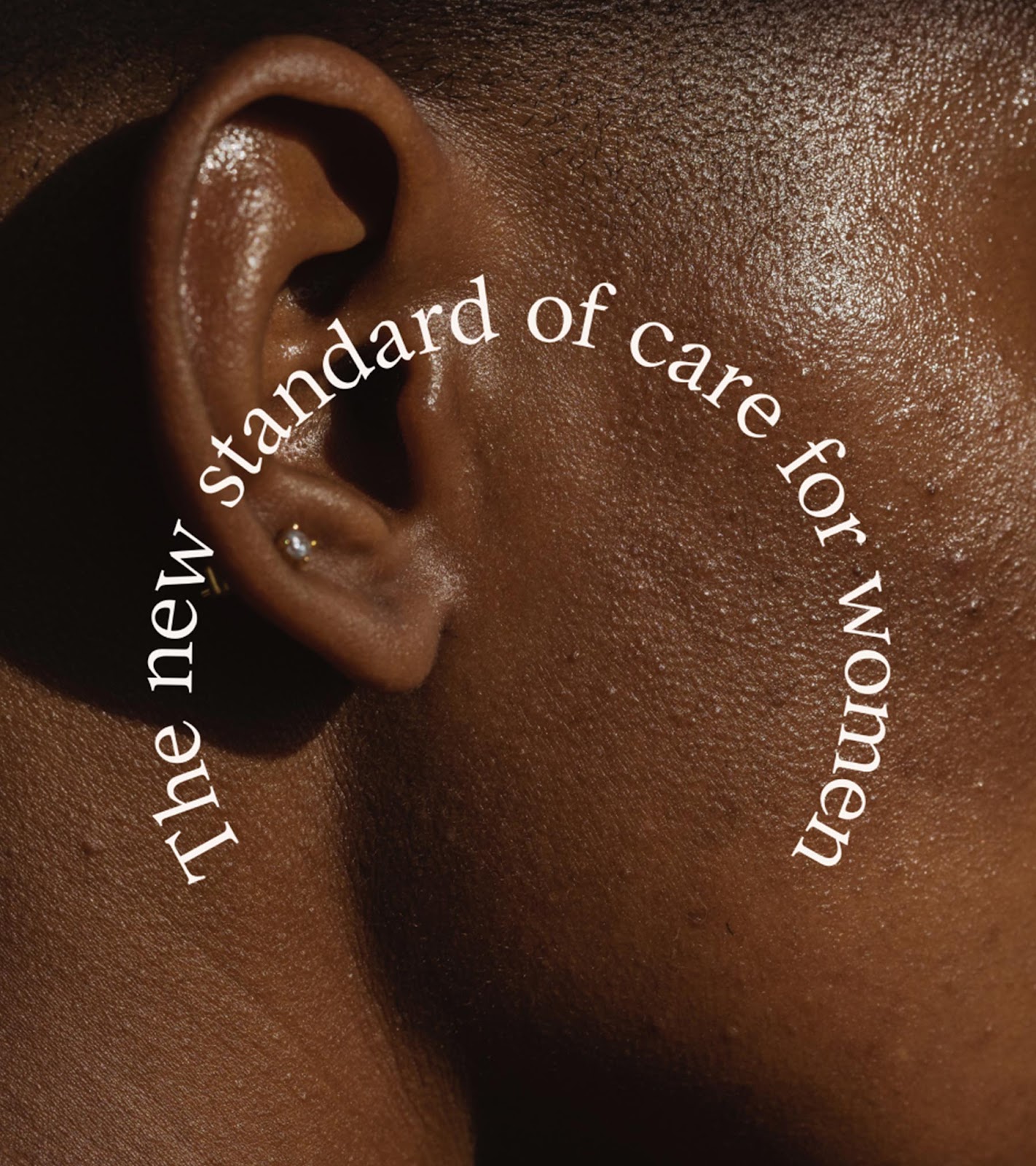
Expanding beyond the millennial set. Athletics team’s goal was to create a visual and verbal identity that would speak to a broader community of women across age brackets and clinical settings—while preserving the friendly personality that’s defined Tia from the get-go.
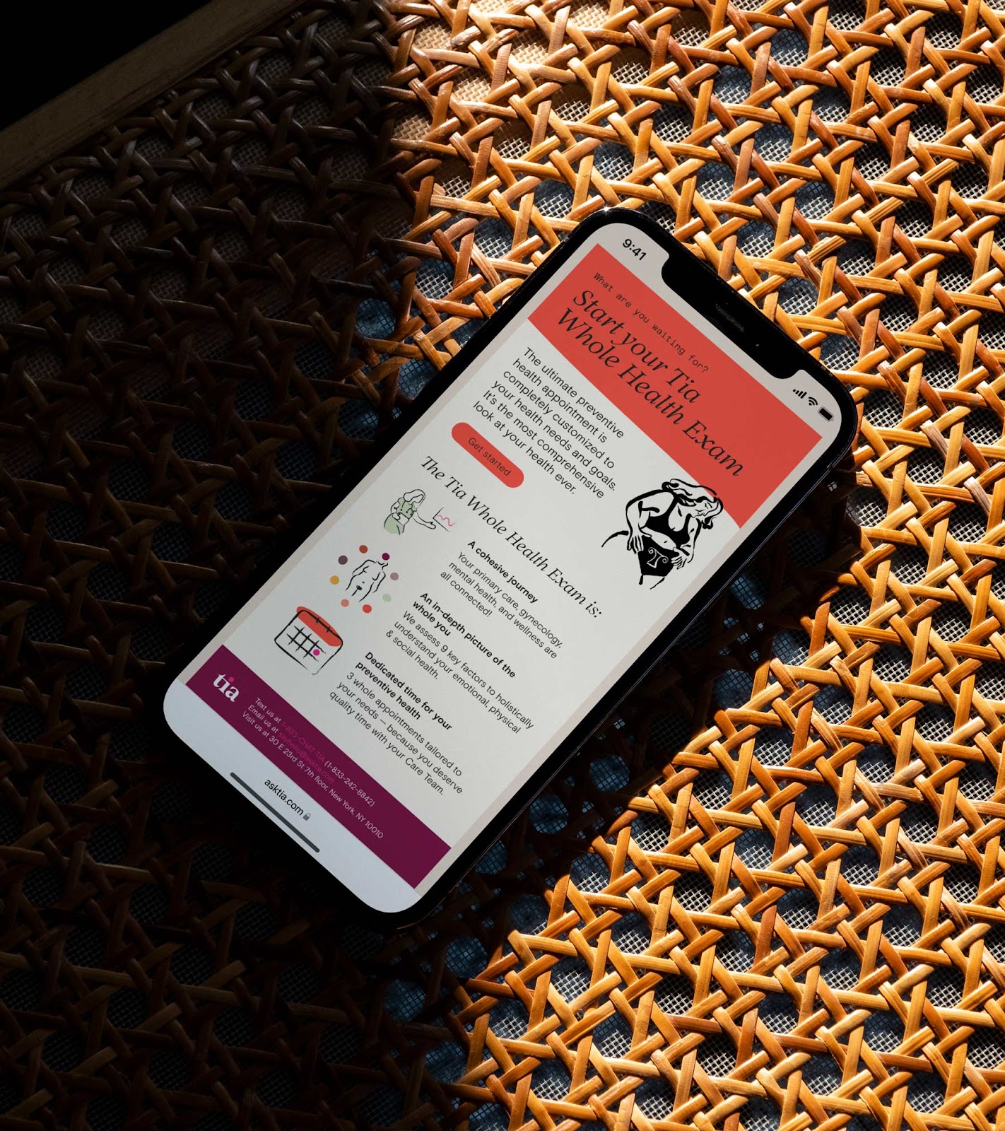
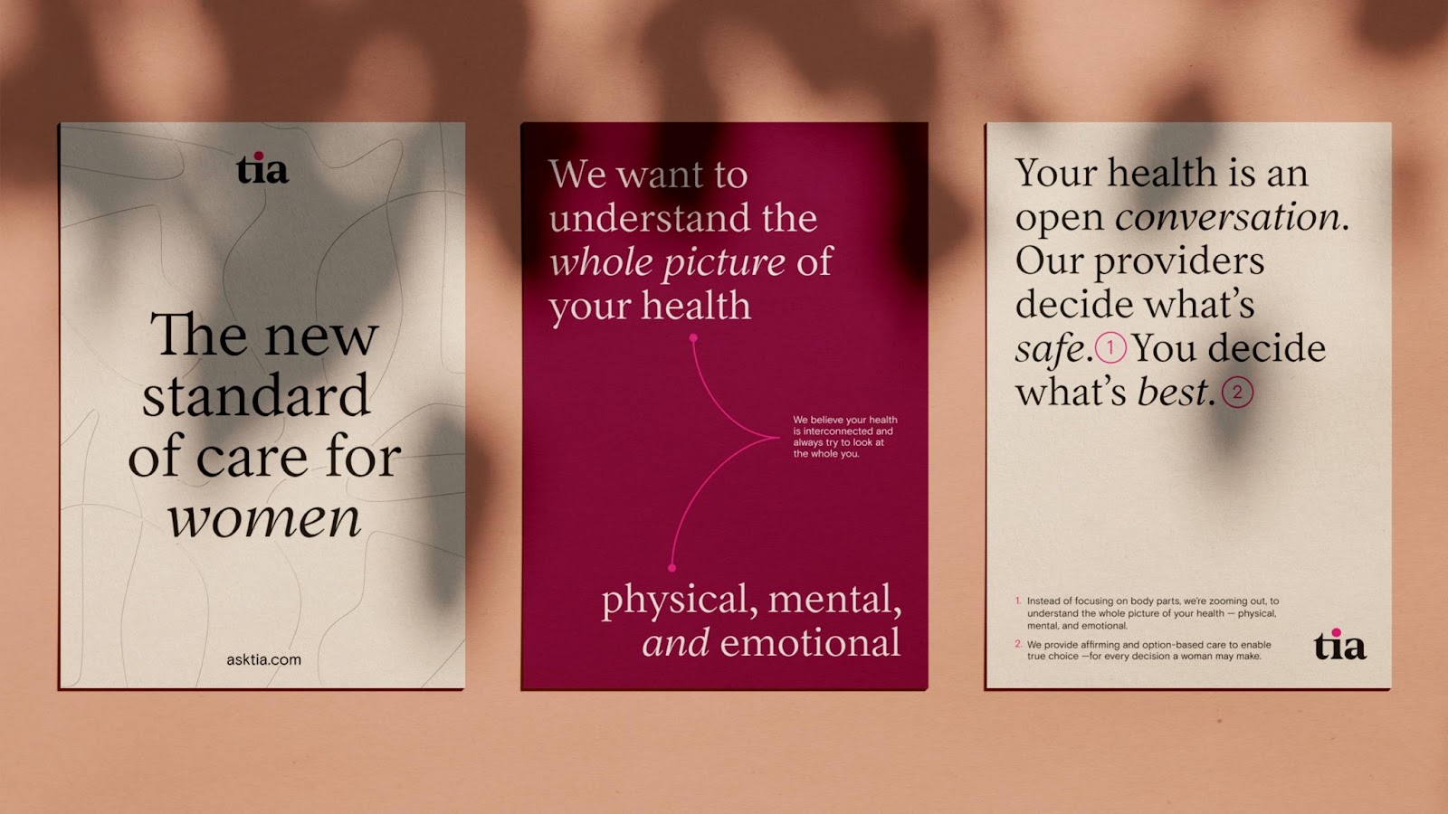
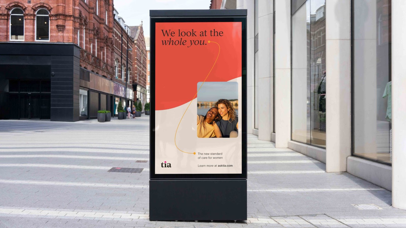
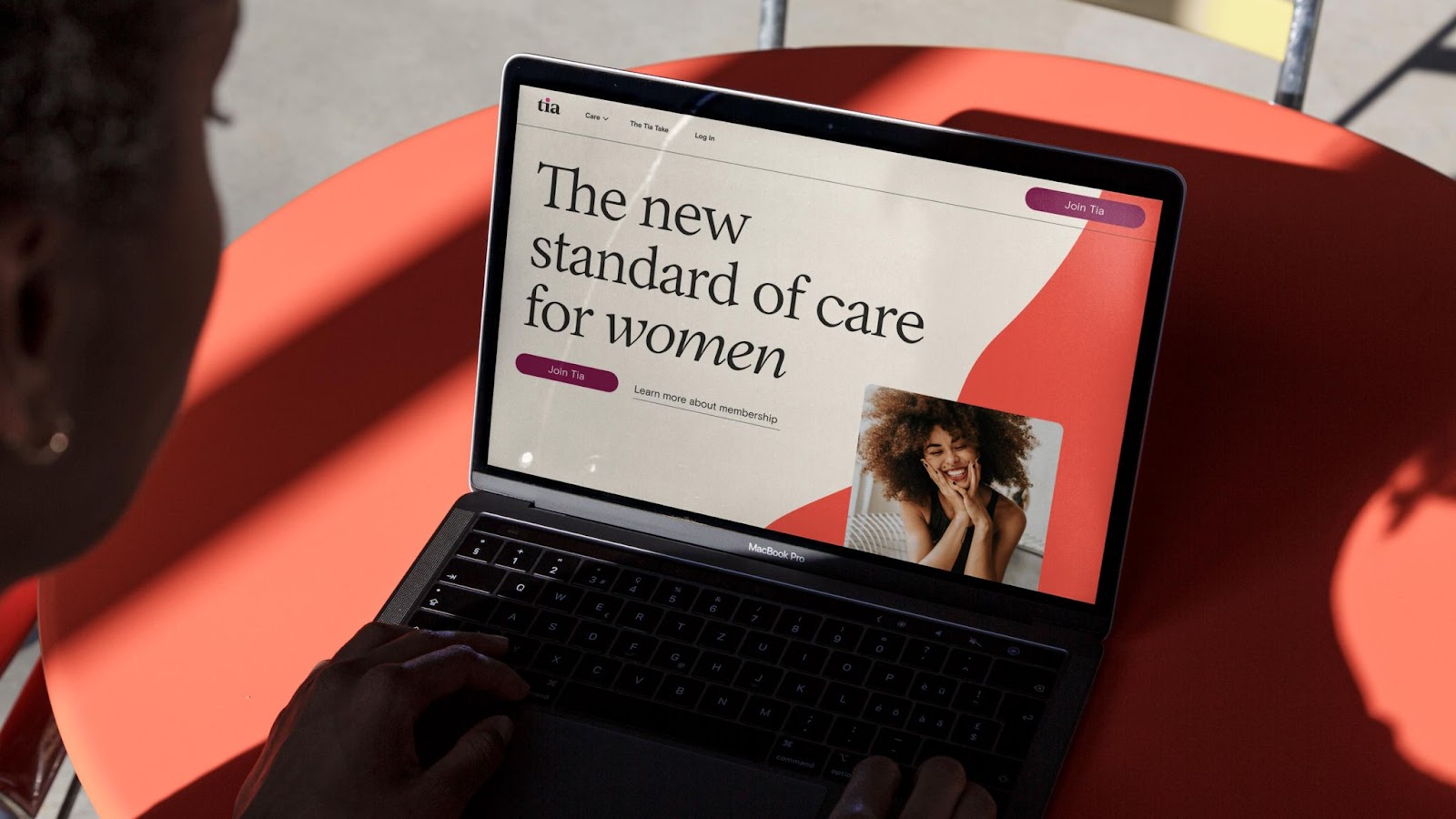
One of our brand objectives, beyond appealing to a more diverse community of women, was to elevate perceptions of clinical sophistication. We selected Tia’s new typefaces with this objective in mind. For headlines and large type moments, we are using a modern take on a literary, 17th-century Garalde typeface called Inferi. For body copy and subheaders, we are using a functional sans-serif called Basis Grotesque. Pairing the two results in a typographic treatment that conveys both editorial gravitas and grad-school competence—repositioning Tia as a voice of clinical excellence.


Summary
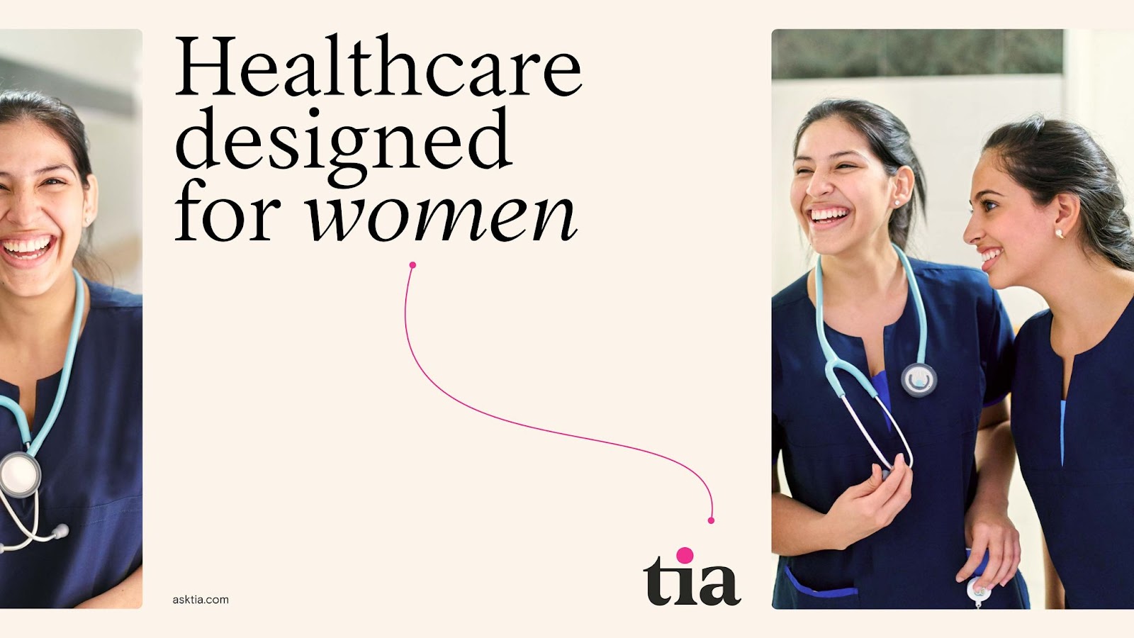
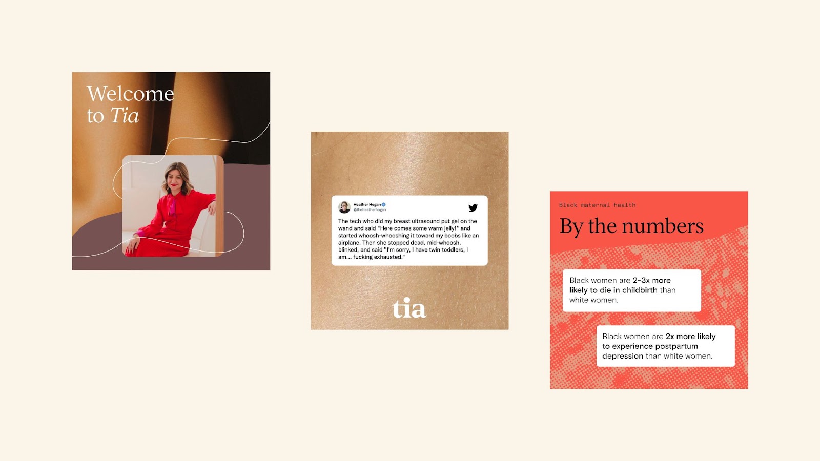
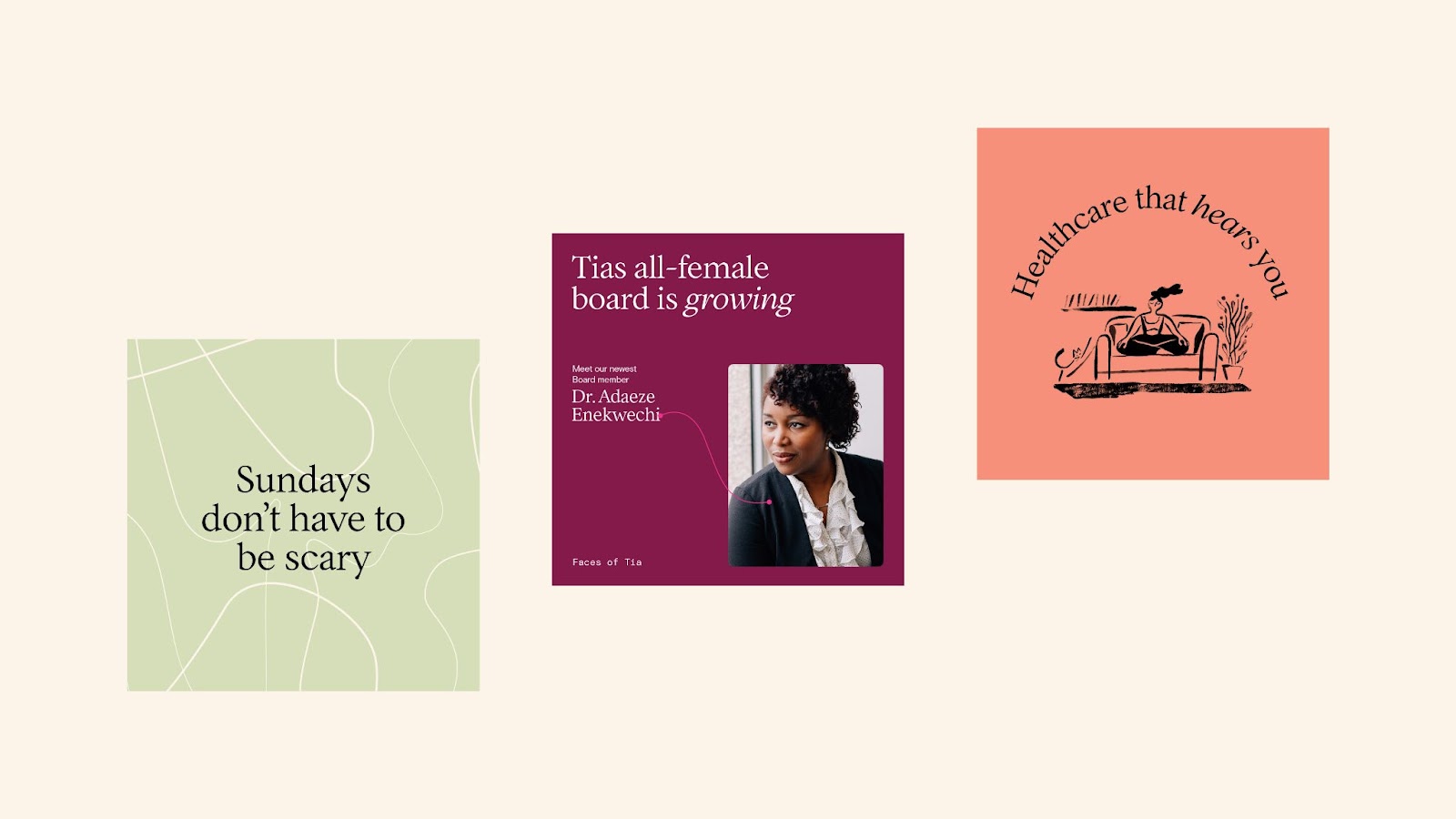
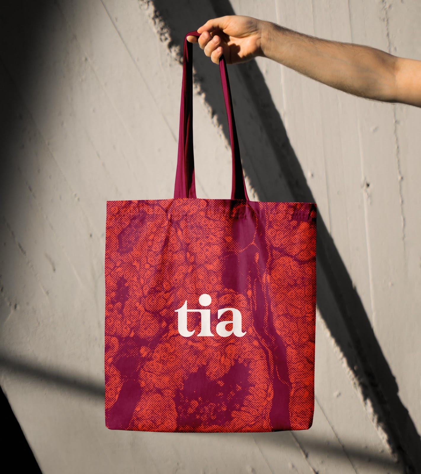
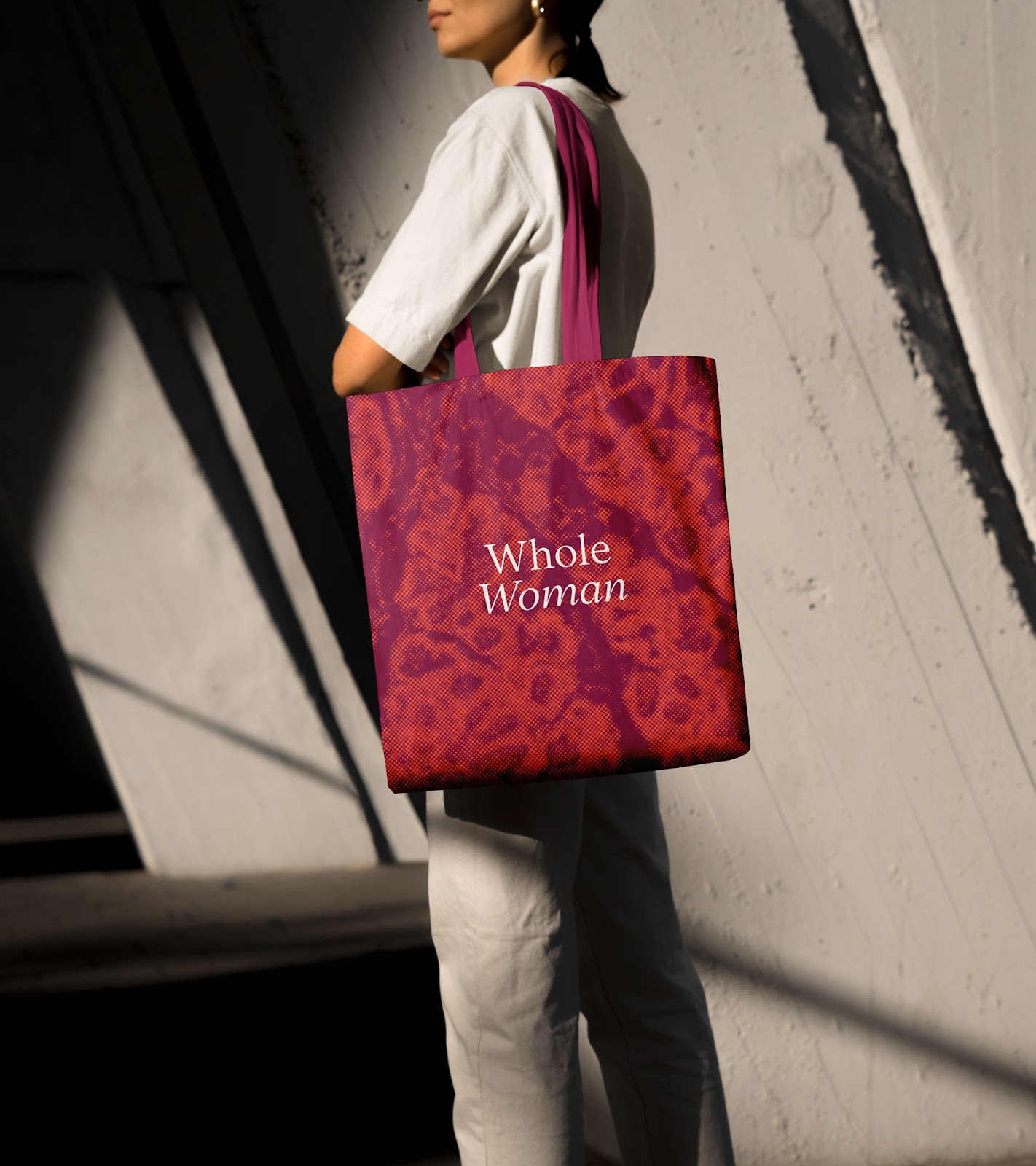
- With Tia’s expansion into physical, in-person locations, Athletics shifted the brand’s color palette from brighter, digital-oriented colors to a selection of warmer, earthier, and more welcoming tones. The new palette is anchored by calming neutrals, ranging from light creams to dark terracotta tones, with a bright poppy and rich raspberry hue.
- To maintain brand recognition, the team held onto the “Tia pink” for accents and added a set of tertiary colors—pistachio, gold, white, and black—for supporting details.
- In line with elevating Tia’s clinical competence, Athletics updated their wordmark with a lowercase “t”, double-story “a”, and evened out the kerning to improve reading readability and to draw attention to the signature Tia pink dot.
- Athletics carefully selected typefaces that introduced sophistication and clinical credibility into the brand. Starting with a modern take on a literary 17th-century Garalde typeface Infer for headlines, and a functional sans-serif called Basis Grotesque for body copy and subheads.
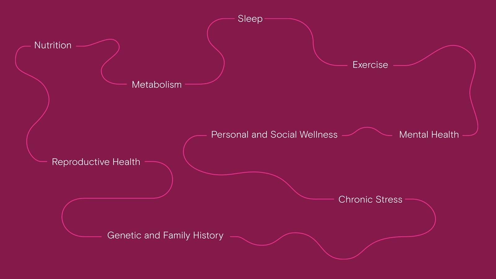
- The line graphic treatment throughout the system was a subtle way of acknowledging that no two healthcare journeys are the same. Paired with copy, the line treatment can be used to connect the dots in a non-linear process to healthcare.
Credits
- Scope: Research and Strategy Art Direction Brand Identity Brand Voice
- Client: TIA
For more information check out the full case study at Athletics website


