by abduzeedo
In the bustling heart of London's design industry, SABER stands as a beacon of innovation, quality, and contemporary style. Established in 2015 by a group of passionate young entrepreneurs, this interior design and supply brand has made a name for itself by focusing on modernity, functionality, and individualized design sensibilities. It was MỘC CREATIVE took up the mantle of transforming SABER's core values into a tangible and resonant branding and visual identity project.
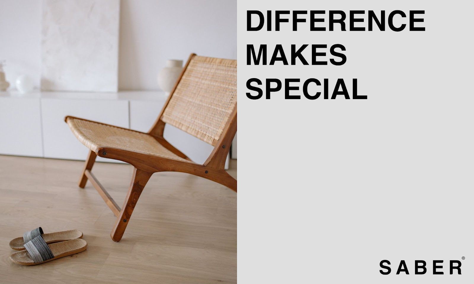
SABER is more than just a name; it's a statement. The brand's philosophy revolves around three vital attributes: prestige, quality, and modernity. These tenets are not merely a corporate mantra but a commitment to every customer's desires and functional needs. The young energy that the founding team exudes translates into the brand's personalities - youthful, dynamic, and pioneering.
MỘC CREATIVE's challenge was not a small one. Translating the unique energy of a brand like SABER into a visual and conceptual identity required an understanding that extended beyond conventional design paradigms. The branding project had to encapsulate not just SABER's commitment to quality but its drive to push boundaries and be a special version of itself.
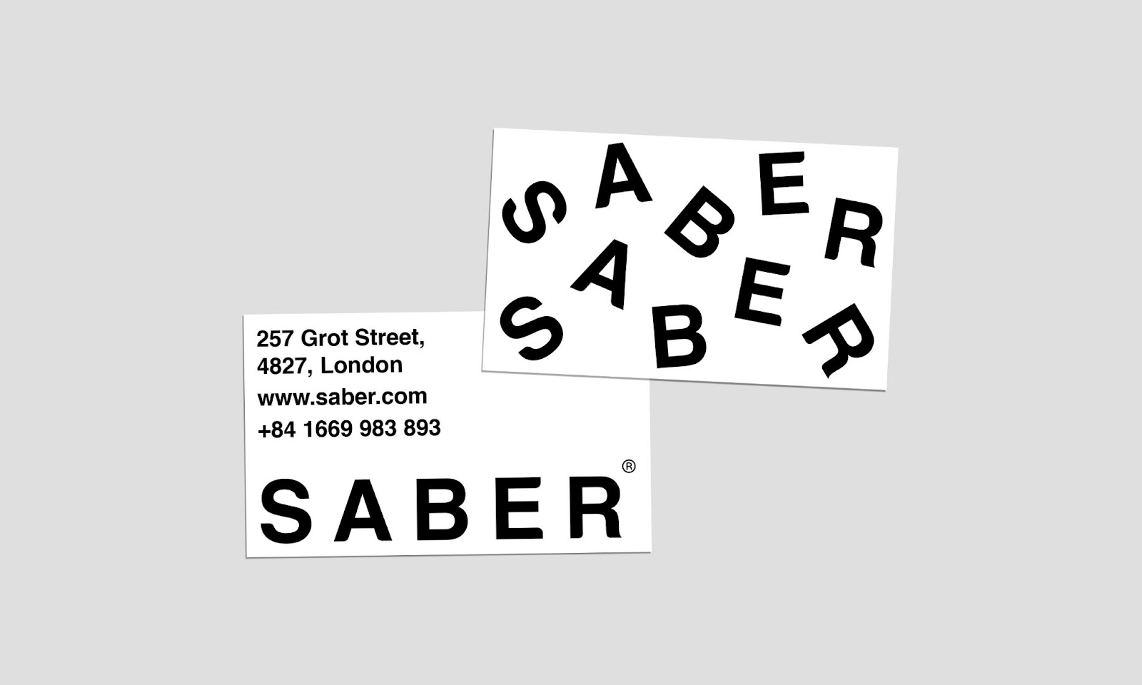
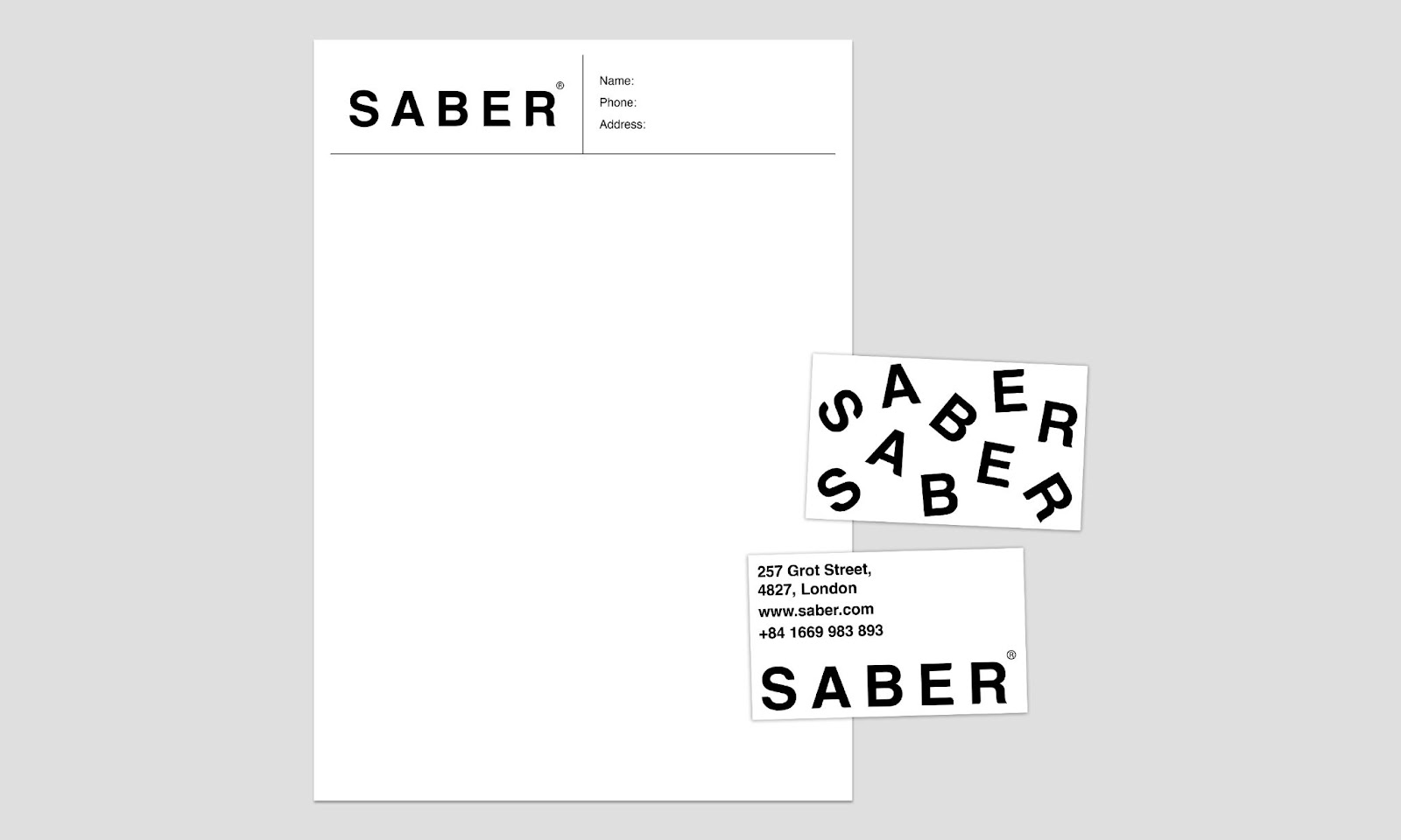
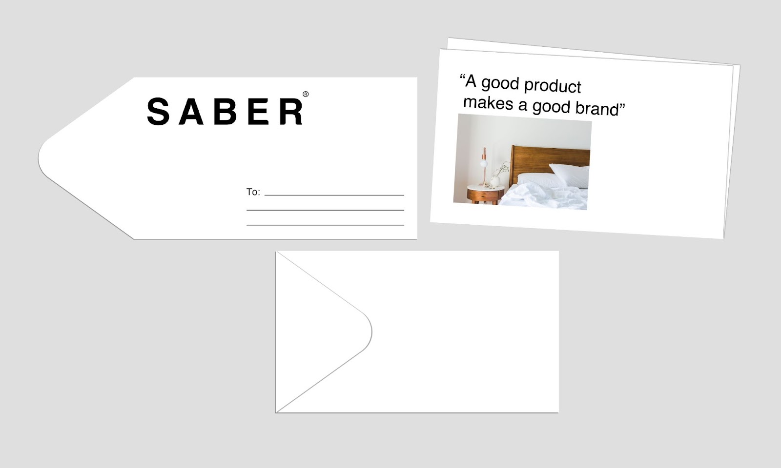
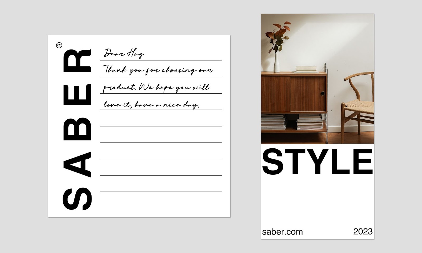
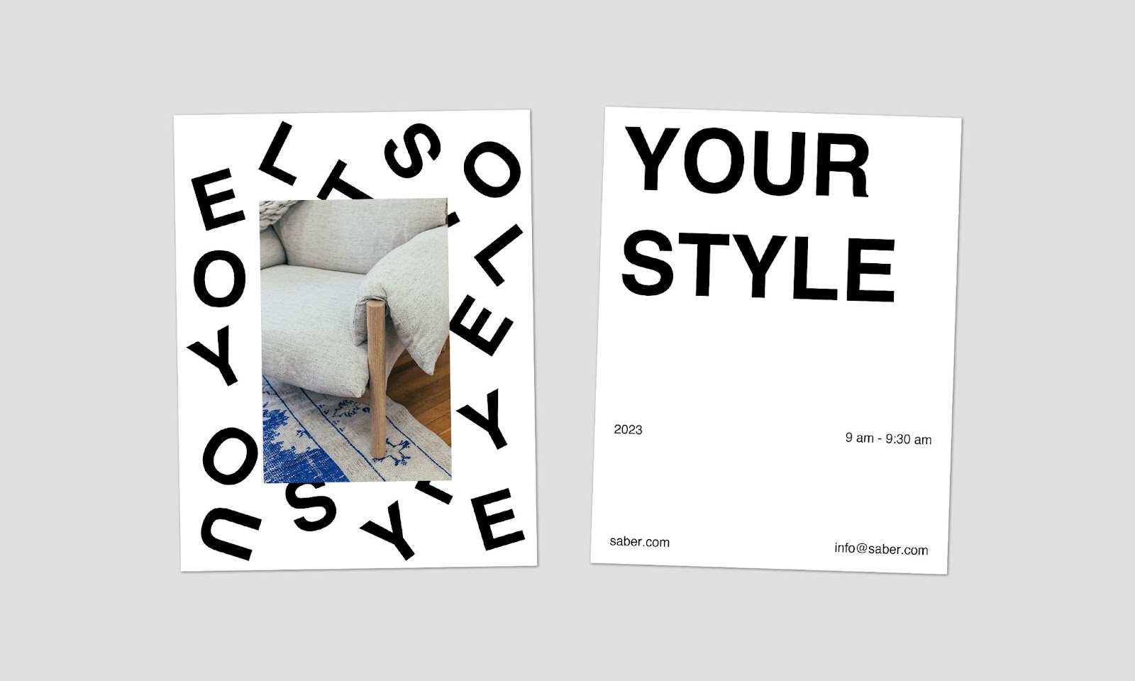
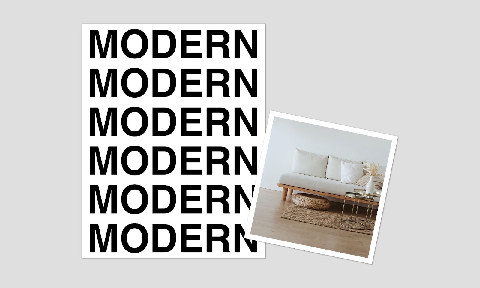
Embracing SABER's minimalist ethos, MỘC CREATIVE opted for a simple yet bold black and white color scheme, with a clean sans serif font for the logo. This seemingly simple choice was profound, reflecting the brand's dedication to modern, unfussy elegance. The lack of color was not an absence but a statement, a testament to SABER's commitment to quality without distraction.
The visual elements were designed to be an embodiment of SABER's personalities. They resonate with not just the vibrancy of youth but also the wisdom that accompanies the pursuit of quality and integrity in design.
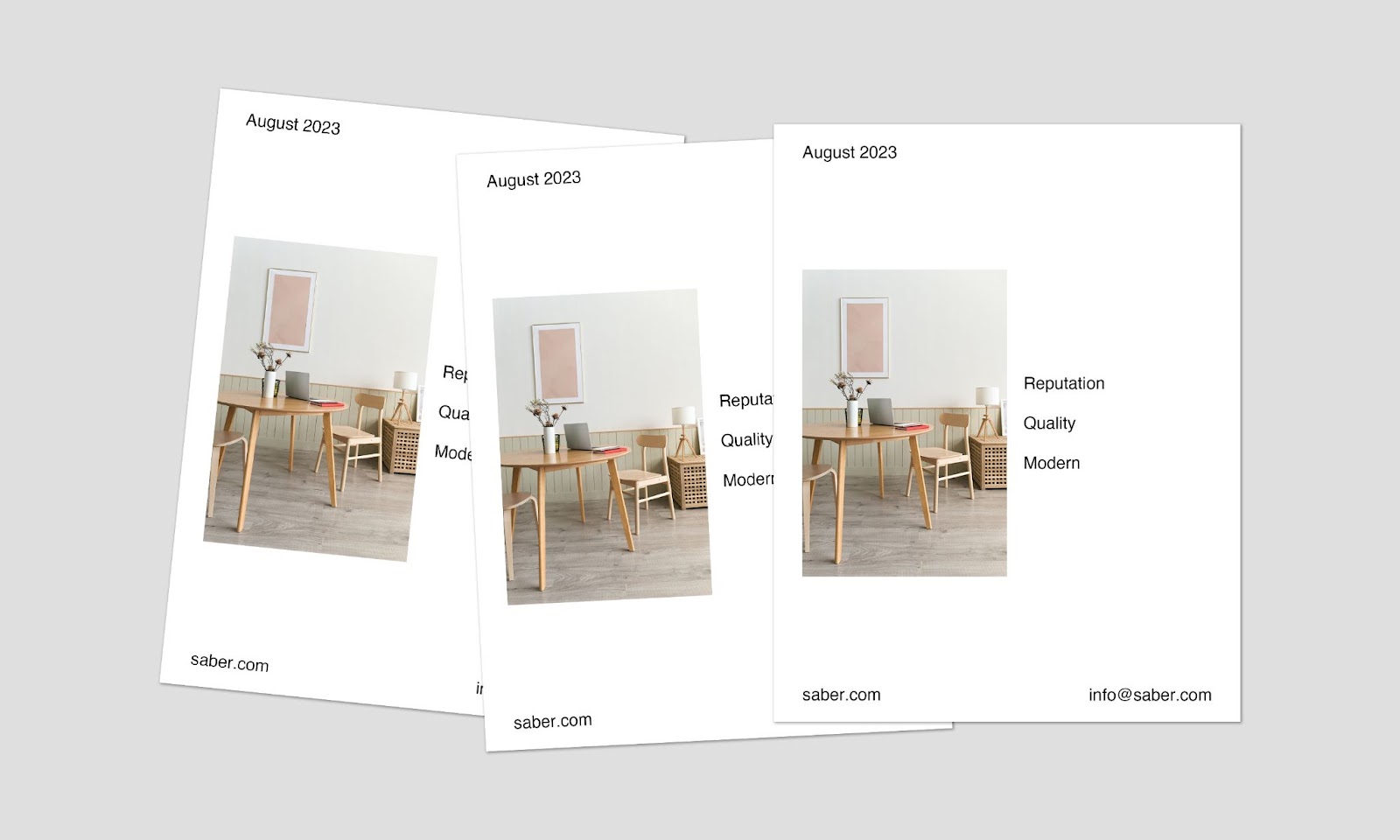
But MỘC CREATIVE did not stop at aesthetics. They took the branding a step further, weaving SABER's ethos into every aspect of their presence, from their digital footprint to their in-store experience. Every touchpoint was an opportunity to reinforce what SABER stood for.
In conclusion, MỘC CREATIVE's branding project for SABER is a testament to the power of understanding a brand's core values and translating them into a coherent and compelling visual identity. It's a story of youthful passion meeting seasoned expertise. It's a tale of a young brand being sculpted into an emblem of modernity, quality, and innovation. And above all, it's a showcase of how design can breathe life into a brand, turning it into a living, resonating entity.
Branding and visual identity


For more information make sure to check out MỘC CREATIVE.