by abduzeedo
Vicarel Studios website shared a case study with us detailing the branding and visual identity work done for Telson Tequila. Tequila is one of the fastest growing spirit categories in the market. With countless options and a huge price spectrum, selecting a quality, reasonably-priced tequila can feel like a daunting task. New brands are popping up every day. With rapidly growing visual noise on shelf, we needed to develop an immediately-identifiable, instantly recognizable brand that not only stands out on shelf but inspires an elevated consumer experience.
The Solution
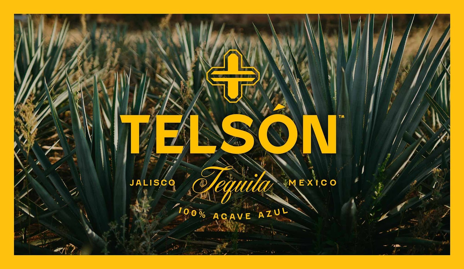
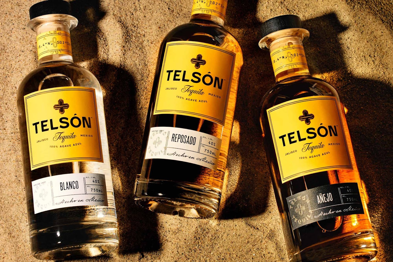
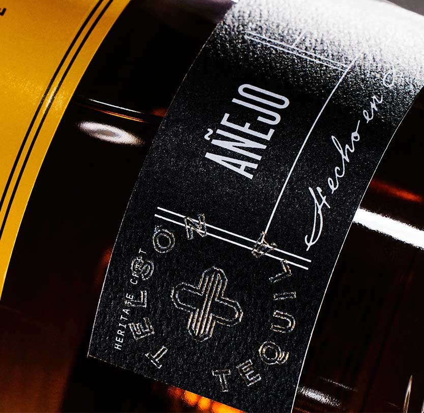
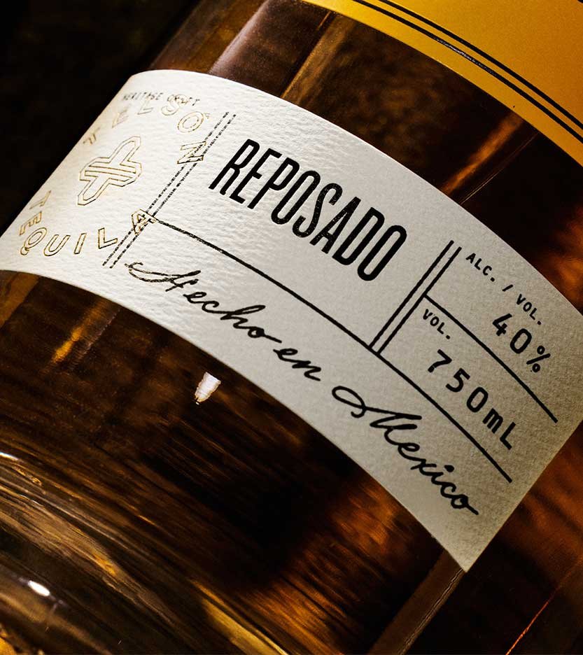
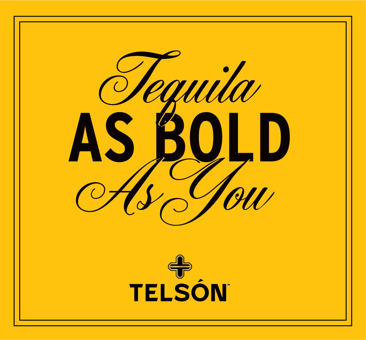
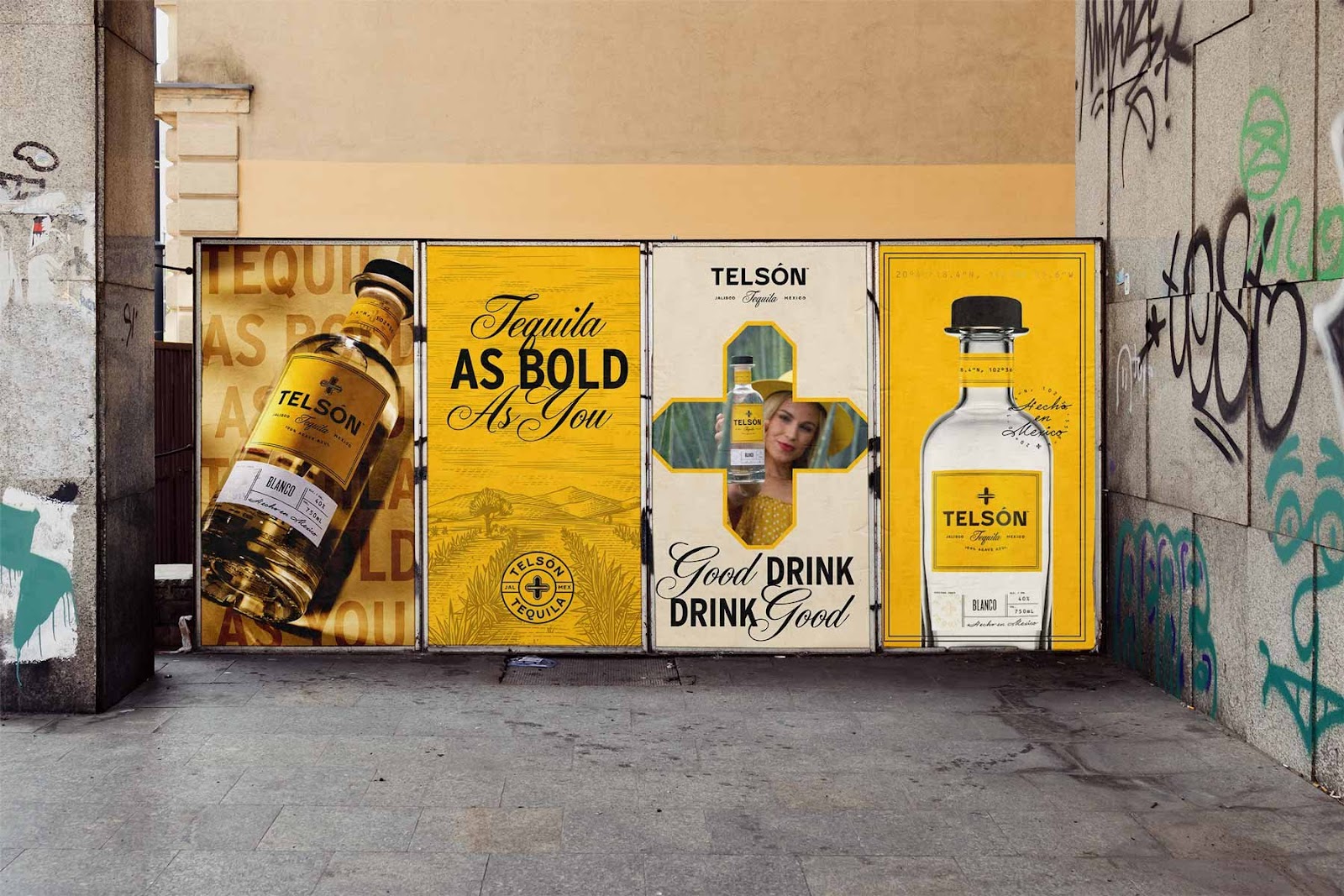
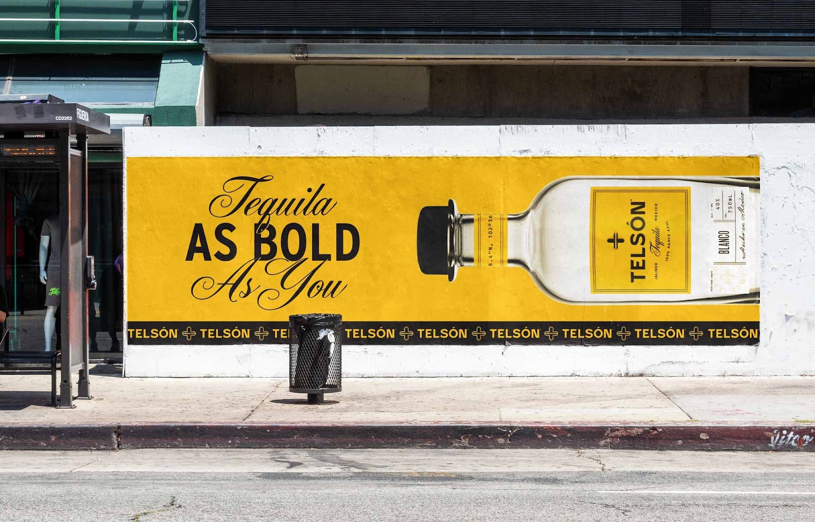
We developed a boldly simple brand through floods of color and minimal design elements. These design choices were paired with a type system that balances masculinity and approachability. A subtle sense of craft is conveyed through hand lettering and illustration throughout the brand, and the use of travel coordinates evokes curiosity and a connection to where the spirits are produced. With use of embossing and gold foil, Telsón fits right in as a luxurious, sippable tequila that can flourish without celebrity endorsements.
Strategy
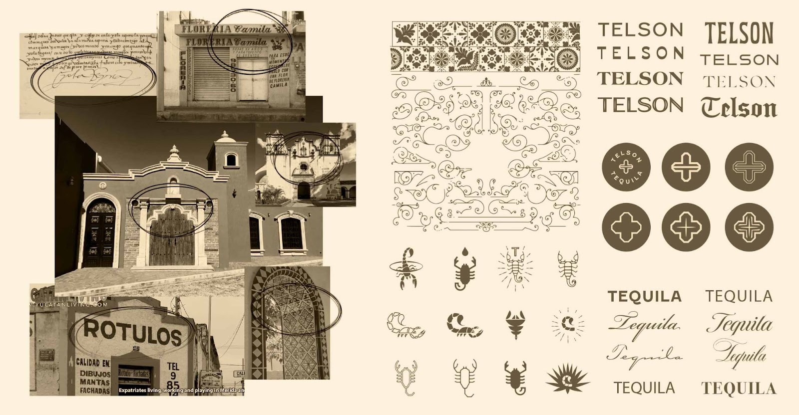
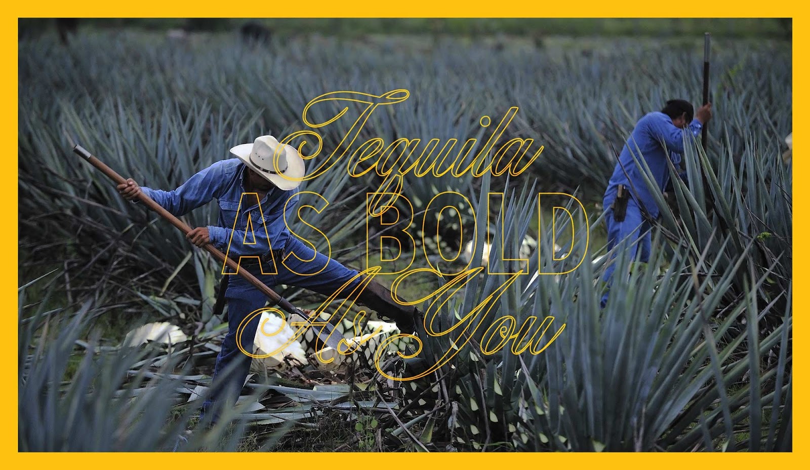
We started by immersing ourselves in research on both Mexico and tequila, and a few themes bubbled to the surface. There was a dichotomy of ornate architecture and decorative design elements found in larger Mexican cities was contrast by a more casual, hand-crafted aesthetic found in rural areas. Harnessing this tension between ‘premium' and ‘authentic Mexico’ supported Telsón’s desire to appeal to both well informed spirit drinkers as well as those who simply want to catch a buzz with some friends.
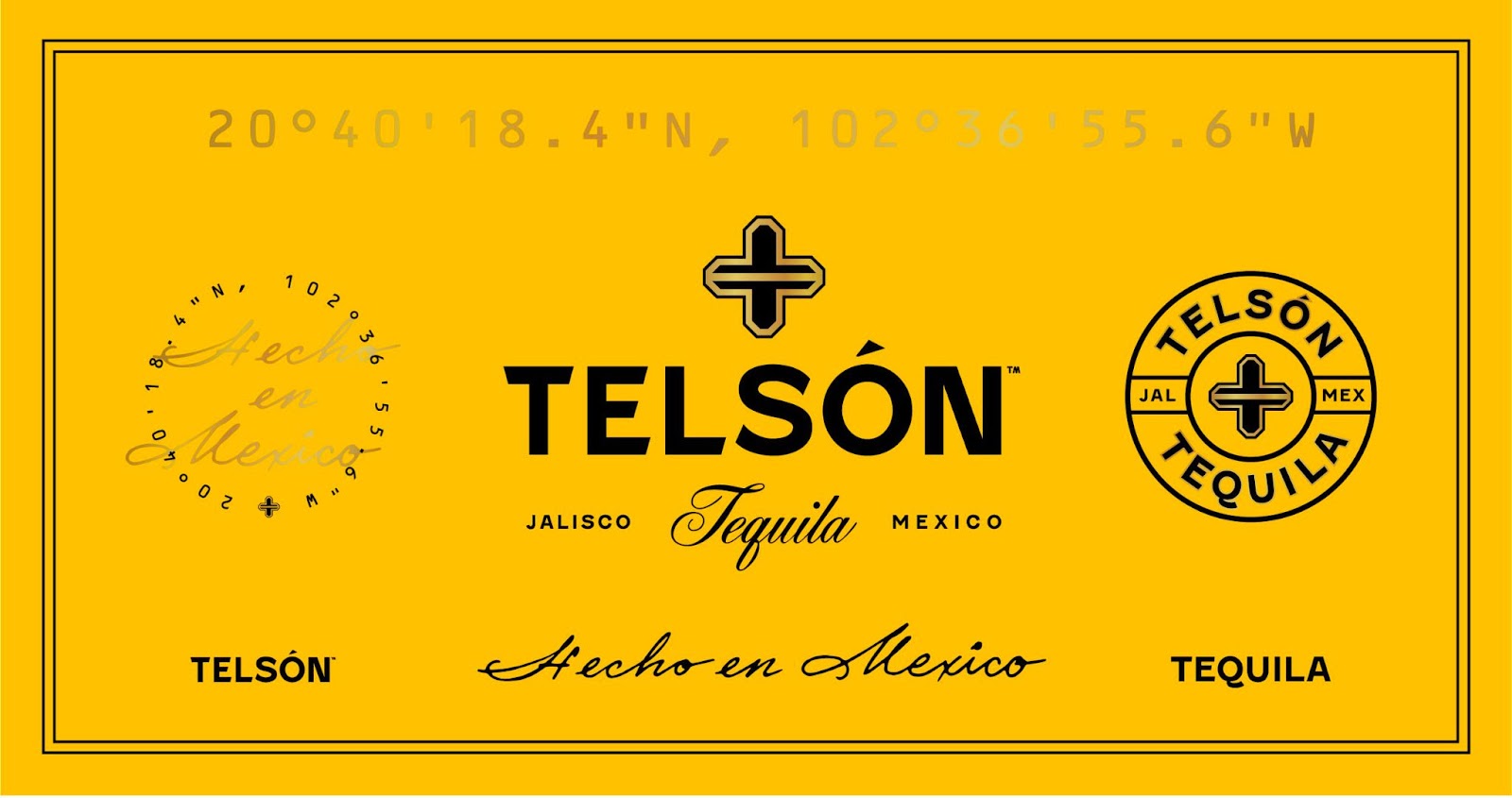
Logo Design
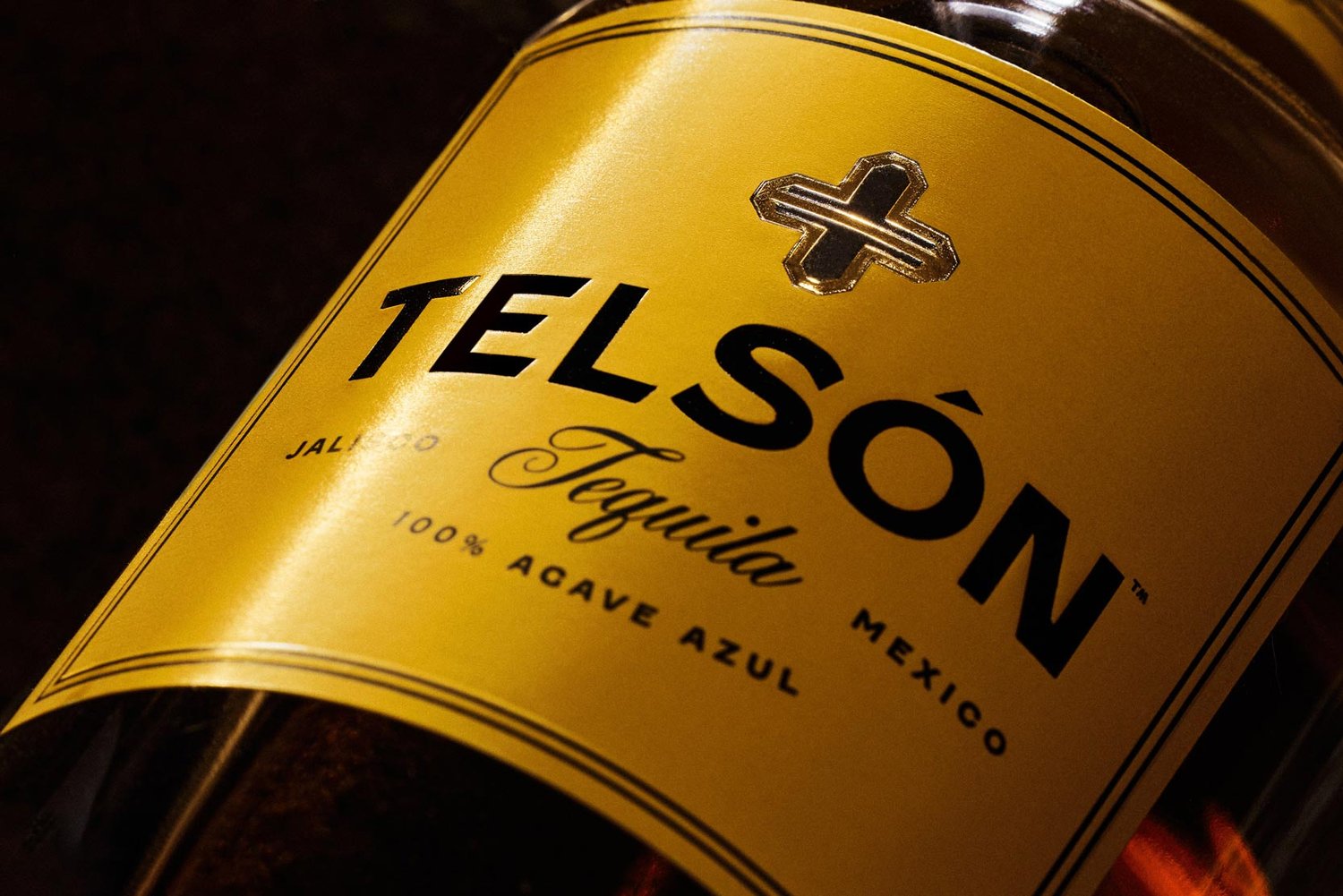
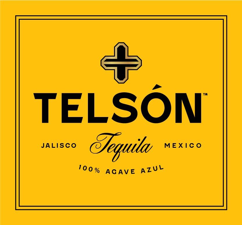
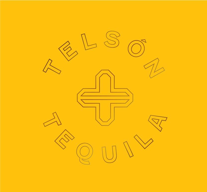
Hand painted street signage was the strategic impetus for Telson's logotype, and this was complimented by an elegant script. The mark draws inspiration from the decorative doorways and ornamentation found in Mexican architecture, and it is comprised of two letter “T's” mirroring each other — for Telsón Tequila. The resulting mark is a + sign, representing this spirit's ability to elevate and enhance any occasion.
Early on, we explored a variety of scorpion illustrations (a telsón is the last appendage in an arthropod). Ultimately, a more minimal and less pictorial direction helped better position the brand as aspirational and premium.

Visual Language
Balancing the tension point between “premium” and “authentic Mexico” was achieved through contrasting the boldly simple design aesthetic with a series of elements that were rooted in both craft and place. Illustration styles, hand drawn elements and design elements such as GPS coordinates all nod to the careful craftsmanship of Telsón.
The brand’s heavy use of yellow is inspired by the Mexican sunshine, and is symbolic of happiness, wealth and prosperity. The typographic system for the brand balances a bold elegance with undertones of craftsmanship and travel.

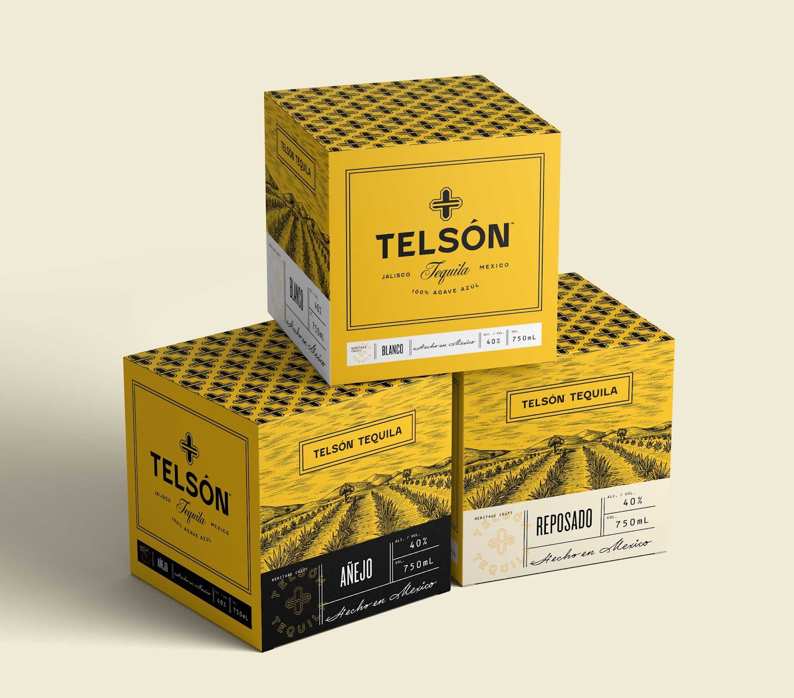
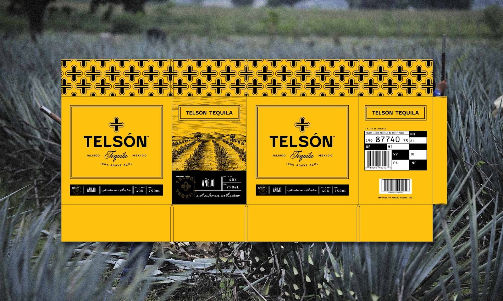
Packaging Design
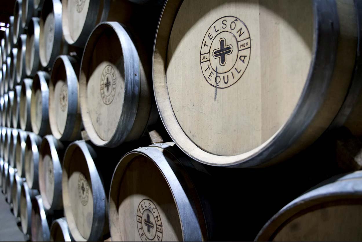
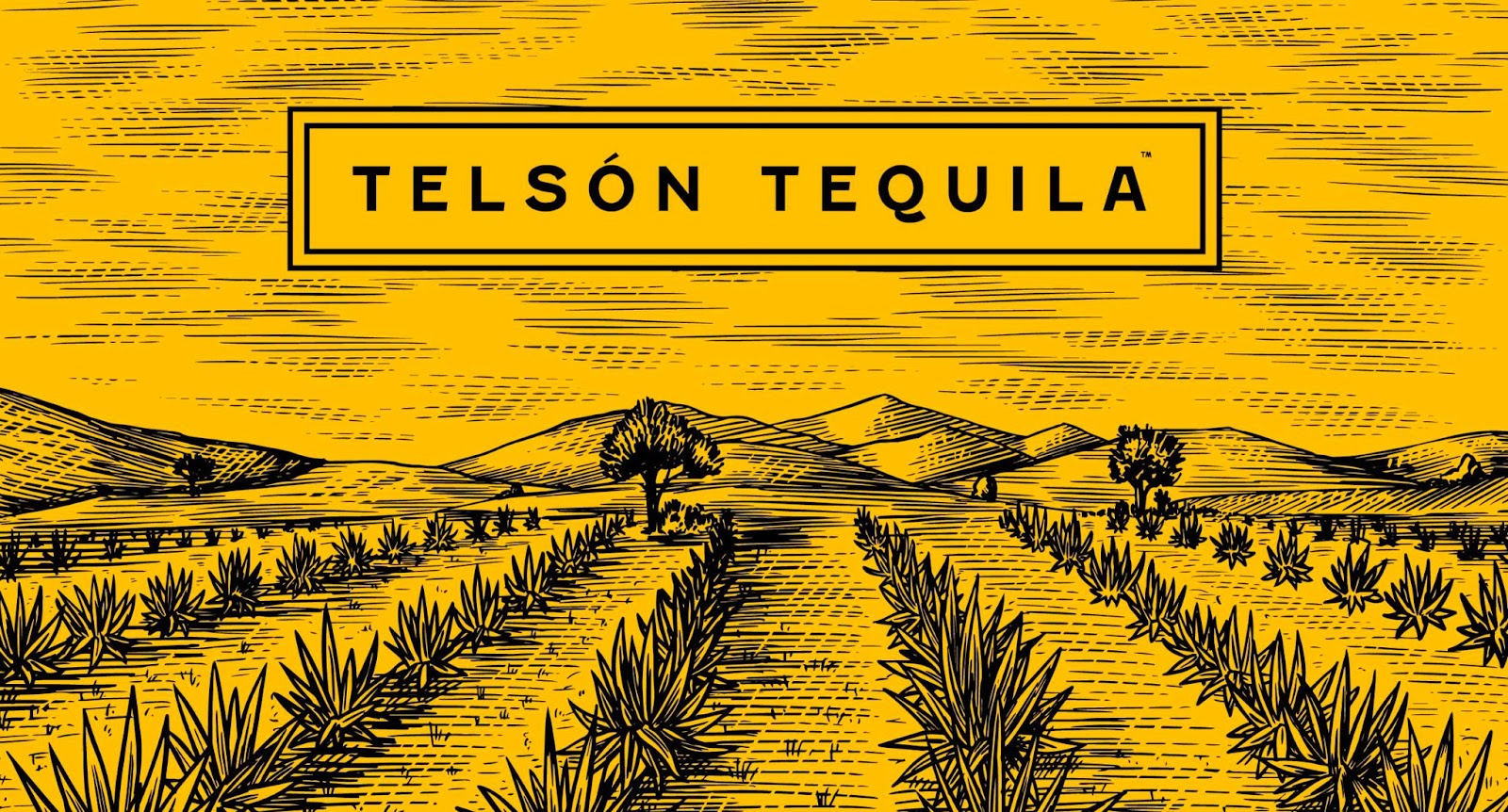
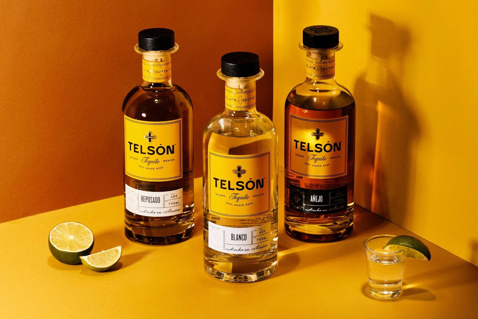
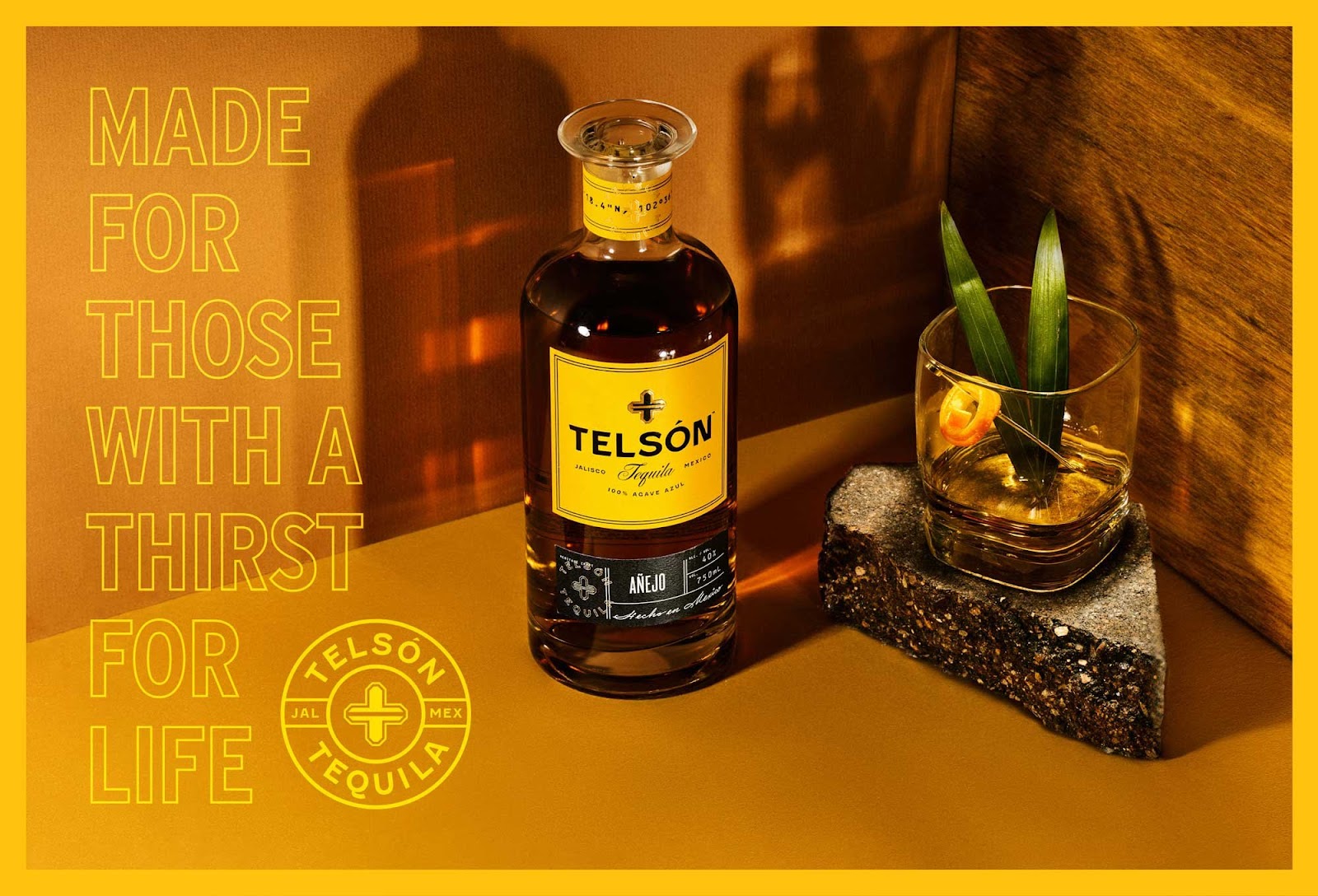
The labels and shipper boxes were a great opportunity to communicate Telsón’s connection to the heritage craft of harvesting agaves for their tequila. We focused on establishing a connection to the distillery’s physical location in Jalisco, Mexico through the inclusion of the GPS coordinates on the neck of the bottle and an illustration of rolling agave fields.
To further convey an aspirational brand positioning, we pulled inspiration from travel documents such as passports and luggage tags for the layout of the secondary label.
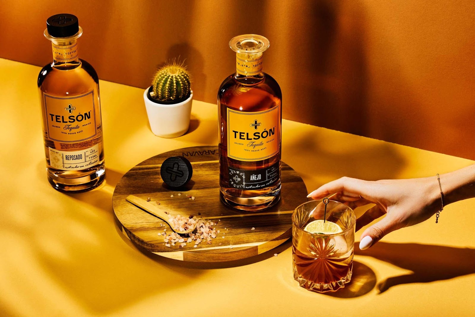

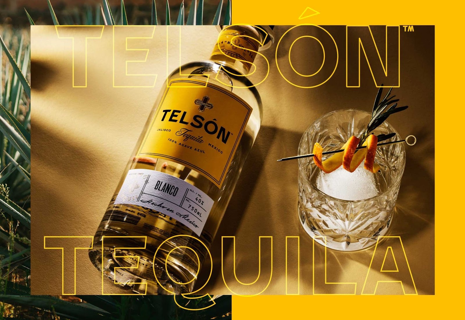
Photography
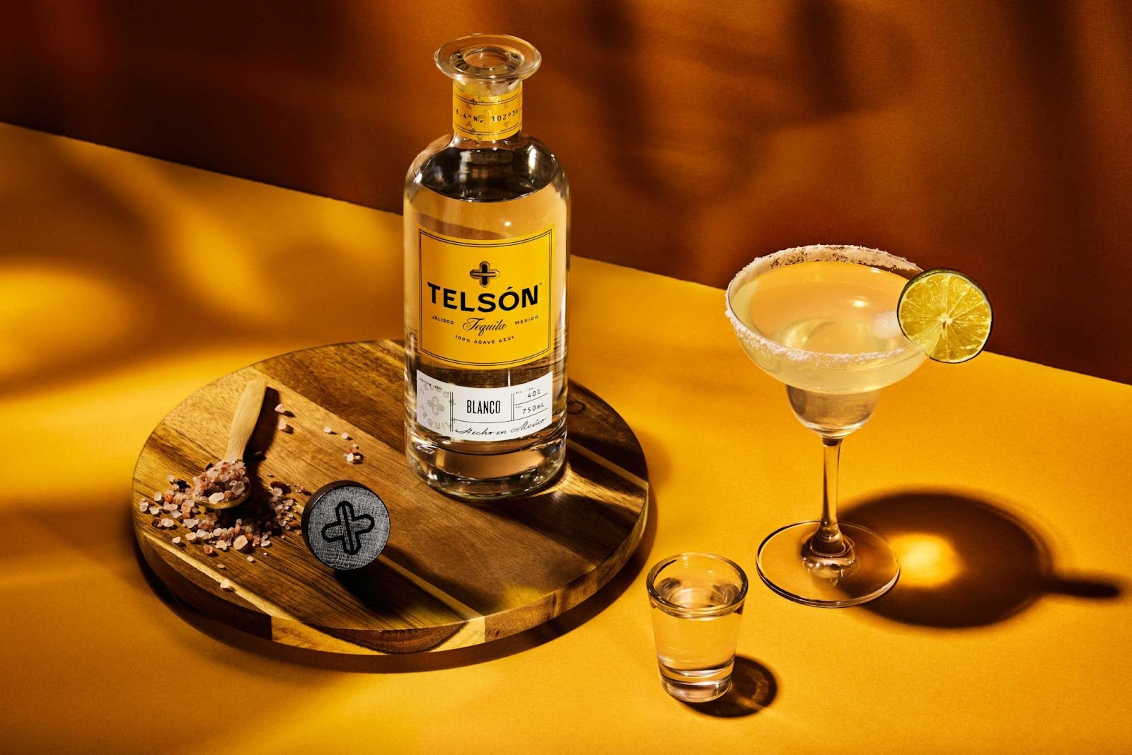
With the support and creative prowess of Joe Friend, we set up an environment that was minimal and rustic. Small pieces of wood, plants, sand, glass, and light that's been cast as if through agave plants all help the brand photography feel premium, experiential and ripe for enjoying with one’s friends.
Art Direction and Visual Language
As a grassroots brand with an aspirational brand positioning, we worked to balance the feelings of “premium” and “authentic Mexico” whenever possible. While Telsón may be a more sophisticated brand, at the end of the day, it's tequila: one shot too many is one shot in the right direction 😃.
The collateral continues to embrace the tension between high end and casual fun. Swaggy and party. Mexico and modern. Telson produces seriously quality tequila without taking themselves too seriously.
Credits
- Client: Romero Brands
- Services: Art Direction, Visual Identity Design, Logo Design, Packaging Design, Collateral Design
- Support: Carly Salzman
- Product Photos: Joe Friend
For more information make sure to check out Vicarel Studios website.


