by abduzeedo
If there’s one thing I love doing is trying to recreate the logos of movies and TV shows. I believe you have already noticed by now. I have been doing since the beginning of the blog and I still think it’s a wonderful way to learn new techniques, or simply, just explore. For this week’s Photoshop tutorial I will share some tips on how to create a text effect similar to the Blade Runner 2049 logo you can see in the posters and trailer.
For this Photoshop tutorial, we will pretty much take full advantage of Layer Styles, especially, because now we can duplicate properties like Inner Glow or Inner Shadow.
Photoshop Tutorial
Step 1
Let’s get started. Create a new document. I am using 5K resolution. Then using the Paint Bucket Tool (G) fill the background with a dark blue. I’m using #0a0c10 for the color.
Step 2
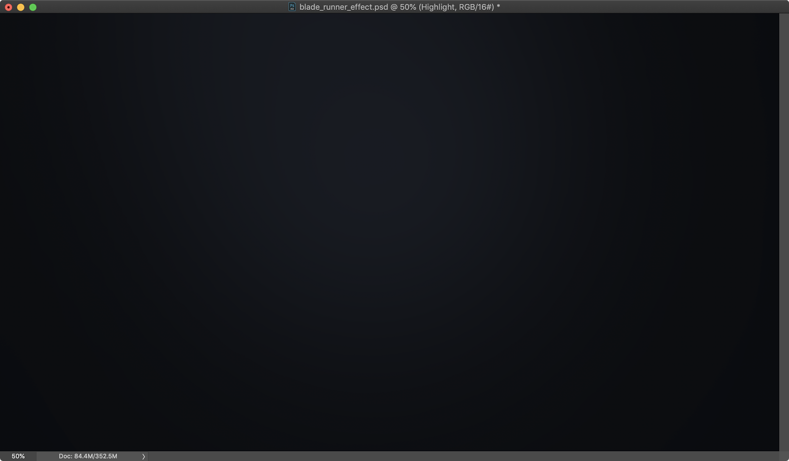
Add a new layer and select the Brush Tool (B). Use a very soft brush with white for the color and paint some spots on the center and top left of the image. You can group the layer and change the Blend Mode of the group to Soft Light with 50% for the opacity.
Step 3
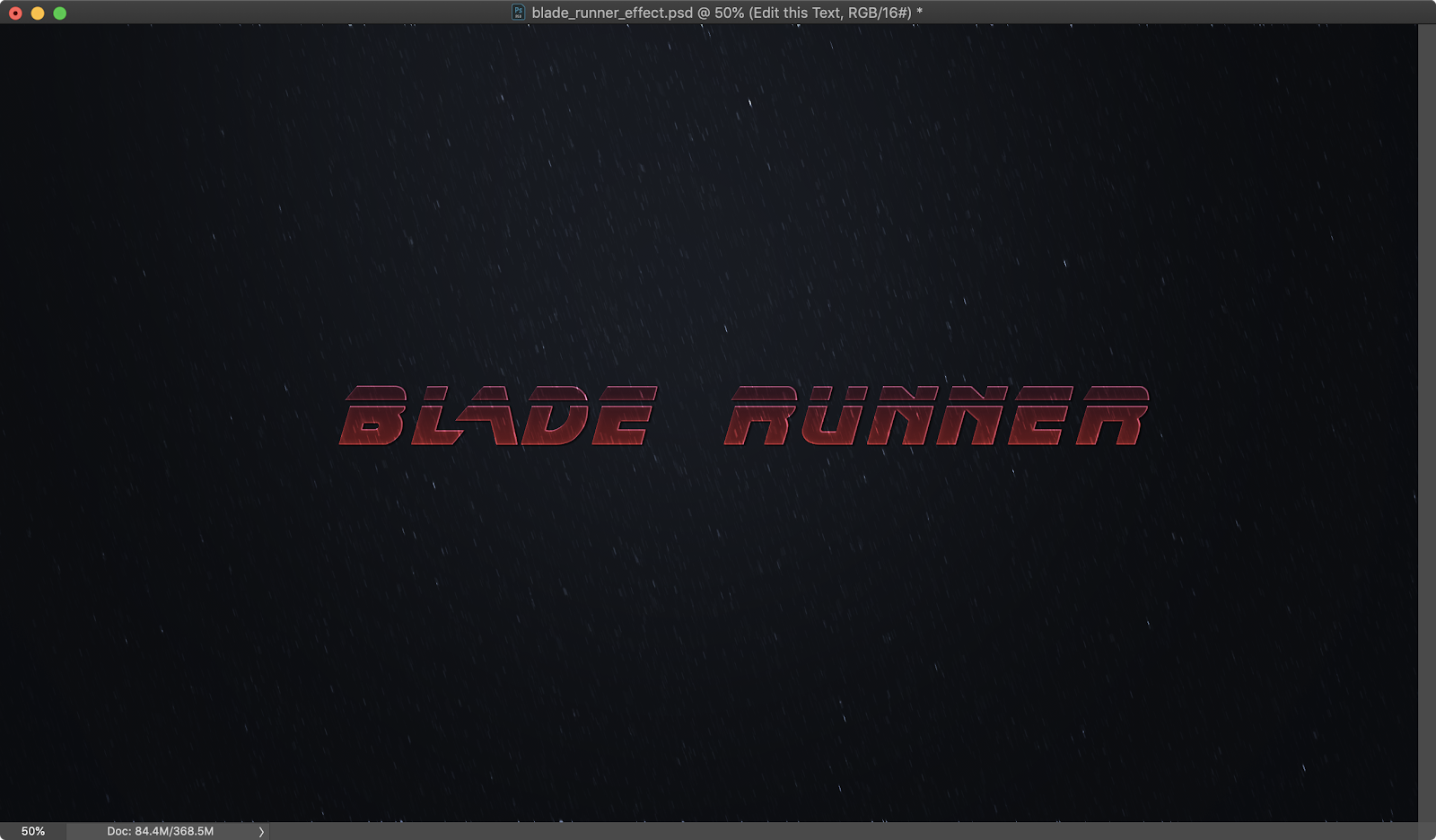
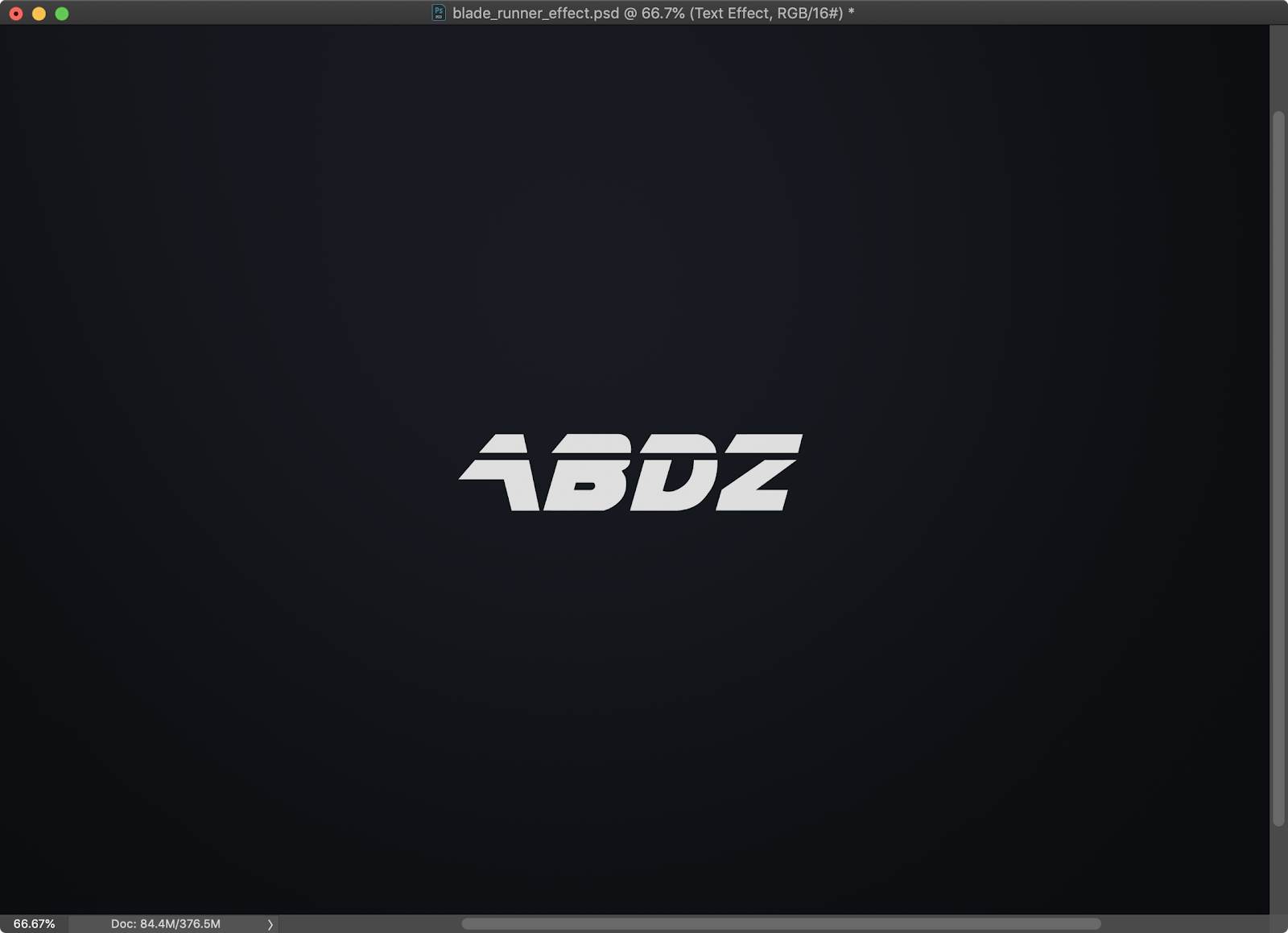
Time to add the text. For the font, I simply search for a similar font to the one used on the Blade Runner poster, not surprisingly, Dafont.com had it. It’s amazing to see that site running, I used to go there a lot at the beginning of the blog, 12 years ago or more. These things definitely bring a smile to my face.
Step 4
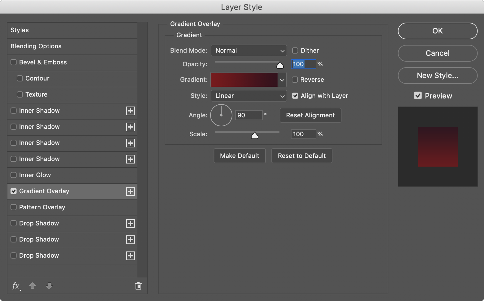
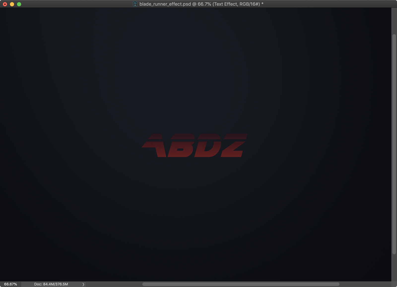
Time to Layer Styles. Go to Layer>Layer Style>Gradient Overlay.
Step 5
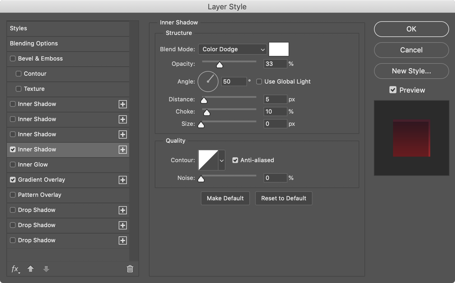
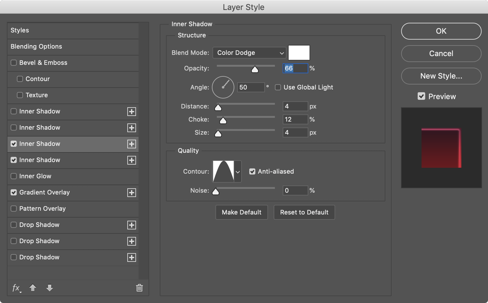
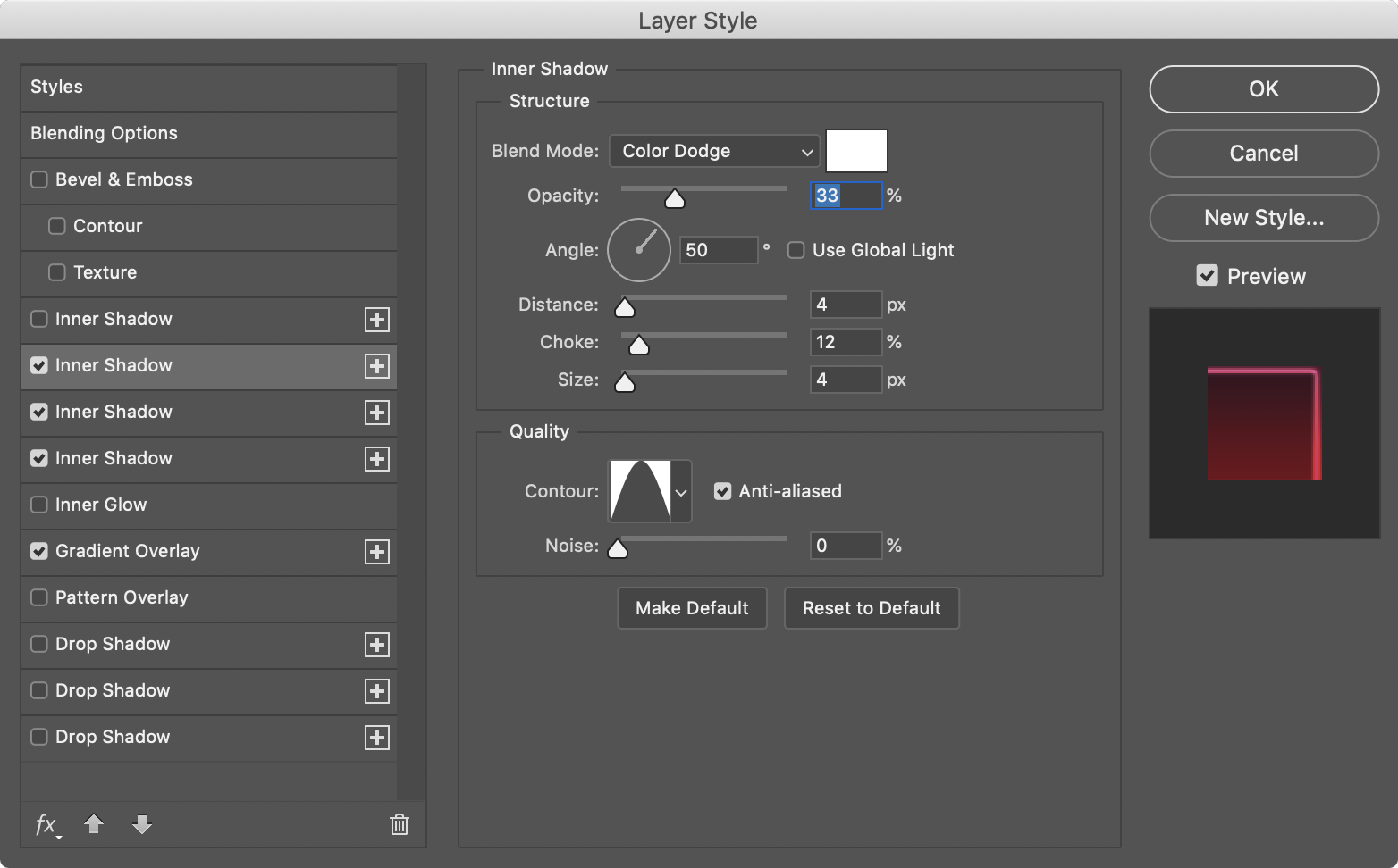
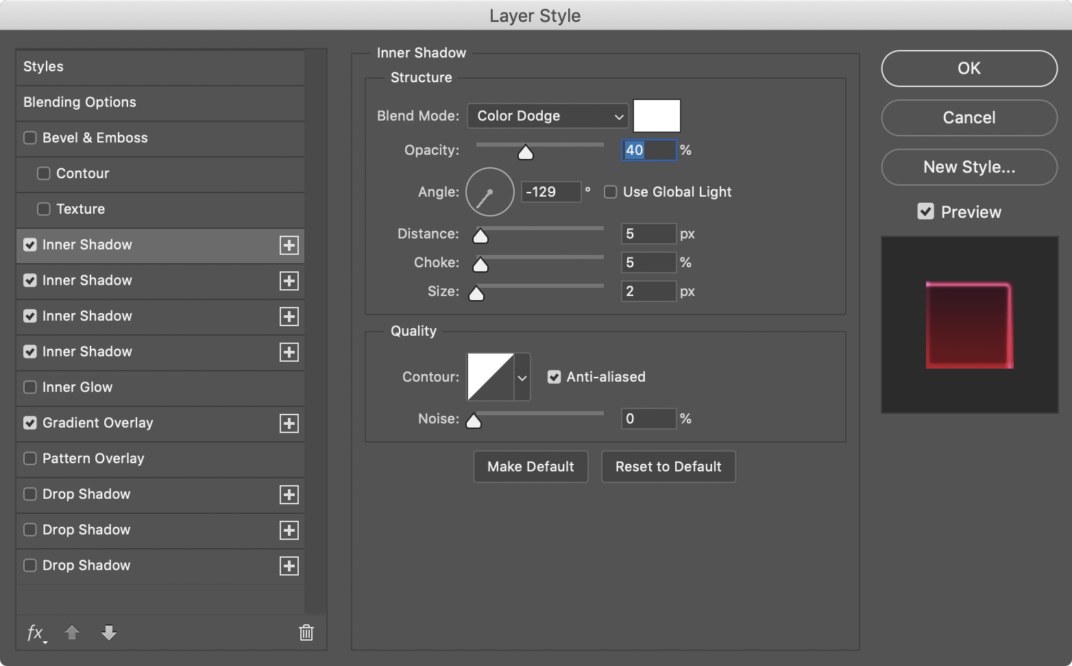
Now let’s add some Inner Shadows. I added 4 to create the contour of the image. Below you can see the values for each one of them.

Step 6
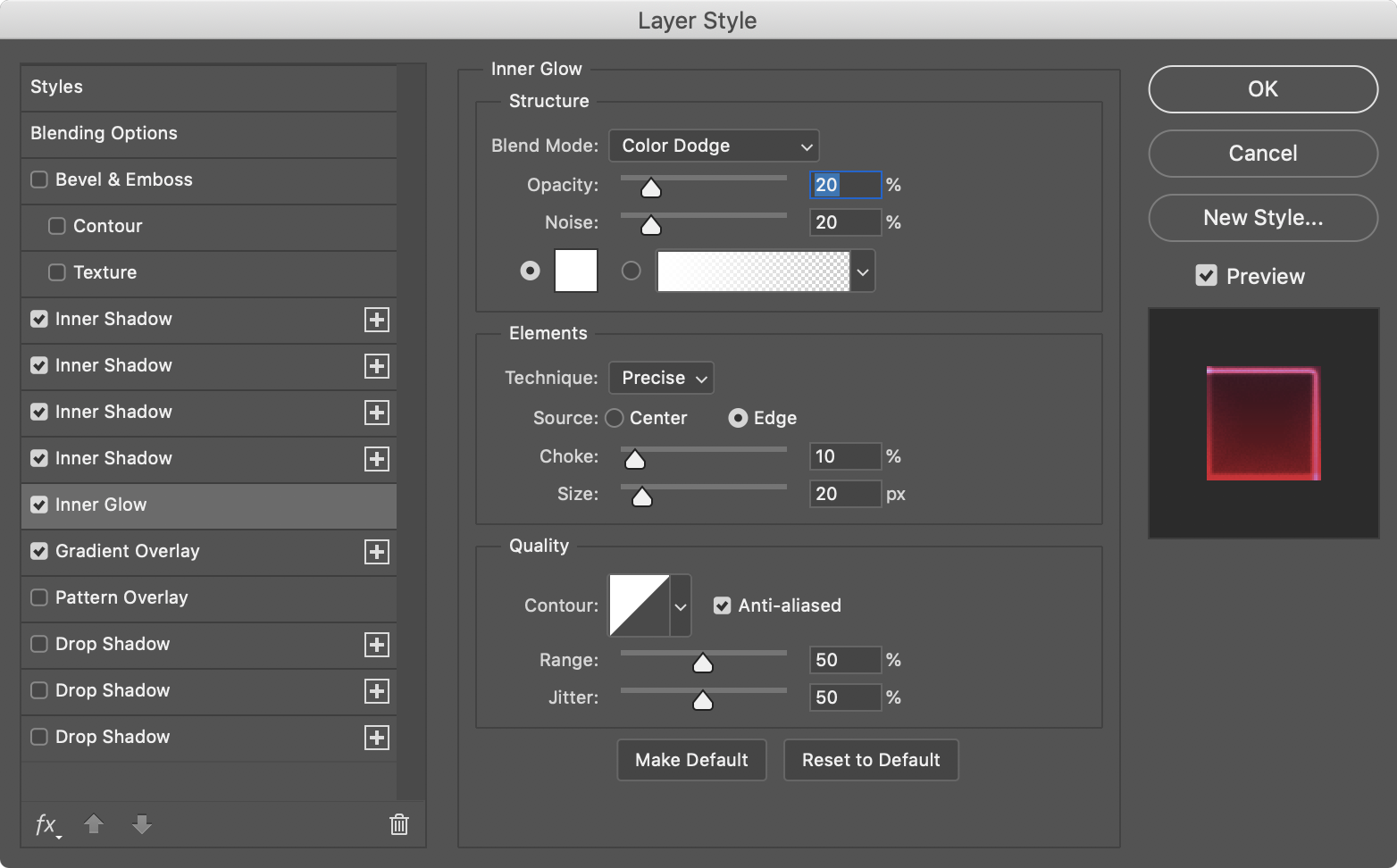
To add a bit more glow, I added an Inner Glow. See the values below:

Step 7
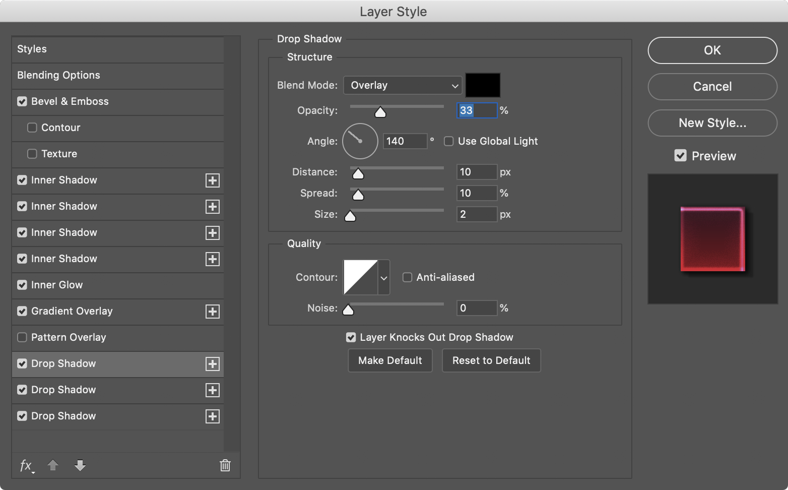
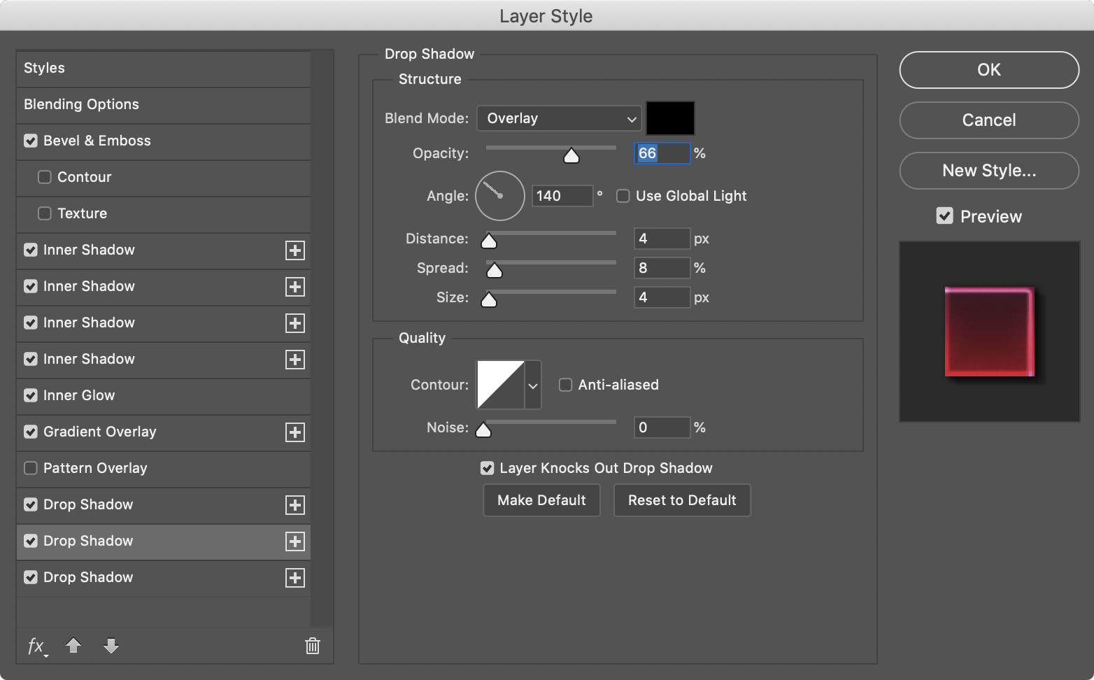
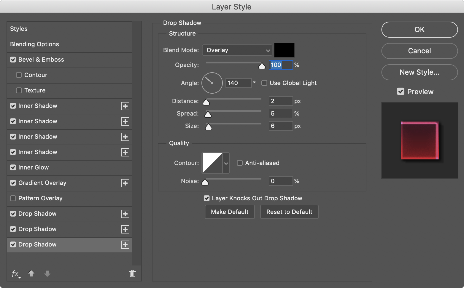
To finalize the text effect I added 3 more Drop Shadows. The reason for that is, basically to add a bit more depth, like a faux 3D effect. I don’t know if it works, but I gave it a try.
Step 8
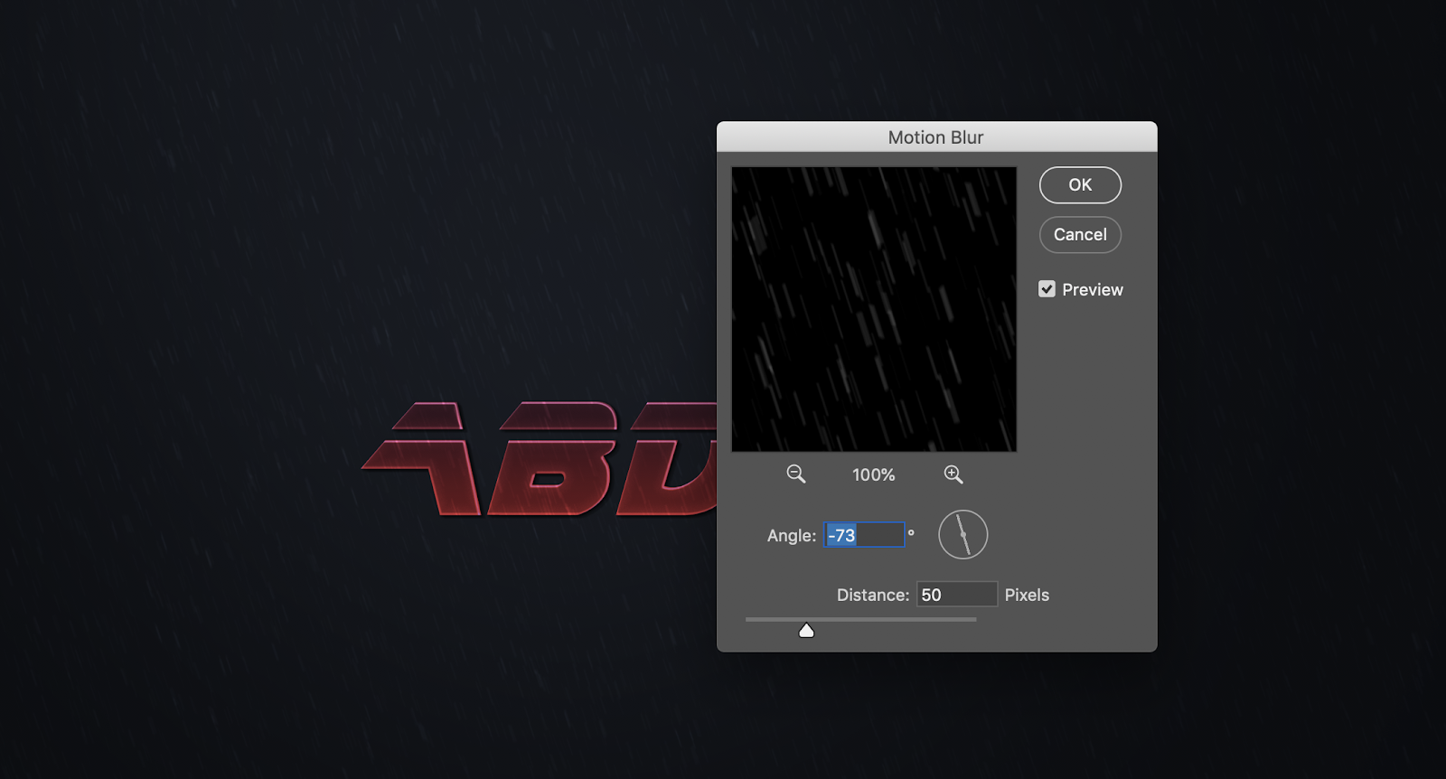
To add a bit more realism, I added some rain to my composition. To fake that is quite simple.
-
Add a new layer and fill it with black
-
Make sure the foreground and background colors are white and black, then go to Filter>Noise>Add Noise.
-
Go to Image>Levels. Move the black handler to reduce the amount of white dots. If that doesn’t work you can apply a gaussian blur before this step.
-
Change the Blend Mode to Color Dodge
-
Go to Filter>Blur>Motion Blur
-
Duplicate the layer and add more Motion Blur. Also, move it up to add a bit more depth.
Conclusion
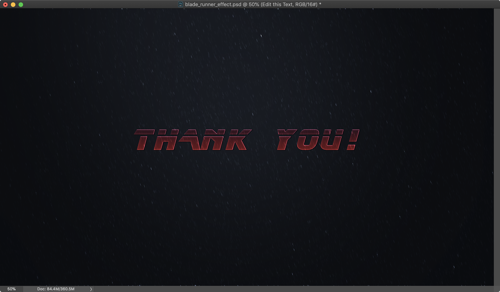
There you have it, the effect is ready to go and you can now try any text you want. I recommend changing the Tracking of the A character to a higher number depending on your font size. The reason for that is to avoid that the overlap with the next font.
Below you can see some examples: