by abduzeedo
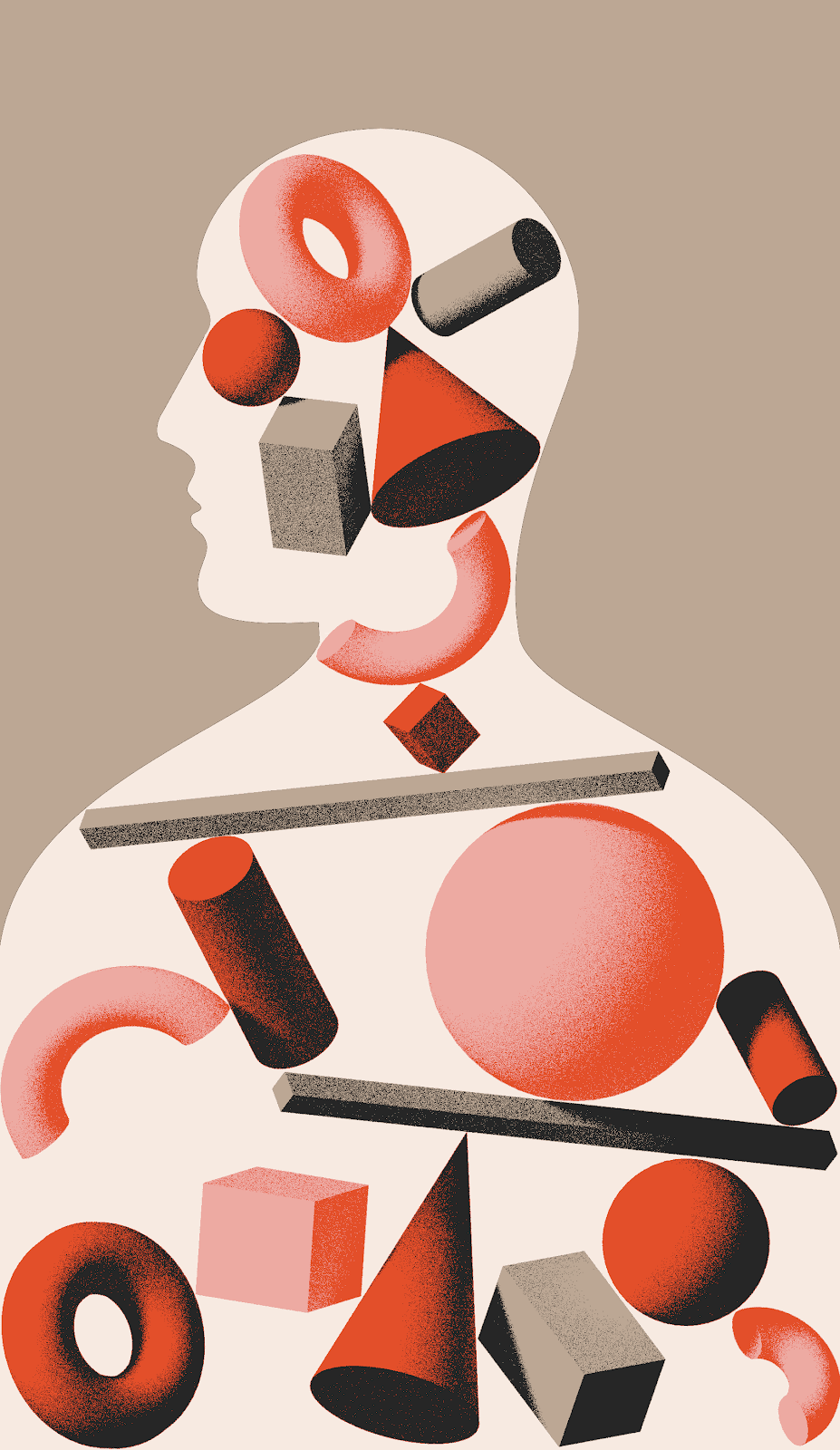
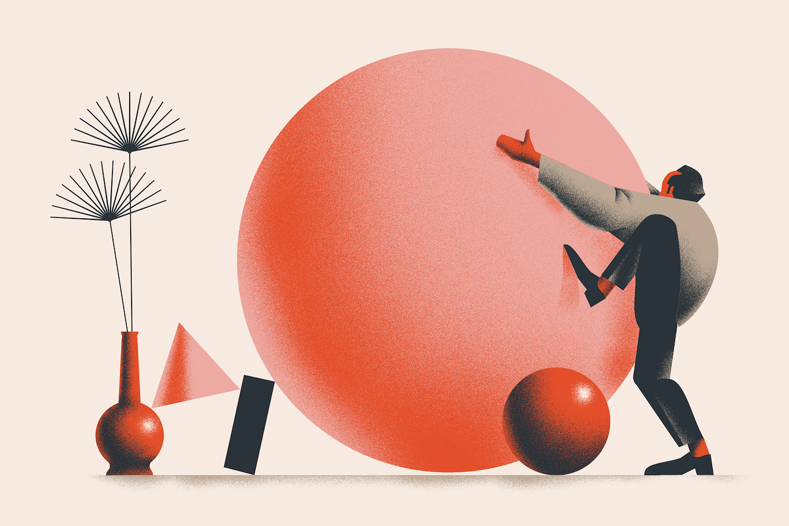
Tomasz Woźniakowski shared a beautiful project on his Behance profile. It’s a set of illustrations he recently created for the newest Wizje magazine publication which is a polish collective of young people promoting poems of various writers. The illustration style is top notch, I especially like the usage of texture and depth. I feel that is a much better alternative to the ultra flat and vector look. Adding noise to shadows adds a lot of style to the illustration
Another awesome thing to mention about this project is that Tomasz is a design student. We love supporting and helping students to get their work out there. So if you want to ge feature on ABDZ let us know. Meanwhile make sure to check out Tomasz Behance Profile
Illustration