by abduzeedo
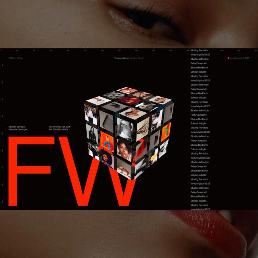
It’s time for another installment of our series of “That 90s Look is Coming Back”. Today we are excited to share a web design project that captures a bit of the essence of the 90s typography. The project was created by Daniel Spatzek and it seems to be for his on portfolio. We have to highlight the typography with that huge contrast of font sizes in addition to deconstructivism look by using masks, the black and white imagery contrasting with some red pop of color. The work is simply awesome, especially if you, like me, love that style. Huge contrast of font sizes in addition to deconstructivism look...
Daniel Spatzek is a freelance graphic designer, art director and creative developer from Austria. He is also a judge at CSS Design Awards. With that long list of titles and credentials of course he has an incredible portfolio and you should definitely check it out. http://www.danielspatzek.com/
