by abduzeedo
Last week I published a tutorial showing how to mix a custom font created in Illustrator with some stock photos of milk to create a nice effect. Now on this tutorial we will sort of repeat the technique but this time using stock photos of meat and add perspective to create a word made from beefs. Also we will play with blurs to create a depth of field effect.
We will use Adobe Illustrator and Adobe Photoshop to create the composition also I will be using images from Shutterstock, but feel free to use the stock photos you want.
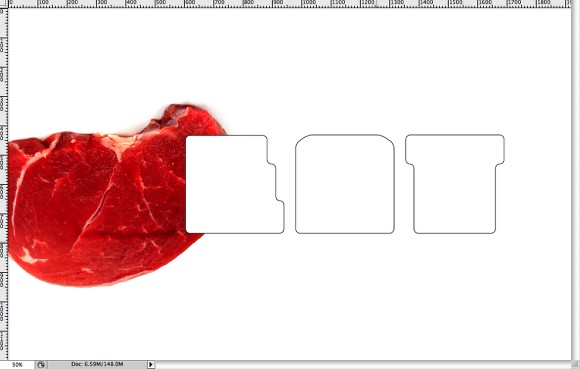
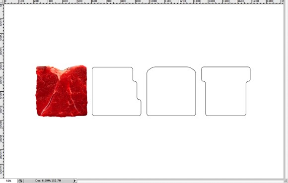
Step 1
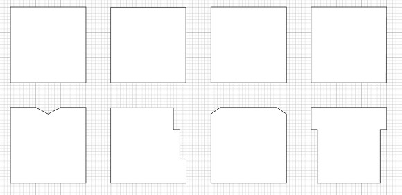
In Adobe Illustrator create a new document and go to View>Show Grid and View>Snap to Grid. Then with the Rectangle Tool (M) create 4 squares that will be the 4 letters of the word MEAT. After that select the Pen Tool (P) and create the letters M, E, A and T like the image below.
Step 2
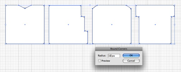
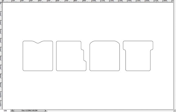
As we're going to create a font made from meat, it's necessary to make the letters with round corners. To do that, select the letters and go to Effects>Stylize>Round Corners. Use 10 pixels for Radius.
Step 3
Copy the letters from Illustrator and paste them in Photoshop in different layers. Each letter will be in a layer.
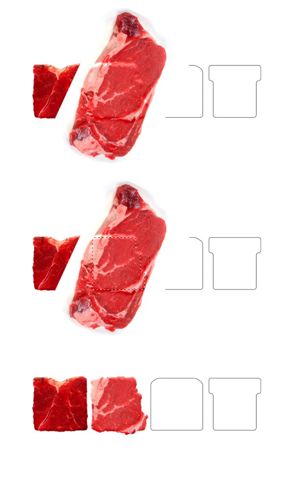
Step 4
Let's use a photo of a beef for the first letter, the photos I'm using are from Shutterstock as I got a susbcription to download quite a few images per day. But you can use different images. This one can be downloaded at http://www.shutterstock.com/pic-3079359-piece-of-a-beef-on-white.html
Step 5
Holding the Command (MAC)/Control (PC) click on the thumbnail of the layer of the letter M to create a marquee selection liket the image below.
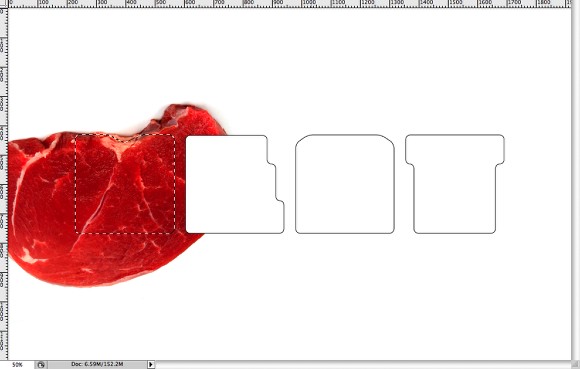
Step 6
Go to Layer>Layer Mask>Reveal Selection. But as we can see the edges are too perfect so we will need to make them less uniform.
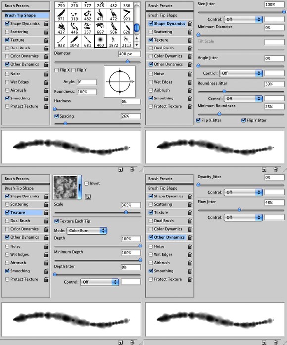
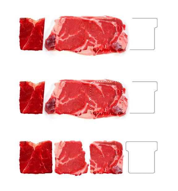
Step 7
Let's create a brush to paint the mask then we will be able to make the edges more real and less uniform. Go to Window>Brushes and then select a regular brush preset, then use the settings below for the Brush Tip Shape, Shape Dynamics, Texture and Other Dynamics.
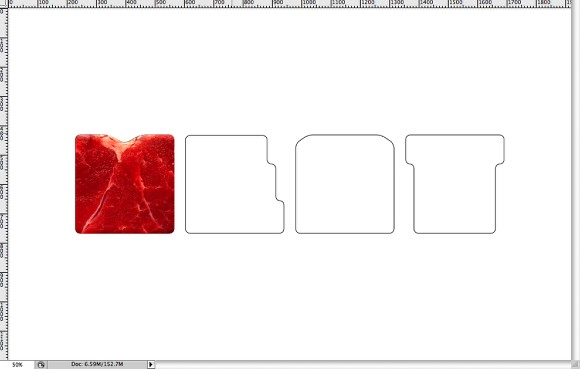
Step 8
With the Brush Tool (B) select the brush we have just created and then in the Layer Palettes click on the thumb of the layer mask. Using white for the color paint over the edges of the letter like the image below.
Step 9
Repeat the same thing we did on the Steps 4, 5, 6, and 8 for the E, the image I used can be downloaded at http://www.shutterstock.com/pic-3681127-raw-ribeye-steak.html
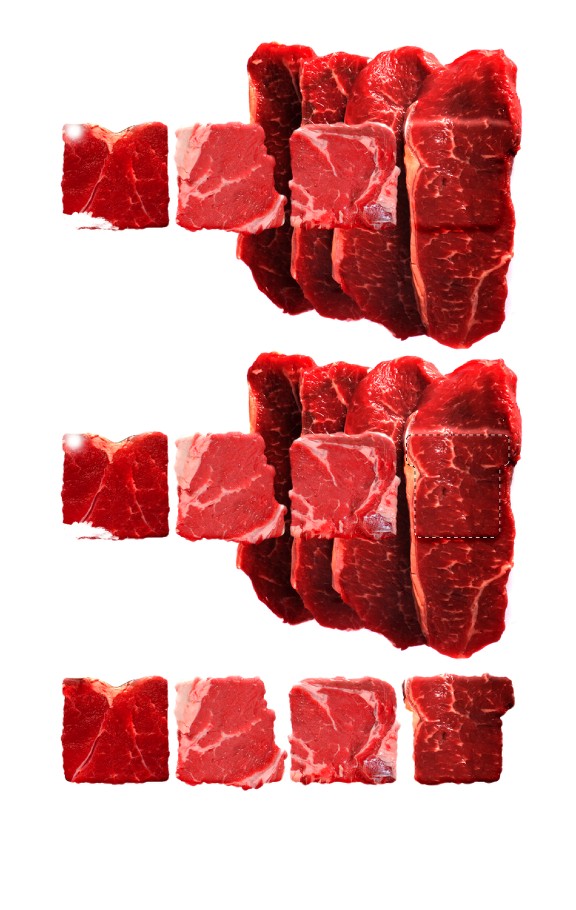
Step 10
Again for repeat the same technique for the A. The image I used the same image as the previous step but I rotated it to use another part of the beef.
Step 11
For the T I used another stock photo, you can download it here.
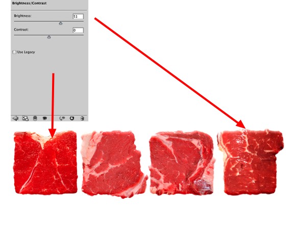
Step 12
The letters M and T need some color adjustments. Select the T and go to Image>Adjustment>Brightness /Contrast. Use 50 for the Brightness. Do the same with the letter M.
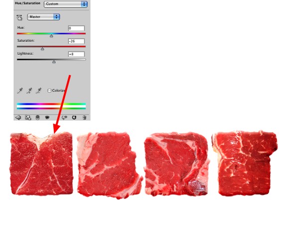
Step 13
Let's reduce the saturation of the M. Select the M image and go to Image>Adjustments>Hue/Saturation. Use -26 for the Saturation and 8 for the Lightness.
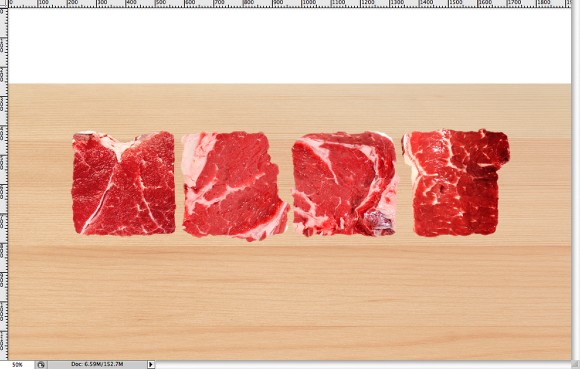
Step 14
Let's add wooden texture to create the board or table where the beefs will be on. The one I used was from Shutterstock as well and you can download it at: http://www.shutterstock.com/pic-23743900-wooden-texture.html
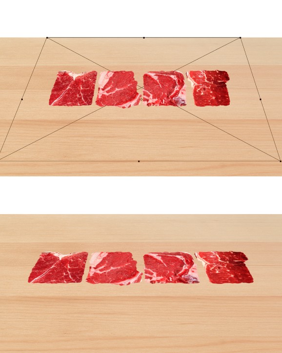
Step 15
Select the 4 letters and go to Layer>Smart Objects>Convert to Smart Objects. Then go to Edit>Transform>Distort. After that holding the Shift Key distort the layer like the image below.
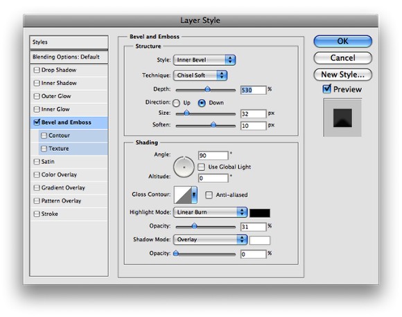
Step 16
Now that the beefs are in the right perpsective go to Layer>Layer Style>Bevel and Emboss. Use Inner Bevel for the Style, Chisel Soft for the Technique, 530% for the Depth, Down for the Direction, 30 pixels for the Size and 10 pixels for the Soften. Also on the Shading options use 90º for the Angle, 0 for the Altitude, Black color for the Highlight Mode with Linear Burn and 30% Opacity. For the Shadow Mode use Overlay change the opacity to 0%.
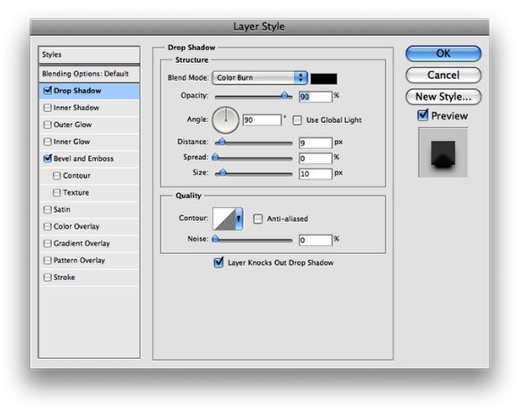
Step 17
After the Bevel and Emboss select the Drop Shadow Option. Use Color Burn with black for the color and 90% for the opacity. For the Angle use 90º, 9 pixels for the Distance, 0 for the Spread and 10 Pixels for the Size.
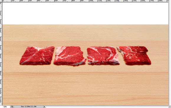
Step 18
After the Layer Styles your meat will be like the image below. To make the beefs thicker or thinner, just change the values of the Bevel and Emboss.
Step 19
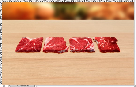
Add an image for the background and go to Filter>Blur>Gaussian Blur. Use 20 or more for the radius that way the backgound image will be out of focus.
Step 20
You can add more elements like vegetables I added letuce to give a nice green to the image. You can download the one I used over here.
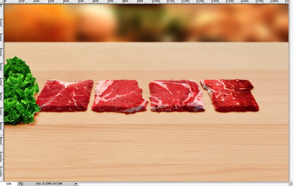
Step 21
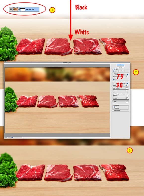
Select all layers that are used to create the composition and go to Layer>Merge Layers. Then go to Layer>Layer Mask>Reveal All. Select the Gradient Tool (G) and using the black and white preset fill the mask with a gradient with the black from the top to white (1).
After that go to Filter>Blur>Lens Blur. Use Faster for the Preview, for the Depth Map use Layer Mask . For the Blur Focal Distance use 75 and Invert. Over the Iris Options, use Hexagon for the Shape and change the Radius to 30. Press OK. The Lens Blur will create a nice depth of field effect.
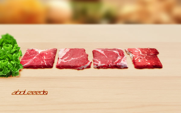
Conclusion
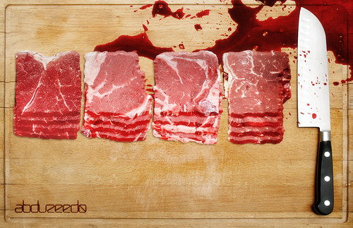
Well, the effect is pretty much done, even though the word is a bit difficult to read, that was the idea to create the word with beefs. You can add your logo and more elements, however the most important thing will br to try to match the perspective, otherwise the effect won't be so convincing. With this technique you will be able to create some nice photo manipulations. I hope the tutorial was useful and let me know your opinion or suggestions for future tutorials.
Another example
You can try different perspectives as well, the idea is just to play with the tool ;)